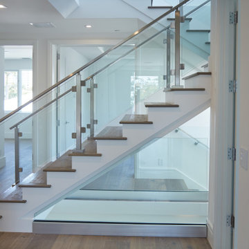
Stainless Steel Glass Railing Designs & Ideas
interiors: Tanya Schoenroth Design, architecture: Scott Mitchell, builder: Boffo Construction, photo: Janis Nicolay
Layout to improve form and function with goal of entertaining and raising 3 children.
Find the right local pro for your project
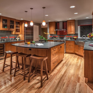
Features: Custom Wood Hood with Pull Out Spice Racks,
Mantel, Motif, and Corbels; Varied Height Cabinetry; Art for
Everyday Turned Posts # F-1; Art for Everyday Corbels
# CBL-TCY1, Beadboard; Wood Mullion and Clear
Beveled Glass Doors; Bar Area; Double Panel Doors;
Coffered Ceiling; Enhancement Window; Art for
Everyday Mantels # MTL-A1 and # MTL-A0; Desk Area
Cabinets- Main Kitchen: Honey Brook Custom in Maple Wood
with Seapearl Paint and Glaze; Voyager Full Overlay Door
Style with C-2 Lip
Cabinets- Island & Bar Area: Honey Brook Custom in Cherry
Wood with Colonial Finish; Voyager Full Overlay Door
Style with C-2 Lip
Countertops- Main Kitchen: Golden Beach Granite with
Double Pencil Edge
Countertops- Island and Bar Area: Golden Beach Granite
with Waterfall Edge
Kitchen Designer: Tammy Clark
Photograph: Kelly Keul Duer
Designed by Melissa Sutherland, CKD, Allied ASID; Photo by Steven Long Photography
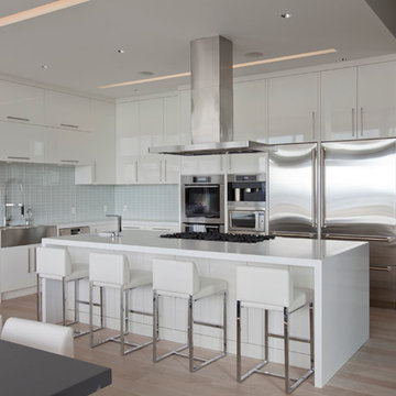
There are so many design elements to this kitchen, I almost don’t know where to start. Bright and airy with crisp clean white cabinets, the kitchen is open and welcoming. Still crisp but gently contrasting, the stainless steel appliance add depth amid the white. To keep this kitchen warm, natural oak covers the floors and a toasted wheat color washes the walls. And then there is the architectural elements. You know. That post and beam in the middle of the room. It’s the center of attention.When you walk into a room your eyes roam around, establishing the size and shape of the room as your feet take you forward. From the front door of this home straight ahead you encountered this wall. The dining area to the right gives you a glimpse of things to come. Where there is a dining room you will usually find a kitchen.
The architecture of years gone by consistently hides the kitchen, the heart of the home, behind walls. I sympathize with my Mom, and all the other Moms, who have had to spend so much time tucked into a tight kitchen, away from the family. This wall had to go, but it was structural. We needed its support but not its bulk.So we got rid of the bulk and only the bulk. Instead of a wall we have a post and beam, offering all of the structure we need. We could have installed a huge steel beam and reconfigure the joists to upset the beam, but why? The small beam and post add an incredible architectural element. It’s turning lemons into lemon, we simply made the most of what we had. It may be functional but it’s so fantastic. It looks like we created the effect just for the drama.
The original kitchen may have had a working triangle and some counter space, but it was fairly small, with each area only a step or two away. The dark cabinets made the space feel even smaller and the butcher block patterned laminate counter tops were very dated. The appliances were feeling their age as well, from a coil burner electric stove to a top freezer refrigerator. To keep this kitchen within its space, a half wall separated it from the dining area.
With the wall gone we borrowed some space from the living room and extended what was a U shaped kitchen into an L. At the living room window we start our new kitchen. We kept a small part of the wall to support the other end of our decorative beam. Sandwiched between a large pantry and our new French door refrigerator, the wall disappears. With our new open floor plan a sizable island was in order.
We split our cooking areas and installed a continuous grill gas cooktop into the island. A sleek island hood takes care of exhaust and adds an extra element to our architectural feature. Under the cooktop we added over-sized drawers for pots and pan storage. The frameless cabinets from New River Cabinetry are maple, painted white, with the Herndon door style. With the cooktop safely nestled into our island, we still had to add an oven.
We used the space where the old range sat for a large single oven of stainless steel and glass. If it worked for one, why not two? We created a home for a microwave in the wall cabinets. It’s perfect for heating leftovers so close to the refrigerator.An important consideration for hot spots in your kitchen is landing zones. Each of our cooking areas have generous landing zones, one on each side of the cooktop and an entire counter area above or below the ovens, depending on which one you’re using.We wanted to give the sink area more room so the half wall had to come out. We moved the trash and recycle cans into a cabinet, removed the heavy soffits and kept the sink under the window.With that little bit of extra space we were able to add a larger cabinet above the dishwasher and slide it all down. This used to be where the carpeting met the vinyl floor, but all of it is gone. Long oak planks eliminate that final divide between the kitchen and the dining area, while adding visual length to the area. White wall cabinets on each side of the window reflect the sunlight for a brighter view.
With all of the darker cabinetry the backsplash walls had been painted white. Even still, there was a darkness in the corners and it wasn’t very exciting. We wanted to add visual interest and reflect the new under-cabinet lighting, eliminating the shadows in this corner.With 1″x 2″ Arabescato Honed marble mosaics and those under-cabinet lights, we achieved the perfect balance. The marble has subtle swirls in gray and beige on a clean white background, but with the honed finish the light is softly reflected instead of glaring. For granite, we chose the soft gray tones of Luna Pearl. The speckles of gray and beige are a gentle contrast to the white cabinets and emulate the color of the stainless steel.Between the carpet, red half wall, dark railing and dated light fixture, the dining area felt tired. Since the kitchen lacked sufficient storage, a large utility cabinet crowded the table space without adding any decorate elements.Although it didn’t get any bigger, our dining area feels fresher and more open too. With the oak flooring joining the area to the rest of our space and the toasted wheat on the walls, the white table and chairs compliment the cabinetry while contrasting the warmer colors. We replaced the chandelier with recessed lighting and changed that railing too.With our new open floor plan, we ended up with a fairly open area in between our foyer closet and the living room window. Not one to miss an opportunity, we filled the space with a multi-functional work space.
With the sunlight streaming in this bright corner works for anything this family needs.
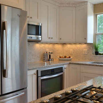
Photo Credit to RJK Construction, Inc.
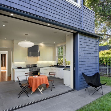
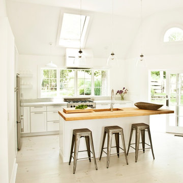
Kitchen open to rear garden through sliding glass doors and screens that slide into exterior pockets.
Cathy Schwabe Architecture.
Photograph by David Wakely.
Contractor: Young & Burton, Inc.
Dark wood cabinets are juxtaposed with a light Terrazo floor in this contemporary u-shaped kitchen. It features an undermount sink, a green, glass tile backsplash, stainless steel appliances, glass-front cabinets, and marble countertops.
---
Our interior design service area is all of New York City including the Upper East Side and Upper West Side, as well as the Hamptons, Scarsdale, Mamaroneck, Rye, Rye City, Edgemont, Harrison, Bronxville, and Greenwich CT.
For more about Darci Hether, click here: https://darcihether.com/
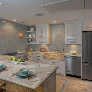
The heart of the home is the kitchen, and this sea side condo's kitchen is no exception. A spacial kitchen creates the optimal work triangle for amateur and master chefs alike, while a full height glass mosaic backsplash adds grandeur to the space. The marble countertops contrast the backsplash while the soft white of the cabinets compliment them. Ceramic shell wall accents bring the outside in, as the blue mosaic floor accent and and travertine floors evoke the beach.
Jerry Hayes Photography
With its clean, simple design, the stylish Lustertone Iconix sink adds a modern touch to the kitchen. Its sophisticated shape maximizes bowl space and makes sink cleanup quick and easy.
This sleek and contemporary kitchen remains inviting with the warm colors and homey with the glass-front cabinets while maintaining a highly modern and streamlined design.
To create a modern and airy feel with dark wood meant designing cabinets that opened up the kitchen. The cabinets make a statement while leaving room for other aspects of the kitchen, such as the marble and backsplash, to stand out. This design includes 3” shaker doors and Chocolate Brown stain. They feature open framed upper glass panels with crown to ceiling and wall to wall cabinets.
3" shaker maple door style with a custom chocolate stain.
The decision to remodel your kitchen isn't one to take lightly. But, if you really don't enjoy spending time there, it may be time for a change. That was the situation facing the owners of this remodeled kitchen, says interior designer Vernon Applegate.
"The old kitchen was dismal," he says. "It was small, cramped and outdated, with low ceilings and a style that reminded me of the early ‘80s."
It was also some way from what the owners – a young couple – wanted. They were looking for a contemporary open-plan kitchen and family room where they could entertain guests and, in the future, keep an eye on their children. Two sinks, dishwashers and refrigerators were on their wish list, along with storage space for appliances and other equipment.
Applegate's first task was to open up and increase the space by demolishing some walls and raising the height of the ceiling.
"The house sits on a steep ravine. The original architect's plans for the house were missing, so we needed to be sure which walls were structural and which were decorative," he says.
With the walls removed and the ceiling height increased by 18 inches, the new kitchen is now three times the size of the original galley kitchen.
The main work area runs along the back of the kitchen, with an island providing additional workspace and a place for guests to linger.
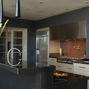
A color palette of dark blues and reds was chosen for the walls and backsplashes. Black was used for the kitchen island top and back.
"Blue provides a sense of intimacy, and creates a contrast with the bright living and dining areas, which have lots of natural light coming through their large windows," he says. "Blue also works as a restful backdrop for anyone watching the large screen television in the kitchen."
A mottled red backsplash adds to the intimate tone and makes the walls seem to pop out, especially around the range hood, says Applegate. From the family room, the black of the kitchen island provides a visual break between the two spaces.
"I wanted to avoid people's eyes going straight to the cabinetry, so I extended the black countertop down to the back of the island to form a negative space and divide the two areas," he says.
"The kitchen is now the axis of the whole public space in the house. From there you can see the dining room, living room and family room, as well as views of the hills and the water beyond."
Cabinets : Custom rift sawn white oak, cerused dyed glaze
Countertops : Absolute black granite, polished
Flooring : Oak/driftwood grey from Gammapar
Bar stools : Techno with arms, walnut color
Lighting : Policelli
Backsplash : Red dragon marble
Sink : Stainless undermountby Blanco
Faucets : Grohe
Hot water system : InSinkErator
Oven : Jade
Cooktop : Independent Hoods, custom
Microwave : GE Monogram
Refrigerator : Jade
Dishwasher : Miele, Touchtronic anniversary Limited Edition
european rational kitchen , Cambia collection in Camee white, soft lacquer by 'rational' of germany.
Photographer: Gordon King Photography (Ottawa)
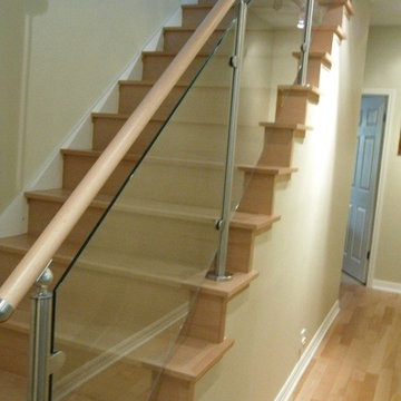
Stainless Steel Glass Railing Designs & Ideas
38