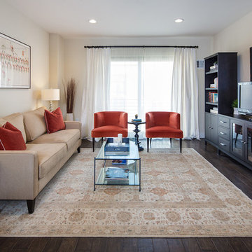
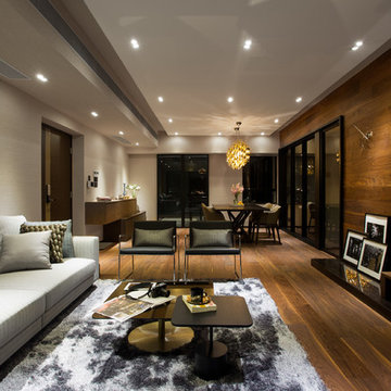
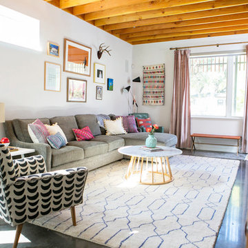
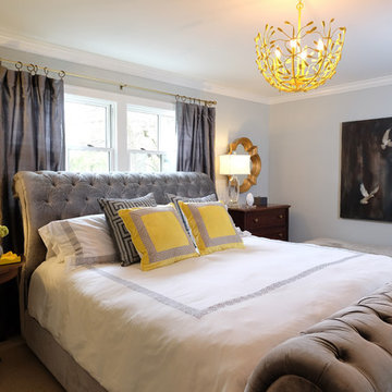
Living Room Partition Designs & Ideas
SeaBend is sited dramatically on a bluff, embracing a commanding view of a New England. The house is long and narrow, mostly one room deep, so that all the major rooms are open to both the north water views and the south sun, with breezes blowing through. The plan is geared to informal living, with the kitchen in the center to serve both indoor and outdoor living areas.
Part of the fun was in seeing what happened when a broad gabled volume was bent to respond to the contours of the site and to begin to suggest an outdoor space on the water side. Keeping the gable roof un-bent while putting a crook in the plan resulted in some curious volumes and unexpected shapes, which you discover as you move around the house.
Photography by Robert Benson
Jesse Young Property & Real Estate Photography -
Starting with a loft residence that was originally a church, the home presented an architectural design challenge. The new construction was out of balance and sterile in comparison. The intent of the design was to honor and compliment the existing millwork, plaster walls, and large stained glass windows. Timeless furnishings, custom cabinetry, colorful accents, art and lighting provide the finishing touches, leaving the client thrilled with the results. This design is now worthy of its character.
Find the right local pro for your project
The owners of this kitchen had spent the money to upgrade the finishes in their kitchen upon building the home 12 years ago, but after living in the space for several years they realized how nonfunctional the layout really was. The (then) two preschool aged children had grown into busy, hungry teenagers with many friends who also liked to hang out at the house. So the family needed a more functional kitchen with better traffic flow, space for daily activities revolving around the kitchen at different times of day, and a kitchen that could accommodate cooking for and serving large groups. Furthermore, the dark, traditional finishes no longer reflected the homeowners’ style. They requested a brighter, more relaxed, coastal style that reflected their love of the seaside cities they like to visit.
Originally, the kitchen was U-shaped with a narrow island in the middle. The island created narrow aisles that bottle-necked at the dishwasher, refrigerator, and cooktop areas. There was a pass-through from the foyer into the kitchen, but the owners never liked that the pass-through was also located so close to the powder room. The awkward proximity was unappealing and made guests feel uncomfortable.
The kitchen’s storage was made up of lots of narrow cabinets, apothecary drawers, clipped corner units, and very few drawers. It lacked useful storage for the larger items the family used on a daily basis. And the kitchen’s only pantry was small closet that had only builder-grade, narrow shelving with no illumination to be able to see the contents inside.
Overall, the kitchen’s lighting plan was poorly executed. Only six recessed cans illuminated the entire kitchen and nook areas. The under cabinet lighting was not evenly distributed either. In fact, the builder had mis-placed the under cabinet lighting around the decorative pilasters which made for choppy, dark cubbies. Further, the builder didn’t include any lighting over the sink or the bar area, which meant whoever was doing the dishes was always in their own shadow. That, coupled with the steep overhang of the game room above made the bar area feel like a dim, cavernous space that wasn’t inviting or task oriented. The kitchen looked out into the main living space, but the raised bar and a narrow wall (which held the only large cabinet in the kitchen) created more of a barrier than a relationship to the living room or breakfast nook. In fact, one couldn’t even see the breakfast nook from the cooktop or sink areas due to its orientation. The raised bar top was too narrow to comfortably sit to either dine at or chat from due to the lack of knee space. The the homeowners confided that the kitchen felt more like a dark, dirty prison than place where the family, or their guests, wanted to gather and commune.
The clients' needs and desires were:
➢ to create a kitchen that would be a space the family loved to be in; to relate to the adjacent spaces all around, and to have better flow for entertaining large groups
➢ to remove the walls between the breakfast nook and living area and to be able to utilize the natural light from the windows in both those areas
➢ to incorporate a functional chopping block for prepping fresh food for home cooked meals, an island with a large sink and drain board, 2 pull out trash cans, and seating for at least the 2 teens to eat or do homework
➢ to design a kitchen and breakfast nook with an airy, coastal, relaxed vibe that blended with the rest of the house's coastal theme
➢ to integrate a layered lighting plan which would include ample general illumination, specific task lighting, decorative lighting, and lots of illuminated storage
➢ to design a kitchen with not only more storage for all the husband’s kitchen gadgets and collection of oils and spices, but smart storage, including a coffee/breakfast bar and a place to store and conceal the toaster oven and microwave
➢ to find a way to utilize the large open space between the kitchen, pantry area, and breakfast nook
Twelve Stones Designs achieved the owner's goals by:
➢ removing the walls between the kitchen and living room to allow the natural light to filter in from the adjacent rooms and to create a connection between the kitchen, nook, and living spaces for a sense of unity and communion
➢ removing the existing pantry and designing 3 large pantry style cabinets with LED tape lights and rollout drawers to house lots of kitchen appliances, gadgets, and tons of groceries. We also took the cabinets all the way up to the 9’ ceiling for additional storage for seasonal items and bulk storage.
➢ designing 2 islands - 1 with a gorgeous black walnut chopping block that houses a drawer for chopping and carving knives and a custom double pull out trash unit for point of use utilization - and 1 that houses the dishwasher, a large Blanco Gourmet sink with integrated drain board, woven baskets for fresh root vegetables and kitchen towels, plenty of drawer storage for kitchen items, and bar seating for up to 4 diners.
➢ closing off the space between the kitchen and the powder room to create a beautiful new private alcove for the powder room as well as adding some decorative storage. This also gave us space to include more tall storage near the new range for precision placement of the husband’s extensive oil and spice collection as well as a location for a combo-steam oven the wife wanted for baking and cooking healthy meals.
The project is enhanced functionally by:
➢ incorporated USB and standard receptacles for the kids’ laptops and phone charging in the large island
➢ designing the small island to include additional open shelving for items used on a daily basis such as a variety of bowls, plates, and colanders. This set up also works well for the husband who prefers to “plate” his dinners in restaurant-style fashion before presenting them to the table.
➢ the integration of specific storage units, such as double stacked cutlery drawers, a custom spice pull-out, a Kuerig coffee and tea pod drawer, and custom double stacked utensil drawers
➢ moving the refrigerator to the old oven location - this eliminated the bottle neck as well as created a better relationship to the eating table. It also utilizes the floor space between the pantry, nook, and kitchen
➢ creating a banquet style breakfast nook - this banquette seating not only doubles the amount of seating for large gatherings but it better utilizes the odd space between the kitchen and the previous nook area. It also helps to create a distinct pathway from the mudroom room through the pantry area, kitchen, nook, and living room.
➢ the coffee/breakfast bar area which includes the perfect location for the concealed microwave and toaster oven, convenient storage for the coffee pods and tea accoutrements. Roll-out drawers below also house the smoothie maker, hot water kettle, and a plethora of smoothie-making ingredients such as protein powders, smoothie additives, etc. Furthermore, the drawers below the Keurig house measuring utensil, cutlery, baking supplies and tupperware storage.
➢ incorporating lots of wide drawers and pullouts to accommodate large cookware.
➢ utilizing as much vertical space as possible by building storage to the ceiling which accommodates the family’s abundant amount of serving platters, baking sheets, bakeware, casserole dishes, and additional cutting boards.
The project is enhanced aesthetically by:
➢ new 5-piece Versailles pattern porcelain tile that now seamlessly joins the entire down stairs area together creating a bright, cohesiveness feeling instead of choppy separated spaces - it also adds a coastal feeling
➢ designing a cabinet to conceal the microwave and toaster oven
➢ the coastal influenced light fixtures over the nook table and island
➢ the sandy colors of the Langdon Cambria countertops. The swirling pattern and sparkling quartz pieces remind the homeowner of black-and-tan sandy beaches
➢ the striped banquet seating whose creamy white background and blue-green stripes were the inspiration for the cabinet and wall colors.
➢ All the interior doors were painted black to coordinate with the blacks and grays in the backsplash tile and countertop. This also adds a hint of tailored formality to an otherwise casual space.
➢ the use of WAC's Oculux small aperture LED units for the overhead lighting complimented with Diode LED strips for task lighting under the cabinets and inside the pantry and glass wall cabinets. All of the lighting applications are on separate dimmer switches.
Innovative uses of materials or construction methods by Realty Restoration LLC:
➢ Each 1-1/2” x 3” block of reclaimed end-grain black walnut that makes up the center island chopping block was hand milled and built in the shop. It was designed to look substantial and proportional to the surrounding elements, executed by creating the 4 inch tall top with a solid wood chamfered edge band.
➢ The metal doors on either side of the vent hood were also custom designed for this project and built in the Realty Restoration LLC shop. They are made 1x2, 11-gauge mild steel with ribbed glass. Weighing 60 lbs a piece, heavy duty cabinet hinges were added to support the weight of the door and keep them from sagging.
➢ Under-cabinet receptacles were added along the range wall in order to have a clean, uninterrupted backsplash.
Design obstacles to overcome:
➢ Because we were removing the demising walls between the kitchen and living room, we had to find a way to plumb and vent the new island. We did this by tunneling through the slab (the slab had post tension cables which prevented us from just trenching) to run a new wet vent through a nearby structural wall. We pulled the existing hot and cold lines between upper floor joists and ran them down the structural wall as well and up through a conduit in the tunnel.
➢ Since we were converting from wall overs to a gas range it allowed us to utilize the 220 feed for the wall ovens to provide a new sub panel for all the new kitchen circuits
➢ Due to framing deficiencies inherited from the original build there was a 1-1/2” differential in the floor-to-ceiling height over a 20 foot span; by utilizing the process of cutting and furring coupled with the crown moulding details on the cabinet elevations we were able to mask the problem and provide seamless transitions between the cabinet components.
Evidence of superior craftsmanship:
➢ uniquely designed, one-of-a-kind metal “X” end panels on the large island. The end panels were custom made in the Realty Restoration LLC shop and fitted to the exact dimensions of the island. The welding seams are completely indistinguishable - the posts look like they are cut from a single sheet of metal
➢ square metal posts on the small island were also custom made and designed to compliment and carry through the metal element s throughout the kitchen
➢ the beautiful, oversized end panels on the pantry cabinets which give the breakfast nook a tailored look
➢ integrating a large format 5 piece Versailles tile pattern to seamlessly flow from the existing spaces into the new kitchen space
➢ By constructing a custom cabinet that jogged around a corner we could not remodel (housing the entry way coat closet) we were able to camouflage the adjacent wall offset within the upper and lower cabinets. By designing around the existing jog in the structural walls we accomplished a few things: we were able to find the space to house, and hide, the microwave and toaster oven yet still have a clean cohesive appearance from the kitchen side. Additionally, the owners were able to keep their much needed coat closet and we didn’t have to increase the budget with unnecessary structural work.
My sweet home designer, who established a top interior design firm in 2017, is a well-recognised, leading, and trusted top luxury interior designer at Ichalkaranji who provides comfortable, relaxing, and satisfactory service to their clients in and outside Ichalkaranji.
The services offered consist of experience in luxury residential interiors, interior design, interior architecture, building architecture, boutiques, corporate office furniture design, and renovation of old bungalows to give them a modern vocabulary.
Civil Interior Work: water work, plastering, waterproofing, and sanitary fittings and fixtures Office furniture: modular furniture, chairs' sitting arrangements Finishing Items: POP and modular ceilings; PVC ceilings; false ceilings: gypsum Flooring: laminated wood; Carpentry: loose furniture, doors, wooden partitions, glass partitions, storages, etc.
Visit us at the nearest My Sweet Home Luxury Best Interior Designer Experience for a free consultation.
Name- My sweet home designer
Mob No- 8087741656
Address- 17/169, Pujari Mala Road, Vivekananda Colony, Pujari Mala, Ichalkaranji, Maharashtra 416115.
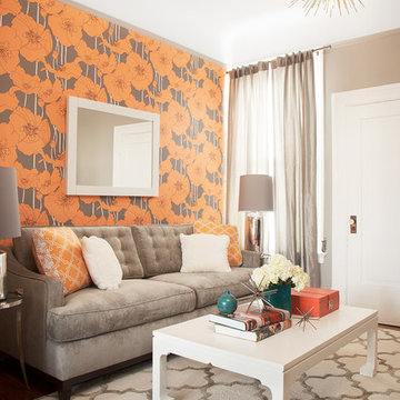
The den features a custom velvet sofa set against a wall of graphic orange and grey wallpaper. A large, white coffee table, Moroccan-style area rug, and vintage, silver side tables compliment the overall look.
Photo: Caren Alpert
Dining/Living Room Bliss Model at Pioneer Ridge. Throughout the open great room, stained ceiling details tie into the darker tones of the natural hickory floors.
Copyright Moss Photography 2012
Boho modern living room by Postbox Designs and Sonder. Home office in small, open floor plan concept.
With adjacent neighbors within a fairly dense section of Paradise Valley, Arizona, C.P. Drewett sought to provide a tranquil retreat for a new-to-the-Valley surgeon and his family who were seeking the modernism they loved though had never lived in. With a goal of consuming all possible site lines and views while maintaining autonomy, a portion of the house — including the entry, office, and master bedroom wing — is subterranean. This subterranean nature of the home provides interior grandeur for guests but offers a welcoming and humble approach, fully satisfying the clients requests.
While the lot has an east-west orientation, the home was designed to capture mainly north and south light which is more desirable and soothing. The architecture’s interior loftiness is created with overlapping, undulating planes of plaster, glass, and steel. The woven nature of horizontal planes throughout the living spaces provides an uplifting sense, inviting a symphony of light to enter the space. The more voluminous public spaces are comprised of stone-clad massing elements which convert into a desert pavilion embracing the outdoor spaces. Every room opens to exterior spaces providing a dramatic embrace of home to natural environment.
Grand Award winner for Best Interior Design of a Custom Home
The material palette began with a rich, tonal, large-format Quartzite stone cladding. The stone’s tones gaveforth the rest of the material palette including a champagne-colored metal fascia, a tonal stucco system, and ceilings clad with hemlock, a tight-grained but softer wood that was tonally perfect with the rest of the materials. The interior case goods and wood-wrapped openings further contribute to the tonal harmony of architecture and materials.
Grand Award Winner for Best Indoor Outdoor Lifestyle for a Home This award-winning project was recognized at the 2020 Gold Nugget Awards with two Grand Awards, one for Best Indoor/Outdoor Lifestyle for a Home, and another for Best Interior Design of a One of a Kind or Custom Home.
At the 2020 Design Excellence Awards and Gala presented by ASID AZ North, Ownby Design received five awards for Tonal Harmony. The project was recognized for 1st place – Bathroom; 3rd place – Furniture; 1st place – Kitchen; 1st place – Outdoor Living; and 2nd place – Residence over 6,000 square ft. Congratulations to Claire Ownby, Kalysha Manzo, and the entire Ownby Design team.
Tonal Harmony was also featured on the cover of the July/August 2020 issue of Luxe Interiors + Design and received a 14-page editorial feature entitled “A Place in the Sun” within the magazine.

The compact living room is both cozy and functional for the homeowner and her daughter. There is plenty of seating for visitors and the small coffee table is a great space for the daughter to sit on the floor cushion and draw.
The design of the formal dining room ultimately set off a chain of resizing throughout the building process for the Schneiders. "First, we bumped our dining room wall out 5 feet to accommodate our large, family oriented dining room table & chairs", Gayle explains, "and with the house plan being symmetrically designed, we then bumped the left side of the house out 5 feet as well, to mirror the change of the right side of the house." As a result, other rooms, such as the kitchen and upstairs loft, gained space and usability.
Gayle and Gary continued similar materials from the adjacent living room for a unified look. Personal treasures are kept on display in the cabinet from Restoration Hardware, while natural elements and materials highlight the center of the table.
Chandelier: see the Veranda Linear Chandelier, by Pottery Barn
Adrienne DeRosa Photography © 2013 Houzz
Interior Design: Allard & Roberts Interior Design, Inc.
Builder: Living Stone Construction
Photography: Deborah Scannell
A primary goal for this small out-building project was the creation of comfortable outdoor spaces for living and entertaining adjacent to an existing pool.
Jeffrey Totaro, Photographer
Free ebook, Creating the Ideal Kitchen. DOWNLOAD NOW
The Klimala’s and their three kids are no strangers to moving, this being their fifth house in the same town over the 20-year period they have lived there. “It must be the 7-year itch, because every seven years, we seem to find ourselves antsy for a new project or a new environment. I think part of it is being a designer, I see my own taste evolve and I want my environment to reflect that. Having easy access to wonderful tradesmen and a knowledge of the process makes it that much easier”.
This time, Klimala’s fell in love with a somewhat unlikely candidate. The 1950’s ranch turned cape cod was a bit of a mutt, but it’s location 5 minutes from their design studio and backing up to the high school where their kids can roll out of bed and walk to school, coupled with the charm of its location on a private road and lush landscaping made it an appealing choice for them.
“The bones of the house were really charming. It was typical 1,500 square foot ranch that at some point someone added a second floor to. Its sloped roofline and dormered bedrooms gave it some charm.” With the help of architect Maureen McHugh, Klimala’s gutted and reworked the layout to make the house work for them. An open concept kitchen and dining room allows for more frequent casual family dinners and dinner parties that linger. A dingy 3-season room off the back of the original house was insulated, given a vaulted ceiling with skylights and now opens up to the kitchen. This room now houses an 8’ raw edge white oak dining table and functions as an informal dining room. “One of the challenges with these mid-century homes is the 8’ ceilings. I had to have at least one room that had a higher ceiling so that’s how we did it” states Klimala.
The kitchen features a 10’ island which houses a 5’0” Galley Sink. The Galley features two faucets, and double tiered rail system to which accessories such as cutting boards and stainless steel bowls can be added for ease of cooking. Across from the large sink is an induction cooktop. “My two teen daughters and I enjoy cooking, and the Galley and induction cooktop make it so easy.” A wall of tall cabinets features a full size refrigerator, freezer, double oven and built in coffeemaker. The area on the opposite end of the kitchen features a pantry with mirrored glass doors and a beverage center below.
The rest of the first floor features an entry way, a living room with views to the front yard’s lush landscaping, a family room where the family hangs out to watch TV, a back entry from the garage with a laundry room and mudroom area, one of the home’s four bedrooms and a full bath. There is a double sided fireplace between the family room and living room. The home features pops of color from the living room’s peach grass cloth to purple painted wall in the family room. “I’m definitely a traditionalist at heart but because of the home’s Midcentury roots, I wanted to incorporate some of those elements into the furniture, lighting and accessories which also ended up being really fun. We are not formal people so I wanted a house that my kids would enjoy, have their friends over and feel comfortable.”
The second floor houses the master bedroom suite, two of the kids’ bedrooms and a back room nicknamed “the library” because it has turned into a quiet get away area where the girls can study or take a break from the rest of the family. The area was originally unfinished attic, and because the home was short on closet space, this Jack and Jill area off the girls’ bedrooms houses two large walk-in closets and a small sitting area with a makeup vanity. “The girls really wanted to keep the exposed brick of the fireplace that runs up the through the space, so that’s what we did, and I think they feel like they are in their own little loft space in the city when they are up there” says Klimala.
Designed by: Susan Klimala, CKD, CBD
Photography by: Carlos Vergara
For more information on kitchen and bath design ideas go to: www.kitchenstudio-ge.com
Overview
Extension and complete refurbishment.
The Brief
The existing house had very shallow rooms with a need for more depth throughout the property by extending into the rear garden which is large and south facing. We were to look at extending to the rear and to the end of the property, where we had redundant garden space, to maximise the footprint and yield a series of WOW factor spaces maximising the value of the house.
The brief requested 4 bedrooms plus a luxurious guest space with separate access; large, open plan living spaces with large kitchen/entertaining area, utility and larder; family bathroom space and a high specification ensuite to two bedrooms. In addition, we were to create balconies overlooking a beautiful garden and design a ‘kerb appeal’ frontage facing the sought-after street location.
Buildings of this age lend themselves to use of natural materials like handmade tiles, good quality bricks and external insulation/render systems with timber windows. We specified high quality materials to achieve a highly desirable look which has become a hit on Houzz.
Our Solution
One of our specialisms is the refurbishment and extension of detached 1930’s properties.
Taking the existing small rooms and lack of relationship to a large garden we added a double height rear extension to both ends of the plan and a new garage annex with guest suite.
We wanted to create a view of, and route to the garden from the front door and a series of living spaces to meet our client’s needs. The front of the building needed a fresh approach to the ordinary palette of materials and we re-glazed throughout working closely with a great build team.
Living Room Partition Designs & Ideas
118