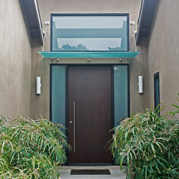
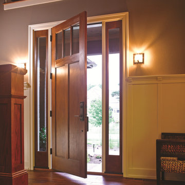
Coloured Front Door Designs & Ideas
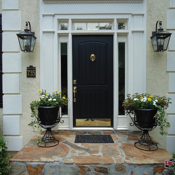
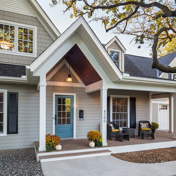
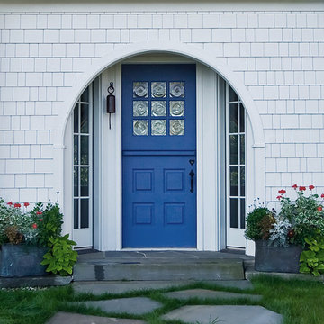
Photo: Mina Brinkey © 2013 Houzz
Door color: Blue Spa, Benjamin Moore; exterior color: Ultra Pure White PPU18-6, Behr
Find the right local pro for your project
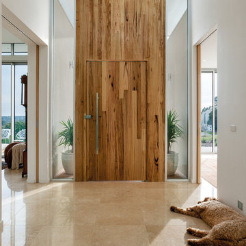
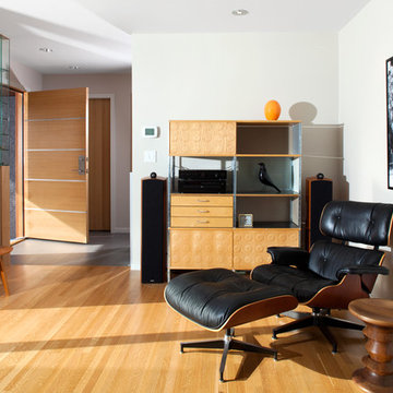
Gorgeous entry way that showcases how Auswest Timber Wormy Chestnut can make a great focal point in your home.
Featured Product: Auswest Timbers Wormy Chestnut
Designer: The owners in conjunction with Modularc
Builder: Whiteside Homes
Benchtops & entertainment unit: Timberbench.com
Front door & surround: Ken Platt in conjunction with Excel Doors
Photographer: Emma Cross, Urban Angles
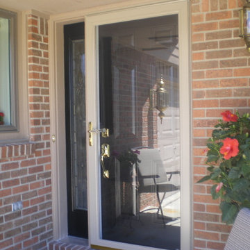
My new front storm and front doors. I chose a storm door that is the same color as the trim of my house so that it wouldn't take anything away from the new black front door. I really like the color with the red brick of the house.
The first storm door I bought was black to match the door, but from any kind of distance, it kind of all blended in and (in my opinion) didn't look so great. Perhaps a black storm door would work if the casing around the door and in between the door and sidelight were painted black as well? I kind of like the look of the sidelight being black and the trim matching the house, so I wanted to replicate that with the actual door, too.
I've seen it done both ways in my neighborhood and the black storm door kind of just made it look like a black blob. Nothing popped out.
Ann completed this project while a principal at dpf Design, inc. Lead Designer - Ann Shriver Sargent. Contractor - Trumbull Nelson. Photography - Greg Bruce Hubbard.
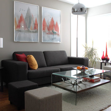
We are a young newly wed couple who decided to ask for cash gifts at our wedding so we could decorate our new digs. We received the keys the morning after becoming Mr & Mrs Leclair, and to this day we have yet to take a honeymoon. Both of us had a brewing passion for modern interior decorating that needed to be fulfilled. Our previous 1 bedroom apartment was a great warm up but the real challenge was ahead. We received generous gifts to get us started but after the wedding, closing costs and a few unexpected costs we were left with a fairly conservative budget to work with.
First up was painting. None of the existing loud colours in the house were really to our liking. So started the giant task of painting every single wall in the house. Oh, and throw the garage and front entrance doors in there also. Thankfully Melissa works at a paint store so we were able to receive a few free cans and some really good deals on others. Quick shout out to Benjamin Moore and Pittsburgh Paints reps. After accomplishing this feat (with the help of family & friends) we decided a few walls needed some punch. A little wallpaper you say? Why not.
Next up was lighting. Most of the fixtures were out of date or not giving us the desired effects. With the help of our handy uncle Rob, we changed every single fixture in the house and out. A few have actually been changed twice. Always a learning curb, right? We splurged on a few pendants from specialized shops but most have been big box store purchases to keep us on budget. Don’t worry, when we strike it rich we’ll have Moooi pendants galore.
After the hard (wasn’t that bad) labor came time to pick furniture pieces to fill out the house. We had ordered most of the big ticket items before the move but we still needed to find the filler pieces. Had a great time driving around town and meeting local shop owners. After most of the furniture shopping was complete we had next to nothing left over for art and a lot of empty walls needed some love. Most of the art in the house are pictures we took ourselves, had printed locally and mounted in Ikea frames. We also headed down to the local art supply store and bought a few canvases on sale. Using left over house paint we created some large bold abstract pieces.
A year has now passed since we first got the keys and we’re, mostly done. Being home owners now, we also realized that we’ll never actually be done. There’s always something to improve upon. Melissa’s office hung in the balance of our undecided minds but after a recent retro chair purchase we’ve been re-inspired. That room is coming along nicely and we should have pictures up shortly. Most of what we’ve done are cosmetic changes. We still plan on upgrading the kitchen, upstairs bath and replacing the old carpets for some swanky hardwood floors. All in due time.
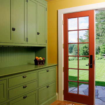
8ft. Therma-Tru Classic-Craft American Style Collection fiberglass door with high-definition Douglas Fir grain and Shaker-style recessed panels. Door and sidelites include energy-efficient Low-E glass.
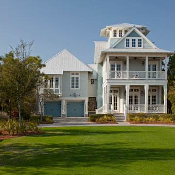
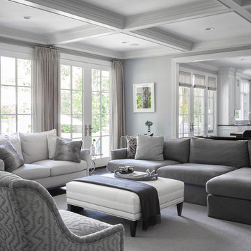
My clients purchased a grand home on a spectacular waterfront setting, but the interior felt dark and drab. Our challenge was to turn the existing home into a high end Hampton-style residence without major construction. We choose to focus on color, contrast and texture, changing almost every surface in the home and reversing the contrast to make the home light and airy. We invested the construction expense on elements crucial to style and function. Removing a row of out of scale upper cabinetry in the kitchen and replacing it with 3 double hung windows expands the view to 180 degrees and floods the room with light. To create symmetry and balance in the kitchen, we moved the cooktop and centered the sink. The wine cellar entry opened awkwardly into the kitchen and there was no pantry, so we modified the wine cellar and moved the door for better flow, allowing for a large pantry. On the opposite end of the great room, we balanced the fireplace with cabinetry and tall wainscoting. The floors were stained dark espresso while all other trim and cabinetry went a bright white. It took 14 tries to get the perfect wall color – a pale beige/color reminiscent of sand. The blue and white furniture and details pull the entire space together and creates a sophisticated yet casual feel.
Photos by Steve Armstrong www.cascadepromedia.com
CCI Renovations/North Vancouver/Photos - Ema Peter
Featured on the cover of the June/July 2012 issue of Homes and Living magazine this interpretation of mid century modern architecture wow's you from every angle. The name of the home was coined "L'Orange" from the homeowners love of the colour orange and the ingenious ways it has been integrated into the design.
Builder/Designer/Owner – Masud Sarshar
Photos by – Simon Berlyn, BerlynPhotography
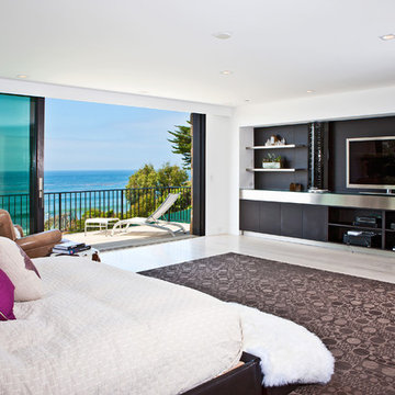
Our main focus in this beautiful beach-front Malibu home was the view. Keeping all interior furnishing at a low profile so that your eye stays focused on the crystal blue Pacific. Adding natural furs and playful colors to the homes neutral palate kept the space warm and cozy. Plants and trees helped complete the space and allowed “life” to flow inside and out. For the exterior furnishings we chose natural teak and neutral colors, but added pops of orange to contrast against the bright blue skyline.
This master bedroom in Malibu, CA is open and light. Wall to wall sliding doors gives the owner a perfect morning. A custom Poliform bed was made in dark chocolate leather paired with custom leather nightstands. The fire place is 2 sided which gives warmth to the bedroom and the bathroom. A low profile bed was requested by the client.
JL Interiors is a LA-based creative/diverse firm that specializes in residential interiors. JL Interiors empowers homeowners to design their dream home that they can be proud of! The design isn’t just about making things beautiful; it’s also about making things work beautifully. Contact us for a free consultation Hello@JLinteriors.design _ 310.390.6849_ www.JLinteriors.design
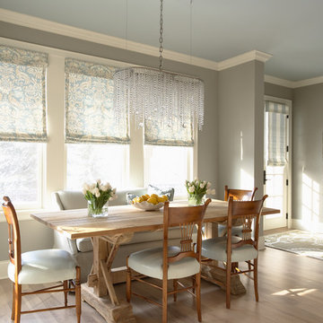
Interior Design by Martha O'Hara Interiors
Photography by Susan Gilmore
This eclectic dining area pulls together warm and cool tones that make this space feel fresh, fabulous & fun! The custom hickory flooring adds a unique touch with the gray wash finish. Martha O'Hara Interiors, Interior Design | Susan Gilmore, Photography
Coloured Front Door Designs & Ideas
35