Houzz Tour: A Studio Flat Transforms Into a One-Bedroom Apartment
Before and after photos show how a studio has been given a new bedroom, roomy storage and smart, Scandi-inspired decor

After a year of searching, the owner of this flat finally found the place of her dreams: A 398 square feet (37 square metre) studio on the fifth floor of a 1960s building. She loved its location, brightness, oak floor and open views.
But while the flat was in fairly good condition, it didn’t meet several of this first-time-buyer’s non-negotiable requirements. The first was that the bedroom should be separate from the rest of the space; the second was a large dressing room for storing all her clothes and shoes. Finally, she longed for a cosy interior that would reflect her personality.
She was won over by the creativity of the June agency – a young interior design duo – and entrusted the renovation to them.
After
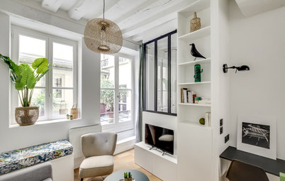
“A door had separated the original entrance from the studio. We opened the entrance up to the living room while adding some drama with midnight blue paint,” Fath says. “This dark hallway calls out to those who enter, attracting them irresistibly towards the light and the core of the apartment.”
“A door had separated the original entrance from the studio. We opened the entrance up to the living room while adding some drama with midnight blue paint,” Fath says. “This dark hallway calls out to those who enter, attracting them irresistibly towards the light and the core of the apartment.”
In the hallway, the original wall that had partitioned off the bathroom was remodelled and extended: It now conceals electrical wiring and pipes and is equipped with cupboards.
The lower part stores the owner’s shoes, while the niches above hold her books and decorative objects.
Check out the fundamentals of hallway design
The lower part stores the owner’s shoes, while the niches above hold her books and decorative objects.
Check out the fundamentals of hallway design
Before
Just opposite the front door is the bathroom, which was the area most affected by the renovation. This 86 square feet (8 square metres) room originally had a bath, toilet, bidet and basin. It was disproportionately large for the small square footage of the studio as a whole.
Just opposite the front door is the bathroom, which was the area most affected by the renovation. This 86 square feet (8 square metres) room originally had a bath, toilet, bidet and basin. It was disproportionately large for the small square footage of the studio as a whole.
The designers took the opportunity to split the bathroom to gain more space for the bedroom and dressing room. They put in a shower and turned an existing cupboard by the entrance into a separate toilet.
A stylish mirror and concrete-look tiles are a chic touch.
Mirror, Leroy Merlin.
Take a look at these statement-making mirror styles for the bathroom
Mirror, Leroy Merlin.
Take a look at these statement-making mirror styles for the bathroom
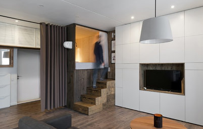
The young owner wanted the interior designers to create a small, detached bedroom next to the living room. As all the studio’s windows are on the same side, they opted for a glass partition to pull some of that light into the room.
“[The owner] is keen on art and design. So rather than proposing the kind of glass wall you see everywhere now-a-days, we designed an original model, inspired by Mondrian’s paintings,” Fath says.
“[The owner] is keen on art and design. So rather than proposing the kind of glass wall you see everywhere now-a-days, we designed an original model, inspired by Mondrian’s paintings,” Fath says.
The new bedroom is not huge, but it can accommodate a double bed. Creating it took floor space from the living room, while the dressing area behind the headboard – distinguishable by the change in flooring – takes up part of what used to be the bathroom. The dressing room floor is covered with anthracite-coloured porcelain.
The side wall is, in fact, the other side of the partition by the entrance. The interior designers shaped this wall on both sides in such a way that sections on one side correspond to niches on the other. On the bedroom side, they make up for the lack of bedside tables.
An accent wall in midnight blue – the same colour as in the hallway – gives the room a sense of depth and perspective when seen from the living room. An oak shelf with three embedded mirrors, created by the interior designers, stands out at the centre. The handira, or Moroccan wedding blanket, on the bed adds a soft, cosy feel. These textiles are hand-woven by the women of the Atlas Mountains and worn by Berber brides on their wedding day.
Here’s why you should use blue in your bedroom
Before
The owner fell in love with the living room because of its glazed sliding door, which opens onto a small balcony.
To its left, a half-wall had divided the kitchen from the living room, creating a small breakfast bar.
The owner fell in love with the living room because of its glazed sliding door, which opens onto a small balcony.
To its left, a half-wall had divided the kitchen from the living room, creating a small breakfast bar.
After
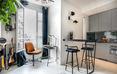
The designers kept the kitchen in the same place, but completely renovated it to give it a new look. The main transformation was the conversion of the breakfast bar into a kitchen peninsula. Not only did this create more worktop space in the kitchen, it provided the owner with a dining table and work area.
The designers kept the kitchen in the same place, but completely renovated it to give it a new look. The main transformation was the conversion of the breakfast bar into a kitchen peninsula. Not only did this create more worktop space in the kitchen, it provided the owner with a dining table and work area.
The black resin sink is tucked into a corner of the kitchen to free up as much worktop space as possible. It was placed in a corner cabinet with the dishwasher on its right.
Wondering where to put the sink in the kitchen?
Wondering where to put the sink in the kitchen?
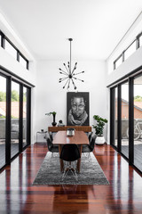
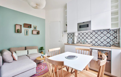
To ensure the contrast between black, white and light wood wouldn’t be too stark, the designers used grey, beige and pattern. From the cushions on the sofa to the throws and the coffee table top, everything was carefully selected to create this final look, which now feels like the obvious choice.
The mixture of materials is another key to the success of the refined and relaxed interior. Wood and openwork metal echo the steel frame of the glass wall.
Likewise, the arrangement of the pieces is visually dynamic, with the vertically extended lamp and mirror (just out of shot) balancing the horizontal coffee table and sofa.
Likewise, the arrangement of the pieces is visually dynamic, with the vertically extended lamp and mirror (just out of shot) balancing the horizontal coffee table and sofa.
The interior designers also refreshed the balcony, which now serves as an extension of the interior. It visually enlarges the living room and partially makes up for the space lost to the bedroom. An exotic wood duckboard picks up on the feel of the interior floor. A bamboo screen adds a natural touch and some privacy.
Here’s a guide on bamboo
Here’s a guide on bamboo
The floor plan shows how the space has cleverly been reconfigured to accommodate the bedroom.
It took the interior designers two-and-a-half months to completely redesign the space. The ₹1880000 (£28,000) budget may seem large, but it included the complete revamp of the electrical, heating and plumbing systems in addition to the functional and decorative makeover. In addition, a dropped ceiling was installed throughout the flat, both to allow for soundproofing and to conceal wiring from light fixtures. Finally, new channels were created in the wall for wires that had previously been hidden under trunking.
Read more:
Houzz Tour: A 1-BHK Flat Transforms Into a 2-BHK
Tell us:
What do you think of the new layout and style of this flat? Share your thoughts in the Comments below.


Who lives here: A young woman
Location: Neuilly-sur-Seine (just west of Paris), France
Property: A flat in a 1960s building
Size: About 398 square feet (37 square metres)
Budget About ₹1880000 (£28,000) excluding tax
Year built: February 2017
Interior designers Anne Fath and Julia Schmit of June
Photos by Shoootin
Before
This is what the entrance to the studio looked like when Anne Fath and Julia Schmit saw it on their first visit. With white walls, vinyl flooring and outdated wiring, the property really needed a makeover.