


Houzz Tour: A 340-Sq-Ft Home Fits in Plenty of Comfort and Style
Careful planning and design tricks create easy access and a pleasing flow in a tiny Manhattan studio
Fred Albert
17 June 2018
Houzz Contributor. Fred has written about architecture and design for many Web sites and magazines, including Houzz, Metropolitan Home, House Beautiful and Style 1900.
Houzz Contributor. Fred has written about architecture and design for many Web sites... More
It’s not so hard cramming an entire home into 31 square metres (340 square feet) of living space. The trick, Stephen Killcoyne has discovered, is not ending up with a bed in the living room.
Killcoyne, of Allen + Killcoyne Architects, was determined to avoid that fate when he was hired to design a New York City pied-à-terre for a Dallas-based retiree. The client wanted someplace to stay in Manhattan that would be close to his daughter and grandchildren. When this studio became available in their building, he snatched it up and asked Killcoyne to take on its redesign.
Houzz at a Glance
Who lives here: A retired widower based in Dallas
Location: Upper East Side of New York City
Size: 32 square meters (340 square feet)
That’s interesting: Killcoyne originally designed another unit in the building for his client, who ended up selling it to his daughter.
Photography by William Taylor
“It was a total wreck,” says the architect, recalling the stained shag carpeting and dangling cabinet doors that greeted him the first time he visited. Working with B&B Construction, Killcoyne gutted the space, replaced the windows and started over from scratch, dividing the unit into discrete zones while maintaining its open feel.
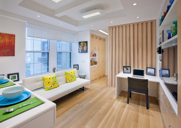
“I really wanted to create rooms that flowed together, but at the same time, you had separate areas that defined different living spaces,” says the architect. He knows something about small spaces, having raised two children in a 59 square metres (650 square feet) apartment.
It’s not the space that proves limiting, Killcoyne concludes. It’s the stuff you’re trying to cram into it. “If you can control the amount of things you own,” he says, “you can live in small spaces very nicely.”
Killcoyne’s client wanted a home that looked “clean, simple, elegant and timeless,” the architect says. Instead of creating one open room to make the space feel bigger, Killcoyne established separate interconnected zones for living, sleeping and cooking. “The place feels bigger,” the architect says, “because you get three major rooms out of it. You don’t feel like you’re trapped in one box.”
See how 5 rooms accommodate in one compact unit
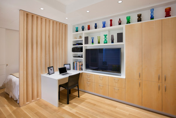
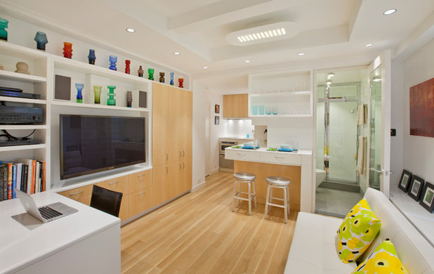
To ensure that spaces flowed smoothly, Killcoyne limited the palette to rift-cut oak floors, quartersawn maple cabinets and Benjamin Moore’s aptly named White paint. He lowered the ceiling around the perimeter to accommodate recessed LED fixtures, but left the centre full height to help define the living area and maximise the vertical space.
The bed is tucked behind a custom louvered partition, which shields the sleeping area from view unless you’re seated at the desk (something visitors are unlikely to do). The storage wall includes ample space for hiding clutter and holding electronics, while still offering room for displaying art and collectibles – the personal touches that keep the apartment’s precision from feeling too antiseptic.
The bed is tucked behind a custom louvered partition, which shields the sleeping area from view unless you’re seated at the desk (something visitors are unlikely to do). The storage wall includes ample space for hiding clutter and holding electronics, while still offering room for displaying art and collectibles – the personal touches that keep the apartment’s precision from feeling too antiseptic.
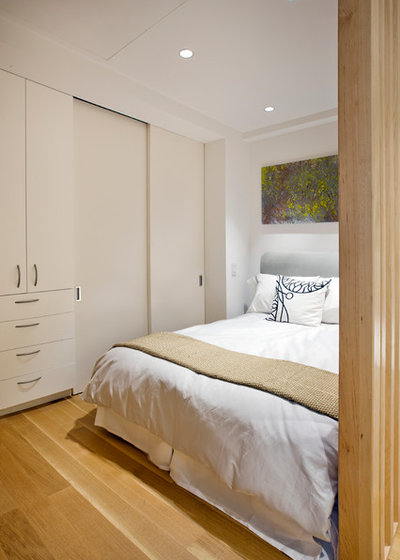
The sleeping area accommodates a queen-size bed, several storage closets and 10 linear feet of hanging space.
When the owner said he wanted to include a large flat-panel TV here, too, Killcoyne realised the only place to put it was in the ceiling. If you look up, you’ll notice the outline of a trap door that flips down to reveal the screen.
When the owner said he wanted to include a large flat-panel TV here, too, Killcoyne realised the only place to put it was in the ceiling. If you look up, you’ll notice the outline of a trap door that flips down to reveal the screen.
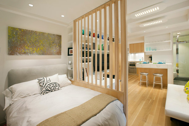
The louvered wall makes the bedroom feel less claustrophobic, Killcoyne explains, while screening it from most angles of the apartment. The painting above the bed is by Thomas Hubben.
Check out reasons to bring louvres into your home
Check out reasons to bring louvres into your home
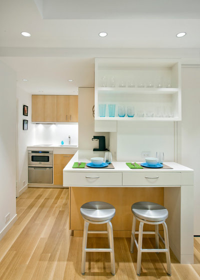
While the kitchen is open to the rest of the space, it’s tucked away in the corner, “so you don’t feel like you’re cooking in your living space,” Killcoyne says. The homeowner doesn’t do a lot of cooking when he’s in residence, so appliances were limited to a microwave oven with a dishwasher drawer below, and a two-burner induction cooktop with a vent concealed in the bottom of the cabinet above.
This space also doubles as the entry hall; the front door is to the left of the oven.
This space also doubles as the entry hall; the front door is to the left of the oven.
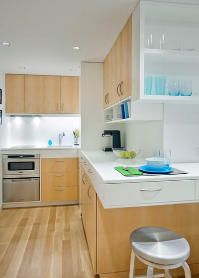
The refrigerator and ice maker are hidden behind the wood doors underneath the counter, which is fashioned from a 1¼-inch slab of commercial white glass. “Glass is fabulous, because it doesn’t stain,” says Killcoyne, who also used the material to cover the walls in the bathroom.
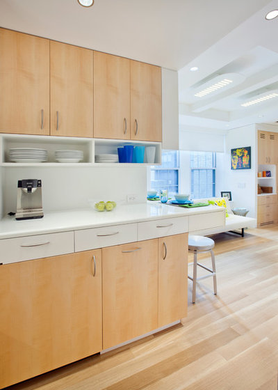
To maximise storage in the kitchen, Killcoyne set the counters at 41 inches (instead of the normal 36), allowing him to tuck an additional row of drawers under the top. A row of open shelves makes access to everyday items easy and keeps the cabinet faces from looking too closed off.
A discreet shadow line divides the cabinets from the ceiling, in lieu of space-hogging mouldings.
A discreet shadow line divides the cabinets from the ceiling, in lieu of space-hogging mouldings.
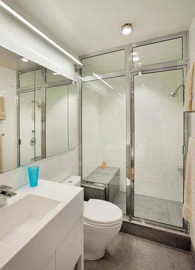
Thinner (¾-inch) sheets of Glassos cover the walls of the bathroom, reflecting light and making the space feel bigger. There’s an integrated Corian sink and a fully enclosed shower. (While it’s not a steam shower, it comes close when the transom windows are closed.) The floors are flame-finished granite.
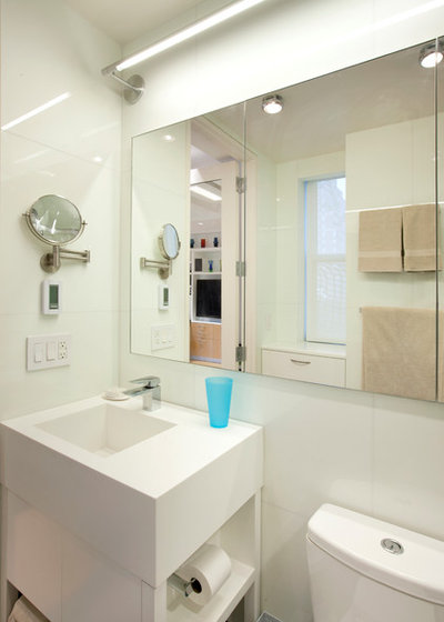
The far-left mirror panel swings open to reveal a medicine cabinet. Even the toilet paper is tucked out of the way to preserve the room’s clean lines.
Take a look at these 5 small yet clever bathroom designs
Take a look at these 5 small yet clever bathroom designs
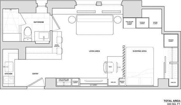
The floor plan shows the clever apportioning of space in the 32 square meters (340 square feet) unit. While Killcoyne won’t reveal the final cost of the renovation, he concedes it wasn’t cheap – a case of less costing more. But he takes satisfaction in the fact that his client needn’t perform gymnastics to make it all work. With the exception of the bedroom TV, everything is in plain sight and is easy to access. “You can live as if it were a bigger apartment,” he says.
Read more:
Houzz Tour: This Flat Defies Mumbai’s Space Crunch With 6 Bedrooms
Tell us:
What did you like the most about this home? Tell us in the Comments below.
Read more:
Houzz Tour: This Flat Defies Mumbai’s Space Crunch With 6 Bedrooms
Tell us:
What did you like the most about this home? Tell us in the Comments below.
What are you working on?


Related Stories
Architecture
Hyderabad Houzz: Allu Arjun's Home is Anything But Conventional
Aamir & Hameeda Associates create an exhilarating minimalist weekend getaway for the Telugu actor
Full Story
Indian Homes
Mallapuram Houzz: Kerala Architecture Finds Modern Expression
Large sloping roofs, wooden panelling and Mangalore tiles give a trad spin to this modern home by Thought Parallels
Full Story
Indian Homes
Mumbai Houzz: How to Be Stylishly Minimal in Maximum City
A Breach Candy apartment by reD architects is all things minimal while evoking understated luxury
Full Story
Indian Homes
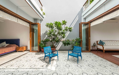
Delhi Houzz: This Rooftop Barsati Has a Front-Row View to the Stars
The open-to-sky courtyard by Shreya Krishnan Design is an idyllic sit-out that mirrors the moods of the day
Full Story
Indian Homes
Actor Alia Bhatt’s Mumbai Pad Is an Eclectic & Whimsical Wonderland
Outfitted in hushed hues, brick finishes and even a tea bar, this home designed by Richa Bahl is a dreamy haven
Full Story
Indian Homes
Mumbai Houzz: This Parisian-Chic Flat is Home to a Newly Married Couple
Jason Wadhwani Design brings in European charm with voguish furniture, elegant wall moulding and marble flooring
Full Story
Indian Homes
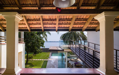
Goa Houzz: A Heritage Structure is Restored to a Riverside Bungalow
A dilapidated 19th century heritage building undergoes a luxurious metamorphosis
Full Story
Houzz Around the World
Houzz Tour: A Modern Extension Brings Together the Old & the New
A contemporary extension, purposely designed in contrasting materials, unites the old with the new in this family home
Full Story
Indian Homes
Gurgaon Houzz: Local Craftsmanship Spells Luxury in This Home
Native materials tell a riveting story in this self-designed home by NIVASA owner Saba Kapoor
Full Story
Indian Homes
Bengaluru Houzz: A Dreamy Penthouse With a Contemporary Twist
By Krita Raut
Crisp design & elegant inserts gives this home designed by Praxis a mesmerising appeal
Full Story
wow....awesome