Small Bar Counter Designs & Ideas
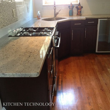
This small apartment kitchen was totally transformed. We opened up the side wall to create a more open space. The shaker door style with a rich espresso stain contrasts beautifully against the white kashmir granite countertops. We decided to use smaller scaled appliances in this space. We even were able to design a mini bar with an under counter wine cooler!
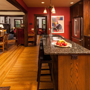
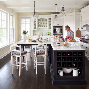
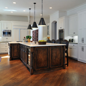
This kitchen was designed to have a good flow of traffic and be open to the rest of the house. As you can see the dinning room arch way was been opened up quite a bit allowing for an island. This was achieved by preserving the original trim in the dinning room and matching trim profiles/stain color in the kitchen. The cabinets have the look of the original cabinet's, but the functionality of a new modern day cabinet. For many of us who live in the city we prefer the charm of an older home but the features of a new home.
Photos by: Benjamin Clasen
Find the right local pro for your project
An adult retreat and relaxing spa get-away, this space and its amenities are more than comfortable for two. A raised platform between the tub and shower, complete with a seat extending from the tub deck allows for a step down into the shower pan rather than a curb. Vanity cabinetry with flip-up grooming area and lavatory were placed opposite this area to capture the natural lighting and reflections of the view to the backyard. The materials and finishes were kept simple and minimal; sand coloured striated porcelain tile was used for the floor, walls, tub deck and shower ceiling. Matte sheen dark rift oak cabinetry and honed dark brown limestone contrast nicely with the white fixtures and polished chrome fittings. Serene blue walls complete the watery spa-like theme of a much deserved get-away without leaving home.
Donna Griffith Photography
Martha O'Hara Interiors, Interior Design | REFINED LLC, Builder | Troy Thies Photography | Shannon Gale, Photo Styling
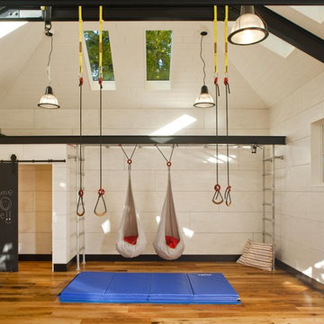
Play pavilion for family exercise and events. Indoor/outdoor Kids space for climbing monkey bars, ropes, swings, dance, party room, garden plays and movie nights. Photo Credit © Subtle Light Photography
Interior - Games room and Snooker room with Home Bar
Beach House at Avoca Beach by Architecture Saville Isaacs
Project Summary
Architecture Saville Isaacs
https://www.architecturesavilleisaacs.com.au/
The core idea of people living and engaging with place is an underlying principle of our practice, given expression in the manner in which this home engages with the exterior, not in a general expansive nod to view, but in a varied and intimate manner.
The interpretation of experiencing life at the beach in all its forms has been manifested in tangible spaces and places through the design of pavilions, courtyards and outdoor rooms.
Architecture Saville Isaacs
https://www.architecturesavilleisaacs.com.au/
A progression of pavilions and courtyards are strung off a circulation spine/breezeway, from street to beach: entry/car court; grassed west courtyard (existing tree); games pavilion; sand+fire courtyard (=sheltered heart); living pavilion; operable verandah; beach.
The interiors reinforce architectural design principles and place-making, allowing every space to be utilised to its optimum. There is no differentiation between architecture and interiors: Interior becomes exterior, joinery becomes space modulator, materials become textural art brought to life by the sun.
Project Description
Architecture Saville Isaacs
https://www.architecturesavilleisaacs.com.au/
The core idea of people living and engaging with place is an underlying principle of our practice, given expression in the manner in which this home engages with the exterior, not in a general expansive nod to view, but in a varied and intimate manner.
The house is designed to maximise the spectacular Avoca beachfront location with a variety of indoor and outdoor rooms in which to experience different aspects of beachside living.
Client brief: home to accommodate a small family yet expandable to accommodate multiple guest configurations, varying levels of privacy, scale and interaction.
A home which responds to its environment both functionally and aesthetically, with a preference for raw, natural and robust materials. Maximise connection – visual and physical – to beach.
The response was a series of operable spaces relating in succession, maintaining focus/connection, to the beach.
The public spaces have been designed as series of indoor/outdoor pavilions. Courtyards treated as outdoor rooms, creating ambiguity and blurring the distinction between inside and out.
A progression of pavilions and courtyards are strung off circulation spine/breezeway, from street to beach: entry/car court; grassed west courtyard (existing tree); games pavilion; sand+fire courtyard (=sheltered heart); living pavilion; operable verandah; beach.
Verandah is final transition space to beach: enclosable in winter; completely open in summer.
This project seeks to demonstrates that focusing on the interrelationship with the surrounding environment, the volumetric quality and light enhanced sculpted open spaces, as well as the tactile quality of the materials, there is no need to showcase expensive finishes and create aesthetic gymnastics. The design avoids fashion and instead works with the timeless elements of materiality, space, volume and light, seeking to achieve a sense of calm, peace and tranquillity.
Architecture Saville Isaacs
https://www.architecturesavilleisaacs.com.au/
Focus is on the tactile quality of the materials: a consistent palette of concrete, raw recycled grey ironbark, steel and natural stone. Materials selections are raw, robust, low maintenance and recyclable.
Light, natural and artificial, is used to sculpt the space and accentuate textural qualities of materials.
Passive climatic design strategies (orientation, winter solar penetration, screening/shading, thermal mass and cross ventilation) result in stable indoor temperatures, requiring minimal use of heating and cooling.
Architecture Saville Isaacs
https://www.architecturesavilleisaacs.com.au/
Accommodation is naturally ventilated by eastern sea breezes, but sheltered from harsh afternoon winds.
Both bore and rainwater are harvested for reuse.
Low VOC and non-toxic materials and finishes, hydronic floor heating and ventilation ensure a healthy indoor environment.
Project was the outcome of extensive collaboration with client, specialist consultants (including coastal erosion) and the builder.
The interpretation of experiencing life by the sea in all its forms has been manifested in tangible spaces and places through the design of the pavilions, courtyards and outdoor rooms.
The interior design has been an extension of the architectural intent, reinforcing architectural design principles and place-making, allowing every space to be utilised to its optimum capacity.
There is no differentiation between architecture and interiors: Interior becomes exterior, joinery becomes space modulator, materials become textural art brought to life by the sun.
Architecture Saville Isaacs
https://www.architecturesavilleisaacs.com.au/
https://www.architecturesavilleisaacs.com.au/
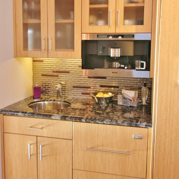
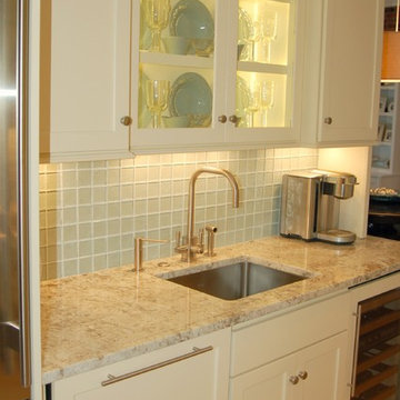
The wet bar at the far end of the kitchen is very convenient for entertaining without disrupting the chief. The station provides a gourmet coffee maker, sink and under counter dishwasher drawer with an integrated front panel. The back splash of stainless steel and purple glass tiles gives this area a look separate from the rest of the kitchen.
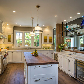
A solid wood walnut counter tops the island and structural posts and bar backing is clad with the same walnut in a board and batten style completing our accents of walnut contrasts to the classical white cabinetry.
Our clients had just recently closed on their new house in Stapleton and were excited to transform it into their perfect forever home. They wanted to remodel the entire first floor to create a more open floor plan and develop a smoother flow through the house that better fit the needs of their family. The original layout consisted of several small rooms that just weren’t very functional, so we decided to remove the walls that were breaking up the space and restructure the first floor to create a wonderfully open feel.
After removing the existing walls, we rearranged their spaces to give them an office at the front of the house, a large living room, and a large dining room that connects seamlessly with the kitchen. We also wanted to center the foyer in the home and allow more light to travel through the first floor, so we replaced their existing doors with beautiful custom sliding doors to the back yard and a gorgeous walnut door with side lights to greet guests at the front of their home.
Living Room
Our clients wanted a living room that could accommodate an inviting sectional, a baby grand piano, and plenty of space for family game nights. So, we transformed what had been a small office and sitting room into a large open living room with custom wood columns. We wanted to avoid making the home feel too vast and monumental, so we designed custom beams and columns to define spaces and to make the house feel like a home. Aesthetically we wanted their home to be soft and inviting, so we utilized a neutral color palette with occasional accents of muted blues and greens.
Dining Room
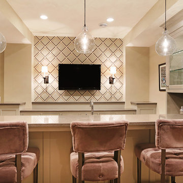
Our clients were also looking for a large dining room that was open to the rest of the home and perfect for big family gatherings. So, we removed what had been a small family room and eat-in dining area to create a spacious dining room with a fireplace and bar. We added custom cabinetry to the bar area with open shelving for displaying and designed a custom surround for their fireplace that ties in with the wood work we designed for their living room. We brought in the tones and materiality from the kitchen to unite the spaces and added a mixed metal light fixture to bring the space together
Kitchen
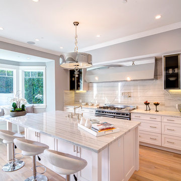
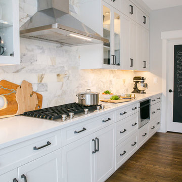
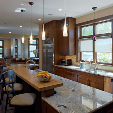
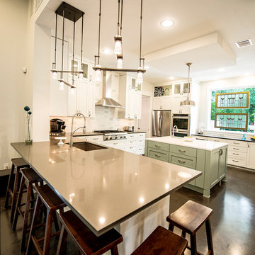
We wanted the kitchen to be a real show stopper and carry through the calm muted tones we were utilizing throughout their home. We reoriented the kitchen to allow for a big beautiful custom island and to give us the opportunity for a focal wall with cooktop and range hood. Their custom island was perfectly complimented with a dramatic quartz counter top and oversized pendants making it the real center of their home. Since they enter the kitchen first when coming from their detached garage, we included a small mud-room area right by the back door to catch everyone’s coats and shoes as they come in. We also created a new walk-in pantry with plenty of open storage and a fun chalkboard door for writing notes, recipes, and grocery lists.
Office
We transformed the original dining room into a handsome office at the front of the house. We designed custom walnut built-ins to house all of their books, and added glass french doors to give them a bit of privacy without making the space too closed off. We painted the room a deep muted blue to create a glimpse of rich color through the french doors
Powder Room
The powder room is a wonderful play on textures. We used a neutral palette with contrasting tones to create dramatic moments in this little space with accents of brushed gold.
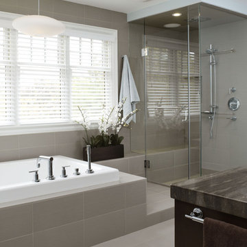
Master Bathroom
The existing master bathroom had an awkward layout and outdated finishes, so we redesigned the space to create a clean layout with a dream worthy shower. We continued to use neutral tones that tie in with the rest of the home, but had fun playing with tile textures and patterns to create an eye-catching vanity. The wood-look tile planks along the floor provide a soft backdrop for their new free-standing bathtub and contrast beautifully with the deep ash finish on the cabinetry.
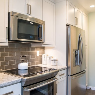
This La Jolla, California kitchen remodel was constructed in a small rectangular space which gave it a very intimate kitchen design. The small kitchen design is complemented by stainless steel appliances, subway tiling, a kitchen bar, white cabinets and hardwood flooring. www.remodelworks.com
Serenity now…that’s what I thought when I first saw this gorgeous bathroom. You remember that line in the movies, a weary Mom, stressed out, pleading for some serenity. This bath is the answer to her plea. The soft swirling colors, soothing yet interesting. The spaciousness, the crispness of the white fixtures and vanity, those decorative round mirrors and sophisticated lighting. Awwww.
This lovely home featured two baths. One in the hall, mostly for guest and the other adjoining a bedroom. What the home really needed was a workable Master Bath and a hallway Powder Room. So, we borrowed some space from the hall bath, adding to the new Master as a Shower, leaving just enough space for the perfect Powder Room in the hall. The existing bedroom bath space gave us plenty of room for a relaxing tub, a semi-private alcove for the toilet and a luxurious vanity with counter space.And what a vanity it is. Our homeowners fell in love and pre-purchased it for the bath. The 48″ Elizabeth Solid wood vanity features an Italian Carrara Marble counter top with a undermount rectangular white sink. The faucet is a Neo wide-spread in crisp, clean chrome. Chrome knobs adorn the drawers will decorative pulls grace the doors. The vanity is truly furniture, with layers of moldings and decorative feet. The Carrara Marble backsplash has an angular curve, for distinctive style. All of this is illuminated by the simple yet elegant wall sconces. Frosted glass and brilliant chrome reflect a softened white light.Semi private. The alcove offers a little privacy while not being claustrophobic. What you don’t see, until you look up, is the ceiling. It’s all the special details that make this bathroom over the top. A swirl of color surrounds the area with a marble wainscot with accent tiles, with just a hint of a textured wall peeking through. But the ceiling, that’s unique. We installed a decorative and molding detailed tray ceiling around a simple recessed light.
Here’s my awww moment, the tub. In the picture of the alcove ceiling did you notice the tub area peaking through? We took that same tray ceiling feature and added it to the bathtub area as well. The small pass through to the rest of the bath keeps the space feeling open while drawing the eye upward. Note that the detailed molding in the tray ceiling are repeated with the crown molding, all around the bath. Surrounded with the beauty of marble and featuring a water fall spout, this tub is inviting and relaxing. The deep bathtub welcomes you with arm and head rests for even greater relaxation. For a dramatic accent, the glamorous silver round mirror.For the extra wow factor, we got jets. Whirlpool jets make this bathing experience relaxing and healing, all at the same time. Light the candles, a glass of wine, it’s every woman’s dream. Most men’s too, although they might not admit it. See that peak of marble mosaic? The natural stone tiling this is bath is spectacular. Our “area rug” feature was created using a border of Pietra Art Bliss 5/8″ x 5/8″ Glass Blend in “Norwegian Ice” with an insert of Stone Partnership Basket Weave in Bianco Carrara with a Bardiglio Dot. The area is set into a floor of Stone Partnership 12″ x 12″ floor tile of “Bianco Carrara”.
The “area rug” and Bianco Carrara leads you to the new shower area, and what a shower it is. A clean, clear glass, frameless shower door with chrome trim welcomes you to the spa colored shower. For ease of use three towel bars and a hook hold your towels in place until you need them. Below the wainscot trim, the walls continue the swirling natural stone of 9″ x 18″ Florida Tile with a finishing Pencil of N.B.S. Pencil Liner, Marble 7 Avalone. Above the pencil, the Pietra Art Bliss 5/8″ x 5/8″ Glass Blend in “Norwegian Ice”. We have two shower heads. One for a soothing rainshower effect and the second is a handheld with slide bar for multiple positioning and spray.For attractive storage, and why shouldn’t storage be attractive, we installed a large niche. We took the Pietra Art Bliss 5/8″ x 5/8″ Glass Blend in “Norwegian Ice” mosaic into our niche and framed it with the Marble 7 Avalone pencil.A door is just a door, unless it’s a pocket door. With crown moldings and tray ceilings, we had to go the extra mile and put in a raised panel pocket door. No more worrying about hitting the tub or vanity with the swing of a door. We have all our controls for the heated floor systems in the shower and main floor located by the door. The bath flows from area to area and maintains it’s beauty with the help of the wainscoting. The height runs around all the walls, including the bath tub area, no small backsplash would do here. A top a cut row of our Bianco Carrara flooring we installed 9″ x 18″ Florida Tile all around in a horizontal brick pattern with staggered joints and was topped with two rows of Pietra Art Bliss 5/8″ x 5/8″ Glass Blend in “Norwegian Ice” mosaics and finished with the Pencil from N.B.S., Marble 7 Avalone. And a subtle but intriguing feature, the painted brick wall. We could have covered it with drywall, but we let that touch of texture peek through a couple of coats of paint. The finished affect, perfect.
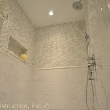
Photo Credit by RJK Construciton, Inc.
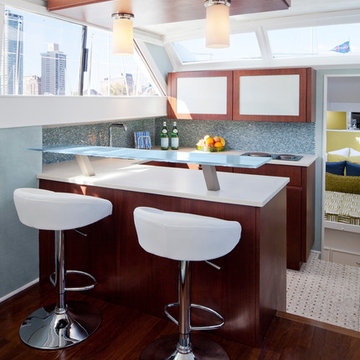
Galley on a 1969 Chris Craft Commodore Yacht.
Photography by Jacob Hand
See before imagesa and read the story about the remodel at the link above. New island, floor, paint, lighting, plumbing, counters and backsplash update this kitchen. A rustic, ethnic vibe was desired with textural limestone counter, new wood stools, and antique rugs and textiles. Photographer - Miro Dvorscak
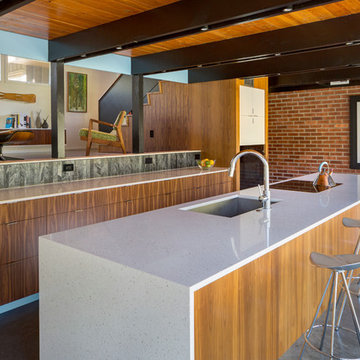
Looking from the dining area toward the kitchen reveals an eating bar that free spans 9 feet on steel supprts. Clean, contemporary walnut slab cabinets are paired with glass backslash and quartz counter tops for a cool, contemporary appearance. Photo by Lara Swimmer
Small Bar Counter Designs & Ideas
Design Objective: To provide my client with a compact yet comfortable space for entertaining. This space needed to reflect my Client’s impeccable taste while at the same time maintaining the original characteristics of this antique building’s Boston roots.
74