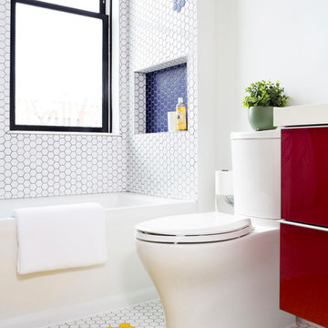
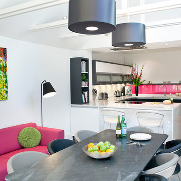
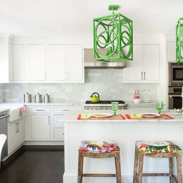
Pops Of Colour Designs & Ideas
CCI Renovations/North Vancouver/Photos - Ema Peter
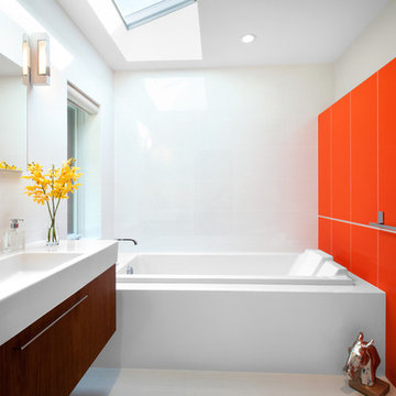
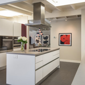
Featured on the cover of the June/July 2012 issue of Homes and Living magazine this interpretation of mid century modern architecture wow's you from every angle. The name of the home was coined "L'Orange" from the homeowners love of the colour orange and the ingenious ways it has been integrated into the design.
Find the right local pro for your project
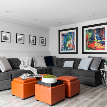
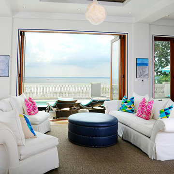
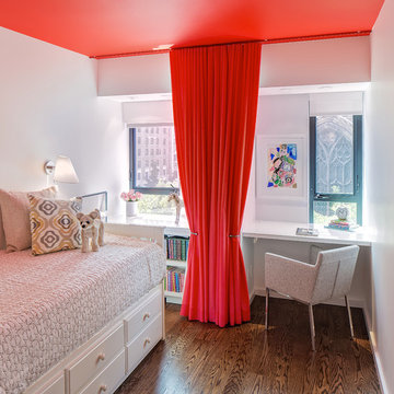
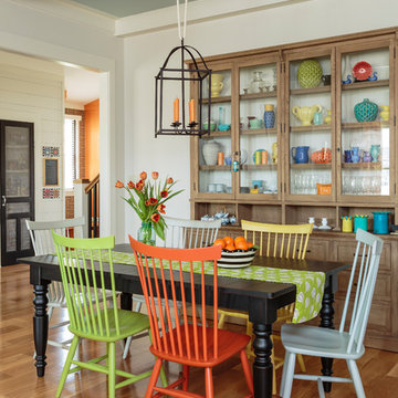
Having a small child, loving to entertain and looking to declutter and kid-proof the gathering spaces of their home in the quaint village of Rockville Centre, Long Island, a stone’s throw from Manhattan, our client’s main objective was to have their living room and den transformed with a family friendly home makeover with mid-century modern tones boasting a formal, yet relaxed spirit
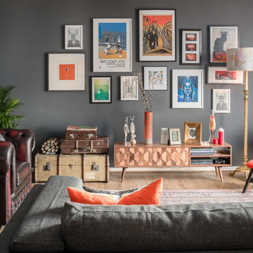
Stepping into the home we found their living room and den both architecturally well appointed yet in need of modern transitional furniture pieces and the pops of color our clients admired, as there was a substantial amount of cool, cold grays in the rooms.
Decor Aid designer Vivian C. approached the design and placement of the pieces sourced to be kid-friendly while remaining sophisticated and practical for entertaining.
“We played off of the clients love for blush pinks, mid-century modern and turquoise. We played with the use of gold and silver metals to mix it up.”
In the living room, we used the prominent bay window and its illuminating natural light as the main architectural focal point, while the fireplace and mantels soft white tone helped inform the minimalist color palette for which we styled the room around.
To add warmth to the living room we played off of the clients love for blush pinks and turquoise while elevating the room with flashes of gold and silver metallic pieces. For a sense of play and to tie the space together we punctuated the kid-friendly living room with an eclectic juxtaposition of colors and materials, from a beautifully patchworked geometric cowhide rug from All Modern, to a whimsical mirror placed over an unexpected, bold geometric credenza, to the blush velvet barrel chair and abstract blue watercolor pillows.
“When sourcing furniture and objects, we chose items that had rounded edges and were shatter proof as it was vital to keep each room’s decor childproof.” Vivian ads.
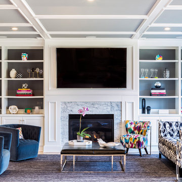
Their vision for the den remained chic, with comfort and practical functionality key to create an area for the young family to come together.
For the den, our main challenge was working around the pre-existing dark gray sectional sofa. To combat its chunkiness, we played off of the hues in the cubist framed prints placed above and focused on blue and orange accents which complement and play off of each other well. We selected orange storage ottomans in easy to clean, kid-friendly leather to maximize space and functionality. To personalize the appeal of the den we included black and white framed family photos. In the end, the result created a fun, relaxed space where our clients can enjoy family moments or watch a game while taking in the scenic view of their backyard.
For harmony between the rooms, the overall tone for each room is mid-century modern meets bold, yet classic contemporary through the use of mixed materials and fabrications including marble, stone, metals and plush velvet, creating a cozy yet sophisticated enough atmosphere for entertaining family and friends and raising a young children.
“The result od this family friendly room was really fantastic! Adding some greenery, more pillows and throws really made the space pop.” Vivian C. Decor Aid’s Designer
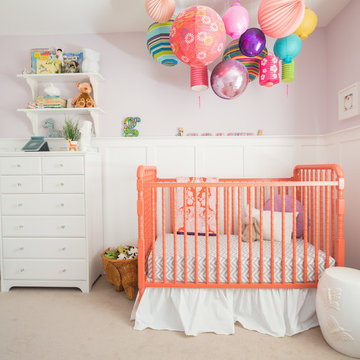
Coral painted Jenny Lind crib under paper lanterns. You are my sunshine spelled out in blocks. Lavender walls. High white wainscot.
Photo by Adrian Shellard
Pops Of Colour Designs & Ideas
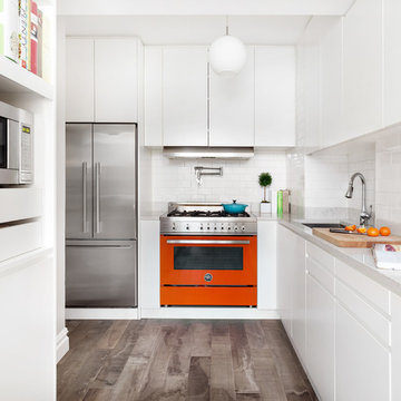
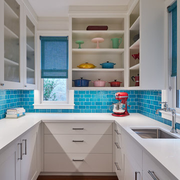
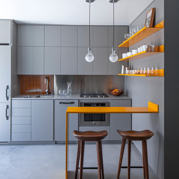
Custom kitchen designed for a client who loves to cook. Every square inch was planned for specific cooking tools, utensils, and homeware. The orange oven, a wedding gift, was the focal point of the design.
*Regan Wood Photography
1