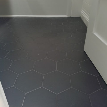
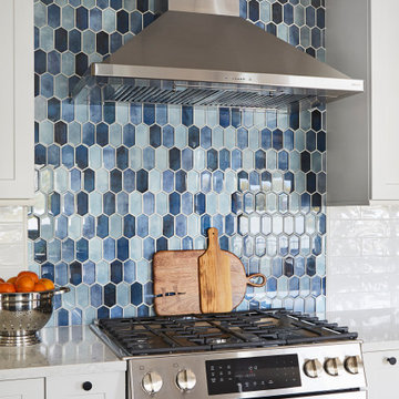
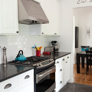
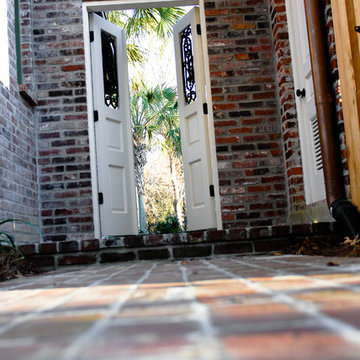
Kitchen Entrance Designs & Ideas
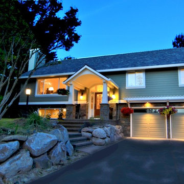
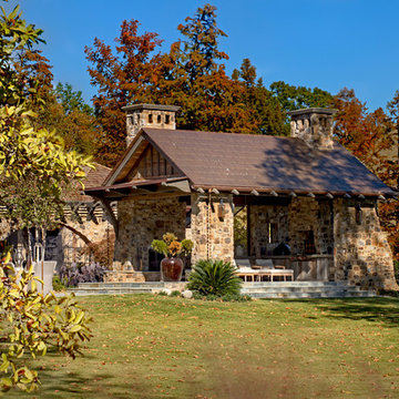
This West Linn 1970's split level home received a complete exterior and interior remodel. The design included removing the existing roof to vault the interior ceilings and increase the pitch of the roof. Custom quarried stone was used on the base of the home and new siding applied above a belly band for a touch of charm and elegance. The new barrel vaulted porch and the landscape design with it's curving walkway now invite you in. Photographer: Benson Images and Designer's Edge Kitchen and Bath
Clifton, the designer, chooses furniture in walnut brown to create a masculine and tasteful ambience for this project. Since the owner often goes traveling and has a collection of deco from all over the world, especially wall paintings. So, he wants a home design that is both practical and unique to reveal his personality and being design as a stylish hotel suite.
Clifton also adapts a sliding door and raised platform to separate the sleeping/ living area and cooking/ dining area. The design is flexible and practical since the owner wants maximum space in such a small area. So, he requires minimal design with the maximum space created.
Dark walnut color is selected as the theme color to portray a timeless metropolitan look. The flower arrangement with a dash of green and white, together with the artistic and colorful painting help to spice up the entire environment. The white wall also works well to break the monotony of the dark brown hues.
The wooden blinds by the entrance, in walnut brown, are unconventional, to conform to the overall look and feel of the design. The oriental wooden chairs by the entrance infuses well with the overall metropolitan design of the flat. This is a perfect blend of “east meets west”.
Entrance
The kitchen design is characterized by simple design, minimalism and functionality. Finest materials and appliances are selected to match with the overall modern design. In line with the minimalistic design, built-in washing machine works magic to create an uncluttered kitchen space. The kitchen drawers are created with meticulous details, where cutleries can be conveniently categorized.
A sliding door is in place to separate the bedroom/living room and the dining area. The door can be fully opened to create a combined space for friends’ gathering if needed. Different floor treatments are used to define the living and dining areas. Drawers under the bed offer extra storage and maximize the utilization of space.
The color tone and material of the furniture in the living area matches with that of the dining room – in hues of black and dark brown. The beige carpet and light chestnut flooring blend well with the furniture to offset the monochromic tonality and create a calm and restful feel. The mood lighting at the ceiling further enhances the homey ambience.
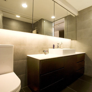
A grey washroom evokes a sophisticated, calming, and uplifting feeling, which offers a private oasis for owners to relax after a day of hectic work.
Find the right local pro for your project
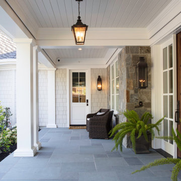
Expanded wrap around porch with dual columns. Bronze metal shed roof accents the rock exterior.
Download our free ebook, Creating the Ideal Kitchen. DOWNLOAD NOW
Lakefront property in the northwest suburbs of Chicago is hard to come by, so when we were hired by this young family with exactly that, we were immediately inspired by not just the unusually large footprint of this 1950’s colonial revival but also the lovely views of the manmade lake it was sited on. The large 5-bedroom home was solidly stuck in the 1980’s, but we saw tons of potential. We started out by updating the existing staircase with a fresh coat of paint and adding new herringbone slate to the entry hall.
The powder room off the entryway also got a refresh - new flooring, new cabinets and fixtures. We ran the new slate right through into this space for some consistency. A fun wallpaper and shiplap trim add a welcoming feel and set the tone for the home.
Next, we tackled the kitchen. Located away from the rest of the first floor, the kitchen felt a little isolated, so we immediately began planning for how to better connect it to the rest of the first floor. We landed on removing the wall between the kitchen and dining room and designed a modified galley style space with separate cooking and clean up zones. The cooking zone consists of the refrigerator, prep sink and cooktop, along with a nice long run of prep space at the island. The cleanup side of the kitchen consists of the main sink and dishwasher. Both areas are situated so that the user can view the lake during prep work and cleanup!
One of the home’s main puzzles was how to incorporate the mudroom and area in front of the patio doors at the back of the house. We already had a breakfast table area, so the space by the patio doors was a bit of a no man’s land. We decided to separate the kitchen proper from what became the new mudroom with a large set of barn doors. That way you can quickly hide any mudroom messes but have easy access to the light coming in through the patio doors as well as the outdoor grilling station. We also love the impact the barn doors add to the overall space.
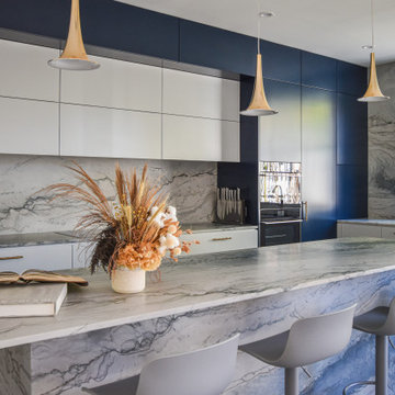
The homeowners’ first words to us were “it’s time to ditch the brown,” so we did! We chose a lovely blue pallet that reflects the home’s location on the lake which is also vibrant yet easy on the eye. Countertops are white quartz, and the natural oak floor works well with the other honey accents. The breakfast table was given a refresh with new chairs, chandelier and window treatments that frame the gorgeous views of the lake out the back.
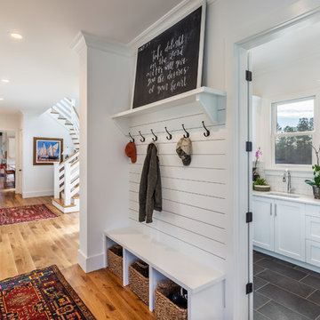
We coordinated the slate mudroom flooring with that used in the home’s main entrance for a consistent feel. The storage area consists of open and closed storage to allow for some clutter control as needed.
Next on our “to do” list was revamping the dated brown bar area in the neighboring dining room. We eliminated the clutter by adding some closed cabinets and did some easy updates to help the space feel more current. One snag we ran into here was the discovery of a beam above the existing open shelving that had to be modified with a smaller structural beam to allow for our new design to work. This was an unexpected surprise, but in the end we think it was well worth it!
We kept the colors here a bit more muted to blend with the homeowner’s existing furnishings. Open shelving and polished nickel hardware add some simple detail to the new entertainment zone which also looks out onto the lake!
Next we tackled the upstairs starting with the homeowner’s son’s bath. The bath originally had both a tub shower and a separate shower, so we decided to swap out the shower for a new laundry area. This freed up some space downstairs in what used to be the mudroom/laundry room and is much more convenient for daily laundry needs.
We continued the blue palette here with navy cabinetry and the navy tile in the shower. Porcelain floor tile and chrome fixtures keep maintenance to a minimum while matte black mirrors and lighting add some depth the design. A low maintenance runner adds some warmth underfoot and ties the whole space together.
We added a pocket door to the bathroom to minimize interference with the door swings. The left door of the laundry closet is on a 180 degree hinge to allow for easy full access to the machines. Next we tackled the master bath which is an en suite arrangement. The original was typical of the 1980’s with the vanity outside of the bathroom, situated near the master closet. And the brown theme continued here with multiple shades of brown.
Our first move was to segment off the bath and the closet from the master bedroom. We created a short hall from the bedroom to the bathroom with his and hers walk-in closets on the left and right as well as a separate toilet closet outside of the main bathroom for privacy and flexibility.
The original bathroom had a giant soaking tub with steps (dangerous!) as well as a small shower that did not work well for our homeowner who is 6’3”. With other bathtubs in the home, they decided to eliminate the tub and create an oversized shower which takes up the space where the old tub was located. The double vanity is on the opposite wall and a bench is located under the window for morning conversations and a place to set a couple of towels.
The pallet in here is light and airy with a mix of blond wood, creamy porcelain and marble tile, and brass accents. A simple roman shade adds some texture and it’s top-down mechanism allows for light and privacy.
This large whole house remodel gave our homeowners not only the ability to maximize the potential of their home but also created a lovely new frame from which to view their fabulous lake views.
Designed by: Susan Klimala, CKD, CBD
Photography by: Michael Kaskel
For more information on kitchen and bath design ideas go to: www.kitchenstudio-ge.com
The rooms in this compact and colourful family home feel spacious thanks to soaring ceilings and large windows. The bold artwork served as inspiration for the decor of the home's tiny main floor that includes a front entrance, living room, dining room and kitchen all in just under 600 square feet. This home is featured in the Spring 2013 issue of Canadian Home Trends Magazine. Interior Design by Lori Steeves of Simply Home Decorating.
photo by Janis Nicolay
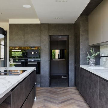
This kitchen is home to two taller individuals who both use the space equally and requested a taller workspace to comfortably accommodate their needs. The island cabinets are standard 34-1/2” tall but the Iceberg countertops were installed with a 3” build-up to add height to the island. Cabinets on the long wall were designed to break up the wall of white: buffet on the end with walnut-framed glass cabinets and seashell backsplash; double refrigerators in a painted, distressed mahogany finish were pulled forward to simulate texture and depth on the wall; wide pantry cabinets with roll-out drawers sitting on the countertops flank the refrigerators. On the opposite wall, a new window box at the kitchen sink was built to add more countertop behind the sink and to let in more light, adding dimension to the room.
The cabinetry in the original existing kitchen was disjointed at the dining room entrance and made the room appear much smaller than it really was. To remedy this, the entry to the dining room from the kitchen was closed up and relocated around the corner from the foyer; 2 simple, stacked columns were built to highlight the new opening. These transitional style columns and wider room openings at the family room and dining room entrances provide an open layout suitable for large groups to mingle comfortably; family room cabinetry and dining room fireplace surround matches kitchen cabinets.
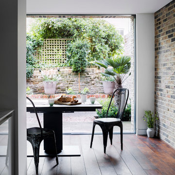
Townhouse renovation in Brooklyn: We redesigned the rear end of the house as an expanded family kitchen with a back door to the deck. We also added a new connection from the entrance hall to the kitchen and fit a small powder room under the stairs. The old windows and doors were replaced with new, larger ones, and the entire kitchen was gutted and refitted with new cabinetry and a banquette dining area. The space was designed to take advantage of the bright southern exposure, with lots of white materials, grounded by the dark base cabinets.
Photos by Maletz Design
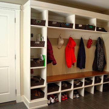
The mud room with garage door entrance to the left and storage closet to the right. Photo: Kate Distasio
Dining room:
The dining room is located within the new extension.
The extension was built between two high party walls. The brick clad feature wall was created from the same bricks that were salvaged and re-used from the demolition process.
We created a recess (between the ceiling and the wall) along the feature wall and the sliding windows to create feature lighting that bathes the wall in light and conceals the curtain tracks for the windows.
The glass of the sliding doors can be heated and used as a radiator during the winter time.
We removed all load bearing walls, like this partition wall in the original kitchen layout. An open contemporary kitchen with an abundance of natural light and a perfect "triangle" for work flow is the beautiful result. We also changed the range wall to create the 17 ft. site line from the kitchen entrance to the terrace windows by reconfiguring the bedroom to add much needed closet space.
The original brief from the client was straightforward to begin with. They had recently purchased the property and had planned to renovate the existing kitchen, laundry, and bathroom. The house was built in the 1930s. The intention was to maintain all the property's original features while creating a contemporary interpretation.
The home belongs to a family of four who wanted to create an open living space with a good connection between the kitchen and dining areas, suitable for entertaining guests. We designed the house with the client's lifestyle and needs in mind and allowed the client to have significant involvement in the process. The kitchen was tiny, and the laundry and toilet were located to the rear, meaning the kitchen had no view.
We wanted to create a space with more natural light from the rear, which meant demolishing the existing kitchen, laundry, and toilet. We created a simple, modern kitchen that was sympathetic to the original house. We demolished the existing garage, giving the property more space for a larger outdoor entertaining area. To achieve the client’s brief, we had to alter the original plans by creating a powder room on the ground floor and putting the laundry upstairs.
As the brief grew, the client decided to also renovate the existing bathroom and master ensuite for the first floor with a new contemporary design by maintaining the original stained glass windows. We retained the original features of the house.
The existing staircase created an enclosed feeling at the front of the entrance of the house with poor natural lighting. The new staircase we designed was a response to create a warmer, grand entrance to the house. This became a prominent feature of the house with a skylight and pendant for dramatic lighting. Using natural and artificial light was central to the design process; positioning the statement pendant and skylight above the staircase created a bright entrance. The handrail on the staircase featured geometric shapes to remind the original art deco style in a more contemporary way. Being transparent in form allows more light to flow through the space.
We used various unique materials throughout the property, including waterproof wallpaper in the wet areas, to create something out of the ordinary. Using reflective materials gave us different perceptions of other parts of the property with different views. For example, you can see the bamboo outside while standing in the kitchen. We kept the stained glass doors in the home to keep a balance between the traditional aspects and the new modern ones. We brightened the home using colours and retained the existing brick fireplace by modernising it.
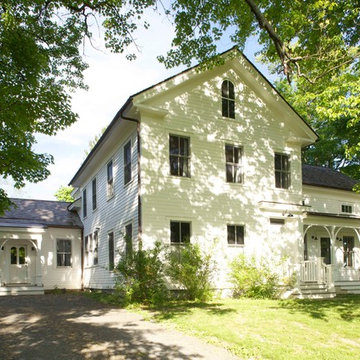
Modern farmhouse situated on acreage outside of a southern city. Photos by Inspiro8 Studios.
Original 19th Century front of house, restored and with the new mudroom, side entrance addition on left. This is the view from the road and preserves the original architecture.
Kitchen Entrance Designs & Ideas
New custom house in the Tree Section of Manhattan Beach, California. Custom built and interior design by Titan&Co.
Modern Farmhouse
123