Decorating Guides
How to Use Colour in Your Living Room
Move away from uninspiring colour palettes. Discover combinations that will be sure shot winners in your living room

Colours can play a decisive role in establishing the mood of a living space. So how about planning the most important room in your home while keeping colour schemes in mind? Read on and explore these extraordinary combinations and looks, and choose what works best for your home.
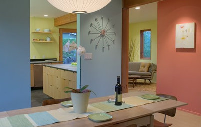
Mixing of light blue with more than one tone of yellow gives this room a different look from other dual colour schemes. The bright yellow strips at the two ends of the carpet add a jolt of crispness.
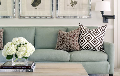
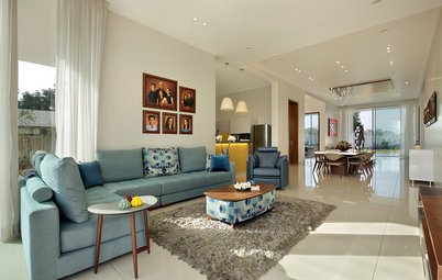
Neutral sea-green unites with off-white to create a space that is soothing and low on contrast. In the furniture, the dash of neutral brown juxtaposes with the off-white and brings more depth into the living room.
Take a look at more living room images
Take a look at more living room images
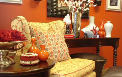
The same colour has been used in different shades to incorporate the dual tone scheme in this subtle living space. Pale orange dominates but is present in a range of tones in the wall art, the cushions and the sofa. Due to the lighting, the pale wall takes on an orange hue too.
Let the neutral meet accents
Being restrained in the use of colour on expansive surfaces and introducing them only in the form of accents is a great way to make them the highlight of your decor. Here the neutrals, such as white, beige, taupe and light grey can take over the base. A pop of colour can be added through the cushions, an upholstered chair or even a vase on the study table. See how the colours dominate in this neutral room?
10 Breathtaking & Unconventional Accent Walls
Patterns can be used to create sophisticated accents in a space with a neutral palette. Purple, green and brown in similar tints are added through patterns in upholstery in this predominantly off-white living room. Instead of looking like solid blocks of colours, these add layers to a monochromatic decor.
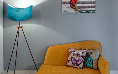
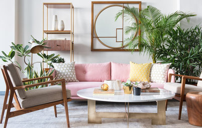
A focal piece of furniture in a different colour tone can also act like an accent. The yellow sofa offsets the white and the beige look – more depth is brought into the space with a deeper shade of yellow for the cushions.
In this living room, the accent colour takes up a major part of the decor. The neutral decor of this room is anchored by the green carpet that binds the whole space together. Different shades of lighter green are used in cushions and accessories to balance the look.
Going solo with monochrome
The living room is an area to show off. What better colour to make an impression with, than one dominant one? This living room is taken over by two shades of blue – indigo and denim. The whites in the cushion covers and the brown painting on the wall create a visual breathing space from the dominant blue.
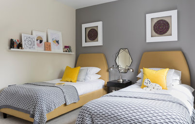
Bedroom Reveal: Mesmerising Monochromes
The living room is an area to show off. What better colour to make an impression with, than one dominant one? This living room is taken over by two shades of blue – indigo and denim. The whites in the cushion covers and the brown painting on the wall create a visual breathing space from the dominant blue.
Bedroom Reveal: Mesmerising Monochromes
Think eclectic
When there is a rainbow of colours available, then why limit your palette? When done right, mixing multiple colours in one space can lead to spectacular results.
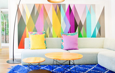
Each colour gets its share here. The trick is to balance repetition and volume. Besides a large patch on the wall, bright orange is used in this space for a small table lamp. Similarly, while a couple of small pieces and the biggest furniture in the room is in turquoise, the colour has not been used on the wall. The black and white rug and the white ceiling balance out the overdose of colours in between.
When there is a rainbow of colours available, then why limit your palette? When done right, mixing multiple colours in one space can lead to spectacular results.
Each colour gets its share here. The trick is to balance repetition and volume. Besides a large patch on the wall, bright orange is used in this space for a small table lamp. Similarly, while a couple of small pieces and the biggest furniture in the room is in turquoise, the colour has not been used on the wall. The black and white rug and the white ceiling balance out the overdose of colours in between.
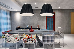
Mixing of bold colours and patterns gives this room a vibrant feel. Flower motifs in the sofa, cushion covers and the ceiling bind the whole look together. The key is to balance the various colours used.
Read more:
Find out how colours can energise your home
Tells us:
What colour scheme have you used in your living room? Share your photos in the Comment section.
Read more:
Find out how colours can energise your home
Tells us:
What colour scheme have you used in your living room? Share your photos in the Comment section.
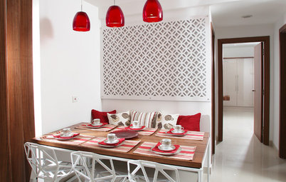
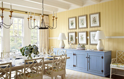
Bringing in symmetry and balance to a space becomes easier when you have only two colours to work with. Subdued tones of red and white create a classic look in this living room. Red has been used in smaller doses as opposed to beige since it is a heavier colour. The use of rich fabric, such as velvet for the cushions and the upholstery of the chair, adds more depth to the look and feel of the room. The use of accessories in contrasting colours (like the black vase) enhances the effect of the other two colours.
Find an interior designer to help design your living room