


A Guide to Using Colour in Your Home
Change the mood of a room with colours that advance or recede
Paul Anater
4 May 2018
I am a former designer, past Houzz contributor and current Marketing Director at The Reclamation Project, a reclaimed lumber flooring and furniture company in Pennsylvania.
I am a former designer, past Houzz contributor and current Marketing Director at... More
Knowing the difference between a warm colour and a cool colour can help you choose colour combinations more confidently. When you understand how the temperature of a colour affects how it’s perceived, you can use that knowledge to design colour schemes that work for you.
When you’re confronted with a blank space and it’s time decide a colour scheme, how can you know how to make colour work with you instead of against you to accomplish your design goals? How can you know what colour goes where?
The answer to those questions is in the colour wheel.
The answer to those questions is in the colour wheel.
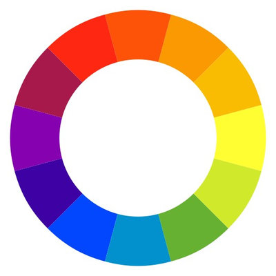
I talked before about how to use the colour wheel to devise some basic colour schemes. It also can help you determine the temperature of a colour.
The basic colour wheel is split into two halves, a warm half and a cool half. The warm half runs from red through yellow-green. The cool half runs from green through red-violet. Our eyes and brains perceive different wavelengths of light as colours. The importance in interior design is that warm colours tend to advance and cool colours tend to recede.
The basic colour wheel is split into two halves, a warm half and a cool half. The warm half runs from red through yellow-green. The cool half runs from green through red-violet. Our eyes and brains perceive different wavelengths of light as colours. The importance in interior design is that warm colours tend to advance and cool colours tend to recede.
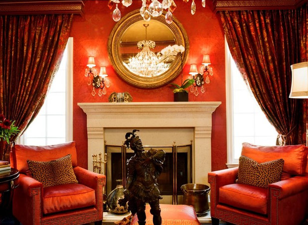
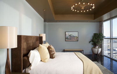
Since warm colours tend to advance, this means that they tend to draw in a space. This red living room feels more intimate because it’s red. If the designer wanted to make the room feel more open and expansive, she would have chosen a cooler colour.
Learn how to work with red walls
Learn how to work with red walls
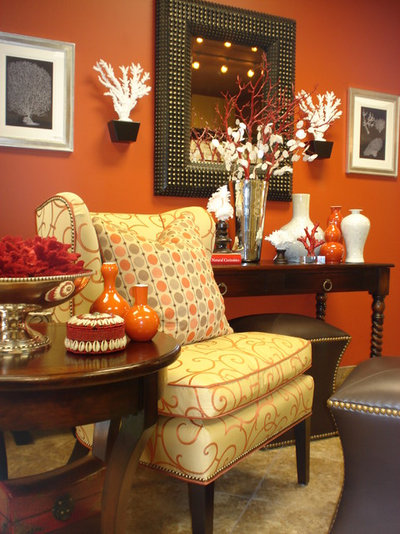
Orange, as a warm colour, can do the same thing red’s doing in the photo above. You can use warmer colours to draw in a room and make it feel smaller.
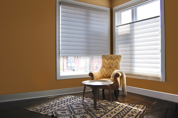
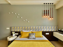
If you have a large, sparsely furnished room and your goal is to close it in and make it feel more intimate, a warm colour like this yellow can do that for you.
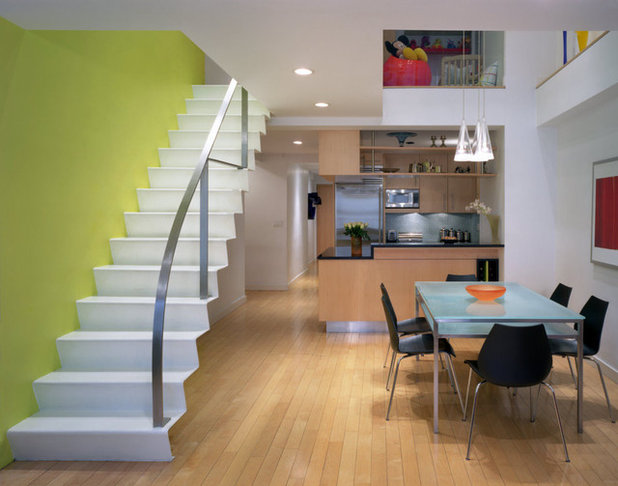
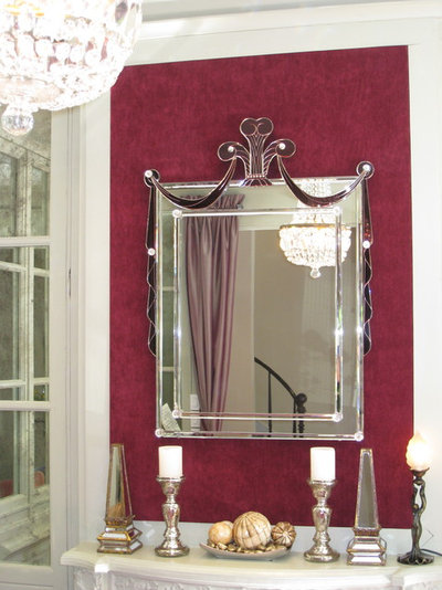
This tendency of warm colours to advance can be seen at work in this yellow-green accent wall. That accent wall is pulling the stairs closer to the dining table. Of course, it’s not actually moving anything, but the perception is that the space feels closer.
If you’re deciding on a paint scheme and there are elements in a room that you want to draw closer, point them in a warmer colour.
Find out the secret to a long-lasting paint job
If you’re deciding on a paint scheme and there are elements in a room that you want to draw closer, point them in a warmer colour.
Find out the secret to a long-lasting paint job
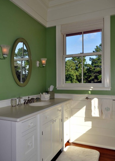
Green is the first cool colour of the colour wheel. In green, the tendency for colours to advance stops and they begin to recede. By recede I mean that cool colours expand a room or a space.
This bathroom feels more expansive with a green wall than it would with an equally saturated red.
This bathroom feels more expansive with a green wall than it would with an equally saturated red.
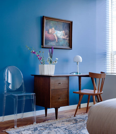
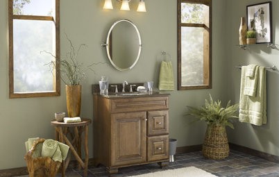
A blue wall tends to make a room feel larger. This is important to know if you have a small room that you want to expand rather than make more intimate and close.
Check out ways to cool down your home this summer with blue
Check out ways to cool down your home this summer with blue
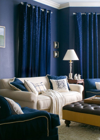
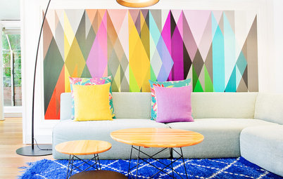
You can mix and match warm and cool colours with purpose and meaning to advance your design goals and make a room more interesting. The blue walls and draperies in this living room are expanding away from the viewer and the yellow accents are advancing toward the viewer.
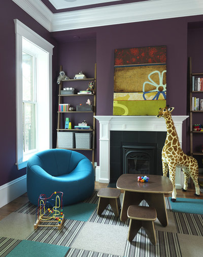
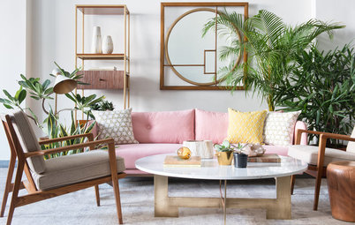
The warm colours in the painting on the mantle in this purple room is the clear focal point. By choosing the cool colours of the walls and furnishings, the designer is adding emphasis to the painting and she’s using her knowledge of colour theory to advance her goal.
The effect is subtle but impossible to miss.
The effect is subtle but impossible to miss.
The closer to red cool colours get on the wheel, the warmer they become. The last stop on the cool side of the wheel is violet-red. After violet-red, colours start to advance again.
Colour theory provides a general framework to describe the behaviours of colours, and exceptions to these generalisations abound. Still, the tendencies of warm colours to advance and cool colours to recede are almost always true.
If you have a room with a low ceiling and you want the room to feel taller, paint the ceiling a white that’s been tinted with blue. Similarly, if you have a very wide room that you want to feel closer and more intimate, then paint the room in a warm colour and it will do just that.
Read more:
Colour Me Bold: 11 Ways to Energise Your Home
Tell us:
How do you use warm and cool colours in your own home? Tell us in the Comments below.
What are you working on?

Related Stories
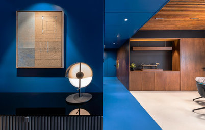
Photo Books
35 Trending Wall Colours From Urban Indian Homes
Take your pick from versatile neutrals to brilliant jewel tones, from raw concrete hues to abstract colour blocking
Full Story
Most Popular
Where to Use Which Paint?
Know your emulsions from your acrylics, and the right types for painting the home's interior & exterior
Full Story
Decorating Guides
How to Decide on a Colour Scheme for the Whole House
Don't be daunted. With these strategies, building a cohesive scheme for your entire home is less difficult than it seems
Full Story
Indian Homes
Is Too Much Colour a Bad Thing? These Indian Homes Say No
Go bold or go home ... these spaces do both admirably
Full Story
Colour Guides
When Colours Are Not What They Seem
By Tess Dolan
Understand the tricks colours can play on you and what can be done to avoid pesky pairings in the home
Full Story
Decorating Guides
Timeless Wall and Sofa Colour Combinations
Here is a compilation of wall and sofa colour combos that help achieve a balance or create an intriguing contrast in the living room
Full Story
Most Popular
11 Paint Colours That Complement Wood Details
Pair your wood trim and cabinets with the right shade of wall paint to bring out the beauty in both
Full Story
Decorating Ideas
12 Ceiling Colours That Aren't White & Why You Would Want Them
These surprising ceiling colours will have you looking up to them and away from the ubiquitous white
Full Story

Photo Books
22 Ways to Use Colour in Your Home
Our coffee-break escape offers you five minutes' worth of images to inspire and delight. Jump right in...
Full Story
Kitchen Guides
24 Alluring Kitchen Colour Ideas & Combinations
Do you want your kitchen to be its own person (so to speak)? Here we look beyond neutrals to beautifully coloured kitchens
Full Story
Great article but I'm still unsure how to apply this rule to my basement.
I am painting a paneled basement (old 70's paneling) and having the exposed wooden ceiling beams painted and adding canned lighting since it's pretty dreary down there with very little natural lighting in our 1920's Tudor style home (small basement windows).
I was originally going to have the ceiling painted white but a pro painter talked me into going with a mid-to-dark tone since white or any light color will take way too many coats of primer and paint to adequately cover the beams, pipes, wires, ductwork etc. Too many imperfections will show.
For the walls I already purchased BM Snow on the Mountain #1513 since this will help brighten it up. The floors are ceramic tiled two charcoal grays - alternating lighter and darker charcoal and I thought the Snow on the Mountain would be a nice contrast to the cool floor.
Since the walls are warm, and floor is cool, do I go with cool on the ceiling too? Or stick with warm walls and ceiling?
I pulled out my SW paint deck, and I was considering the following:
Cool grays (to my untrained eye): SW 7067 Cityscape or one darker SW 7o68 Grizzle Gray - they seem to coordinate with the floor tile too.
Warm grays: SW Dorian Gray or Dovetail SW 7017 & 7018, but Not sure how these rules apply to cool floors, warm walls - warm or cool ceiling?
Or, should I go even more to the blue end of the spectrum toward SW Software or SW Web Gray #7064 & 7075, also cooler grays.
The ceiling itself is about 8 feet in height, but the trusses come down to a little over 7 feet in height. Is the ceiling going to recede or will I feel like I'm in a cave. Utterly confused, not sure which direction to go.
If anyone has any advice for me, it would be greatly appreciated.
Certainly, there are some "jewel" tones, but what is available is mostly in a few plain velvets which doesn't really suit my style. I went shopping today and at the moment everything is pastel pinks & washed-out blues mixed in with black and "organic" neutrals - linens, scrubbed raw or blond wood and metal - and white! Lots of white! Sure, it's pretty, but It would appear that people are becoming more and more afraid of using any saturated colour! It all starts to look very same-same from one store to another, even from the most expensive to the cheaper chain stores! Does that mean our homes are also the same, with the same current trendy neutral (grey - any shade there-of) and gallery white walls?
I would love be able to buy some brighter colours and printed items to make a statement! I can see myself having to either source a great fabric from one of the fabric houses (expensive option) and making my own cushions, or going on line to buy from overseas.