Bedroom Reveal: Mesmerising Monochromes
If mix-and-match isn't your thing, opt for a one-colour theme that can enhance your space in wondrous ways

Monochromatic colour schemes can be easier to work with when you are not too sure about working with different colours. You can play with colour variations, patterns, textures and styles and yet cohesively tie the space together. Here are some bedrooms that celebrate a single dominant colour in gorgeous ways. Read on for tips and ideas.
White is often used as a base neutral colour when working with a monochrome setting. It helps create negative space to define the composition. Here it is used to balance out and create negative space in a room full of sage green.
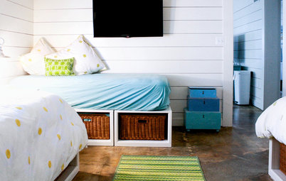
When you have doubts about using too many shades from a single family, consider a transitional colour scheme. Reach out for the most basic colour, such as white or grey to balance darker, brighter tones. This room is a good example of a transitional design. The shades of blue – azure, turquoise and sky blue – gradually transition to a more neutral white in the centre of the room.
Neutrals are a popular choice
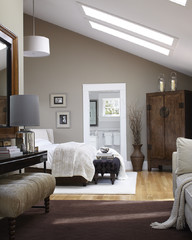
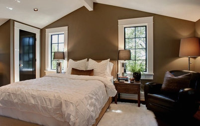
Similarly, the most popular colours seem to be beige and white in the neutral palette. While textures can create depth in the ensemble, inclusion of sheened browns or gold can infuse warmth and opulence into the decor. Here, the light wood finish on the flooring complements the cool undertones exuded by the beige blinds and textured wallpaper.
Similarly, the most popular colours seem to be beige and white in the neutral palette. While textures can create depth in the ensemble, inclusion of sheened browns or gold can infuse warmth and opulence into the decor. Here, the light wood finish on the flooring complements the cool undertones exuded by the beige blinds and textured wallpaper.
If you’re designing a monochromatic colour scheme based only on neutrals, then refer to the guidelines mentioned about shades, tints, hues and tones at the beginning here. It is also important to be able to identify warm tones from the cool ones when working with in neutral colour scheme. If your space is predominantly filled with warm neutral surfaces, your main neutral colour for your monochromatic scheme should also be warm.
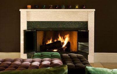
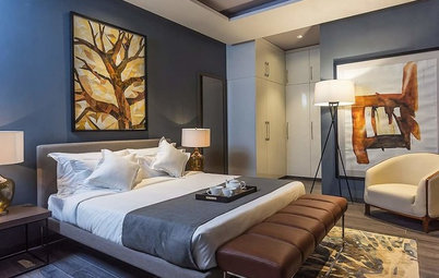
In the picture, the dominant shade is the rustic dark chestnut finish on the wall. The warm undertones are complemented by similarly darker or warmer shades of brown through the curtain and the painting (which contains cool pale blue to balance the darker shades, preventing them from getting oppressive).
In the picture, the dominant shade is the rustic dark chestnut finish on the wall. The warm undertones are complemented by similarly darker or warmer shades of brown through the curtain and the painting (which contains cool pale blue to balance the darker shades, preventing them from getting oppressive).
Prints and patterns add more depth and dimension
Prints and patterns on your wallpapers, throws, pillows, rugs and blankets can add finesse to the existing shades and tints used in the room. Similar sorts of prints, like waves, stripes or even floral motifs, can cohesively tie a space together.
Prints and patterns on your wallpapers, throws, pillows, rugs and blankets can add finesse to the existing shades and tints used in the room. Similar sorts of prints, like waves, stripes or even floral motifs, can cohesively tie a space together.
Colours like pink can attract a lot of attention. When working with tints and shades of pink, consider infusing coral and peach, which come from the same family, to create depth in the surface.
Pro tip: When working with busy floral prints, repeat patterns across two or three objects in the room to maintain continuity. This is key when working with monochromes. Offset it with the lightest tint in the spectrum of that colour, such as the light baby pink used for the headboard and the columns of the poster bed.
Pro tip: When working with busy floral prints, repeat patterns across two or three objects in the room to maintain continuity. This is key when working with monochromes. Offset it with the lightest tint in the spectrum of that colour, such as the light baby pink used for the headboard and the columns of the poster bed.
Bright, cheerful shades of yellow can brighten up your room. Here, daisy yellow incorporated through prints and patterns, infuses freshness into the design while maintaining continuity of theme at the same time.
The same shade in different materials reacts differently with light
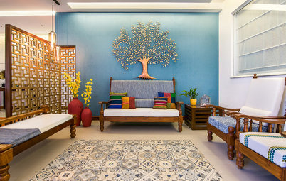
While working with wallpapers and fabrics of the same colour, it is important to remember that different materials react differently to light. When working with one colour, such as lavender here, experiment with paint finishes and fabrics for furnishing. A glossier surface will reflect more light than a matte surface.
While working with wallpapers and fabrics of the same colour, it is important to remember that different materials react differently to light. When working with one colour, such as lavender here, experiment with paint finishes and fabrics for furnishing. A glossier surface will reflect more light than a matte surface.
In this predominantly grey-themed bedroom, mirrored surfaces, silk sheets and textured wallpaper are used to create surfaces to bounce off light in varied intensities, thus automatically creating shades and tints in the surfaces.
White is the most underrated colour
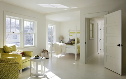
Whites are often used to offset a darker shade but it can also stand alone on its own – and how. Opt for fabrics with different textures or patterns that stand out to create depth in an all-white decor.
Whites are often used to offset a darker shade but it can also stand alone on its own – and how. Opt for fabrics with different textures or patterns that stand out to create depth in an all-white decor.
Wallpaper, paints and fabrics are available in a surprisingly wide array of shades to support your white theme. Shades such as oatmeal, cream, porcelain white, pearl, alabaster, azure, linen and bone white create an ethereal effect when they come together. True, white may seem a difficult colour to maintain but it is a boon for tiny bedrooms as it creates an illusion of more space.
Pro tip: Introduce a pop of colour through objets d’art in an all-white decor to inject an element of interest.
Bring artwork in the foreground
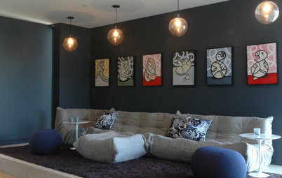
Monochromatic colour schemes work best when light and dark variations of the same colour are used to create a harmonious setting. This arrangement is ideal to display a work of art as the distractions are minimal in a single colour setting.
Monochromatic colour schemes work best when light and dark variations of the same colour are used to create a harmonious setting. This arrangement is ideal to display a work of art as the distractions are minimal in a single colour setting.
Here, the two simple framed sketches are brought to the fore by the textured wallpaper in the background. The simplicity of the artwork is accentuated by the bold indigo statement wall. The textures on the cushion and duvet cover aptly complement and complete the setting.
Read more:
9 Beds You Need to Know About
8 Areas to Go Bold with Burgundy
Tell Us:
Share your experiences of designing a monochromatic space in Comments below.
Read more:
9 Beds You Need to Know About
8 Areas to Go Bold with Burgundy
Tell Us:
Share your experiences of designing a monochromatic space in Comments below.


While going monochromatic, it is important to understand the difference between hues, tints, shades and tones. While hues are just the basic colours, tints are created by adding white to colours, shades refer to the colours when black is added. Tones are the variations when greys (in varying proportions of black and white) are mixed into colours.