Standout Wall Colour Combinations That Celebrate Contrast
Two or three wall shades, when mixed with the right accessories, can help spice up the decor of a space. Find out how

Pairing two or three tones can lead to one of two things – either each colour brings out the best in the others, pulling together an eye-catching scheme, or it can look like a complete mishmash. Those who love to experiment with hues on walls and struggle to find ways to make the colours to get along can take help of complementing accessories to tie together multi-hued walls. Here are examples that show dynamic interiors put together with the clever use of accompanying accessories. Take a look, and don’t forget to bookmark your favourite combinations.
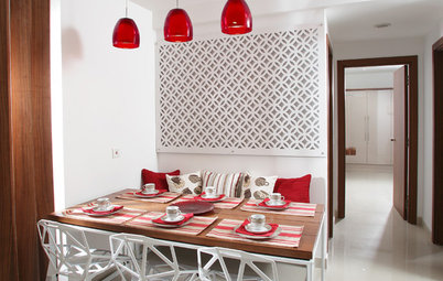
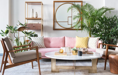
Pastels can also help conjure up a lively, dynamic space. What do you think? Let’s look at this space. Blue and pink create a candy-hued scape and the green in the far back adds to the colour dynamism, where each shade holds its own. The three tones come together in the table mat. Giving another dimension to the animated palette is the the light-brown wooden table and chair. What a colour-happy space this is!
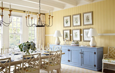
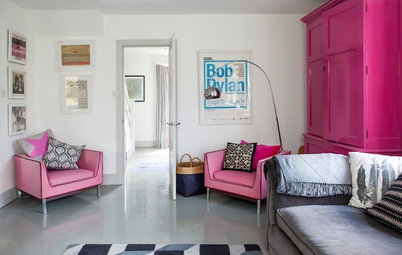
In this dining room, the bright coral leaps out and makes a statement, more so when paired with beige. Juxtaposing a bright colour with a light one visually heightens the wall, too. The pink leopard-print chairs and the beige curtains and sunburst frame pull the colour scheme together in the space.
Wondering what colour to paint in which room?
Wondering what colour to paint in which room?
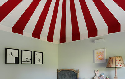
Tip: Consider playing with contrasting colours on the same wall. This pixel-style wall in orange and pink gives such a refreshing quality to the bathroom. The mere colour combination would be enough to wake you up, even when the shower isn’t running.
Purple and gold – the tones lie opposite each other on the colour wheel, thereby creating a lively clash. The plum-coloured wall and a muted gold column and ceiling panelling add sparkle and vibrancy to this hallway.
Both grey and brick are known for their fierce individuality, and when coupled together lend a slice of uniqueness to the room. The greys of the wall and the floor get an infusion of warmth from the brown brick accent wall. The white bed and ceiling balance the darkness of the two shades; the pale beige cushions striped in grey and the twiggy bedside plant soften and integrate the contrasts.
The staircase is a transitional space – an area that sometimes gets neglected on the decor scale. Without having to invest in too many accessories, here the three colours – green, orange and brown – do a good job of creating an impact. I like the touches of white that run along the stairs and on the handrail on the wall, giving a little bit of neutral background, a lightness, to the vivid space. The usual ascending and descending routine becomes more fun with these spirited hues.
Red and mango yellow come together to create a stylish living room with a touch of opulence. The yellow helps reflect ample sunlight inside the room, giving it a light, airy touch. The patterned deep-red wall gives the scheme depth and lends a magnetic quality to the room.
Read more:
Get the Look: 10 Stunning Drawing Room Colour Combos
Tell us:
Have you used more than one colour on your interior walls? Share images and ideas in Comments below.
Read more:
Get the Look: 10 Stunning Drawing Room Colour Combos
Tell us:
Have you used more than one colour on your interior walls? Share images and ideas in Comments below.
Browse through images of spaces full of contrasting colours