How to Choose Colours for Your Home
Dressing your home in colours that embody your personality calls for reflection, inspiration and a readiness for risks

There are plenty of places to look if you’re interested in finding out which colour choices might mean that you’re creative or quiet or calm. Online quizzes, books and colour psychology forums crank out potential explanations for the colours you’re drawn to, but when it comes to decorating your home, the shades you use should really be felt, not analysed. “Above all, colour is a reflection of personality and provides the means to express our emotions,” says Leatrice Eiseman, executive director of the Pantone Color Institute, where experts annually determine a colour of the year.
Here are a few hints for homing in on a combination of colours that really says you.
Here are a few hints for homing in on a combination of colours that really says you.
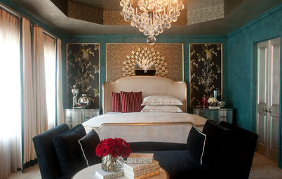
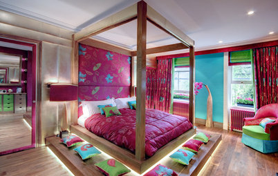
In this bedroom, the eggplant wall colour continues onto the ceiling – a choice that might feel claustrophobic or cozy, depending on the person in the space.
Browse through images of spaces drenched in eggplant hue
Browse through images of spaces drenched in eggplant hue
Keep an eye out for inspiration
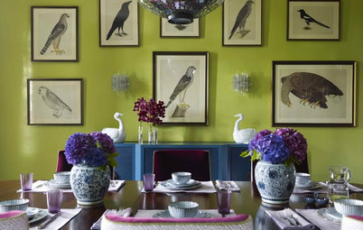
If you’re not ready to face a daunting wall of paint chips at the hardware store just yet, start narrowing down the colours you connect with by scrolling through images on Houzz or in the pages of a design magazine and noting which ones spark an emotional response.
If you’re not ready to face a daunting wall of paint chips at the hardware store just yet, start narrowing down the colours you connect with by scrolling through images on Houzz or in the pages of a design magazine and noting which ones spark an emotional response.
Consider the colours of clothing you tend to choose. Think about a vacation, a favourite memento, an art piece you own or an outdoor scene that’s stuck with you.
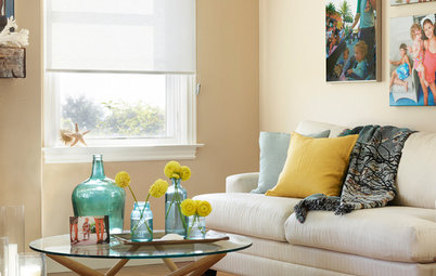
Look to nature, which is bursting with colours you can build off of at home. The rich greens and natural woods in this living room, for instance, are all the more soothing complemented by the live plants throughout the space.
Think about which colours your favourite things have in common. “If [the colours] ‘speak to you’ and you are drawn to them, then those colours and combinations will have even more meaning when you paint those same colours on your walls and in your other furnishings,” Eiseman says.
Think about which colours your favourite things have in common. “If [the colours] ‘speak to you’ and you are drawn to them, then those colours and combinations will have even more meaning when you paint those same colours on your walls and in your other furnishings,” Eiseman says.
Study the space
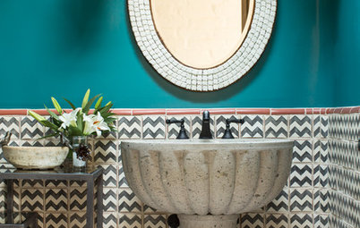
Even if you love a colour or a combination of colours, some hues work better in some spaces than others. Nashville, Tennessee-based interior designer Anna Forkum opted for a rich aqua in this vintage-inspired guest bathroom both for its retro vibe and for how it complemented the room’s existing details.
“Having the white wainscot halfway up and then all the angles, it seemed like it could handle a strong colour in a small space,” Forkum says.
Check out ways to use blue at home
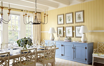
The structure of a room can affect how a colour will appear, so if you’re painting or using colour – such as the yellow tiles shown here – for an entire wall or more, test an area first.
A bright floor might make the paint show up a little warmer than the colour you love. High ceilings can make a colour feel more potent. Painting multiple walls can also create a shift in tone.
A bright floor might make the paint show up a little warmer than the colour you love. High ceilings can make a colour feel more potent. Painting multiple walls can also create a shift in tone.
“Go a shade lighter on the colour wheel, always, than the one that your eye is attracted to, because once you paint four walls that colour, the colours just intensify because it’s bouncing off all the walls,” Forkum says. “Try to stay with a dustier version of what you love.”
Once a feeling has been established for the space, translating that into a colour often depends on gut instinct.
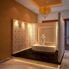
If there’s one colour in particular that feels right, like the warm brown of this powder room, breaking it up with different textures and forms – penny tile walls and a custom marble surround in this case – can make a statement without going overboard.
Learn how to work with brown colour
If there’s one colour in particular that feels right, like the warm brown of this powder room, breaking it up with different textures and forms – penny tile walls and a custom marble surround in this case – can make a statement without going overboard.
Learn how to work with brown colour
Ease into it
Colour can be intimidating. Forkum says many of her clients will start with a more neutral palette and add in more vibrant colour over time.
“A lot of times people would rather add the colour in a different way, whether it’s furniture or pillows or art,” she says.
In the kitchen shown here, the unexpected orange oven and the playful patterned floor are balanced by the otherwise low-key white walls and cabinets.
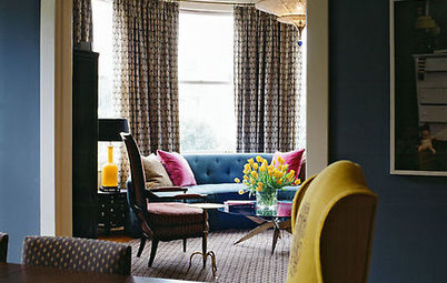
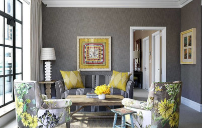
Another approach is to paint just one hallway or wall, as in this bold living room. If you opt for a lighter paint shade, Forkum says, you can always go darker later.
Forkum says her job as a designer often involves simply validating for clients that the colours that speak to them are the right fit for their homes. “A lot of it is just the fear, whether it’s being told by a peer that perhaps that’s not a good colour or an ugly colour,” she says. “For me, it’s really just the client trying to figure out what stimulates or relaxes or energises them, because everybody is so incredibly different.”
Forkum says her job as a designer often involves simply validating for clients that the colours that speak to them are the right fit for their homes. “A lot of it is just the fear, whether it’s being told by a peer that perhaps that’s not a good colour or an ugly colour,” she says. “For me, it’s really just the client trying to figure out what stimulates or relaxes or energises them, because everybody is so incredibly different.”
Make your own rules
Ultimately, if you like a colour or combination of colours and you feel like they fit in a space, incorporate them into your home. “In today’s world, decorating with colour is less about rigid rules and what goes together and more about guidelines and sources of inspiration,” Eiseman says.
If you’re still feeling nervous narrowing down the colours that channel your personal energy and go together, check out the colour palette guides on Houzz.
When you’re experimenting, try a smaller area to go bold with expressive colour. Even if a colour scheme doesn’t end up working for you in the way you thought it would, accent walls, throw pillows and artwork can usually be swapped out pretty easily. And remember that a little colour goes a long way.
“There is no right or wrong way to decorate,” Forkum says. “It’s your space, it’s your home, it’s what stimulates you at the end of the day or relaxes you when you come home. Your home and your surroundings are just really important, and I don’t think people realise how much it either stresses them out or doesn’t really make them happy. That’s the most fun thing at the end of a project – the ‘Wow, I had no idea!’”
“There is no right or wrong way to decorate,” Forkum says. “It’s your space, it’s your home, it’s what stimulates you at the end of the day or relaxes you when you come home. Your home and your surroundings are just really important, and I don’t think people realise how much it either stresses them out or doesn’t really make them happy. That’s the most fun thing at the end of a project – the ‘Wow, I had no idea!’”
Read more:
A Guide to Using Colour in Your Home
Tell us:
How did you find a colour that spoke to you? Share your stories and photos in the Comments below.
A Guide to Using Colour in Your Home
Tell us:
How did you find a colour that spoke to you? Share your stories and photos in the Comments below.
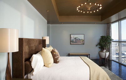
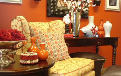
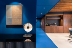
Colours mean different things to different people. Blue, as seen in this room’s accents, for instance, can come across as breezy and calming to some, cold to others. Eiseman suggests that homeowners design a space around the mood they want that space to convey to them.