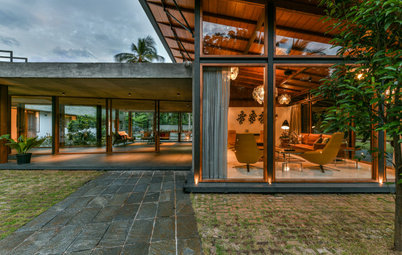
Before and After: 4 Kitchens With Built-In Beverage Stations
See how designers, including one found on Houzz, included designated drinks zones in these remodeled kitchens

Creating a special spot in your kitchen for grabbing a cold drink or a hot cup of coffee makes entertaining easier — and prevents traffic jams in your cooking zone. Thinking of incorporating one in your home? Get your fill of inspiration from these kitchen projects, which added attractive beverage stations outfitted with handy features like mini fridges and bar sinks.
After: Lindsey (who’s also a cousin of one of the homeowners) kept the existing wood-look porcelain flooring but removed a wall between the kitchen and living room to open up the space. Eliminating redundant sliding glass doors allowed her to wrap the cabinetry around the back left corner of the room, which increased storage space, improved workflow and created visual symmetry.
Now the sink is in the new peninsula, the range is on the back wall and the fridge is where the former coffee center was. There’s a new slim island with seating and storage too.
To create a casual beach look, Lindsey paired white cabinets, marble-look porcelain counters and white glazed ceramic backsplash tiles with a soft blue-gray island base and a light wood ceiling beam and stools.
Backsplash tile: Cloe in white, Bedrosians Tile & Stone; sconces: Lupe in Old Bronze, Hudson Valley Lighting; cabinets: Potter’s Mill door style with White Icing (cabinets) and Gale (island), Medallion Cabinetry
New to home remodeling? Learn the basics
The old coffee center got the heave-ho, but a new, better version took its place. A little nook that the previous homeowners had used as a TV cabinet became the coffee and beverage station, complete with a wine refrigerator. It’s home to other small appliances too, which helps keep the main countertops clear. The nook sits across from a casual dining area, making grabbing drinks a breeze.
Read more about this kitchen remodel
Read more about this kitchen remodel
“After” photos by Sarah Baker Photos
2. Cornered Center
Kitchen at a Glance
Who lives here: A pair of empty nesters
Location: Tulsa, Oklahoma
Size: 300 square feet (28 square meters)
Designer: Jennifer Strickler Design
Before: A load-bearing wall (pictured at right) separated this Oklahoma kitchen from the dining room, and a peninsula (in the foreground) cut it off from from the living room. An electric cooktop hogged island space, a built-in desk area to the left of the microwave never got used and counter space was limited. Dark distressed cabinets, dark and busy countertops and a travertine tile floor felt cold and uninviting to boot.
The style and setup simply weren’t working for the homeowners, who love to entertain, so they called in designer Jennifer Strickler for help.
After: After taking the kitchen down to the studs and removing the wall between the kitchen and dining room, Strickler reconfigured the appliance layout to create an efficient work triangle and added a central island, which offers plenty of counter space and seating.
Although the color scheme didn’t change dramatically, mixing warm maple cabinets (some with glass fronts) with new black cabinets and adding a white marble backsplash, polished marble-look quartz countertops and new red oak flooring gave the new kitchen a lighter, softer, more up-to-date look. Strickler leaned into the fact that the back wall isn’t symmetrical, adding an eye-catching reeded front on the paneled fridge.
Backsplash: Daphne White marble, Daltile; black cabinet paint: Onyx by Benjamin Moore; wall and ceiling paint, Pale Oak by Benjamin Moore
Shop for beer and wine refrigerators
Around the corner, Strickler added two pantry cabinets with 12-inch-deep shelves. In the corner of that nook she installed a coffee and beverage station in place of the rarely used desk. Its backsplash continues the marble elongated hexagonal tile used elsewhere in the room and its countertops are the same marble-look quartz.
A two-zone wine and beverage fridge keeps drinks cold, an upper glass-front cabinet stores glasses and three drawers hold entertaining supplies.
Read more about this kitchen remodel
A two-zone wine and beverage fridge keeps drinks cold, an upper glass-front cabinet stores glasses and three drawers hold entertaining supplies.
Read more about this kitchen remodel
“After” photos by Andrea Rugg Photography
3. Grab and Go
Kitchen at a Glance
Who lives here: A couple, their two teenage kids and two dogs
Location: Minneapolis
Size: 215 square feet (20 square meters)
Designer: Kate Roos Design
Builder: Mitch Tuthill of City of Lakes Builders
Before: The owners of this 1903 Minneapolis house had a list of complaints about their kitchen, seen here from the dining room. Among them: They couldn’t open their dishwasher and oven at the same time, the peninsula (which had a range at the end) protruded into the room, and the wood cabinets and floors were showing their age. But perhaps the biggest problem was that the layout was inefficient and awkward, creating a traffic path into the kitchen from the dining room that went right through the work zone.
The couple hired designer Kate Roos and builder Mitch Tuthill to simplify the layout, add storage and upgrade the look.
After: Roos and the remodeling team removed walls and a back staircase and absorbed part of an unused back entry, breakfast area and bathroom to add 64 square feet to the former 151-square-foot kitchen. That gave them plenty of room to create a U-shaped layout with a central island topped by walnut butcher block — a real beauty that also created an efficient work triangle and improved traffic paths.
Sunlight streaming in from a new casement window, higher ceilings and creamy light greige cabinets, molding and ceiling beams (Natural Cream by Benjamin Moore) give the room a light and open look.
Backsplash: Expo collection in Prima White, Ceramic Tileworks; wall paint: Rockport Gray, Benjamin Moore
Shop for kitchen and dining furniture
In the former kitchen, the refrigerator used to sit just inside the entrance from the dining room in an angled bank of cabinets. Roos relocated the fridge and created a wet bar and beverage station in its place, carrying over the finishes from the rest of the kitchen.
Creating a deep panel cased opening to the dining room and recessing the beverage station helped ease flow into the room, simplify the wall and make the station look intentional.
Read more about this kitchen remodel
Creating a deep panel cased opening to the dining room and recessing the beverage station helped ease flow into the room, simplify the wall and make the station look intentional.
Read more about this kitchen remodel
“After” photos by Moris Moreno
4. Doubled Down
Kitchen at a Glance
Who lives here: A couple
Location: Bellevue, Washington
Size: 215 square feet (20 square meters)
Designer: Ellen Weiss Design
Before: This U-shaped Washington kitchen had cosmetic challenges, including worn wood cabinets, vinyl flooring, old white appliances and dated finishes. It was also cut off from the dining room, which was through the door on the left, and a breakfast area that was on the other side of a peninsula to the left of the big window.
Its owners found designer Ellen Weiss on Houzz and hired her to create a more attractive, easy-flowing and entertaining-friendly space.
After: Weiss added a structural beam so she could take down walls and open up the kitchen to the dining room and breakfast area. This photo was taken from the same angle as the previous shot, believe it or not.
Now traffic can flow easily between the kitchen and dining room and out to the patio, which is much better for entertaining. The new L-shaped layout with an island designed with entertaining in mind also eased circulation patterns and added storage. And light and views of greenery coming in through the sliding doors now fill the entire open space.
In contrast to the old kitchen’s basic, dated finishes, the new kitchen’s stainless steel appliances, white quartz countertops and two-tone cabinets — with wood-look laminate doors and aqua-colored satin paint — look contemporary and fresh. In a stroke of luck, beneath the old vinyl flooring Weiss and the owners discovered the original oak boards, which they refinished.
Cabinets: Modena Grano horizontal laminate door and Matisse door in Fjord paint, Bellmont Cabinet; wall, ceiling and trim paint: White Heron, Benjamin Moore; backsplash tiles: Sacramento Decor in Snow, 6 by 6 inches, TileBar
This kitchen has two separate beverage areas. The pantry at the rear right of the photo has a hidden coffee station and an adjacent cubby wine rack. And on the interior side of the island (but not directly opposite the sink) are a single-zone beverage cooler and single-zone wine cooler. This design keeps the fridges out of the line of sight when you enter the room yet easily within reach of the hosts and their guests.
Read more about this kitchen remodel
More on Houzz
Read more kitchen stories
Browse kitchen photos
Hire a kitchen remodeler
Shop for kitchen products
Read more about this kitchen remodel
More on Houzz
Read more kitchen stories
Browse kitchen photos
Hire a kitchen remodeler
Shop for kitchen products

1. Bevy of Upgrades
Kitchen at a Glance
Who lives here: A couple with a baby on the way and their dog
Location: Boynton Beach, Florida
Size: 240 square feet (22 square meters)
Designer: Erin Lindsey of Lindross Remodeling
Builder: Antonio Quelhas of Portal Construction Group
Before: The lighting is dim in this “before” snapshot of a 1980s Florida kitchen, but even during the daytime its wood cabinets made it feel too dark and heavy for its sunny coastal locale. And despite being fairly spacious, it had a dishwasher, microwave and peninsula range uncomfortably squeezed together in one corner. A pantry area and coffee station (at the left of this photo) felt too far away from the action.
The homeowners tapped designer Erin Lindsey and builder Antonio Quelhas to give the dated kitchen a new layout and a breezy coastal style.
Find a kitchen designer on Houzz