8 Hot Colour Combinations for Bedrooms
Go spicy, mild or a mix of both with warm and cozy hues in your bedroom

Waking up to pleasant, sunny weather in an equally pleasant, sunny room (preferably while on vacation) is a pretty spectacular way to start the day. The colours in our environment affect our mood, and warm shades of red, orange and yellow make us feel happy and energised.
However, if you live in a predominantly hot climate, you might want to scale back on the warm hues and use them as accents against cooler neutrals. If you live someplace that tends to be cloudy, cool and rainy for long periods at a time, then layering several warm hues in different shades, tints and tones will give you a cozy sanctuary that you might never want to leave.
Keep reading for eight warm and inviting bedrooms, along with sample colour and material palettes inspired by each room.
Sample palette
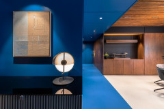
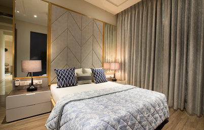
This is a great palette for a bedroom in a warmer climate. Shades of grey and dark wood cool down the spicy red.
This is a great palette for a bedroom in a warmer climate. Shades of grey and dark wood cool down the spicy red.
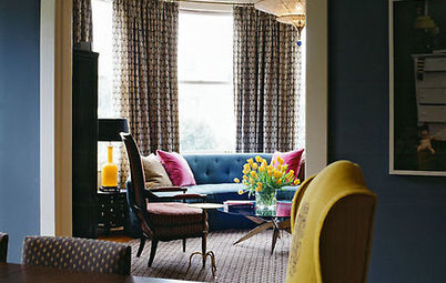
2. Hot pink made cool
Pink, grey and black make an unexpected and striking combination here. This super-stylish bedroom would be perfect in a warmer climate, as the cool neutrals help chill out the pinks.
Here’s how you can use pink without making it seem too OTT
Pink, grey and black make an unexpected and striking combination here. This super-stylish bedroom would be perfect in a warmer climate, as the cool neutrals help chill out the pinks.
Here’s how you can use pink without making it seem too OTT
Sample palette
This is no little-girl pink. Make it even more grown up and sophisticated by pairing it with cool greys and black.
This is no little-girl pink. Make it even more grown up and sophisticated by pairing it with cool greys and black.
Sample palette
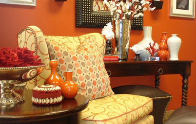
A bright orange hue looks great with dark wood and neutral taupes.
A bright orange hue looks great with dark wood and neutral taupes.
4. Paint isn’t just for walls
You don’t always have to go with wood-tone or neutral furniture. The orange shelf at the foot of the bed brightens up this otherwise neutral room. With orange, yellow and green (analogous colours on the colour wheel) in the bedding, the effect is colourful yet balanced.
You don’t always have to go with wood-tone or neutral furniture. The orange shelf at the foot of the bed brightens up this otherwise neutral room. With orange, yellow and green (analogous colours on the colour wheel) in the bedding, the effect is colourful yet balanced.
Sample palette
Liven up your bedroom by giving your furniture a fresh coat of paint.
Liven up your bedroom by giving your furniture a fresh coat of paint.
5. Red the right way
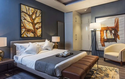
When I bought my first fixer-upper many years ago, I took great care to pick the perfect shade of red to paint all four walls in my dining room. I ended up hating it. The room didn’t get much natural light and I found it dark and anxiety inducing – not a very comfortable space to be in. This is an example of how to do intense red in a bedroom, with just a chunk of it above the bed. Add a few other red elements, but keep the rest of the palette light.
See how red and grey dominate the theme of this Mumbai home
Sample palette
Bold red is best used sparingly if you want your bedroom to be a relaxed and restful place. Pair it with less intense colours so it doesn’t compete for attention and make you feel nervous.
Bold red is best used sparingly if you want your bedroom to be a relaxed and restful place. Pair it with less intense colours so it doesn’t compete for attention and make you feel nervous.
6. Smart use of colour
I’m a fan of bold hues, but I realise that not everyone wants the colour in their home to pack such a wallop. This sunny bedroom illustrates my favourite colour advice: Use bold colours for items that are easy and inexpensive to change or replace. Here, the walls are painted a mellow shade of yellow and the bolder colours are reserved for the bedding. Imagine this same bedroom with all white linens – it would have a completely different feel.
I’m a fan of bold hues, but I realise that not everyone wants the colour in their home to pack such a wallop. This sunny bedroom illustrates my favourite colour advice: Use bold colours for items that are easy and inexpensive to change or replace. Here, the walls are painted a mellow shade of yellow and the bolder colours are reserved for the bedding. Imagine this same bedroom with all white linens – it would have a completely different feel.
Sample palette
This happy palette would be great for a bedroom located in a cooler climate or where cloudy, overcast days outnumber sunny ones.
This happy palette would be great for a bedroom located in a cooler climate or where cloudy, overcast days outnumber sunny ones.
7. Berry elegant
My bad pun aside, this bedroom illustrates a nice trick when using a deep, dark hue: Limit it to the ceiling and one wall. It looks less jarring than painting one wall only, and it helps bring the ceiling down, creating a cozy and intimate effect that’s perfect for the bedroom.
Check out these 7 charming bedroom colour palettes
Sample palette
This palette features a couple of deep, dark colours, but they have some grey in them, which tones them down.
This palette features a couple of deep, dark colours, but they have some grey in them, which tones them down.
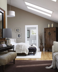
8. Rustic with red
This handsome, modern, rustic bedroom is all about that fabulous chandelier. Intense colour on the walls would detract from it, so I think it’s smart to keep the room fairly neutral with just a punch of colour in the bedding.
This handsome, modern, rustic bedroom is all about that fabulous chandelier. Intense colour on the walls would detract from it, so I think it’s smart to keep the room fairly neutral with just a punch of colour in the bedding.
Sample palette
Instead of the expected beige, pair red with neutrals that have more grey and less yellow in them, such as flax or taupe.
Read more:
Houzz Quiz: What Colour Should You Paint Your Bedroom Walls?
Tell us:
What colour have you used in your bedroom? Share images and your tips in the Comments below.
Instead of the expected beige, pair red with neutrals that have more grey and less yellow in them, such as flax or taupe.
Read more:
Houzz Quiz: What Colour Should You Paint Your Bedroom Walls?
Tell us:
What colour have you used in your bedroom? Share images and your tips in the Comments below.
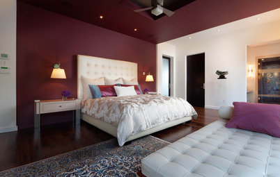
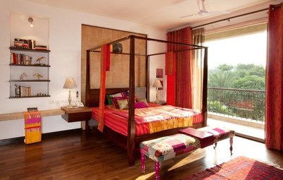
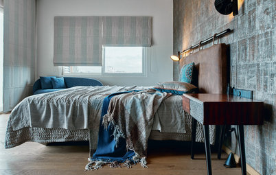
Red, being a warm colour, is often paired with other warm hues. Shake it up by mixing it with cool neutrals instead, as demonstrated in this modern and elegant bedroom. It’s a great way to inject red into your bedroom without making the space too energetic.