11 Pastel Interiors That Will Put a Smile on Your Face
Versatile, eye-catching and undeniably irresistible, these soft shades make spaces shine ... but gently

There’s something about pastels – happy, positive, reminiscent of halcyon childhood days, they bring that joy and tranquility to a room. Pastels belong to the softer, less chromatic colour family. They soothe and relax; their light and subtle tones give the room freshness and character. To show you how spaces can be transformed with these hues, we bring you a large gallery of cheery, fun examples. Take a look.
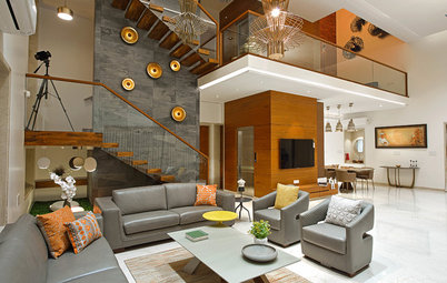
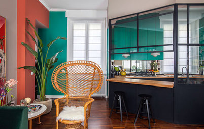
1. A large room enhanced with a rainbow of pastels – the mango-yellow wall in the living room, the multi-hued dining chairs and the sky-blue steps on the left. The light wooden flooring and the white walls help lift these smile-inducing colours, making the entire space seem like a candy-coloured universe.
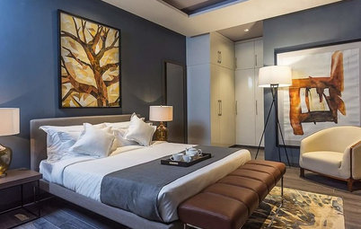
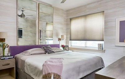
2. A blushing peach bedroom with jet-black highlights. The use of bold black lines on the headboard, pendant lights and mirror frames punctuate the pretty pastel scheme and prevent it from becoming too flat.
3. A wall in a dreamy shade of purple (very close to the 2018 Pantone Colour of the Year) is offset by the mint-green and pink cushions. The sectionals and carpet in beige work with the white ceiling to create a wonderful muted shell for the zany colours to stand out. The glittering wall and ceiling lights inject a sparkle to the vibrant setting.
4. Why should large spaces be the only rooms that benefit from friendly pastels – these cheery tints can be used to enliven corners too. Baby blue, soft pink and pale yellow together create a soothing layered effect that’s so visually pleasing. The sunlight streaming in further brightens up the three hues. What fun it would be to be curled up here with a book, all day long.
Here’s how you can style dead corners
Here’s how you can style dead corners
5. I love the colour blocking and washed-out look on the walls – the three shades of green complement each other and contrast beautifully with the blue panel behind. The blue-green canvas, reminiscent of nature, ensures a cool, relaxed and refreshing interior.
6. Almost seems like a painting, doesn’t it? A hearty dose of crisp white has been added to this room so that it doesn’t seem too pastel-heavy with the turquoise and green linen.
7. This little girl’s bedroom is like a fairytale haven, replete with all colours imaginable – a bold, vivid geometric wallpaper, pops of candy pink in the chair, pouffe and stuffed toy, avocado and mint green on the cushions and blinds, and baby-blue blankets, with a calming feather pendant hung above.
Check out these three girls’ bedrooms in three colour palettes
Check out these three girls’ bedrooms in three colour palettes
8. This delicious shade of orange makes me think of ice-cream and candies … and the mint green centre table adds to the sumptuous quality of the room. The tall, arched doors in white provide a nice interlude to the dominating wall tone.
9. Stairway to heaven? I certainly think so. The risers are painted in such a cheerful range of colours, it seems the perfect description for what they do to our mood. The white walls around help create the perfect muted cocoon within which happy colours reside.
10. The soft pink and grey create a surprisingly sweet and delicate synthesis – the grey backdrop in this luxe living space provides a neutral base to bring out the beautiful, creative colour combination.
11. Light peach and orange pastel hues giving a nice layering effect to this living room, sporting neutral colours in the furnishings. The raw wood logs fit in well inside this subtle, cosy scheme and the entire room reverberates with a restful, calming vibe.
Read more:
Colour Me Bold: 11 Ways to Energise Your Home
Tell us:
Have you used pastel hues in your interiors? Share images and your thoughts in the Comments section below.
Read more:
Colour Me Bold: 11 Ways to Energise Your Home
Tell us:
Have you used pastel hues in your interiors? Share images and your thoughts in the Comments section below.