Decorating Guides
Ultra Violet: The Pantone 2018 Colour of the Year
How does it work in an interior? Tips from the pros all around the world

Yesterday, the Pantone Color Institute announced their 2018 colour of the year: PANTONE 18-3838, Ultra Violet – “a dramatically provocative and thoughtful purple shade,” as the official press release has it.
Will it be popular?
Pros say that the colour can be divisive. As Australian pro Jacquelene Symond, architectural colour consultant at The Colour Agency, puts it, “violet is one of those colours that you either like or dislike – there’s no in-between.”
Pros highlight its great potential for interiors and, like the Patone Color Institute, point to its meaningful associations.
“The purple colour family has a complex and fascinating history,” says Australian pro Sonia Simpfendorfer, creative director of Nexus Designs. “It has baggage! From royalty and the suffragettes to the psychedelic, it has a powerful, patchouli-scented history. Ironically, a shrinking violet is probably not the personality of the ultra-violet adopter, but it is a surprisingly liveable colour.
Browse through images to see how this colour has been used in interiors
Stefan Nilsson, design and interior trend forecaster, Stockholm, Sweden, says, “I am surprised, and yet not surprised, to hear that ultra violet will become colour of the year. Violet, to me, stands for elegance and exclusivity.”
US pro Jennifer Ott weighed in as well. “Intriguing indeed. And while I can see this shade being a hit on fashion catwalks, I have a feeling it will get mixed reviews when it comes to decorating due to its intensity. Now let’s take a look at Ultra Violet’s potential in the home, because you might be surprised by just how great it can look.”
US pro Jennifer Ott weighed in as well. “Intriguing indeed. And while I can see this shade being a hit on fashion catwalks, I have a feeling it will get mixed reviews when it comes to decorating due to its intensity. Now let’s take a look at Ultra Violet’s potential in the home, because you might be surprised by just how great it can look.”
A colour for the brave
German pro Markus Altvater of The Inner House says, “Violet has been a trend for a couple of years now. However, I would not consider it a ‘mainstream true-love’ colour for German designers and homeowners.”
Interior designer Caterina Magliulo from Italy: “I don’t like violet-coloured walls – [I would] use it just for details or little objects in the rooms. I usually do not recommend it, as it’s not a relaxing or calming colour and people easily get tired of it. It’s hard to make Italians love violet, and in some cases they even superstitiously associate it with bad luck.”
Russian designer Taras Bezrukov, of TS Design: “Ultra Violet is not a colour that could become ‘the new beige’ or ‘the new grey’ for Russian audiences. It’s a colour of boldness and decisiveness, for self-assured people who are confident in their choices. On the other hand, beige is the colour for neutral solutions for warm and cozy interiors. I’d say it’s for people who have a different mindset.”
What colours match Ultra Violet best?
Russian interior designer Daria Kharitonova, from Russia: “Ultra Violet suggests loads of great palettes. Turquoise, green, crimson – these go wonderfully with it. It also goes perfectly with a dusty orange and accentuates the warmth of brass.”
Here are 12 tried & tested paint colours
Russian interior designer Daria Kharitonova, from Russia: “Ultra Violet suggests loads of great palettes. Turquoise, green, crimson – these go wonderfully with it. It also goes perfectly with a dusty orange and accentuates the warmth of brass.”
Here are 12 tried & tested paint colours
German Pro Markus Altvater, of The Inner House: “Violet delivers great value when combined with other bright colours such as red, orange or pink. For a more modern colour scheme, combine violet with neutral tones like white and grey. If you would like to achieve an extravagant statement look, you can pair [it] with a dark olive-green. Pastel tones like pale rose and light blue create a very harmonious look in combination with violet.”
Set a goal
A dominant colour which can even overpower other elements in an outfit or an interior, Ultra Violet demands decent company and well-thought-out coordination.
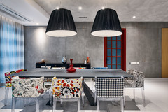
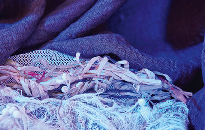
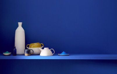
Stas Samkovich, designer and co-founder of TS Design: “Magazines are bound to push the fact that Ultra Violet goes well with shades of green. Which is true. For me, though, it only works under one condition – the hues should be rich and solid. Ultra Violet goes very nicely with “dirty” shades [as in the photo above], which should appeal to the those looking for a brutalist interior.”
A dominant colour which can even overpower other elements in an outfit or an interior, Ultra Violet demands decent company and well-thought-out coordination.
Stas Samkovich, designer and co-founder of TS Design: “Magazines are bound to push the fact that Ultra Violet goes well with shades of green. Which is true. For me, though, it only works under one condition – the hues should be rich and solid. Ultra Violet goes very nicely with “dirty” shades [as in the photo above], which should appeal to the those looking for a brutalist interior.”
Singapore Pro Nikki Hunt from Design Intervention recommends a base palette of soft violet, cool blues and gentle greys: “These colours provide a cooling backdrop to which we have added stronger hues and patterns to give depth to the design.”
The importance of lighting
Ultra Violet looks different. depending on whether it is exposed to natural or artificial lighting. It all depends on the warmth of the bulbs you’re using – artificial lighting can be warm, neutral or cold. For private interiors warmer lighting – labeled 2700K (a measure of colour temperature) – is usually used, and these lights add a notable yellow tinge.
Take a look at these 10 ways to get the lighting right at home
Notice the carpet fringe in this photo: This is a great way to add a micro dose of Ultra Violet to an interior.
Where would it work in the home?
Bolder colours are usually recommended where people don’t spend as much of their time, including hallways, entry halls and guest bathrooms.
Australian pro Sonia Simpfendorfer of Nexus Designs: “It would work in any room, but I’d use it in light-filled living spaces in preference to bedrooms or kitchens or bathrooms. Inky blues and denim shades can be very calming and luxurious in a bedroom, but ultra violet and purple have an intensity that might work against sleep – they’re too dramatic.”
Sophie Mouton-Brisse, Houzz France contributor and author of DécoBox: Colors and Well-Being, agrees, but sees a role for it in bedrooms as well. “Purple has a very specific energy, which likewise explains why it is often tied to the worlds of spiritual and sacred things. It is an extremely soothing colour, nearly hypnotic in certain very dark shades. It is calming and soporific. I therefore naturally advise using dark shades in adult bedrooms and lilac – a lighter but very effective shade – in children’s rooms.
Australian pro Jacquelene Symond, architectural colour consultant at The Colour Agency: “Violet is a strong colour, so unless you’re completely obsessed with it, it’s best used in small doses as an accent colour so that it doesn’t overwhelm a space.”
Read more:
Colour Me Bold: 11 Ways to Energise Your Home
Tell us:
Love it or hate it? Have you ever used Utlra Violet in own projects? Share your opinion in the Comments.
Read more:
Colour Me Bold: 11 Ways to Energise Your Home
Tell us:
Love it or hate it? Have you ever used Utlra Violet in own projects? Share your opinion in the Comments.
Ultra Violet is by no means is Pantone’s first purple shade – just last summer, they launched Love Symbol #2 (Pantone PQ7448C) as a tribute to pop-star Prince. As this year’s press release points out, purple is also linked to David Bowie and Jimi Hendrix, who famously turned to shades of violet to express their individuality.
Besides creativity, Pantone notes that Ultra Violet is associated with mindfulness practices, and has an overall mystical and spiritual quality that offers a refuge from today’s over-stimulated world.
So will it be the next “it” colour? And where and how can you use it in your home? Houzz pros weigh in.