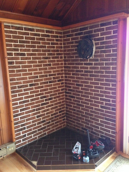
Really ugly brick walled corner
grammajay
10 years ago
Featured Answer
Sort by:Oldest
Comments (9)

dclostboy
10 years ago PRO
PROAnnalise Bubes
10 years agoRelated Discussions
Experts opinion required - which plan is better? Pictures attached.
Comments (42)Since the lot you describe is smaller than my open living area, I would suggest looking at some of the "shotgun" house plans around New Orleans,LA. I think you can build up and back and get an interesting home with a loft for space. It can be done, A porch with an entry to a narrow hall at the back might work best for you. Will you plan a courtyard (closed)? or what? What part of the country are you in? What are your local codes?...See MoreRenovating a tiny( 4'2"x7'8") outdated bathroom.
Comments (53)I am so happy to see you here! I will have to go back and see if i can retrieve my posts... thought I would make them into a little book for my daughter, with photos. Quick run-down on the bathroom (not travels, no time) - The kitchen has a rather elegant sliding door with beveled glass panels. Painted white, since this was the original colour. GD's new bathroom has the doors I had picked earlier; i thought of polishing them but decided sprayed automobile paint (on a resin primer) would wear better. Especially since it is such a small bathroom, and she is so splashy. I have this finish in my kitchen and it has lasted 15 years now. A tad chipped here and there, but only needs a wipe down once a week. Same finish for the balcony doors, also split like the bathroom. We have a new wardrobe, a study table with built-in shelves, and a small chest of drawers for her odds and ends. I want to re-tile the tiny balcony, more as a little statement. Currently we are looking at Portuguese tiles, though I did think a mosaic with a funky cat might be nice. Let me see the costing. The room will be painted a neutral adobe, with bright white woodwork and an off-white ceiling. This means she can go wild with cushions and covers. Other changes in the flat; We have changed the glass in the master bedroom and living room from small cramped panes to a single pane for each section with a 1" bevel all round. Doubles the cost of the glass, but looks so elegant! The air-conditioning is being re-located. The compressors were all mounted in the bedroom and living room balconies, which looked terrible and meant the balconies (very narrow, only 30" deep) couldn't be used for anything. Not even plants. So they are being moved so that the compressors can be mounted at the rear of the building. two down, one to go. Now we can put in some nice plants, fishtail palms etc. The kitchen counter on one side came out intact and will be reused elsewhere. I am planning overhead storage, cupboards, and a draining cupboard for plates and glasses. Right now there is no dish washer, though a place is earmarked, but for now I will put in a cupboard with steel racks for cups, glasses and plates, all hidden behind pressed glass doors. This is all in the planning stage.... Pictures in a little while, they are mostly on my ipad and don't transfer well to the mac. They come without numbers... so I have to rename the or something. Somebody tell me how to do this!...See MoreDesign Input for new 3 BHK flat India
Comments (21)For the living room, the focus should be the balcony area. So flipping the couch to face the wall and not the dining table will help. Kind of like this pic. Even if you already have the sectional that is in the diagram, you should be able to flip it. In fact a sectional would probably work better than the couch in this pic. I also really don't like the style of this pic, but it showed what I meant, For the girls' room: No matter which bedroom you choose, you should maximize floor space so that they have the biggest play space possible in their room (as they get older you can add desks for school work and such). To get this space, I would give them bunk beds. This configuration gives them an open feel and more storage, essential for girls. You posted two different kitchen designs. This makes it hard to give you advice. I agree with other posts that your sink should be away from the wall. This allows you to have stuff to the left of you (drying dishes in my house), while you wash vegetables on the right of the sink. You need the same space on both sides of the stove, also. At least 24 inches on both sides is good. 36 is better, though. The first design has a nice little countertop space that adds a place for your daughters a space to sit a watch/ talk to you while you're in the kitchen. When they added this to the first design, you lost cabinets on the other wall. This is bad, as the space is already storage limited. Try making the rounded countertop bump out into the living space more. If you play with the shape, you could make it work without losing the cabinets on the other side. It doesn't have to be rectangular or a perfect circle. You can see how this one isn't confined to the floor plan of the kitchen. I think this is what you would need to do to make it the most functional....See MoreWhich exterior would u choose
Comments (25)I love the exterior lights in the first photograph! It's a great and simple way to give your property a major makeover with something so settle. We talk about exterior lights and 8 other ways to easily add curb appeal to your property in our latest blog post. Read about it here: http://goodfellasconstruction.net/blog/9-ways-to-add-instant-curb-appeal...See More
indianpatti
10 years ago
Darzy
10 years ago
motownmom
10 years ago PRO
PRODesert Tile & Grout Care
10 years agodclostboy
10 years ago PRO
PROArticle
10 years ago


groveraxle