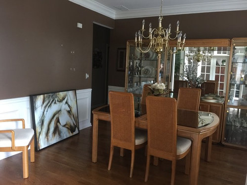
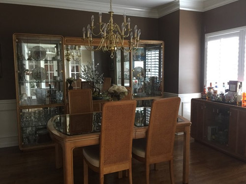
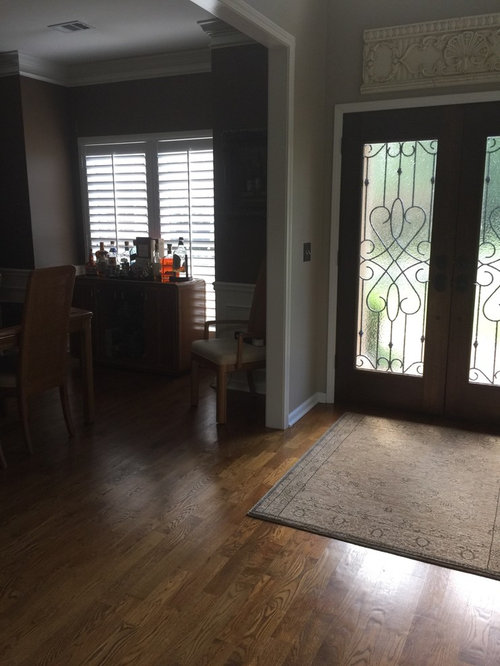
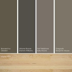
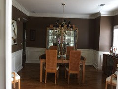
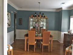
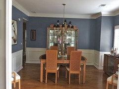
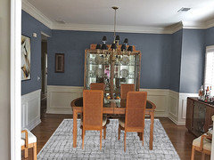
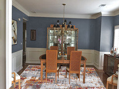
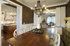
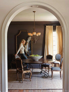
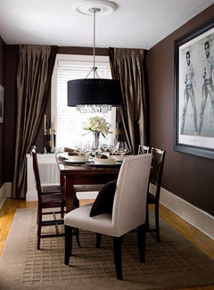
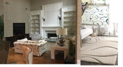
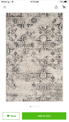
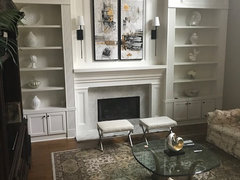
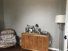
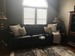
didi888

Stay Brown or not

5 years ago
I am in the midst of updating my rooms and so I replaced a tuscan fruit bowl work of art with this new more transitional art. I was preparing the walls, ready to paint and couldn’t believe I had no more of the brown paint from years ago! Now the question is do I match it or change it.
The adjoining foyer and family room are Balanced Beige. I am looking at Chandeliers and may go with an antique gold/silver quatrefoil( not sure how you spell it). My daughters say stay Brown my friend says worldly gray. I can see both.

Comments (52)

  • 5 years ago
    Thank you RL. I am not thin skinned so I am fine with you calling the furniture outdated. It is! I bought it in 1984. With so much going on in my life it was low on the list to get rid of and replace. The problem with changing out the old stuff is now I have to find room for the storage it holds. I have the same problems in the living room, but I have been slowly moving in that direction. I am hoping to make this room more appealing until I am ready to replace.
    I liked the brown years ago when it was red, now I need to make the space work better and it may force me to be ready. LOL!
  • 5 years ago
    last modified: 5 years ago

    Since you can't do a total makeover right now, just match the brown. If you bought the set in the 80's I assume your daughters are out and on their own. Would they or your grands appreciate some of your knick knacks? Maybe it is time to start paring down and letting others in your family have the items they want. No since waiting until you're gone! You want to upgrade and change the room, but the "stuff" is holding you back. Invite the girls over for a pack-it-up party and let them take home boxes of the things via which they can fondly remember their home life.

  • Related Discussions

    Help!

    Q

    Comments (35)
    I like this tile as well. Very sleek and mod looking. I would consider running it vertically instead of the picture horizontal pattern. It might give the illusion of more height in the shower surround. The color is great. If you are worried about it being "too much," you could always see if they have the same tile in a different shade and mix the two or doing one wall in a contrasting (lighter) color. I personally like it as long as you have good lighting.
    ...See More

    Sofas and curtains Ideas

    Q

    Comments (13)
    Rowe Furniture has very clean line sofas that I think would be an appropriate scale for this room. LOVE the red feature wall. You do need to bring the red into the room but knowing how you want the room to feel can help determine a color palette. If you want the room to have energy and "pop", try a split-complementary or triadic color scheme. If you want it to be more relaxed and harmonious, I would suggest an analogous color scheme.
    ...See More

    Bedroom Nightstand

    Q

    Comments (34)
    If you go with the black bed, get a rustic and in fall colors night stand, that will stand up with the orange. Or that particular bedspread has golds, browns, and other shades... you might even be able to work a fall leaf red (sort of a dark faded red) in there for the night stand and the red into more accent pillows that would take the Halloween away. Stay away from bright limey greens and not picking up more of the orange or black and you could make it work well.
    ...See More

    Living room decoration help!!

    Q

    Comments (4)
    Try to find some material for your draperies that have some pink or coral as well as the brown and another color. See pic below. Then repeat those colors in your accessories. Many patterns nowadays have white like the ones below.. Get a white coffee table and end tables. Then you could you could get a couple of lamps in a dark coral or pink. Gold and glass tables are really in right now. Don't forget to get some pillows for your couch. Make a couple out of the drapery fabric and then add some solids ones in the pink or coral color. I would get a dark colored tray for your coffee table to help tie in the dark sofa. Then add accessories in those color plus a third color that would come from your drapes. Or if you go with the gold table add gold to your accessories. Have fun! Blessings!
    ...See More
  • 5 years ago
    last modified: 5 years ago

    Start with a clean palette: paint over the brown with two coats of white primer. Then pick a blue or green that has enough character to complement the furniture. There are contemporary(ish) streamlined chandeliers that will go better with your 1980's furniture than the traditional chandelier that's there now.

    Something swirly or with glass panels in a gold finish, a bit like this:

    Zara 5-Light Chandelier, White Gold · More Info
    Here's a blue with character:


    Royal York Residence · More Info

  • 5 years ago
    last modified: 5 years ago

    They say 'the lighter the main brown, use more black'- but you are, or not including black? "Black, brown and off-white / This classic arrangement will never be out of fashion. It is sharp and elegant and very masculine too. It works well in both brightly lit rooms and darker ones, but will benefit from additional lighting and a well placed mirror if in a darker environment."

    353 Mascoma Street Strathmore Heights Victoria Australia · More Info

    Création - Ecurie Mathy · More Info

  • 5 years ago

    .....Your furniture is in such wonderful condition....And what you buy now is so much glued sawdust or veneer,-- I would paint the room Swiss Coffee Eggshell by PPG, (sold at alot of Walmart stores) where it is brown now, and not look back. It is a paint and primer in one, and with your brown base, even if you wanted to experiment with a faux finish on one wall using this beautiful cream color... or some gold leaf stencils or do a special feature on one wall only, it could be fun. If your furniture is in such nice condition, there is alot of things paint can do in a room to freshen up the area.

    Dawn thanked redsilver
  • 5 years ago
    Paint! But not the same brown or gray. Your dining room chairs screamed “I need to be in a pink room!” They also want a round, white table btw
    Dawn thanked mandy_moo_pants
  • 5 years ago
    I love your son in my set... it is screaming for fun..maybe a teal or somet h ing tropical. thank pink is also fun. the cane/wicker back says to me. sit down have some drinks. have fun. the brown not so much.
    Dawn thanked Kerry Blossom
  • 5 years ago

    I agree with the others who have said it's time to retire the brown. I'd look towards the spa like muted bluish-greens to pair with your honey woods. Here's a mock up using Window Pane by Sherwin Williams. Rainwashed might be another option. I like that your print reflects some of the honey tones of your furnishings. For a light fixture consider a tailored fabric drum.


    Dawn thanked Manon Floreat
  • 5 years ago
    I think your furniture and chandelier are nice. Maybe consider painting the upper walls a light colour. The mirrored back of the cabinet is reflecting a different style. Have you considered removing the mirror and changing that to the same wood as the cabinet (or wallpapering/painting)?
  • 5 years ago

    This might depend on the furnishings you end up putting in here (eg, do you think you'll be going darker? about the same tone, etc?) as much as the style you end up with... The foyer paint goes well with the floors, and you could just continue that. Or if you think you'll be getting darker furniture down the road, nothing to stop you from doing a dramatic red again... or peacock blue. I like the brown too, but would personally use white furniture to set it off.

    No need to replace everything in one go, unless you like the look of staged rooms where everything self-consciously goes with everything else... you can do it bit by bit for a lovely acquired over time look, but figuring out the eventual gestalt of the room will help you pick a colour now.

  • 5 years ago
    last modified: 5 years ago

    Not quite, but posting if you love the cognac / chocolate colors / 31" long / are backs textured, cane was it?

    Nine Light Pendant, Sku: E21310-10Bz · More Info


    [://https://www.houzz.com/products/nine-light-pendant-sku-e21310-10bz-prvw-vr~18026611[(https://www.houzz.com/products/nine-light-pendant-sku-e21310-10bz-prvw-vr~18026611)

    Forest Satellite Pendant, Vermillion · More Info

  • PRO
    5 years ago
    last modified: 5 years ago

    try Urbane Bronze. I don't like the light blue gray, or gray/green w/your furniture. At all.

    you have very warm, brown wood furniture and flooring. use a warmer wall color.

    Dawn thanked Beth H. :
  • 5 years ago
    last modified: 5 years ago

    What feeling, vibe do you want now? Pleasantly natural like horses are... It'd be nice to see an example of chandelier....more rooms of house even... more info... :)

  • 5 years ago

    I browsed, and saw graceful lines like art of horse's neck....

    Visual Comfort S5040AI Choros 1 Light Chandelier in Aged Iron with Hand-Rubbed A · More Info
    https://www.houzz.com/products/choros-chandelier-aged-iron-prvw-vr~61683667

  • 5 years ago
    Dont do gray. Several years ago, gray became the new neutral & now it is the new boring. Dont overthink your paint color. Paint is somewhat cheap. (It can seem expensive until we compare it to eating out, a daily starbucks, a new shirt, etc) Wing it. If you dont like it, paint it something else. Its just one room. For most people, painting isnt a huge job, its getting yourself started on painting that can be such a huge job.
    Dawn thanked S. W.
  • PRO
    5 years ago

    could parts of it be moved to other rooms?

    Dawn thanked RL Relocation LLC
  • 5 years ago

    And I really see no reason to add a chandelier with glimmer and crystal, when as you say, that is what your mirrored cabinets give the room. But to do so would be a change and who doesn't like a crystal chandelier of any kind, but you do have that with your beautiful mirrored shelving...

  • 5 years ago
    Thank you all for so many great ideas, photos and mock ups! They are all amazing and appreciated! I have not made a decision yet because all that has been said has much merit! The one decision I can make is that only a warm color will work. My home is warm with the only gray a warm gray in the main floor bath and an upstairs bedroom. I love teal and some greens but they wear on me so I can only take as accent pieces in small doses. I agree that refreshing is best done in small doses but I am giving much thought to breaking down the set and possibly repurposing for now in another room. Doing so will allow me to bring the back wall into scale with the room. It has always been too big! I think bringing bronze or black into the chandelier will bring some continuity with my swirly Spanish foyer chandelier and the black frame of the new art. I do like the drama of a dark wall for the Dining Room, but I also like the fresh air of a medium color. I like the Urban Bronze, Wood Grain Brown(BMoore) and in the other direction Amazing Gray/greige or even Relaxing Khaki, Universal Khaki, or Macadamia (SW). Loved the softness of Windowpane and Rainwashed, but I don’t think I can live with them too long. It’s not easy loving color but knowing your long term tolerance!
    Here are some shots of adjoining spaces some of you so nicely requested!
  • PRO
    5 years ago

    Wow, beautiful home. I can see now where the iron chandelier would tie to the railing, and I can also see the color palette much better. I do still think a lighter color would be better. and even removing the two outer pieces to the china hutch would do wonders for the space.

    since the table is a bit heavy, I think this fixture could lend itself to the space well.

    https://www.lowes.com/pd/Cascadia-Meritage-28-in-6-Light-Charred-wood-black-iron-Rustic-Tinted-Glass-Shaded-Chandelier/50182477

    Dawn thanked RL Relocation LLC
  • 5 years ago

    Since you want to keep the jewel-box drama in the room without being 'colourful', maybe look at deep warm greens. Something like SW Roycroft Bronze Green.

  • PRO
    5 years ago
    Thanks for the additional input of the pix showing adjoining areas. That helps make decisions easier so it will all make sense.

    When designing a room I like to make some kind of positive, lasting statement that adds a surprising, unexpected, yet enduring element so guests remember having been there and talk about it in a positive way. A monochromatic room can be somewhat boring unless something happens.

    First the table and chairs die and sink into the quicksand of the brown floor. They need to be anchored and contrast on a rug about the soft color of the ceiling in the photograph. If the ceiling is painted the same as the crown molding, note that a ceiling will always look darker than on Zay vertical surface. Same color but darker, softer tone.

    NOW, for the kicker. Let’s bring the outside in by introducing a strong, brighter green....for the new semigloss table finish. My suggestion would be (have courage, you’ll like it) a Granny Smith Apple Green. White place ware chargers on seagrass placemats with darker plates and silver flatware would be terrific.

    I like the idea of a simple pendant drum shade in a light material (fabric, glass, fiberglass or? )but shallow vertically. It could even have narrow silver bands at top and bottom of shade.

    To further bring the green outside in, use a BIG round mirror (to echo the round pendant light) opposite the window. You’ll instantly have a larger, more interesting, room with a dash of color. Your guests will want to linger longer!
  • PRO
    5 years ago
    Just in case you might be puzzled about the shade of green for the table, try chips of these Ben Moore colors in your dining room. They will look different there than in the store:
    Iguana green, **
    baby fern, *
    Malachy green, *
    Killala Green, **
    Sweet Pea, **
    Tropical Seaweed, *

    Rooms with contrast really are more interesting. If you like brown and have an ongoing love affair with it, you probably like chocolate, also. I do. Be even more daring....go dark Chocolate for the walls above the wainscot/dado. Try Benjamin Moore Wenge( almost black), very chic and desperately romantic.
  • 5 years ago
    Thank you RL!
    Thank you again for the mock up of the space! I so agree that I need to remove the curio cabinets and am working toward making room for them in the living for the moment. Sometimes, I am ready to just let it go! It’s just such a beautiful maple and In trying to be practical I am getting tired of making it work.
    I love the chandelier, it is warm, different and pulls it all together nicely. I will keep that on my radar.
  • 5 years ago
    McWhorter, Thank you for your ideas! They are indeed dramatic and I wish I was so brave as to paint the table green! It certainly would change things up quite a bit! I can more easily go for dark chocolate on the walls though! Love desperately romantic! I can see how the lack of contrast beneath the chairs screams for an area rug and I like the idea of an ivory/cream to match the ceiling. It seems that, in general, I’ve always been attracted to dramatic neutrals, lots of black, cream, and tan. I have been tempted by strong color, but I think my high stress job and wiring needs a calm warm environment. That design looks like so much fun!!
  • 5 years ago
    Ever Debi, thank you. I love that chandelier as well! Not overstated, kind of classic and easy to live with. I am not sure what vibe I am trying to achieve. I purchased the horse art because I just loved it and it was neutral. I think I am trying to update away from the feeling of my Family Room which is still some what traditional and Old World. I have a beautiful black background Belgian tapestry (w fruit topiaries flanking)over the fireplace and a tall elegant TV cabinet in a carved two tone distressed wood. I am getting rid of the topiaries and thinking tall vases with swirly sticks to update and changing the lamps to something more updated as well. I got rid of my wood coffee table and have not replaced it. So you see the transition is evolving. I want warm and open no fuss.
  • PRO
    5 years ago

    Doing something that's out of your comfort zone can be scary and I suggest taking baby steps to ease into it. You say that greens can wear on you. All greens? Or ones that you have had in the past? If your mind is not quite closed to the idea yet, try buying a length or two of a couple of green fabrics and throw one over the top of the table and view it at different times of the day and then take a look the following day and see how you feel about it. Then do the same with the next fabric. If you still feel a non-green vibe try other colors...ivory or white. Or black. Vibrant colors can also be introduced in small ways... A bowl as a centerpiece,

  • 5 years ago
    I really like the drama of black or ivory furniture and I will keep it in mind. I have taken your suggestion and started with the easy fixes first and purchased an ivory rug. Next will be the light fixture. Currently I am trying to update the family room and until I have a clear direction I've been doing things in small doses. Thank you!
  • 5 years ago

    http://www.true-design-house.com/blog/2016/3/14/bestpaint-with-honey-oak IF you decided to paint, than, you might benefit from the samples they feature in this article. None of them are bad, and your furniture is not exactly honey oak, but it is a brown and therefore, you might see a color here that peaks your interest...

    Dawn thanked redsilver
  • 5 years ago

    Thank you so much! I have been looking at colors but made no decision except to patch with the existing color for now. I really enjoyed this article! The color Night Train was one that actually initially sparked my attention but I can see how they can all look perfect. Thanks Again.

  • 5 years ago

    Try sampling colors in the middle of a big piece of white poster board (one for each color.) Leave a big border of white around the color so your current wall color doesn't distort the reading you get. Move the boards around the room day and night, sunny and rainy, lights on and off to see what you can expect from a full room of it.

  • 5 years ago
    Update: Finally reduced the size of the breakfront moving the center unit to another room. Now Just need a chandelier, centerpiece and still considering painting the room SW Urbane Bronze. Any suggestions very much appreciated!
  • PRO
    5 years ago

    I like your last chandelier. Here are some rendering to show you different dark colors.

    Urban bronze


    Dawn thanked Celery. Visualization, Rendering images
  • PRO
  • 5 years ago
    I like the brown, just some inspiration
    Dawn thanked Irene Morresey
  • 5 years ago
    Celerygirl: Wow! Those are amazing! How did you do that? I love the rooms you created also with the beautiful rugs, especially the first one! The blues are very complementary to the orange hues in the maple furniture. I am attracted to the deep muted blues/teals. These photos do make the brown in this room less exciting. Thank you. Where did you find the first rug?
  • 5 years ago
    Irene: Thank you for the photos of dark brown inspiration rooms! I love the drama and romantic vibe of dark sultry spaces especially in the Dining Room. This room has been brown for many years and has worked with the rest of my neutral home. Needing a change, I have been considering options to go darker, lighter or blue/greens. Ive been proceeding cautiously because sometimes what you love doesn't really work. Lol!
  • PRO
    Dawn thanked Celery. Visualization, Rendering images
  • PRO
  • 5 years ago
    Grasscloth might be another option
  • 5 years ago
    Also BM Templeton Grey is lovely
  • 5 years ago
    Celerygirl: Thank you! Those are striking rug designs!
  • 4 years ago

    I cannot believe it has been over a year since we started this conversation!! I had been working on a few other projects that I can also use some direction on. :-) I think this chandelier will work and for paint color it looks like i am still torn but the brown I agree has to go. Can't tell you how many times I have been ready to get SW Urbane bronze, SW Worldly gray, SW Relaxed khaki or BM Slate Teal! Crazy!! All of the photos here are some of the other projects i have been trying to tackle. I moved the dining room center buffet to the Living Room which is directly across from the Dining room. I switched the sofa that was in the Living room to the Family room because when I changed the fireplace the leather did not work any longer. This year I did find a lamp for the changed Family Room and accessories for the shelves. Working on Abstract painting now for that room. Also looking for a larger carpet for the Living Room (with the leather sofa). I will need to relocate my Egyptian Prints but don't know where. It is amazing how when you change one thing it brings on a cascade of changes to follow!!!!

  • 4 years ago
    last modified: 4 years ago


    Pallara Chandelier in Peruvian Gold a brushed finish.

  • 4 years ago
    last modified: 4 years ago


    I will also be repainting and making changes to this room when I can figure out where to relocate some of these pieces. With limited space every change/relocation is tricky.

  • 4 years ago

    Hi.... when I see that you have 4 art pieces, I wonder if one [the square is largest?] could go over the fireplace... let me think: mantel is white and piece next to it is dark- it might?

    Dawn thanked everdebz
  • 4 years ago

    Here is the latest update for the Dining Room. It still needs an area rug and something on the back walls I think. Thank you to you all for all the amazing suggestions!

  • PRO
    4 years ago

    wow, AWESOME that you came back.

    I think now the dinging room only needs the rug. Less is more and it looks really good now, i actually like the dark walls.


    For your prints, would you be willing to change the frames they are in? I think they could stay in that room if if they had new frames. I think the floor lamp in that room could go and it looks pretty good. Maybe a larger area rug that can fit under the sofa.


    In your living room, I REALLY think you should consider getting rid of the large entertainment center and going with something scaled down a bit so the fireplace can shine, and the other furniture doesnt look so small. I would also get rid of the os end tables the are too big for the couches. I think you need a bit of texture in the rug. Though I dont think too much pattern would be good as we want everyone to notice the fireplace.

    Could you just remove the top of the entertainment center? or is it one piece?


    Dawn thanked RL Relocation LLC
  • 4 years ago
    last modified: 4 years ago

    Thank you so much RL.!

    We have been able to finally address all these changes recently and I was happy to share what we all collaborated on. Sorry it took so long I've been known to be a bit slow. LOL! However these past two weeks I finally found the right picture for above the fireplace. It is a split canvas by Uttermost called Lifestyle Scenes and it features only neutrals so nothing fights it. I will post a photo.

    Last night we decided that we will bite the bullet and remove the hutch from the TV cabinet. It definitely overwhelms the space. I am concerned about the size and color of the console 84"W x 24"D x 30'H but I'm ready to see if it's even possible it might work. Thank you for the sneak preview!!! I can see I will need to think about what to put above on that big blank space. :-) Not too much just a little.

    The plan is to change the sofas in the Family Room to a neutral oatmeal color down the road. Due to the expense I am tackling the smaller projects first. When I do the end table will go for sure. :-) I agree it's got to go. Thank you for seeing that.

    Now, the Living Room, has just been painted to SW Mega Greige and the prints removed. They will not go back. I can't see them working as much as I love them so they are going to be relocated. They are from the Franklin Mint so I did not think to remove the frames, but it is an interesting idea! However balancing that empty space may be a challenge. I have all my relocated items in this room. The sofa was in the Family Room but after we did the fireplace wall that no longer worked so we swapped out the furniture. The item we are using as a bar was the center buffet for the oversized Dining Room cabinet. The remaining piece was from the prior entertainment center which may get moved but not now because it works. I love the rugs you attached!!! I was thinking that the beautiful cream one could work nicely in the brown sofa room too. I just ordered a rug for the dining room a few hours ago! I will attach the photos.

    Thank you again for all your input and sharing this journey with me. It really really helps!!!!!! :-)


  • 4 years ago

    everdebz: I wish the size of those frames would have made it possible to consider, but they are small being approximately 20 x 30. I needed art to fill aa 52" h x 47"W space that thankfully I stumbled upon just 10 days ago! Thank you for the thought! :-)

  • PRO
    4 years ago

    I love uttermost! those look smashing! I also like the rug for the dining room.

    Im not too worried about the color of the tv console because you need some contrast in the space. But if nothing else its a good place to start.

    I LOVE those prints, and I think no matter (if possible) reframing them would be a splended way to refresh them and make them more user-friendly. They should be seen especially with there story.. Im also thinking the floor lamp you have in there isnt working, and possible what about getting new lamp shades for those lamps?