A Minimalist Apartment Uses Graphics & Colour in a Unique Way
Come to this remodelled apartment for the bar in the kitchen. Stay for the fun graphic patterns and minimalist decor

Apartments in old buildings present both a challenge and myriad possibilities for an architect. When renovating the interior of this apartment on central and historic Sretenka Street in Moscow, architects Sergey Kolchin and Nadezhda Torshina faced numerous technical difficulties, but they also had the opportunity to play around with graphic elements and modern reinterpretations of its classic past.
When the owners first bought it, the apartment looked as if it hadn’t been renovated once since the building was built in 1913. The layout also lacked logic: In Soviet times, huge apartments in what were known as revenue houses – a style of construction originating in the 18th and 19th centuries that involved large multi-dwelling homes where units were designed to be rental properties – were subdivided arbitrarily.
The ceiling posed another problem. It is made of wood-fibre reinforced cement composite slabs, which had to be strength-tested before any changes could be made to the layout.
Wondering which ceiling is better – gypsum or POP?
The ceiling posed another problem. It is made of wood-fibre reinforced cement composite slabs, which had to be strength-tested before any changes could be made to the layout.
Wondering which ceiling is better – gypsum or POP?
The apartment consists of an entrance (1), living-dining room (2), hallway (3), kitchen (4), bathroom (5), children’s bedroom (6), master bedroom (7), walk-in closet (8) and master bathroom (9).
Luckily, the ceiling turned out to be in acceptable condition. Having secured permission for the renovation, the architects got started on dramatically changing the space.
The owners had come to them with one special request: a large home bar where they could entertain guests. The designs the architects came up with centred on that one element. The resulting layout has two entrances, one of which goes directly into the kitchen and its bar. Guests enter through here, and the owners also use this staircase to bring up groceries.
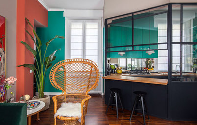
Another of the owners’ priorities was to spruce up the interior brickwork.
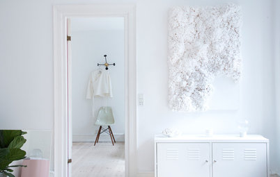
Tall cabinets with yellow and green fronts stand against one of the walls in the main entrance hallway. Yellow is a recurring motif in the apartment.
Tall cabinets with yellow and green fronts stand against one of the walls in the main entrance hallway. Yellow is a recurring motif in the apartment.
The designers were able to partially preserve the century-old parquet. They first removed the original finish and then took the floorboards to their workshop for cleaning.
Unfortunately, many of the boards had to be thrown away, as they were broken or too worn to be salvaged. There were only enough pieces left for the living-dining room, so the architects had to find something similar for the other spaces. But the old boards can easily be distinguished since 100-year-old parquet has a distinctive texture and feels like stone to the touch.
Unfortunately, many of the boards had to be thrown away, as they were broken or too worn to be salvaged. There were only enough pieces left for the living-dining room, so the architects had to find something similar for the other spaces. But the old boards can easily be distinguished since 100-year-old parquet has a distinctive texture and feels like stone to the touch.
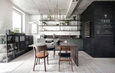
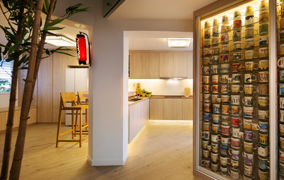
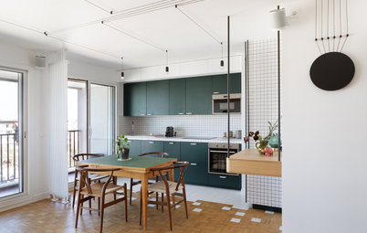
The owners and their guests mix up and enjoy cocktails in the kitchen, which is set up as a comfortable square room with lots of storage space and an island with a bar counter.
Here’s how to have an ergonomic kitchen design
Here’s how to have an ergonomic kitchen design
The kitchen is made up of modified Ikea cabinets, with a custom-made countertop and bar. The door goes to the utility stairs.
The kitchen walls are finished in inexpensive tiles. Some are cut to look as if they had cracked over time, creating a playful visual effect. A line of pendant lights illuminates the bar counter.
An interesting detail: The clients had the foresight to insist that all the light fixtures in the apartment have the same lightbulb bases. Now the owners can use the same kind of bulb to replace any of the lights in the house.
An interesting detail: The clients had the foresight to insist that all the light fixtures in the apartment have the same lightbulb bases. Now the owners can use the same kind of bulb to replace any of the lights in the house.
A hallway leads from the kitchen to the living-dining room. A glass door with a transom that reaches to the ceiling separates the spaces while letting in as much light as possible.
The bathroom in this hallway is decorated with a patterned mosaic with yellow crosses – an inexpensive way to liven up this space.
Learn how to mix and match tile styles
Learn how to mix and match tile styles
Vertical stripes embellish the storage unit in the living-dining room, where six Thonet 14 chairs surround the table. For fun, a different part of each chair was painted.
There are no superfluous items in this room. The minimalist look was both aesthetic and practical: One of the owners is allergic to dust.
There are no superfluous items in this room. The minimalist look was both aesthetic and practical: One of the owners is allergic to dust.
Problem and solution
The master bedroom and the children’s bedroom are on opposite sides of the living-dining space, but their entrance doors aren’t aligned.
The yellow paint on one door is offset to indicate where the door should have been to be directly opposite its counterpart.
The conventionally painted second door is an antique dating to the 19th century. It was bought in St. Petersburg, Russia.
The design of the master bedroom was particularly influenced by the owner’s taste. She wanted classical motifs –hence the traditional moulding on the wall. The architects suggested adding geometric shapes as a humorous touch.
A walk-in closet, which is separated from the bedroom by a metal-framed glass partition, leads to the en suite bathroom. The bathroom’s key accent is its finish – the original brick is painted blue, while the wet areas are covered in neutral-coloured porcelain stoneware.
Read more:
Houzz Tour: A Snug, Warm Haven Within Mumbai’s World One Tower
Tell us:
What did you like the most about this home? Tell us in the Comments below.
Read more:
Houzz Tour: A Snug, Warm Haven Within Mumbai’s World One Tower
Tell us:
What did you like the most about this home? Tell us in the Comments below.

Apartment at a Glance
Who lives here: A family with two kids
Location: Moscow
Size: 98 square metres (1,055 square feet); 2 bedrooms; 2 bathrooms
Architects: Sergey Kolchin and Nadezhda Torshina of Le Atelier