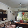
Don't balk at the ugliness!
Kalden Sakya
10 years ago

Featured Answer
Sort by:Oldest
Comments (7)

Kalden Sakya
10 years agoRelated Discussions
WHAT IS THE MISSING IN THIS INTERIOR.?
Comments (23)The first thing that bothered me in this room is the distance between the seating area and the tv area and that both seem unrelated in everything. I think what you should do to pull everything together is the following: 1) Move that sectional away from the back wall and the curtains (placing couches against the wall is outdated now) and closer to the tv 2) Center the coffee table under the chandelier with the sectional placed 16 inches away from it 3) get a console table of a height equal to the sectional's back 4) place few decorative items, stacks of books, candles, lamp shades whatever you find suitable on the console 5) someone mentioned that the two accent chairs are not in scale with the room. I totally agree with that. You need wider chairs with a low back 6) A rug is a must and two are better than one, layered of course !! But make sure the biggest one is big enough to place all the seating on it. 7) pillows and a throw will add warmth and texture too......See MoreUrgent..
Comments (3)I don't think its ugly, there is just too much stuff, clear out everything then you will see the potential of this space.....See MoreDesign Input for new 3 BHK flat India
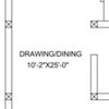
Comments (21)For the living room, the focus should be the balcony area. So flipping the couch to face the wall and not the dining table will help. Kind of like this pic. Even if you already have the sectional that is in the diagram, you should be able to flip it. In fact a sectional would probably work better than the couch in this pic. I also really don't like the style of this pic, but it showed what I meant, For the girls' room: No matter which bedroom you choose, you should maximize floor space so that they have the biggest play space possible in their room (as they get older you can add desks for school work and such). To get this space, I would give them bunk beds. This configuration gives them an open feel and more storage, essential for girls. You posted two different kitchen designs. This makes it hard to give you advice. I agree with other posts that your sink should be away from the wall. This allows you to have stuff to the left of you (drying dishes in my house), while you wash vegetables on the right of the sink. You need the same space on both sides of the stove, also. At least 24 inches on both sides is good. 36 is better, though. The first design has a nice little countertop space that adds a place for your daughters a space to sit a watch/ talk to you while you're in the kitchen. When they added this to the first design, you lost cabinets on the other wall. This is bad, as the space is already storage limited. Try making the rounded countertop bump out into the living space more. If you play with the shape, you could make it work without losing the cabinets on the other side. It doesn't have to be rectangular or a perfect circle. You can see how this one isn't confined to the floor plan of the kitchen. I think this is what you would need to do to make it the most functional....See MoreHow do I beautify this Shutter
Comments (5)Hi Gurdip. How often do you use the parking spaces and do you use both? Is the parking to the left of the camera shot or directly in front of the shutters? I might think about a mural painted on a board on wheels that could be moved ( if you only use one space) as I assume it would be difficult to paint direct. I also think your sofas are lovely! I would be inclined to make a separate seating arrangement with a table with them as they look as if they're trying to disguise the shutters at the moment. The area is lovely but might benefit from some large shrubs and trees....See MoreKalden Sakya
10 years ago
Angel 18432
10 years agoKalden Sakya
10 years ago
mousemaker
10 years ago
Elizabeth Bishop
10 years ago


inkwitch