momlife2

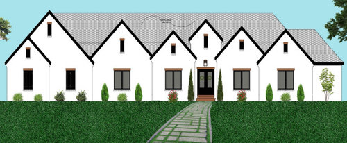
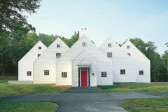
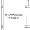
front elevation...do you like it?

Alaina Grace
3 years ago

Please give me your honest opinion on our front elevation. We still have time to change it, so if you have suggestions please let me know! This is just a flat rendering obviously. It won’t be flat, it goes in and out in depth with each peak.

like it okay
don’t like it
love it
hate it

Comments (36)

  • vinmarks
    3 years ago

    Sorry. I voted hate it. You need to simplify the roofline. Do you like it?

  • JJ
    3 years ago

    Good gravy. Looks like a norweigan fishing village!

  • Related Discussions

    Exterior (Building Front) wall decoration ideas - Contemporary looks.

    Q

    Comments (10)
    Dear Shubham, I am Ravi Prakash and I am an Architect. A lot of information required to start with any project, like context, site, plot, budget, timelines and many more. It appears like you had not consult a professional assistance for your hotel as I don't see anything interesting in this building. Its just a boring box with lot of windows. Hotels are hospitality buildings where service and comfort to the guests/visitors is the prime concern. It has to be a beautiful building with rich, healthy and welcoming environment. If you are looking for professional consultancy you can share your contact here or can contact me. Thanks and Regards Ar. Ravi Prakash 8882204074 ar.ravi2013@gmail.com
    ...See More

    need help regarding design of front glass panel.like pattern etc

    Q

    Comments (5)
    The point is not with the glass,but with the curtains .i think that,curtains with that much height will not look nice ,so I m asking for alternative.I also thought of doing hatching on the glass,but curtains will kinda spoil the look.
    ...See More

    front elevation

    Q

    Comments (8)
    it certainly did not sound like one. this is a professional platform. best to give a call to discuss if you would like us take this design forward
    ...See More

    Front elivation query

    Q

    Comments (4)
    hi neetuji, You can use some rustic dark tile contrast with light colour paint or tile and for some uniqueness you can add designer tiles or designer laser cutting for modern look you can add glass railing for more queries please contact us. thank you.
    ...See More
  • strategery
    3 years ago

    Troll, ignore.

  • Alaina Grace
    Original Author
    3 years ago

    Vinmarks: I have stared at it so long I don’t even know anymore 😂 I thought about taking one of the peaks out like this...do you like it better?

  • Rho Dodendron
    3 years ago

    The 1st elevation looks to ME like either a nursing home or a duplex due to the windows lining up and being so alike.

  • PRO
    Mark Bischak, Architect
    3 years ago

    How did you get to this point? Have the other three elevations received the same attention? Does the designer feel rain (and snow) will be properly handled by the roof? If the shuttered windows are fake windows, scrap everything and start over with a local architect.

  • Alaina Grace
    Original Author
    3 years ago

    The shutters windows are faux windows to the garage. We are using a local architect.

  • worthy
    3 years ago
    last modified: 3 years ago

    Or borrow from the originator:


    arch. Hugh Newell Jacobsen

    (And get the best roofers you can!)

  • PRO
    Norwood Architects
    3 years ago

    Unfortunately, that's way too many gables. There needs to be some variety of roof shapes, some variety of materials and even some 3 dimensional renderings so you can see what your finished product will look like.

  • HU-187528210
    3 years ago

    I like your second option. Better than the first. But I’m thinking domed roof lines would work better. Not even for all. This has a lot of potential...

  • kculbers
    3 years ago

    I agree that your roofline is a bit busy. It looks like an apartment complex.

  • res2architect
    3 years ago
    last modified: 3 years ago

    This is a simple exercise in peak control and reduction but we need the floor or roof plan to understand what's going on. You won't know for sure without a 3D model.

    Sadly Hugh died 2 weeks ago at the age of 91. He was a good man and master of Monopoly House Modernism.

  • 3onthetree
    3 years ago

    Sorry in advance for the TL:DR! I'm not a fan of the competing gables, even if they are in different planes. Looking at your floorplan thread, I think there could (maybe should?) be changes that will be expressed with the elevations.

    My 1st thought is all the gables are being forced to mimic each other with the same ingredients in size and placement of vents and windows, but the gables themselves have different heights and widths. Alternatively, the detailing can set an heirarchy of gables, where they can use the same "language" of each other, without being an exact clone.

    My 2nd thought is the grouping of 3 entry gables, where the massing is not equal on either side of the entry, but symmetry is being forced around the raised door gable. Maybe modeling a version that brings out the wall in plan and having a larger porch to reduce the 3 down to 1 (or 2?) dominant gable.

    My 3rd thought is the garage massing. Switching the bumpout might balance the front elevation better. Also, I see the stair to the garage attic (and also not sure how you don't hit your head at the top of stairs if you consider the upstairs 1/2 story ceiling height). Unless that is strictly garage storage, this attic would be unopportunized. I am used to seeing this as a bonus room, so the stair location does not fit in that description. It would need to be brought into the living space. If so it can be combined with moving the tornado room out of the closet and making it accessible unto itself (what if your bedroom is locked?). This lengthens the elevation.

    My 4th thought is how the main house hip roof interacts with the garage appendage. Marked in ORANGE is the main roof. Not convinced about the elevations showing this. The garage massing needs to consider how it's roof mates to it.


    Other items I sketched while I was on the plan, might as well talk about them this thread:

    - Switching the spots for PowderRm and Laundry.

    - Opening up the Mud Room at the Master hallway. Moving the Master door so when it is open it stays within the vestibule ceiling.

    - The rear elevation may not be equivalent to the front. Maybe some effort spent modeling some porch clerestories into the Great Room.

    - The secret ladder: great idea, maybe maximize closet space by shifting it though. I assume everything about it would have to be left undone and unspoken about until Certificate of Occupancy, as the space won't meet light+ventilation+egress and the attic will be hot, so you need supply + return.

    Items I didn't sketch but thought about:

    - Entering the house and arriving at the Dining table: I am unsure if there is island seating, and whether the ceiling beams will be vaulted as rafters or as a truss bottom chord. But it seems the table might want to be centered between these ceiling beams, which is front and center and leaves little room for the couch area.

    - The Master Bath I feel can be done better. The toilet room door needs to be always shut (window there), so you enter the Bath and feel a long, walled, skinny space, with a sunlit shower breaking up the middle. Is this enough to make a proportionate room? Moving the garage stair might allow opening up the Bath exterior wall to more windows and re-arrangement.

    - Kitchen has a round-about way to get to the outdoor kitchen.

    - Master is "dark" and access to the porch is unopportunized. Maybe addressing a porch dormer can allow a scheme to open up the Master to light+access.


    Alaina Grace thanked 3onthetree
  • worthy
    3 years ago

    Every gable a whole new and confusing world to decipher.

  • PRO
    Virgil Carter Fine Art
    3 years ago

    Some of the geometry of the late architect Hugh Newell Jacobsen:


  • just_janni
    3 years ago

    While interesting to look at - that water management / snow management would be a nightmare and regardless of how well "designed" that is - I can't believe it was executed well enough to not encourage water intrusion and other roofing issues.

  • Alaina Grace
    Original Author
    3 years ago

    Thank you all for the helpful comments. I’m overwhelmed at where to go from here. I do not wish to change anything inside since we live the way we have it now. I’ve been playing around with ideas myself this morning and came up with a couple of different ones that might be better from the roof leaking point that a few of you brought up.

    Do you think one of these would be better? Less busy?

  • Alaina Grace
    Original Author
    3 years ago

    Also this was the look I really love...how can I get that look without the problems you guys mentioned?

  • User
    3 years ago
    last modified: 3 years ago

    I never comment on these sorts of threads, because I lack the necessary training to offer anything constructive. I'm not an architect, I'm not an interior designer, and until about 10 years ago I lived in blissful ignorance of most of the basic "design" rules

    The more I learn, the more I realize I don't know squat.

    I also have no desire to ever be hurtful to someone. I don't see the value in being mean to strangers on the internet. I don't enjoy that at all.

    Knowing all of that, and that I'm truly not trying to be hurtful - that is not a good look, at all. It's bad enough that I felt compelled to come out of lurker-dom to say for the love of all that is holy, please don't spend six figures of your hard earned cash on something that looks like that!! It looks like it has a terminal case of roof acne - there's just bumps coming out all over the place!

    I like what PPF did approximately a million times better.

    Good luck!!!

  • Hanna S
    3 years ago
    last modified: 3 years ago

    Architecture takes a lot of knowledge and a very experienced eye. I think looking at some things that are wrong on other houses might help you decide what you like. McMansion Hell humorously highlights some house elevations and what is wrong with them architecturally speaking. Old House Guy, a specialized blog on old houses, does a lot of work illustrating what is wrong and right in terms of home exteriors. Just reading these has really opened my eyes to more classical proportions.

    I would pay someone and also read up on classical rules of design and aesthetics. I like to do a lot of things myself but this is too much to DIY. IMO.


    This is a quick and funny explanation of masses and entries. (It is from a blog on McMansions though I think that that term is really overused now to apply to all larger contemporary residential construction)


    https://mcmansionhell.com/post/148605513816/mcmansions-101-what-makes-a-mcmansion-bad

  • cpartist
    3 years ago

    If you don't have a design background, why are you trying to design the house?

  • res2architect
    3 years ago
    last modified: 3 years ago

    Front facing gables are very powerful features; they don't need to be outlined with black rake trim and black window frames.

    Unfortunately, Jacobsen's book is out of print (almost a thousand dollars online).


  • David Cary
    3 years ago

    Oops - voted "don't like it" before I saw "hate it"/

  • PRO
    Old House Guy LLC
    3 years ago

    This looks like a mini-mall. Don't do this unless you hate your neighbors.

  • PRO
    Mark Bischak, Architect
    3 years ago
    last modified: 3 years ago

    I hate the front elevation. I did not say I hated the design, I said I hate the drawing. See RES2's comments from earlier today in this thread: https://www.houzz.com/discussions/6091758/traditional-modern-elevations#n=33

  • rrah
    3 years ago

    OP--the two alternative options you posted are just as busy. The first is not as bad, but the enormous gable over the front door is too much.

    The cleanest and most attractive option is the one posted by PPF.

  • 3onthetree
    3 years ago

    I do not wish to change anything inside since we live the way we have it now.

    I do not know what this means, is this a yet-to-be-built house or existing? The floor plan is expressed in the elevations. That affects massing, fenestration, and balance.

  • PRO
    Mark Bischak, Architect
    3 years ago

    I think "live" was suppose to be "love".

  • 3onthetree
    3 years ago

    Ahhh, ok. OP though you are not in love with the elevation, so it's reasonable to think minor changes to the plan that helps the elevation will not cause you to un-love the floor plan as it exists.

  • shead
    3 years ago

    I love the Broadmore house you posted above (from Instagram) but I’m not sold on the exterior of it. I feel like her style is very trendy and there’s no way my family could handle all the white and black she has in her house. It looks great on camera, though.


    Definitely simplify those gables!

  • PRO
    Virgil Carter Fine Art
    3 years ago

    More geometry from the late architect Hugh Newell Jacobsen:


  • Hemlock
    3 years ago

    Lovely

  • Little Bug
    3 years ago

    I don’t like to be hurtful either, but I can’t imagine a house really built like this. It’s a house of the 7 gables.

  • res2architect
    3 years ago
    last modified: 3 years ago

    It would be really funny if these were the only gables on the house.... like a Hollywood set.