sarah_ebel

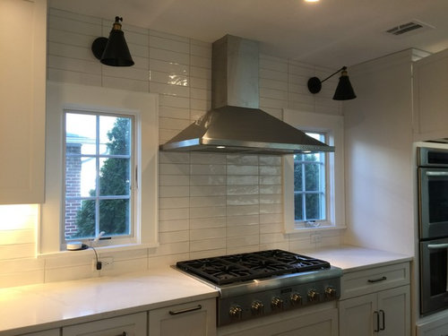
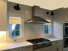
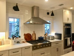
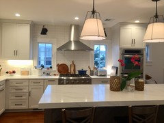
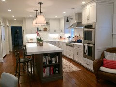
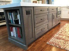
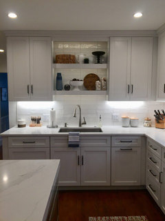
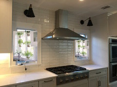
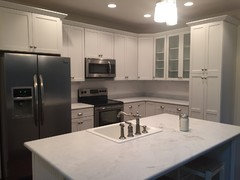
Not happy with how my backsplash turned out...:(

sarah_ebel
6 years ago

We just completed a huge kitchen renovation that I spent months researching and designing. I looked at endless inspiration photos and decided on doing elongated subway tiles but in a stacked formation as opposed to the usual brick layout. My tile guy then convinced me to use a light grey grout as opposed to white so the tiles would stand out. I thought it was going to look cool, contemporary and amazing but it honestly just looks kind of sterile and cold. I thought I could just live with it (some days I kind of like it) but it really bothers me. Sometimes I can't sleep because I feel like I screwed up my one shot at a dream kitchen (doesn't help that my husband let me choose everything, no question). Just wondering if I even dare think about ripping out the tiles and redoing or just learning to live with it. Anyone else regret a major design decision in the kitchen?? What did you do? Here's a photo, I'd love some feedback. Thank you!!!


Comments (86)

  • artsyphartsy_home_maker
    6 years ago
    last modified: 6 years ago

    Thank you lisa_a !!! ,

    P.S. your after colors look much better than before!

  • loves to decorate
    6 years ago
    You've had lots of input already and I don't have anything new to add, but for whatever it's worth, I think your kitchen is lovely- it just needs some finishing touches. As others have mentioned, I think the only reason your kitchen (as pictured) looks 'sterile' is because it's completely bare. I truly believe that adding some colour and organic textures will go a long way to warming things up. I would not rush into any further renovations with out at least trying out some accessories first, please don't do anything hasty. Good luck!
  • Related Discussions

    I think the rectangular mirror is looking out of place? Is it?

    Q

    Comments (9)
    Yes, I also think that the mirror is too high but I had an artwork earlier there which I removed recently. The entire thing is not centered above the sofa because it is below a light fixture which is at the centre of both (thanks to the builder). I think Christinero is right (her room is fabulous) and I could add another starburst mirror. It's just that I have to sit and make it as the other two are DIY.
    ...See More

    Kitchen backsplash - which tiles for a white Cottage/Farmhouse kitchen

    Q

    Comments (8)
    Hi Rasa, Nice to hear from you and I’m glad I was able to give you some inspiration for your kitchen tiles. I’ve included another image for you to look at that shows more of a farm house style kitchen with the coloured tiles. If you worried the coloured tiles might look too contemporary for your space, I would advise going for quite soft, muted colour tones to give you the same effect but in a more rustic style. You can see in the attached image how they have used a soft sheen, textured tile in neutral tones, with a subtle hint of colour to be in-keeping with that farmhouse feel. For your tile colours, you could pick up the off white tone of your cabinets with the grey in the granite, and a very soft hint of green or blue to add a little colour to achieve the same look for your kitchen. I have also added some paint swatches below you could use as reference for tile colours to help you visualise the combination. Off white: Greys: Blue or Green: Hopefully this answers your questions for you and I’d love to see some pictures when your project is finished. Good luck with the decorating. Paola Dulux Design Expert www.designer.duluxamazingspace.co.uk
    ...See More

    my kitchen .wud appreciate suggestion for backspash n tile

    Q

    Comments (20)
    Thnks a lot gor taking your time from aura interiors.i admired your work been a follower too....im waiting till my kitchen slab is fixed in black granite galaxy.... My idea right now something young and luxurious looking which black n metallic will give... Any suggestions regarding toughed glass for kitchen is it durable... Houzz has so much to offer...great help... Thnks again
    ...See More

    Hi, I need advice for the tiles to use for kitchen backsplash.

    Q

    Comments (5)
    You could go for tiles with design if they are simple ones. if you want plain, you can add some life in the country style with an exposed brick facade or subway tiles. for colours, it depends on how far out of your comfort zone you're willing to go. white is the safe choice, but you can go for blue, green, yellow, all pastel hues
    ...See More
  • lisa_a
    6 years ago

    It looks even better IRL. She and I stood in her kitchen after I was finished and said "it looks like a new kitchen!" That's good because it's going to be a very long time before my friend can afford to remodel her kitchen. The cabinets are horrible - one has a cracked side, one drawer fell apart (my DH repaired it) and the storage is abysmal. But at least it's a cheerier place to cook in than it was.

    The right color paint really does work wonders.

  • deegw
    6 years ago
    last modified: 6 years ago

    You've gotten lots of good advice. Don't abandon ship yet! I haven't seen any mention of the lights. The contrast between the black and white does look a little harsh. Do you have other finishes or colors in the room that you can pull for the shades? Perhaps painting the shades the accent color might perk up the spot.

  • blondelle
    6 years ago
    I really like it. I looks sterile because there are no accessories yet. Add some herb plants on the sills, some pretty canisters, and pot rack with some copper pots or cast iron. Add a nice poster or some artwork. Add one of those oversized clocks. They all add warmth. It just needs to be personalized. You will love it after!
  • blondelle
    6 years ago
    Wanted to ask if by any chance those are the 2.5" x 7.5" Equipe tiles in Blanco. Looks like it!
  • stefaniebogles
    6 years ago

    It looks great! Go with the excellent ideas above and in a month or two, it will be a complete non-issue. I get it....after many years of planning my perfect kitchen, I became so obsessive about everything and worried I was making bad decisions. As time went on, that overthinking went away....now we just enjoy the kitchen and I honestly do not even remember all the little things that were making me so concerned. IT IS A LOVELY kitchen...congrats

  • Anthony C
    6 years ago
    last modified: 6 years ago

    as someone just posted, I like everything except the sconces. Maybe something with a little gold instead of all black (sconces are great to follow trends because they are easy to replace). The sconces seem like they might be too high also.

  • Marta
    6 years ago
    I like the way the backsplash looks here. I would be very tempted to paint those black sconces a bright color - red, navy, or peacock (teal).
  • larkspurproject
    6 years ago

    I like how it turned out! I would only add color with accent pieces. I would not take the backsplash out or paint anything. Just me.

    sarah_ebel thanked larkspurproject
  • DR4
    6 years ago
    I agree it looks amazing, and I also generally don’t love stacked tiles. The symmetry it creates with the windows is very calming here. May i ask what you used for your counters? I’m also doing an all white kitchen reno
    sarah_ebel thanked DR4
  • foreverreno2
    6 years ago

    You likely are done now, but here are my comments. I would not paint your ceiling. If you paint your ceiling a colour, your eyes will still focus on light, so you will not be futher ahead. I would agree that you can put colour into some decorative items on the counter and or on coloured glass against the backsplash behind the cooktop. But most of all, I would put up a piece of artwork, not a black frame, likely frameless, the same size as one of your windows on that left wall of the countertop. No matter whether the colours are muted or bold, they will add your personality to the kitchen. I personally preferred the stacked layout. I find the brick layout to be ordinary. Painting the sconces bright colours may or may not reflect your personality.

    sarah_ebel thanked foreverreno2
  • oldbat2be
    6 years ago
    last modified: 6 years ago

    This is fabulous! Please do not touch the tile. I think Sophie has nailed it again - here are her suggestions. Ceiling with color and bamboo shades.

    Edited to add - transitions are tough (i.e., ceiling color) - if you post pictures I'm sure the forum can help.

    Second edit:

    After all the time, money, energy, and stress we put into this renovation, all I wanted were gasps of astonishment at how beautiful everything turned out (in my dreams anyway).

    Ha! I know this feeling all too well. I have regretted many a post when others not only didn't gasp but pointed out areas in which I could improve (the gall). I do think you have a lovely palette here, and are listening to the advice given, so are on the way to the 'oohs and aahs' we all hope for :)

    Again, I speak from experience. My family room is nauseatingly blah with colors I like very much - again, fabulously neutral palette. Two (three?) years later I am still looking for the pops of color to complete the room.

    sarah_ebel thanked oldbat2be
  • Kathi Steele
    6 years ago

    Can you post pictures of the accessories you have added?

    I love your kitchen! I also did a white on white on white. I love my kitchen. I am sorry some comments have made you doubt yourself. I am so glad your husband let you design your kitchen as you saw fit. It looks wonderful!!!

    sarah_ebel thanked Kathi Steele
  • Anna D'Arco DeLeo
    6 years ago
    I did. I kept my existing cabinets. They were in good shape, just hated the cream color. So I thought if I got new granite it would look good. Biggest mistake I made. I hate it all. Living with it until I get rest done and then will reconsider on having the cabinets refaced. Not first time I updated and hated it. Join the crowd.
  • Anna D'Arco DeLeo
    6 years ago
    By the way, your kitchen is beautiful. Just accessorize with color
    sarah_ebel thanked Anna D'Arco DeLeo
  • sarah_ebel
    Original Author
    6 years ago
    last modified: 6 years ago

    You are all so kind to comment and I REALLY appreciate your input! It is such a relief to see your many positive comments so I am holding off on doing anything drastic for now. As I live with the backsplash, I have come to like it much more and some days I even love it because I think it is kind of unique, but other days I still get that twinge of "ugh". I've found that I like it the most at night when all the lights are on, which kind of washes out the color of the grout so all I see is the texture of the tile. So now I'm wondering if I should change the grout color to white so I don't see so much of the "grid" look that I think is bothering me. What do you think?

    foreverreno2 - I'm definitely planning to put some art on that side cabinet wall by that window...thinking of something vintage.

    SDT, I used Compac Unique Calacatta quartz for my countertops and I love them! My original plan was to carry the quartz up into the backsplash but that was just so expensive. Now I wish I would've!!

    oldbat2be (love the handle lol!) - love the rendering you posted! That helps! See below for transition pic of ceiling. I think for those of us who love design, the tweaking never ends!!

    Thanks, Anna - good luck with your cabinets! I hope they turn out great when you redo! Not fun to live in a space you don't totally love...

    Some of you asked for more pics now that I've styled it a little. I'm still working on it and I don't have my woven shades in yet, but here are a few different views...

    Regarding the shades, my island is walnut so I'm wondering if I need to bring that wood color into the shades...the only thing is it's a pretty cool tone and I'm trying to warm things up.

    I'm also not sure I love the lighting in these shelves. Looks different than the under cabinet lights....almost a greenish tone. They are LED light strips that my electrician suggested. Not sure I can do anything about it.

    I also wanted to show you the transition from the kitchen to the eating area. As you can see, there is a pretty significant difference in the ceiling heights, so I'm not sure a painted ceiling would work (please ignore the big blank space over the fireplace, still trying to find a piece of art to go there).


    As always, thanks for your feedback!

  • Kathi Steele
    6 years ago

    It looks very nice! By bringing color, I was thinking instead of white crocks for your tools, get one with a punch of color. Something like this....

    https://www.touchofclass.com/mariachi-kitchen-canisters-multi-bright-set-of-four/p/J160-001/

    I used a flower pot for mine.

    And the shelves above your sink are pretty, but could use color, instead of blending in.

    Wood blinds to match your floor would look good.

    And you may be getting a little too cluttery!! I think because the things you have sitting out are mostly white or silver, they are blending in and you may feel you need to add more. Less accessories with more color would be a better alternative. The orchid is beautiful, but the candles detract. Can the knives go in a drawer? The paper towels under the sink? The cutting boards in a cabinet?

    This is just my opinion, of course!!

    What you have is very, very nice, but I am wondering if the accessories may be making you second guess yourself?

    sarah_ebel thanked Kathi Steele
  • Anna S
    6 years ago
    There is grout paint. If you remain unhappy, check to see if you can paint white over grey, and whether the paint lasts. This would be simpler than removing the grout and redoing. I removed and redid a small section of my backsplash, where an all white Test was done because I panicked, and the edges are not smooth. Unfortunately, he did the test right by the sink, so I see it all the time. The new grout is a very pale grey. Eventually, my eyes will get used to it.


    As for accessories, don’t only think about color, think about shape. Curves are your friend. My bathroom tiles are all square -so the chrome fittings I bought all have round ends. My apartment is filled with mounted textiles, so, again, all square. I added colorful round African basket lids, and masks, to add variety. Even if you weren’t concerned about “all the lines,” curves will look better against the horizontals.
    sarah_ebel thanked Anna S
  • Joyce K
    6 years ago
    last modified: 6 years ago

    Leave it be. Just adding something simple to your windows will do wonders. Just saw your updated kitchen as a whole, and it's gorgeous. Congrats!

    sarah_ebel thanked Joyce K
  • tedbixby
    6 years ago

    Due to fire hazard, you might want to find another place for your wood cutting board rather than behind the cook top. They really aren't adding any design points there either. If you haven't yet, you may want to look through houzz "white kitchens" and focus on the accessories. Ask yourself what are you drawn to? What do you like? What do you not like? How are they displayed? Do they use a lot of accessories or just a few that still make a statement. Is there a theme? A theme can be as simple as all the same color or shape. Are small appliances part of it? Etc. You've spent a lot of time researching and designing your kitchen and have taken it to the next level. Don't let the accessories tell a different story...

  • sarah_ebel
    Original Author
    6 years ago

    I should note that I do actually move the cutting boards when I cook - I just feel like there needs to be something behind the cooktop to break up the tile. Also, looking over the pics again, it does look cluttered but what I've got going on right now is definitely function over form. I use all those things...tools, knives, paper towels, etc on a daily basis so I like to have them out and accessible. When entertaining I put some of this stuff away. I did, however, run out today and get some new colorful canisters and another rug and it has made a huge difference! Thx!

  • Kathi Steele
    6 years ago

    sarah, blank space is good!! You do not need to hide that beautiful tile!!

    I use my paper towels daily, they are under the sink. I have the same dispenser!!

    I use my knives daily, I have a knife drawer....that my husband though of!!! Who knew!!!

    kathi_steele's ideas · More Info

    sarah_ebel thanked Kathi Steele
  • oldbat2be
    6 years ago
    last modified: 6 years ago

    sarah_ebel - This is a home run! What a fresh, creative, new space you have come up with. I especially like this shot - the texture of the tile is so rich and clean and fun. I don't notice an issue with the UCL. I LOVE the shelving you show here too. I know if you haven't planned for a knife drawer, it might be a little jarring to hear the suggestion. FWIW - I have one and love it. (OT - DF approves of it, on a safety level, should, say, someone break into the house, eye roll, but valid point).

    Regarding the ceiling transition, I think a strip of wood on the vertical side could do the trick. [This[(https://www.houzz.com/photos/different-ceiling-heights-phbr0lbl-bl~l_47951) shows lots of options.

    sarah_ebel thanked oldbat2be
  • tatts
    6 years ago
    last modified: 6 years ago

    Kathi's right--blank space is good. Your major design element on the wall is the stacked tile, and the cutting boards prevent it from visually establishing itself. That's your biggest space to present the tile and it should be allowed to shine. Get rid of the cutting boards.

    The cast-iron Dutch oven looks great there. I know it's not permanent, but it sure sets off the transition from stove to wall.

    sarah_ebel thanked tatts
  • kdsinclair
    6 years ago

    Actually i like the gray choice for the grout color. It highlights the stainless steel appliances. Is the hardware stainless? If not i would maybe change to stainless hardware. I love the suggestion of using pottery to spiff it up a bit. I like the white/black/grey. Thinking it would add some subtle style to your kitchen. It all depends on what area you want to highlight. I think you made a great decision, love your kitchen. I do not find it sterile at all.

    sarah_ebel thanked kdsinclair
  • kdsinclair
    6 years ago

    Really - you should be proud of yourself. Outstanding job!

    sarah_ebel thanked kdsinclair
  • kdsinclair
    6 years ago

    Why cover those windows with that beautiful wood trim? Would be a shame. I think the light fixtures were also a great choice. Could not have turned out any better if you had hired an interior designer. The counter color is perfect with the tile and grout color. Perfect. Girl - you accomplished something very special.

    sarah_ebel thanked kdsinclair
  • jmast101
    6 years ago
    I absolutely love that tile in the stacked pattern! So over the usual subway tile that seems to be in every kitchen these days! Your kitchen is amazing!! Enjoy.
    sarah_ebel thanked jmast101
  • loulou burke
    6 years ago

    It looks gorgeous! I love the stacked tile and grey grout. Very elegant!

    sarah_ebel thanked loulou burke
  • blondelle
    6 years ago
    I love it too. I think you're asking too much of this poor tile. It's white, a bit of a ripple, but plain vanilla white. It's in a good majority of kitchens from low end to up to the the highest end. White tile can't be amazing or cool unless maybe with much darker grout. Whether stacked or brick style it's still plain white. The bit deeper grout it and the stacking is what gives it some design creds. White grout would make it plainer. It's a background, and it's job is to sit there and keep the walls clean. It looks beautiful, and it looks perfectly installed. That's all you can ask of it. It's that little black dress but in white that needs a scarf and some jewelry, and a nice bag to accent it. How about giving it some jewelry. There are decorative faux tin ceiling tiles that can be mounted if not rigid, and hung over the range in every pattern color or metal finish you can think of. There are metal plaques and medallions. Metal door initials would give it personality. Here are some below. I think those would add interest and the initials would be a fun touch there. Instead of a wow print you chose the plain dress, now dress it up and give it some pizzaz!
  • Marla V
    6 years ago

    I think your kitchen is beautiful! I would love to see how the windows look with some sort of natural element blinds - I believe it just might give you the warmth it sounds like you are craving.

    sarah_ebel thanked Marla V
  • Pugga70
    6 years ago

    Your kitchen is very nice!! Like others have said, just focus on accessorizing with colour and you will be fine. So far you have done an excellent job and your kitchen shows that you have very nice taste. So don't worry about the tiles. Busy yourself with accessorizing and you'll be amazed at how the finished product looks. Don't forget to post photos of the finished product!!

    sarah_ebel thanked Pugga70
  • Rita / Bring Back Sophie 4 Real
    6 years ago

    As you know, I am a huge fan of your kitchen's. I have one wee criticism of the current accessorizing- and I offer this comment only because I love your kitchen so much- so I hope you will not take offense.

    The cutting boards you have behind the range top are seen in picture after picture of kitchens all over the place. I know it's a fine line to navigate between liking something because you like it and disliking something because it is overexposed (I say this as someone who loves white kitchens with marble countertops- so definitely a popular, seen everywhere look.) I fear the cutting boards risk making the rest of your kitchen look less original (and while yours is a white kitchen, it is not a cookie cutter version at all.)

  • sarah_ebel
    Original Author
    6 years ago

    Rita - thank you! I'm more than happy to hear any comments, they are immensely helpful! I tend to agree with you about the cutting boards and I did remove the taller one but I put back the round one because I just needed something with a warm tone on that wall. I ordered my woven shades today! I will post a pic when they're installed - maybe they will add enough warmth and texture so I won't feel the need to have the cutting board there.

    blondelle - I think you hit the nail on the head...yes, my tiles are plain white but I thought stacking them would provide me with the design element I wanted. It didn't quite turn out how I envisioned. The reason I chose those tiles and why I did white on white on white is because all three of my previous houses had dark wood and cream/warm toned kitchens and I was desperate for a cool, white, totally neutral palette. I wanted to choose ANY color of accessories - I went too long being stuck in a box of limited color choices. Now I can go from the blue/coral I have going on now and change it to pink or purple or red or whatever and they will all work. So while I'm sort of mourning/missing the "wow" factor that lacks in these tiles, I can have fun with accessories.

    kdsinclair - thanks so much for your kind words! I love the window trim, too - I just need 'something' there to warm up that wall and also because our neighbors are very close and at night I'd like to lower the shades for privacy. :))

    Kathy Steele and oldbat2be - I don't mind the idea of knives in the drawer and even went so far as to move the knives to a drawer, stow away my knife holder and look online for drawer knife holders, but then every time I walked in the kitchen that poor corner just sat there so empty and nothing else seemed to look good so I put the knives back! For now, anyway. :). Although cleared out many other things off the countertop and added some colorful canisters and it looks much better.

  • PRO
    Beth H. :
    6 years ago
    last modified: 6 years ago

    as much as I tire of the white subway look, yours does look nice once you've accessorized. it's a very pretty kitchen.

    as for the walnut (gorgeous island) have you thought about some tung oil? Natural, 100% tung oil, not the garbage finish stuff at Home Depot.

    here's the difference


    you could also use linseed oil, hemp oil,,etc. the tung oil needs to have a solvent while applying. I use a citrus solvent that's all natural. RealMilkPaincompany sells them. they also have a dark tung oil.

  • Kathi Steele
    6 years ago

    sarah, embrace the empty!!!! It is soothing and relaxing!!!! You should see my countertops!!

    As we live in our house, we add things without realizing it. When we painted our family room several years ago and I took all of the paintings down, I enjoyed the empty and no clutter of it! I have only put up 3 of the 10 I took down! I did the same with our family picture wall. Repainted and now it is perfectly blank. I put the pictures in an album. As we paint and remodel a room, I take all of the clutter and centrally locate it so it does not take over the whole room. As I get older, I enjoy the less is more!!

    sarah_ebel thanked Kathi Steele
  • glendah
    6 years ago

    the space is great. What about a shuttle tone change on the window frames and wall, like a toupe.

    sarah_ebel thanked glendah
  • PRO
    SJS Interiors
    6 years ago
    Accessorize! Add some wood to warm it up as in cutting boards. From the picture it doesn't look lived in and adding accessories will make a huge difference!
    sarah_ebel thanked SJS Interiors
  • Tina Moore
    6 years ago
    Add a vase with some fresh flowers maybe a wooden cutting board to give it warmth. Looks nice
    sarah_ebel thanked Tina Moore
  • PRO
    North Coast Interiors
    6 years ago

    Not that you need ONE MORE COMMENT HERE, but you have done beautifully. You have a blank canvass, now the fun begins! Make the room come to life! Please post your "afters" :)

    sarah_ebel thanked North Coast Interiors
  • Melissa Gallagher
    6 years ago
    I agree....love it! Don’t rip it out, please!
  • Maraly Wagner
    6 years ago
    I love it! We built a home 6 years ago. My husband also let me design and choose everything. I picked out very dark cabinets and granite. Did I ever hate it! Loved the white kitchen of our previous home. So, we painted the cabinets white and got white marble. We have white subway. Embrace it! Nothing nicer than white kitchen! Put out pottery or a pretty pitcher with some vibrant color. It’s gorgeous!
    sarah_ebel thanked Maraly Wagner
  • Kathy Pelletier
    6 years ago
    last modified: 6 years ago

    Beautiful timeless kitchen ! I would add a white vintage pitcher on counter with white and different shades of pink roses etc.


    sarah_ebel thanked Kathy Pelletier
  • mainenell
    6 years ago
    I think it is lovely, especially after seeing the whole kitchen. The original post focused on only a portion of the room. But taken as a whole it is beautiful.

    With only the first picture showing I really wanted to put a bright colorful picture on the range side of the oven cabinet.
    sarah_ebel thanked mainenell
  • Maraly Wagner
    6 years ago
    I love this ceiling!
    White Marble Kitchen · More Info
  • Melissa Gallagher
    6 years ago
    Are those Rejuvenation lights over the island? Omg I love them.
    I LOVE your kitchen!!!!
    sarah_ebel thanked Melissa Gallagher
  • Jenn W
    6 years ago
    last modified: 6 years ago

    I love love your kitchen. I have white cabinets and am preparing to do a white subway backsplash. Before I read farther down your thread, I was actually going to suggest some wood accents to warm up the space. Then I saw you already have, and the island really helps. I built my own wood plank counters, so I could keep my space white and light grey. I try to keep my decor simple, love the clean and calm feel in the kitchen. I have an abundance of counter and island space like you, and I've actually had to intentionally find homes in the cabinets for my mixer, toaster, etc; as to keep away the clutter. So I want to echo another comment and tell you to embrace the empty space! I wouldn't paint your ceiling though. Just me. And again your kitchen is beautiful <3

  • blueblin
    6 years ago
    Wow! Clean, modern, beautiful!! Goes with anything, you will love it through the years.
    sarah_ebel thanked blueblin
  • artsyphartsy_home_maker
    6 years ago
    last modified: 6 years ago

    sarah_ebel ,

    After seeing more photos, I.M.O. I see nothing whatsoever wrong about this kitchen design --all of the permanant items in your kitchen are PERFECT together, and to many this is a dream kitchen. The additional photos you've provided really show how amazing it is. Your backsplash and it's grout are perfect they go with everything else you have.

    If I have anything negative to say at all, the one thing I don't like though are the wonky cutting boards behind your range. It makes it look cluttery, & detracts from the beautiful tile. You already have a toaster etc. on display and I think the dark cutting boards may be overkill. If you want to put something on the backsplash behind the range have you considered adding a magnetic knife strip? Or a metal strip for hanging ladels and other utensils? It would break up the space and also add function. That being said, If it were mine though I wouldn't add anything & just let the tile shine through. However it is all about what makes YOU happy though, as long as it does, that is the only thing that matters.

    sarah_ebel thanked artsyphartsy_home_maker