Introducing Pantone’s 2017 Colour of the Year: Greenery
See how to give your home a fresh start for the new year with this fun, nature-inspired hue

I’ve heard many folks grumble that 2016 has been a rough year. In addition to losing many iconic musical heroes, we are still emerging from an especially heated election season. As we turn our attention to the new year and, hopefully, look forward to a fresh start, the colour-management company Pantone Color Institute has stepped in to offer an insightful pick for Colour of the Year for 2017: Greenery.
Pantone chose Greenery “to provide us with the reassurance we yearn for amid a tumultuous social and political environment,” says Leatrice Eiseman, the institute’s executive director. She adds, “Satisfying our growing desire to rejuvenate and revitalise, Greenery symbolises the reconnection we seek with nature, one another and a larger purpose.”
I was a bit dubious of Pantone’s picks the past couple of years: Marsala for 2015 and the Rose Quartz-Serenity combo for 2016. But this leafy green hue is right up my alley. In fact, I use it all the time with my colour-consultation clients. It’s a fun accent hue for interiors and exteriors alike.
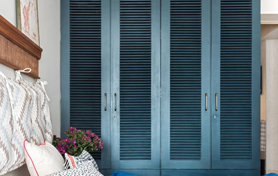
Here, we added a similar verdant hue to brighten up and add some zing to a kids’ bedroom for a recent design client of mine. I also love using this welcoming colour on the front door of a home.
Here, we added a similar verdant hue to brighten up and add some zing to a kids’ bedroom for a recent design client of mine. I also love using this welcoming colour on the front door of a home.
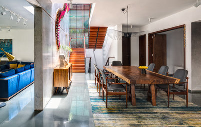
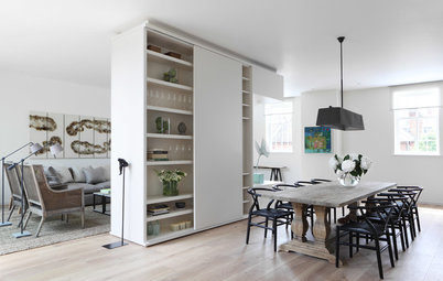
This vegetal hue also makes a terrific addition to a kitchen or dining room. The generous dose of green throughout this space injects such vibrance and personality.
Leafy green, when paired with a wood tone, brings a nice organic vibe to a room. The palette really lends an outdoorsy quality to interior spaces, giving them an indoor-outdoor connection.
Learn where these colour trends begin
Learn where these colour trends begin
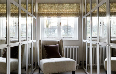
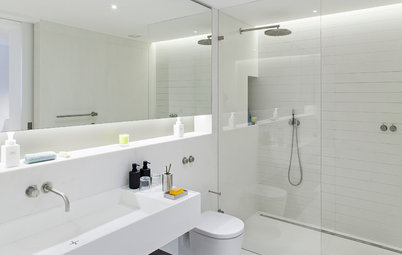
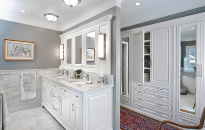
One of my New Year’s resolutions is to encourage homeowners to move on from all-white interiors and think about painting an area in an accent colour, whether it be the ceiling or a wall in a room. Both the bedroom in the previous photo and this bathroom are heavy on the white hues, but the splash of green adds vibrancy and keeps the rooms from looking sterile or cold.
Because this green is so prominent in nature, it tends to work as a semi-neutral. It can be pleasingly paired with many other colours. As in nature, it’s right at home with shades of red, orange, yellow or blue.
Ready to take the plunge and add ‘Greenery’ to your own home? Here’s an assortment of paint colours similar to Pantone’s colour of 2017, from left: Mardi Gras Green from Valspar, Green Thumb from Benjamin Moore, Overt Green from Sherwin-Williams and Herbal Garden from Behr.
Tell us:
Do you give this green a thumbs up or a thumbs down? Tell us how you feel about Pantone’s Colour of the Year 2017 in Comments below.
Tell us:
Do you give this green a thumbs up or a thumbs down? Tell us how you feel about Pantone’s Colour of the Year 2017 in Comments below.