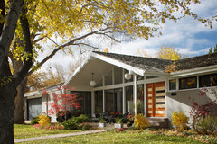
Need help with ugly home exterior
N Rochelle
10 years ago

Featured Answer
Sort by:Oldest
Comments (30)

N Rochelle
10 years agoRelated Discussions
Need help in designing exteriors for my new house
Comments (1)Please save the floor plans as 'jpeg' file in order for them to show up....See Moreneed a help for EXTERIOR COLOR OF my HOUSE
Comments (1)Hello! We are a windows and siding company, and have FANTASTIC siding. We use James Hardie siding and with our ColorPlus Technology siding the color palette depends on the region you are in. I have attached the website for James Hardie Siding and our website! Feel free to give us a call! http://www.jameshardie.com/homeowner/colorplus-palette.shtml http://www.wonderfulwindowsandsiding.com/ As for a color scheme for the house though- I would go lighter! That will really make a change and will bring out all of the details in your home! -Wonderful Windows and Siding...See MoreHelp needed: Any ideas for this type of home exterior?
Comments (3)carpet and wall papers both are printed which are giving a confused look. If one thing is printed we should keep others simple and single tone. So either the wallpaper or carpet can be changed in a monotone. Also add some by accent flowers pot/planter....See MoreNeed help My Exterior color...of my house.
Comments (4)Modern houses like yours tend to be painted neutral colors. I'd go for white or off white with trim in different colors. I'd probably accentuate the horizontals, painting your porch railings a contrasting color. You can go to a website like SherwinWilliams, up load a better picture of your house and play around with color ideas. https://www.houzz.com/photos/texas-residence-contemporary-exterior-dallas-phvw-vp~1994082-Residence-contemporary-exterior-dallas https://www.houzz.com/photos/san-clemente-california-home-contemporary-exterior-orange-county-phvw-vp~2456325-CLEMENTE-California-Home-contemporary-exterior-orange-county https://www.houzz.com/photos/oakland-hills-residence-contemporary-exterior-san-francisco-phvw-vp~52742-Hills-Residence-contemporary-other-metro...See More
brooksideto
10 years agoN Rochelle
10 years ago PRO
PROSound Painting Solutions, LLC
10 years agoN Rochelle
10 years agosally78
10 years agobrickln
10 years agolast modified: 10 years ago PRO
PRORidgewood Renovations
10 years ago PRO
PROColumbia Redevelopment
10 years ago PRO
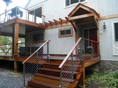
PROMountain Laurel Handrail
10 years agoN Rochelle
10 years ago
Brandon Schmahl
10 years ago PRO
PROBrothers Custom Works
10 years ago- PRO
Brothers Custom Works
10 years ago fredm51
10 years agoN Rochelle
10 years agoN Rochelle
10 years agolibradesigneye
10 years agolast modified: 10 years agolibradesigneye
10 years agoBrandon Schmahl
10 years ago
victorianbungalowranch
10 years agolast modified: 10 years agoN Rochelle
10 years agolibradesigneye
10 years agoN Rochelle
10 years agoN Rochelle
10 years ago
Aubry M
10 years agolibradesigneye
10 years agolast modified: 10 years agopdk920
8 years ago


walnutgreen