Silestone Statuario - Anyone used it?
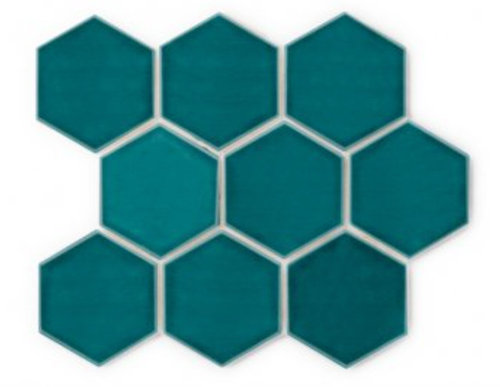
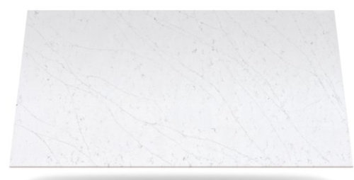
Has anyone used Silestone Statuario in a project? I know it is fairly new (part of their new Eternal Series) so I am having a hard time finding photos. If anyone has experience with this color of Silestone, I'd love to know how you feel about it! It's one of my top contenders for my kitchen remodel and want to make sure it's the right one :) My only concern is how dark the long veining actually is. No one has a slab to look at where I am, and I'd have to drive 2 hours to see one (don't think i'll have time to do that). My kitchen is all white. Here is the backsplash tile I"m planning to use, and here is a photo of it from the Silestone website. Thanks!
Comments (285)

Camille Gray
4 years agoIs the backsplash going all the way up to the cabinets? I have a dark wood cabinet because I "wasn't allowed" to get white, which is what I really wanted. I'm partial to the statuario, I like the clean look of it and it looks like the tile really picks up on the veining. But it's your kitchen, you have to go with what you love!

Kari Nielsen
4 years agoYes the backsplash is going all the way up 18” and 28” at the range, with the blue tile. We were going to do an “interest” piece at the range but decided our kitchen is too small and just keep it simple with the blue subway. If we did the Caesarstone Cosmopolitian White we may do white subway and forgo the blue. Will decide once we get the counter in - if we can ever decide on that! Need to place our order tomorrow/Friday. Thanks for any and all suggestions and advice! Taking polls from friends and family - it’s really a toss up. We like both.
Camille Gray
4 years agoI agree with doing the white subway with the darker counter. I didn't like how the blue looked with it, too much going on. We were thinking the same thing behind our range, but our backsplash is pretty busy. I'd also recommend a midtone grout with whatever tile you choose, easier to maintain.
Kari Nielsen
4 years agoI’ve been told that with the new epoxy grout there should be no issue with maintaining - it cost more but I hear well worth it, especially with white tile and grout....
Kari Nielsen
4 years agoBrattypants: thank you! It was a ton of work to find something that looked good that we could afford. What I really wanted was $35 a piece!! What I found was $5 a piece!! I hope they hold up, the quality seems really nice so we are excited. I found them on Amazon - after many trials/returns....we settled for Southern Hills Brushed Nickel drawer pulls 6.25” and 8.75” pulls. They don’t make an appliance pull (for the panel dishwasher), so I hope the 8.75” will work. They seem really solid and sturdy. Not wide - we wanted something narrow, sleek and square (not rounded). Like I said it was a tough-hunt to find on a budget!!

Lindy
3 years agoHi, I'm hoping to get some insights from those who have Silestone Eternal Statuario. We just got it installed and it looks has a pink hue to it. Does anyone have the same issue? We're not sure if it's a lighting problem or defect. We also remember the sample being more white, but now it looks more grey (we knew it would have light grey veining). Thanks in advance if you could share your experience!
Kari Nielsen
3 years agoWe have the polished Eternal Statuario and it’s white and we absolutely love it. Could be your lights, I hope!
Lindy
3 years agoThank you, Kari! I hope it’s just the lights too. What color are your cabinets? We have white cabinets so it could also be the whites not matching each other.
Lindy
3 years agoThank you for sharing, Kari. Your countertop looks beautiful and is the look we were hoping to get! We used it as a backsplash in this photo. We’re hoping it’s the lighting or the brown paper throwing it off, and not the wrong color installed. Thanks again, we really appreciate you sharing!
Kari Nielsen
3 years agoBeautiful!! I realized my photo didn’t show our white backsplash, but honestly the whites are all a little different but that’s Ok - it’s the perfect palette for any accent color you choose. We did very light grey walls (50% of BM “silver chain”) and it turned out great! I realized I really stressed over it all but in the end I’m quite happy (our cabinet installer, well that’s another story....)
brattypants
3 years agoHi Lindy, we have eternal statuario installed and it does not have a pink hue either. It appears very white with light grey veining. Our flooring is a light grey and the walls are Sherwin williams natural choice. We are using 5000k lighting because we originally had 2700k lighting in the home and everything looked yellow, so it totally could be due to the light source or possibly any light being reflected off adjacent walls, floors, etc.
Lindy
3 years agoThank you both so much! I’m so grateful for the kind feedback from the Houzz community here! I am probably stressing over everything too much. It’s great to hear about your positive experiences with the Statuario. 😃

Embeth
3 years agoHi all, I’m looking at eternal statuario and have found this thread helpful. Would love to see more pics. Kari or Lindy do you have any finished product pics? How did the pink hue end up once things were finished? I just got my sample in the mail today and I thought it had the very slightest pink hue as well. Camille, thanks for your pics. I like the arabesque backsplash. Emmy would not have thought of doing the Calcutta backsplash but it’s beautiful. For those of you that have had it for a couple years, how is it holding up? Thanks.

Camille Gray
3 years agoI've had mine for 2 years, it's holding up great, no chips, scratches or problems. It does show water drops when the light hits it right, so I have to dry it after wiping it down.
Kari Nielsen
3 years agoI am really happy we went with the polished Eternal Statuario, we seriously considered the matte because I liked the “real stone” look - but I’m sooooo happy with the polished. Turns out great and so easy to maintain. Our cabinets are while and black splash is white hex. Turned out great and wouldn’t change a thing! (Except for the contractor! Our very simple basic kitchen took a year which was six months too long).

sd1962
3 years agoMe too!! Deliberating between Et Statuario & Desert Silver. We are going through HD for main floor Reno & need to get Cosentino for guarantees & best price. Also thinking of Dekton but scant info about it.
blahnik1
3 years agoOur Eternal Statuario is holding up very well. No stains at all. Looks as good as day 1 (since December 2017). We have the polished version. We got a waterfall counter (lots of counter) and it looks great. Many samples we saw had a slight pink undertone. I do not see any pink in our installed counters.
Kari Nielsen
3 years agoWe were going to go through HD for Eternal Statuario but they could not promise minimal seams - so watch out and make them tell you where the seams will be. We cancelled our order and went through another wonderful place in San Leandro. (I don’t think I can advertise the spot on this web site) We are so incredibly happy and the owner could not have been more of a delight to work with! Wonderful woman and price, was about the same even with the Hd sale, and install was faster and so much better than ever expected. We went to constantino to see the large piece and looked at Dekton too - but way too many issues w/it chipping - and so expensive. We are thrilled with Eternal Satautario polished and wonder why we struggled so hard with the decision! It’s definitely a process. Spent over a year trying to decide....just go with your gut make the decision and move on - there are too many choices out there!
Embeth
3 years agoblahnik1 and Kari, thank you for sharing your experiences. I’ve been concerned about slight pink undertone in my sample. Good to hear people are not seeing it in their installed counters.

Jennifer Gruninger
3 years agoI just installed Eternal Statuario this week and it’s beautiful!! Very neutral, and one of the closest options to Bright White.


Embeth
3 years agoJennifer, thanks for sharing! Looks really nice. We are installing in a couple months, and this makes me feel better. Curious, have you decided on a backsplash?
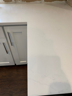
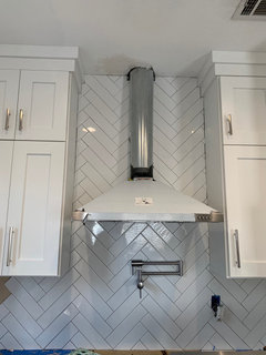
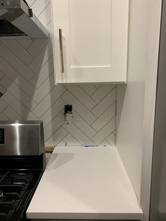
Jennifer Gruninger
3 years ago@embeth Yes, we are working on installation for it this week too. I’m doing herringbone subway tile with a medium gray grout color (as long as I like it when I test it, so pictured without grout yet). Here’s the progress so far.
Camille Gray
3 years ago

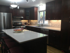
The middle picture shows where there is a seam, it's there but not too noticeable. I love the white cabinets, so nice and bright, couldn't get my husband to agree to them.
Camille Gray
3 years agoThe only thing that was a little off was the color of the filler, it was too yellow so I had him mix a whiter one.
sd1962
3 years agoCamille Gray-thanks again for posting these pix. The marble -arabesque?- looks great beside the Statuario. I agree with Joseph C. the seam is inconspicuous. I know white cabinets are all the rage, but your espresso ones teamed with the white & light gray are classic. I wanted gray cabs, but husband insisted on white as he has eye to resale.
Camille Gray
3 years agosd1962 I agree with your husband, I expect someday the gray will look as dated as oak does now. Our old cabinets were oak. The backsplash was the first thing I fell in love with, everything else was chosen to coordinate. My kitchen is on the north side of the house, so white would have brightened it up considerably. My husband couldn't understand why I went so dark after wanting white,lol. I guess I just don't like the midtones.

Erin Pieratt
2 years agoJennifer Gruninger, do you mind sharing what color white you picked for the cabinets? We too are having Eternal Statuario as our countertop in our soon to be new kitchen. Thanks for your help.
Kari Nielsen
2 years agoOur cabinets are DeWils and called Bianco Matte (not painted, something called nano technology - looks great with Eternal Statuario, and our light grey walls (silver chain at 50%)
Stephanie Kendrick
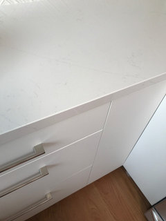
last yearlast modified: last yearSo, im very interested in this countertop. im not a huge fan of thick veining in some quartz. Its going to be for a 8ft long, 2 sink vanity, so im thinking more subtle delicate veining would look nicer. In some photos it looks so nice, soft, and subtle. But ive seen others were the veining is more darker and there is a lot of it. Can anyone tell me what it looks more like in person?
Embeth
last yearWe put this in our kitchen recently. It is subtle and from a distance the countertops just look white, until you’re standing next to them where you can see the veining. I’ll be honest, I was kind of disappointed with Silestone eternal Statuario because the veining looked so realistic in every single sample I saw, like the veining was embedded deep in the quartz if you know what I mean. But when mine came ready for install some of the veins definitely look pixelated and more fake, like they were stamped on. Not all of them, just some. In the end, I wish I would have just picked something more dramatic for my kitchen, but I don’t hate them. I think it could be nice for a bathroom.
Stephanie Kendrick
last yearlast modified: last year@Embeth thank you so much. Thats very helpful! Im stuck between wanting more subtle or slightly more dramatic. ugh thats too bad since it seems like most people seem to really like it. Im doing a prefabricated top, so I can actually see exactly how the piece will look in person beforehand. I dont think I want so subtle you can barely see the veining. Its going to be in a small bathroom with bright lighting so maybe the veining will be more noticeable. We shall see. Picking out a counter has been so much harder then I thought.

Ashlie Brady
last year@Jennifer Gruninger What size are your subway tiles? I am also wanting to do herringbone white subway. Yours are the exact size/look i want! Where did you get them? Beautiful!

Rhonda
last yearMy kitchen us not finished yet- still have to i stall the backsplash and paint the walls but i hope this helps i have polished statuario countertop and love them The marble is more subtle than many which I really like They are definitely white

HU-737980060
last yearI love your kitchen. I am alo looking at using the polished statuario on a navy blue and white cabinet. Do you have more pics of your backsplah? how obvious is the vaining?
leannabaker
2 months agoHello,
would you say your eternal staterario is slightly warm or cool toned?
I live too far away from where you can pick slabs and I picked up 4 samples. all of them are different but the two i ordered from home depot look creamy. i want that.
blahnik1
2 months agoMy counter is more cool toned. Not at all creamy. The veining is very subtle. The counter looks white unless you are up close ; then you see the veining.
Aleah R.
Original Author2 months agoIt's more cool toned vs. warm for sure, but it is very neutral and a light gray/white. The veining is subtle. We still love ours 6+ years later!


marykalil