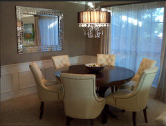
palermot

Dining Room Drama

palermot
11 years ago
Having a hard time desciding on what chandelier best fits the look of my dining room. Any suggestions? Which do you think fits better?
Option 1
Option 2

Comments (86)

  • Dottye Wescoatt
    11 years ago
    Option #3 all the way! Classy - love, love.
  • Dottye Wescoatt
    11 years ago
    Oops, I meant option 2
  • bunnit
    11 years ago
    I like the option 1 with black shades idea
  • PRO
    TKraft Art & Interiors
    11 years ago
    LOVE, love option 2. This chandelier is very fresh and modern while maintaining a traditional edge. The large round shade detail on this option plays off nicely with the circles in the room; artwork, table base, column, newel post and the tufted chair buttons. As far as the other comments above - yes it's hard to tell by these photos without exact measurement but both lights might be similar in dimensions. I agree with some of the other comments I too would love to see a black round shade like option 2 - but with less fussy hardware details. You're dining room is already exquisite but changing out your light fixture to option two will put your room over the edge. Oh the drama it would make...
  • Lori Barber
    11 years ago
    I voted for option #1 for this space. With either choice I would lower the fixture to put the placement closer to the table resulting in a much friendlier dining area. It might help to illuminate the adjoining area and make them more cohesive.

    The overall height and open design of #1 feels like it will be part of the room rather than an obstacle and will do two things to make the dining area more comfy (1) it will open up the space above the table and create a feeling that the room is bigger (2) it will allow the light source and the artwork to compliment each other without competing for your attention.

    I also believe that you'll have more light reflected around the room with #1 which will warm up the space. I'd stay with the current shade selection and not go with darker as has been suggested - to keep that brightness.
  • kat63
    11 years ago
    # 2 seems as though it is too "heavy" for the room, I would go with #1. #1 also won't be as tedius to clean. The height you hang the fixture at will also make a huge difference as to how it fits into the space. The present fixture is way to high.
  • selawela
    11 years ago
    Look what I found on the Houzz Facebook page...
  • zenhome
    11 years ago
    Love it!!
  • PRO
    Susan Keefe, C.I.D.
    11 years ago
    #2 is so glam - the lines of the chairs call for it!
  • PRO
    Cheryl Umbles Interior Design
    11 years ago
    Think about consistency with the rest of your home.....does it say chic metropolitan or do you have a touch of dramatic glamour in each space...think theme throughout and make sure the theme says you!
  • PRO
    Susan Keefe, C.I.D.
    11 years ago
    just to give you an idea of how it would look. Also, I think the room needs stationary drapery panels so I put them in too... :)
  • selawela
    11 years ago
    Nice photoshopping skills! :)
  • PRO
    Susan Keefe, C.I.D.
    11 years ago
    Thanks! I love using Photoshop to give my clients a look at what my design ideas might look like in their room. One picture worth a thousand words, right?
  • tinafoster
    11 years ago
    Like that! Like the texture of the chandelier AND the drapery panels! :)
  • PRO
    karen paul interiors
    11 years ago
    last modified: 11 years ago
    19th century Empire lamp...just for kicks! :) http://www.1stdibs.com/furniture_item_detail.php?id=590525
  • jingstad
    11 years ago
    LOve option 2....seems like it would just pull all the elements of your room together! It makes the table and the chandelier the grounding center of the room.
  • kat63
    11 years ago
    I might be inclined to throw a conversation piece into that room and change the pic between the two windows.... this is a five light piece with clear pendants.....
  • enfantterrible
    11 years ago
    I would go for option 2. Option 1 looks too "delicate" and would not be in harmony with the rather voluptuous chairs, my opinion is it would seem "less".
  • User
    11 years ago
    option 2 is all the drama this room needs
  • Oksana Nikitenko
    11 years ago
    nr. 1 definitely - chic elegance and simplicity! :)
  • laurie0714
    11 years ago
    last modified: 11 years ago
    Really like the other alternative from Karen Paul Interiors. It has the finish that compliments your current furniture better than the first 2 options. Also agree with another comment to change the picture on the wall.
  • PRO
    karen paul interiors
    11 years ago
    Oh no, Laurie! That is a $22,500 lamp. It's the real deal. I was pulling up the three pictures to show the Empire styling. Thanks anyway. I guess I didn't make it clear what I was doing. Most of the Empire chandeliers (19th century) with the crystals where VERY French and meant for large estates. The other two I was pulling up were adaptations of a more simple style.
  • PRO
    Cherry Yount @ Furnitureland South
    11 years ago
    Love Option 2!! Just enough drama and bling to complement the upholstered chairs. Agree with adding drapery panels. What a difference the right window treatment makes in a room.
  • Catherine
    11 years ago
    I'm all about the bling for the dining room!
  • bellenoir123
    11 years ago
    Stunning Room. Option #1 is simple and elegant. Option #2 is much too busy and would draw attention from the entire room
  • jannielee
    11 years ago
    Two gorgeous choices. The scale of the second one appears to be a bit larger and even if they're the same overall size, option 2 will take up more visual space. I initially thought I liked that one better, but the first option (if large enough) is perhaps a bit more elegant and delicate. Honestly, it depends on how heavy a look you'd like. Either choice will be just beautiful.
  • TXMamaCat
    11 years ago
    While I like the style of Option 1 better, I think the Option 2 would look better in the space. Option 2 would definitely be the focal point in a rather austere room.
  • laurie0714
    11 years ago
    @Karen, didn't notice the price! I still like that one better, but the second link you posted looks good and would compliment the room. The gold tones go better in the room with the current colors than the silver tones.
  • laurie0714
    11 years ago
    @Karen, didn't notice the price! I still like that one better, but the second link you posted looks good and would compliment the room. The gold tones go better in the room with the current colors than the silver tones.
  • Ann Ah
    11 years ago
    Option 1 is best for the space. The chairs are already a heavy piece so their must be a light feeling piece brought into the space. The other photo I saw on this comment by selawela is a unique warm piece to bringi nto the space that is not heavy and plays well with the mirrors, but it causes a seperation to the eye with the chairs.
  • PRO
    Mise en Scene Designs by Paula Haymon
    11 years ago
    I prefer a larger version of option 1. The style coordinates better with your table and chairs and the architecture of the room, but it does look a bit out of scale. Don't know all the dimensions, but a good rule of thumb is that the width of the chandelier should be sized, in inches, the sum of the width and length of your room. For example, an 11' by 11' room needs about a 22 inch chandelier.
  • laurie0714
    11 years ago
    @Langford...thanks for the size rule; I had not heard that before and I will be shopping for a fixture soon. :-)
  • PRO
    karen paul interiors
    11 years ago
    laurie, if we have the dimensions of your room I'm sure you will have several Houzzers do some shopping for you.
  • PRO
    karen paul interiors
    11 years ago
    last modified: 11 years ago
    I just found this on the Ralph Lauren site. Comes in two metal finishes and two sizes. http://www.circalighting.com/details.aspx?pid=3285
  • palermot
    Original Author
    11 years ago
    Thank you to everyone who responded. I have purchased a new rug to go into the room (see photo). Some people were asking for the dimensions of the room (10 x 12) and the table is 78 inches long. The dimentions of option 1 is 26inches and option two is 22inches. Any different thoughts?
  • selawela
    11 years ago
    the rug is beeeeeauuuuutiful!!!!!!!!
  • PRO
    karen paul interiors
    11 years ago
    Very nice!
  • Emily H
    11 years ago
    Absolutely LOVE the rug!
  • Momof5x
    11 years ago
    Option 2 as more suited to a dining room atmosphere, the other would be appropriate in a bedroom. Love the chairs they look elegant and very comfortable, also love the layout of the house.
  • ahroberts04
    11 years ago
    Option 2, without a doubt!
  • Saam Phelps
    11 years ago
    Where can I find option #2? That's the one I voted for and now want to buy it too!
  • Joselyn Martinez
    11 years ago
    Oh my! Where is Option 2 from? I need to know. Been looking for one just like it. thanks.
  • palermot
    Original Author
    11 years ago
    Option 2 is from supplier Maxim Lighting...I found it at the retailer Lando Lighting in Brampton Ontario
  • Saam Phelps
    11 years ago
    Palemot, thanks so much for the info but I'm having a hard time finding it online without the style number/name do you have that information? Thanks so much!
  • PRO
    Modern And Classic
    11 years ago
    Choose #2. It is a more solid and singular object as opposed to #1 which would create busy look when combined with all those dining chairs and chair legs.
  • Joselyn Martinez
    11 years ago
    Thanks so much for the info on the lamps! What ever you choose, they're both great!
  • PRO
    Mackenzie Austin Design
    11 years ago
    While I chose Option 1 for it's gentle curve (works great with those chairs), I'm not sure the fixture is large enough? I think Option 2 's shade is too stark and the fixture itself just isn't elegant enough...too busy for that room. It's a great fixture...how would it look in your bedroom instead?