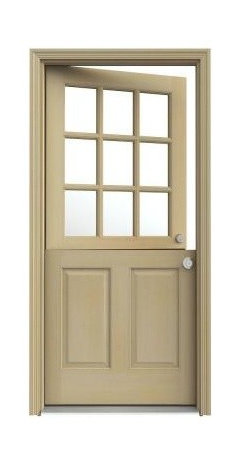
Need helping choosing exterior door color for my 1940's cape remodel
Melissa
9 years ago


Featured Answer
Sort by:Oldest
Comments (18)

Melissa
9 years agoMelissa
9 years agoRelated Discussions
I need help to decide on choosing exterior paints
Comments (2)I see this post it really old, but if you haven't already, with blue roof, you can go with white or white toned wall paints, or give it a Moroccan look by painting the walls mustard and doors and windows white. This color scheme is very lively....See MoreGreat room in 1820 West Indian house
Comments (10)This is a fabulous room. It oozes a bygone charm that you would lose by adding false ceilings and tube lights. Please don't! Go all out to preserve this magnificent floor and the beautiful furniture. That mirror is superb, as is the old painting. Keep the wall colour as is and change the upholstery after polishing and keeping the beautiful wooden furniture. The upholstery is mismatchedat present. But the different styled armchairs look very comfortable. Keep them. No modern furniture will give you such comfort. When you re upholster, refrain from choosing firm foam and such nonsense. It is far better to have good quality down or cotton, which moulds to the body shape. Invest in a high quality traditional patterned Persian or Kashmiri carpet for a restrained stroke of colour. Your upholstery should pick up colours from this carpet. So should the curtains. Please never even consider vinyl blinds, horizontal and vertical. If you tamper with this room and remodel it to be 'modern'- you will lose a treasure....See MoreColour combination with aqua colour for exterior wall.
Comments (36)I select these colours with the help of other houzzer and expert professional advice and discussion. I also got help from colour paint catalogue. Is it looking good or not? Is there any problem with these colours and their combination. Please guide me in this regard....See MoreWhich shade of white?
Comments (18)@Studio Chippan, Thank you, for your response and the reference pictures. It offered me helpful insights. I agree with you regarding the 3rd-photo. This illustrates that 3 paint colours in my living-room will not work (even if 2 of them are white!). This also means that I can no longer go with 8300/Confetti as my choice of white for walls (as much as I like it, it will dull/dim my rooms if I paint that on my ceilings as well, especially my north-facing rooms). So now, I need to find 1 single-white that can go/complement with my 2 adjacent accent walls in 8307/Quicksilver, and that can be used on my ceilings as well (and the walls and ceilings of all the other rooms). Any suggestions? So far I have sampled the following Asian/royal white(ish) shades (I’ve added my take on them beside it, but it is only my own perception of these shades): 1) Base White (the one without any tint): boring, clinical, too bright a white for walls 2) 8300 /Confetti: not too cold, not too warm, my favorite white among the ones sampled, but too dull for the ceiling 3) L104/Cotton Wool: seems to have a slight-pink-undertone(?) on my walls, too bright a white for walls 4) L109/Icy Peak: boring, slight-green-undertone(?), but might work for my walls+ceilings requirement 5) 8332/Snowflake: this is a very nice grey, but I am looking for a white (for walls+ceilings) 6) 8308/Whispering Smoke: this is a very nice grey, but I am looking for a white (for walls+ceilings) 7) 9483/Clear Sky Night: this is a nice grey, but I am looking for a white (for walls+ceilings) 8) 8299/Ice Age: this is a nice grey, but I am looking for a white (for walls+ceilings) 9) 8292/White Gold: this is too warm a white (strong pink/peach undertones!), ruled-out. Why 8307/Quicksilver, and why 2 accent walls (if I may call it that) instead of 1? This particular vertical-line of the fan-colour-deck is the best match with a wallpaper that will be applied on an exposed beam (~L:15’+15’*H:1.5’*D:4”) running along the ceiling on 2 of my living room walls. Shades along this deck-line are: 8308/Whispering-Smoke (one of the whites you suggested above, but too light a grey for accent), 8307/Quicksilver (seems like the right density for me), 0615/Silver Grey (gets too dark for me from here), 0643/Steel Grey, etc… *Disclaimer: I do not claim to be a minimalist; I am merely trying to be one. However, I did not succeed with my living room design; and now I only hope it doesn’t get out of hand and OTT....See More
libradesigneye
9 years agoMelissa
9 years agoMelissa
9 years ago PRO
PROCreative Visual Concepts, Kevin Strader
9 years agoMelissa
9 years agoMelissa
9 years agolefty47
9 years agolast modified: 9 years ago PRO
PROJudyG Designs
9 years agolast modified: 9 years agoMelissa
9 years agoMelissa
9 years agoUser
9 years agolibradesigneye
9 years ago
Annie Fischer
9 years agoMelissa
9 years agolast modified: 9 years agoMelissa
9 years agolast modified: 9 years ago


Carey Reid Kirk inc.