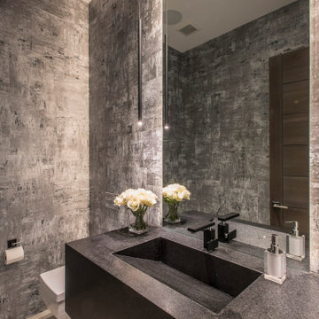
Cement Board Wall Designs & Ideas
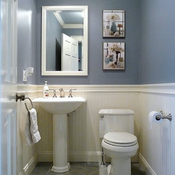
A focused design transformed a small half bath into an updated Victorian beauty. Small details like crown molding, bead board paneling, a chair rail and intricate tile pattern on the floor are the key elements that make this small bath unique and fresh.
The cabinet paint is standard Navajo White and the 3"x6" tile is Pratt & Larson C609 metallic glazed ceramic tile. Visit http://prattandlarson.com/colors/glazes/metallics/
Find the right local pro for your project
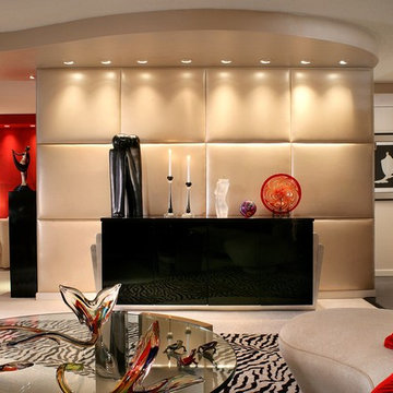
Stricking combination of zebra inlaid carpet, padded walls add hi light to this neutral apartment. Zebra carpet leads to L shape Den with dramatic red 'faux goat skin' walls. Photo by Peter Rymwid.
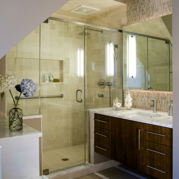
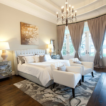
In this master bathroom renovation, a Crema Marfil marble was selected for the floor and tub deck, as the movement of the tile was complementary to that in the existing Alabaster tile used for the shower walls. With continuity in mind, Crema Marfil was also selected for the vanity tops and a mocha glazed, canvas finish was specified for the vanities themselves. By choosing a rich, neutral color for the walls, the designer ensured that the cream and brown tones in all the materials would appear dominant, unifying those materials and giving the room a warm, relaxing feel.
Richard Leo Johnson
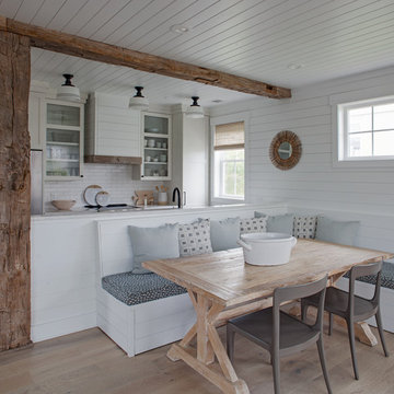
Wall Color: Sherwin Williams Extra White 2137-40
Cabinet Color: Benjamin Moore Intense White OC-51
Hardware: My Knobs, Nouveau III Collection - Matte Black
Faucet: Feruson Enterprises, Delta Trinsic Pull-Down - Matte Black
Subway Tile: Savannah Surfaces, Waterworks Grove Brick - White
Countertop: Cambria, Brittanicca
Lighting: Rejuvenation, Jefferson 6" Classic Flush Mount - Black Enamel
Roman Shade: The Woven Co., Canton #206
Bench Fabric: Perennials, Elements - Rhino
Pillow Fabric A: Kerry Joyce Textiles, Corsica - Blue Dot
Pillow Fabric B: Scalamandra, Bamboo Lattice - Endless Summer
Chairs: Redford House, James Side Chair
Wooden Bowls: Asher + Rye, Farmhouse Pottery
Cheese Boards: Asher + Rye, Farmhouse Pottery
Cutting Board: Asher + Rye, Son of a Sailor
Glass Corked Jars: Roost
Ceramic Utensil Pot: Asher + Rye, Farmhouse Pottery
Firmness . . .
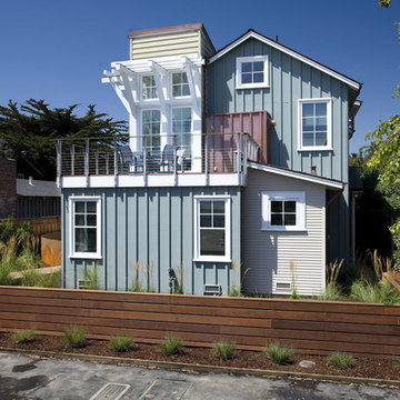
Santa Cruz’s historically eclectic Pleasure Point neighborhood has been evolving in its own quirky way for almost a century, and many of its inhabitants seem to have been around just as long. They cling to the relaxed and funky seaside character of their beach community with an almost indignant provinciality. For both client and architect, neighborhood context became the singular focus of the design; to become the “poster child” for compatibility and sustainability. Dozens of photos were taken of the surrounding area as inspiration, with the goal of honoring the idiosyncratic, fine-grained character and informal scale of a neighborhood built over time.
A low, horizontal weathered ipe fence at the street keeps out surfer vans and neighborhood dogs, and a simple gate beckons visitors to stroll down the boardwalk which gently angles toward the front door. A rusted steel fire pit is the focus of this ground level courtyard, which is encircled by a curving cor-ten garden wall graced by a sweep of horse tail reeds and tufts of feather grass.
Extensive day-lighting throughout the home is achieved with high windows placed in all directions in all major rooms, resulting in an abundance of natural light throughout. The clients report having only to turning on lights at nightfall. Notable are the numerous passive solar design elements: careful attention to overhangs and shading devices at South- and West-facing glass to control heat gain, and passive ventilation via high windows in the tower elements, all are significant contributors to the structure’s energy efficiency.
Commodity . . .
Beautiful views of Monterey Bay and the lively local beach scene became the main drivers in plan and section. The upper floor was intentionally set back to preserve ocean views of the neighbor to the north. The surf obsessed clients wished to be able to see the “break” from their upper floor breakfast table perch, able to take a moment’s notice advantage of some killer waves. A tiny 4,500 s.f. lot and a desire to create a ground level courtyard for entertaining dictated the small footprint. A graceful curving cor-ten and stainless steel stair descends from the upper floor living areas, connecting them to a ground level “sanctuary”.
A small detached art studio/surfboard storage shack in the back yard fulfills functional requirements, and includes an outdoor shower for the post-surf hose down. Parking access off a back alley helps to preserve ground floor space, and allows in the southern sun on the view/courtyard side. A relaxed “bare foot beach house” feel is underscored by weathered oak floors, painted re-sawn wall finishes, and painted wood ceilings, which recall the cozy cabins that stood here at Breakers Beach for nearly a century.
Delight . . .
Commemorating the history of the property was a priority for the surfing couple. With that in mind, they created an artistic reproduction of the original sign that decorated the property for many decades as an homage to the “Cozy Cabins at Breakers Beach”, which now graces the foyer.
This casual assemblage of local vernacular architecture has been informed by the consistent scale and simple materials of nearby cottages, shacks, and bungalows. These influences were distilled down to a palette of board and batt, clapboard, and cedar shiplap, and synthesized with bolder forms that evoke images of nearby Capitola Wharf, beach lifeguard towers, and the client’s “surf shack” program requirements. The landscape design takes its cues from boardwalks, rusted steel fire rings, and native grasses, all of which firmly tie the building to its local beach community. The locals have embraced it as one of their own.
Architect - Noel Cross Architect
Landscape Architect - Christopher Yates
Interior Designer - Gina Viscusi-Elson
Lighting Designer - Vita Pehar Design
Contractor - The Conrado Company
Paul Craig ©Paul Craig 2014 All Rights Reserved. Architect: Charles Barclay Architects
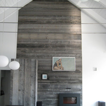
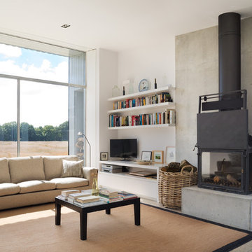
Anchoring the north end of the living area, a wall paneled in barn wood organizes a modern hearth, a concealed refrigerator, and a growing art collection into a peaceful vignette.
We are a young newly wed couple who decided to ask for cash gifts at our wedding so we could decorate our new digs. We received the keys the morning after becoming Mr & Mrs Leclair, and to this day we have yet to take a honeymoon. Both of us had a brewing passion for modern interior decorating that needed to be fulfilled. Our previous 1 bedroom apartment was a great warm up but the real challenge was ahead. We received generous gifts to get us started but after the wedding, closing costs and a few unexpected costs we were left with a fairly conservative budget to work with.
First up was painting. None of the existing loud colours in the house were really to our liking. So started the giant task of painting every single wall in the house. Oh, and throw the garage and front entrance doors in there also. Thankfully Melissa works at a paint store so we were able to receive a few free cans and some really good deals on others. Quick shout out to Benjamin Moore and Pittsburgh Paints reps. After accomplishing this feat (with the help of family & friends) we decided a few walls needed some punch. A little wallpaper you say? Why not.
Next up was lighting. Most of the fixtures were out of date or not giving us the desired effects. With the help of our handy uncle Rob, we changed every single fixture in the house and out. A few have actually been changed twice. Always a learning curb, right? We splurged on a few pendants from specialized shops but most have been big box store purchases to keep us on budget. Don’t worry, when we strike it rich we’ll have Moooi pendants galore.
After the hard (wasn’t that bad) labor came time to pick furniture pieces to fill out the house. We had ordered most of the big ticket items before the move but we still needed to find the filler pieces. Had a great time driving around town and meeting local shop owners. After most of the furniture shopping was complete we had next to nothing left over for art and a lot of empty walls needed some love. Most of the art in the house are pictures we took ourselves, had printed locally and mounted in Ikea frames. We also headed down to the local art supply store and bought a few canvases on sale. Using left over house paint we created some large bold abstract pieces.
A year has now passed since we first got the keys and we’re, mostly done. Being home owners now, we also realized that we’ll never actually be done. There’s always something to improve upon. Melissa’s office hung in the balance of our undecided minds but after a recent retro chair purchase we’ve been re-inspired. That room is coming along nicely and we should have pictures up shortly. Most of what we’ve done are cosmetic changes. We still plan on upgrading the kitchen, upstairs bath and replacing the old carpets for some swanky hardwood floors. All in due time.
Above and Beyond is the third residence in a four-home collection in Paradise Valley, Arizona. Originally the site of the abandoned Kachina Elementary School, the infill community, appropriately named Kachina Estates, embraces the remarkable views of Camelback Mountain.
Nestled into an acre sized pie shaped cul-de-sac lot, the lot geometry and front facing view orientation created a remarkable privacy challenge and influenced the forward facing facade and massing. An iconic, stone-clad massing wall element rests within an oversized south-facing fenestration, creating separation and privacy while affording views “above and beyond.”
Above and Beyond has Mid-Century DNA married with a larger sense of mass and scale. The pool pavilion bridges from the main residence to a guest casita which visually completes the need for protection and privacy from street and solar exposure.
The pie-shaped lot which tapered to the south created a challenge to harvest south light. This was one of the largest spatial organization influencers for the design. The design undulates to embrace south sun and organically creates remarkable outdoor living spaces.
This modernist home has a palate of granite and limestone wall cladding, plaster, and a painted metal fascia. The wall cladding seamlessly enters and exits the architecture affording interior and exterior continuity.
Kachina Estates was named an Award of Merit winner at the 2019 Gold Nugget Awards in the category of Best Residential Detached Collection of the Year. The annual awards ceremony was held at the Pacific Coast Builders Conference in San Francisco, CA in May 2019.
Project Details: Above and Beyond
Architecture: Drewett Works
Developer/Builder: Bedbrock Developers
Interior Design: Est Est
Land Planner/Civil Engineer: CVL Consultants
Photography: Dino Tonn and Steven Thompson
Awards:
Gold Nugget Award of Merit - Kachina Estates - Residential Detached Collection of the Year
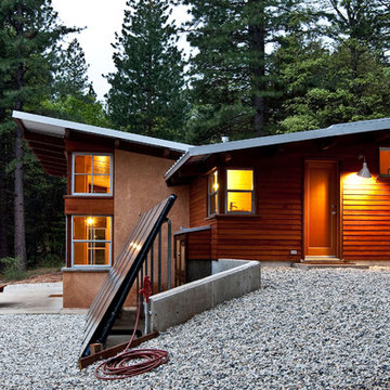
This 872 s.f. off-grid straw-bale project is a getaway home for a San Francisco couple with two active young boys.
© Eric Millette Photography
Cement Board Wall Designs & Ideas
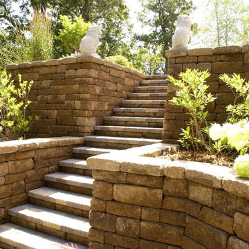
Versa-LOK Weathered Mosaic Retaining Wall Stone replaced old timber walls
80