Great Color Palettes: 8 Hot Bedroom Color Schemes
Go spicy, mild or a mix of both with warm and cozy hues in your bedroom

Waking up to pleasant, sunny weather in an equally pleasant, sunny room (preferably while on vacation) is a pretty spectacular way to start the day. The colors in our environment affect our mood, and warm shades of red, orange and yellow make us feel happy and energized.
However, if you live in a predominantly hot climate, you might want to scale back on the warm hues and use them as accents against cooler neutrals. If you live someplace that tends to be cloudy, cool and rainy for long periods at a time (I'm looking at you, Seattle!), then layering several warm hues in different shades, tints and tones will give you a cozy sanctuary that you might never want to leave.
Keep reading for eight warm and inviting bedrooms, along with sample color and material palettes inspired by each room.
Hot Pink Made Cool
Pink, gray and black make an unexpected and striking combination here. This super-stylish bedroom would be perfect in a warmer climate, as the cool neutrals help chill out the pinks.
Pink, gray and black make an unexpected and striking combination here. This super-stylish bedroom would be perfect in a warmer climate, as the cool neutrals help chill out the pinks.
Sample palette: A bright orange hue looks great with dark wood and neutral taupes. Clockwise from top left (from Pratt & Lambert): Mauve Mystique 1-32, Cayenne Pepper 8-14, and Pelham Gray Light CW819, with wenge.
Paint Isn't Just for Walls
You don't always have to go with wood-tone or neutral furniture. The orange shelf at the foot of the bed brightens up this otherwise neutral room. With orange, yellow and green (analogous colors on the color wheel) in the bedding, the effect is colorful yet balanced.
You don't always have to go with wood-tone or neutral furniture. The orange shelf at the foot of the bed brightens up this otherwise neutral room. With orange, yellow and green (analogous colors on the color wheel) in the bedding, the effect is colorful yet balanced.
Sample palette: Liven up your bedroom by giving your furniture a fresh coat of paint. Clockwise from top left (all from Benjamin Moore): Sweet Daphne 529, San Fernando Sunshine 360, Tangerine Melt 091 and Britannia Blue 1623.
Red the Right Way
When I bought my first fixer-upper many years ago, I took great care to pick the perfect shade of red to paint all four walls in my dining room. I ended up hating it. The room didn't get much natural light and I found it dark and anxiety inducing — not a very comfortable space to be in. This is an example of how to do intense red in a bedroom, with just a chunk of it above the bed. Add a few other red elements, but keep the rest of the palette light.
When I bought my first fixer-upper many years ago, I took great care to pick the perfect shade of red to paint all four walls in my dining room. I ended up hating it. The room didn't get much natural light and I found it dark and anxiety inducing — not a very comfortable space to be in. This is an example of how to do intense red in a bedroom, with just a chunk of it above the bed. Add a few other red elements, but keep the rest of the palette light.
Sample palette: Bold red is best used sparingly if you want your bedroom to be a relaxed and restful place. Pair it with less intense colors so it doesn't compete for attention and make you feel nervous. Clockwise from top left (all from Valspar): Crabapple Wine 1005-7A, Seashell Gray 4003-1A and Cherry Pickin' CI221.
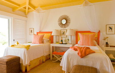
Smart Use of Color
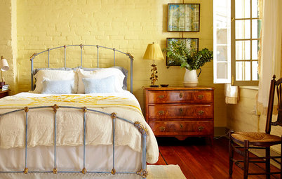
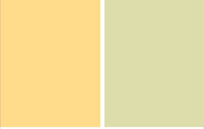
I'm a fan of bold hues, but I realize that not everyone wants the color in their home to pack such a wallop. This sunny bedroom illustrates my favorite color advice: Use bold colors for items that are easy and inexpensive to change or replace. Here, the walls are painted a mellow shade of yellow and the bolder colors are reserved for the bedding. Imagine this same bedroom with all white linens — it would have a completely different feel.
I'm a fan of bold hues, but I realize that not everyone wants the color in their home to pack such a wallop. This sunny bedroom illustrates my favorite color advice: Use bold colors for items that are easy and inexpensive to change or replace. Here, the walls are painted a mellow shade of yellow and the bolder colors are reserved for the bedding. Imagine this same bedroom with all white linens — it would have a completely different feel.
Sample palette: This happy palette would be great for a bedroom located in a cooler climate or where cloudy, overcast days outnumber sunny ones. Clockwise from top left (from Mythic Paint): Sundrenched Sand 096-3, Orange Delicia 103-5 and Embers Glow 107-6, with mahogany.
Berry Elegant
My bad pun aside, this bedroom illustrates a nice trick when using a deep, dark hue: Limit it to the ceiling and one wall. It looks less jarring than painting one wall only, and it helps bring the ceiling down, creating a cozy and intimate effect that's perfect for the bedroom.
My bad pun aside, this bedroom illustrates a nice trick when using a deep, dark hue: Limit it to the ceiling and one wall. It looks less jarring than painting one wall only, and it helps bring the ceiling down, creating a cozy and intimate effect that's perfect for the bedroom.
Sample palette: This palette features a couple of deep, dark colors, but they have some gray in them, which tones them down. Clockwise from top left (from Behr): Bleached Linen UL140-13, Forest Berry UL100-17 and Cranberry UL100-4, with Brazilian cherry hardwood.
Rustic with Red
This handsome, modern, rustic bedroom is all about that fabulous chandelier. Intense color on the walls would detract from it, so I think it's smart to keep the room fairly neutral with just a punch of color in the bedding.
This handsome, modern, rustic bedroom is all about that fabulous chandelier. Intense color on the walls would detract from it, so I think it's smart to keep the room fairly neutral with just a punch of color in the bedding.
Sample palette: Instead of the expected beige, pair red with neutrals that have more gray and less yellow in them, such as flax or taupe. Clockwise from top left (from Glidden): Natural Wicker GLN11, Olivewood GLN15 and Red Geranium GLR06, with dark hickory.
More:
Great color palettes for every room
More:
Great color palettes for every room
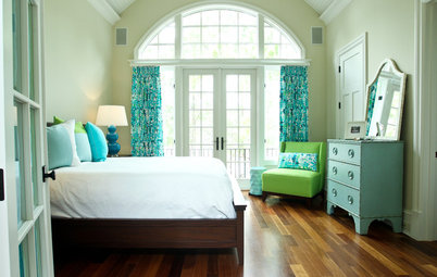

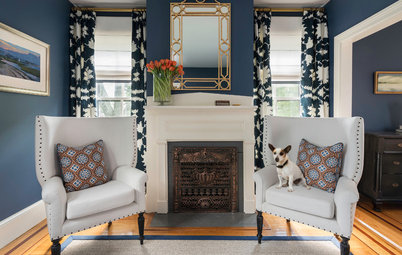
Red, being a warm color, is often paired with other warm hues. Shake it up by mixing it with cool neutrals instead, as demonstrated in this modern and elegant bedroom. It's a great way to inject red into your bedroom without making the space too energetic.