Ever Heard of the Right Shade of White Paint?
White is white, right? Not quite. See 8 white paint picks for 8 very different effects

I have to admit that I don’t have a single white room in my home. However, I’ve had first-hand experience with the challenges of selecting white paint: When my husband and I put our previous home up for sale, we decided to repaint the entire house white, and we allowed the contractor to choose the paint. After all, white is white…right? Wrong! After the painting was completed, I walked into the house and almost grabbed my sunglasses. I was shocked at how bright the walls looked. That’s when I truly understood that white can be as vivid (or soft) as any other colour. White also has a variety of undertones and tints, making the selection process somewhat tricky. As a colour consultant, I thrive in colourfully painted spaces, but I realise that many people enjoy the simplicity of white rooms. So, here are some tips for picking the right white paint.
2. Cool white
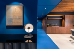
In this space, the cool white walls perfectly match the white furniture and window treatments. This creates a serene, homogenous space that has very little contrast and/or distraction. Cool, pure whites work well in contemporary spaces because they provide a feeling of newness.
In this space, the cool white walls perfectly match the white furniture and window treatments. This creates a serene, homogenous space that has very little contrast and/or distraction. Cool, pure whites work well in contemporary spaces because they provide a feeling of newness.
3. Soft white
Pairing white with black creates a very elegant, Art Deco feel. Even with so much contrast, this look is still a blank canvas for adding any other colour. To lessen the drama, choose a slightly-softer white. In this space, you see how the wall colour is a bit more toned down as compared to the crisp white trim and doors.
Wondering how to choose between white and cream walls?
4. Snow white
A very classic way to treat wainscoting is to paint it with a glossy, snow white paint colour. This look also works great in a more contemporary space, as shown here. The same tone of white is seen on both the furniture and wainscoting, which creates a harmonious look.
A very classic way to treat wainscoting is to paint it with a glossy, snow white paint colour. This look also works great in a more contemporary space, as shown here. The same tone of white is seen on both the furniture and wainscoting, which creates a harmonious look.
5. Antique white
For a more traditional space, antique whites work best because they provide a lived-in feel to a room. In dining areas, this shade of vanilla is a great choice because it’s considered a ‘delicious’ colour.
For a more traditional space, antique whites work best because they provide a lived-in feel to a room. In dining areas, this shade of vanilla is a great choice because it’s considered a ‘delicious’ colour.
6. Ivory white
Many people like the look of white cabinetry in the kitchen, but they don’t want the space to appear too cold. In this case, look for a white that has a slight ivory undertone. You can also add warmth to your kitchen with wood flooring, and by using clear halogen lighting.
Take a look at these 6 ways to play with ebony and ivory
7. Grey white
A crisp, greyish-white wall colour will always make a sophisticated, museum-like backdrop for artwork and vivid accent hues.
A crisp, greyish-white wall colour will always make a sophisticated, museum-like backdrop for artwork and vivid accent hues.
8. Warm white
The use of whites with khaki undertones, along with natural materials create an organic feel in this dining room. These types of colours are very warm and welcoming.
Read more:
4 Reasons Why White Walls Will Never Go Out of Style
Tell us:
What white have you painted your home? Why did you choose that shade? Share in the Comments below.
A white bedroom can be a very relaxing haven. For best results, use a few different tones of white and layer them in the space. In this bedroom, creamy white walls are combined with crisp white curtains and ivory coloured bedding. This type of variation will prevent your space from looking too stark.