The Science of Colour How Hues Impact Mood in Interior Design
Wouldn't entering a room soaked in a vibrant sunshine yellow feel like your spirits are instantly uplifted? Conversely, contemplate the serene ambiance created by a deep, cool blue tone. Colour more than being a catalyst of magnifying an aesthetic glare, possesses the remarkable ability to influence our emotions. In this article, Krish Kothari, CEO and Creative Director at KKD Studio explores the crucial role of colour psychology in designing spaces.
Chromatic Conversations Between Perception and Emotion
When light enters our eyes, it triggers photoreceptor cells in the retina, which then relay signals to the brain, interpreting them as colours. Yet, colour perception extends beyond a mere physical process! Here, cultural associations and past experiences also shape our reactions. For instance, red may evoke feelings of passion or danger, depending on context.
Often specific colours are linked to distinct emotions and behaviours, for instance, warm hues like red, orange, and yellow tend to be invigorating and social, ideal for areas like living rooms or dining spaces. On the other end, cool tones such as blue and green induce a sense of calm and focus, making them perfect for bedrooms or home offices.
Harnessing the Power of the Palette
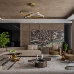
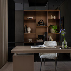
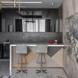
To harness colour psychology in designing intentional spaces, begin by considering the desired mood for each room. Soft shades of blue or green, such as lavender or sage, can promote serenity in a bedroom. Cooler blues combined with bursts of energising yellow can boost focus and productivity in a home office. Colour also significantly influences our perception of space, with lighter tones creating an airy, expansive feel, and darker shades adding intimacy and drama. This understanding is particularly valuable in open-plan areas, where strategic colour choices can delineate zones and enhance functionality.
Creating Harmony and Balance
Effective interior design transcends selecting the "right" colours, but rather creating a harmonious and balanced palette. The colour wheel serves as a guide for understanding colour relationships. Analogous colours adjacent to the wheel offer a sense of unity, while complementary colours, opposite each other, provide dynamic contrast. Adhering to the "60-30-10 rule" ensures a visually pleasing balance: 60% of a dominant colour, 30% of a secondary colour, and 10% of an accent colour. This principle prevents overwhelming visual clutter while infusing spaces with depth and interest.
The Final Choice of Choosing the Perfect Colour
While colour psychology offers innumerable insights, it's essential to acknowledge its fluidity rather than a rigid science. The interplay of personal preferences and cultural influences adds layers of complexity to the colour selection process. Therefore, the quest for the perfect hue is best approached with an experimental spirit. Take the plunge and test colour samples under various lighting conditions, observing how they harmonise with different furnishings. It's through this tactile exploration that the true essence of colour reveals itself, guiding us towards the perfect palette that resonates with our space.
Lastly, remember that your home is an extension of your personality. So make sure to celebrate and use shades that resonate with you and reflect your unique style!
Chromatic Conversations Between Perception and Emotion
When light enters our eyes, it triggers photoreceptor cells in the retina, which then relay signals to the brain, interpreting them as colours. Yet, colour perception extends beyond a mere physical process! Here, cultural associations and past experiences also shape our reactions. For instance, red may evoke feelings of passion or danger, depending on context.
Often specific colours are linked to distinct emotions and behaviours, for instance, warm hues like red, orange, and yellow tend to be invigorating and social, ideal for areas like living rooms or dining spaces. On the other end, cool tones such as blue and green induce a sense of calm and focus, making them perfect for bedrooms or home offices.
Harnessing the Power of the Palette
To harness colour psychology in designing intentional spaces, begin by considering the desired mood for each room. Soft shades of blue or green, such as lavender or sage, can promote serenity in a bedroom. Cooler blues combined with bursts of energising yellow can boost focus and productivity in a home office. Colour also significantly influences our perception of space, with lighter tones creating an airy, expansive feel, and darker shades adding intimacy and drama. This understanding is particularly valuable in open-plan areas, where strategic colour choices can delineate zones and enhance functionality.
Creating Harmony and Balance
Effective interior design transcends selecting the "right" colours, but rather creating a harmonious and balanced palette. The colour wheel serves as a guide for understanding colour relationships. Analogous colours adjacent to the wheel offer a sense of unity, while complementary colours, opposite each other, provide dynamic contrast. Adhering to the "60-30-10 rule" ensures a visually pleasing balance: 60% of a dominant colour, 30% of a secondary colour, and 10% of an accent colour. This principle prevents overwhelming visual clutter while infusing spaces with depth and interest.
The Final Choice of Choosing the Perfect Colour
While colour psychology offers innumerable insights, it's essential to acknowledge its fluidity rather than a rigid science. The interplay of personal preferences and cultural influences adds layers of complexity to the colour selection process. Therefore, the quest for the perfect hue is best approached with an experimental spirit. Take the plunge and test colour samples under various lighting conditions, observing how they harmonise with different furnishings. It's through this tactile exploration that the true essence of colour reveals itself, guiding us towards the perfect palette that resonates with our space.
Lastly, remember that your home is an extension of your personality. So make sure to celebrate and use shades that resonate with you and reflect your unique style!