The Secret to Using Rich, Dark Paint
See how deep colours – navy blue, charcoal, dark chocolate – can bring out your home's best details

Colour plays such an important role in interior design. A room’s entire mood can be enhanced or completely ruined by one decision. The wrong decision can mask interesting design details, help create an uninteresting space or throw everything out of balance. But, when the colour is just right, everything comes into focus. Art pops, interesting architectural details are highlighted and drama is created.
This ideabook is all about using dark colours. I’m talking about navy, dark chocolate, black, charcoal – all colours we typically shy away from because we’re not sure how to use them appropriately. Here are 9 ways you can use these rich paint choices to great effect in your next interior design project.
This ideabook is all about using dark colours. I’m talking about navy, dark chocolate, black, charcoal – all colours we typically shy away from because we’re not sure how to use them appropriately. Here are 9 ways you can use these rich paint choices to great effect in your next interior design project.
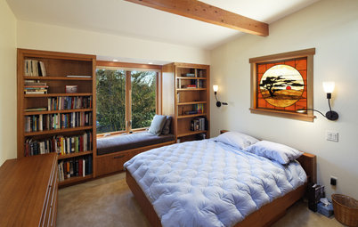
The design of this master bedroom creates a cocoon-like environment. Chocolate brown walls paired with crisp white linens and warm wood tones create a comfortable, relaxing space.
Here’s how to work with brown colour
Here’s how to work with brown colour
2. Create contrast
The deep reddish-brown tones on the upper portion of these walls are offset by the white wainscoting and the white wood ceiling. There’s no better way to greet your guests than with a room rich in comfort, a little drama and all the amenities.
The deep reddish-brown tones on the upper portion of these walls are offset by the white wainscoting and the white wood ceiling. There’s no better way to greet your guests than with a room rich in comfort, a little drama and all the amenities.
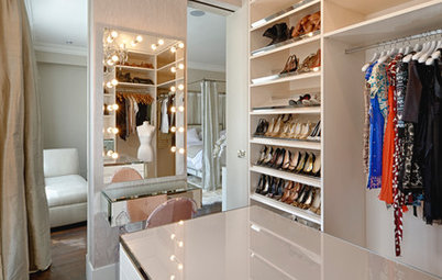
3. Use a dark wall colour to highlight the other design elements in the room
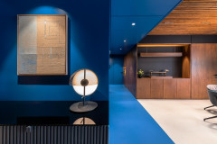
With any other colour on these walls, the stunning cabinetry and marble counters would look washed out. By pairing these design elements with a deep navy, each element gets a chance to be noticed and appreciated.
With any other colour on these walls, the stunning cabinetry and marble counters would look washed out. By pairing these design elements with a deep navy, each element gets a chance to be noticed and appreciated.
4. Use wall colour to create an art gallery
The palette in this stunning hallway is simple: White and deep grey-brown. The wall colour acts as a perfect backdrop for all the white design elements. Simple white picture frames, white console table and a “porcupine quill” mirror all stand out beautifully.
These colours are great for gallery walls
5. Consider a deep neutral tone to highlight bright colours
Some might say using a deep brown in a nursery is crazy. I beg to differ. The particular tone of brown is a perfect backdrop for all the colourful toys, artwork and furniture that makes this room a perfect space for your baby. And it’s neutral enough that you could decorate for either a boy or a girl – just imagine pink and brown, a classic colour combination.
Some might say using a deep brown in a nursery is crazy. I beg to differ. The particular tone of brown is a perfect backdrop for all the colourful toys, artwork and furniture that makes this room a perfect space for your baby. And it’s neutral enough that you could decorate for either a boy or a girl – just imagine pink and brown, a classic colour combination.
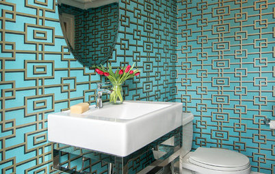
6. Use dark tones to highlight architectural features
This well-appointed vintage powder room is really about the contrast between the walls and white architectural elements: Window trim, crown moulding, shutters. Because of the contrast, we really notice the cute little window, which I think is the real star of this bathroom.
This well-appointed vintage powder room is really about the contrast between the walls and white architectural elements: Window trim, crown moulding, shutters. Because of the contrast, we really notice the cute little window, which I think is the real star of this bathroom.
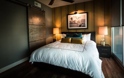
7. Consider your lighting plan
No matter the room, thinking through the lighting plan upfront, especially if you’re remodelling, allows flexibility in using a darker tone on the walls. In this master bedroom remodel, we designed a full lighting system based on the eventual location of the clients’ artwork. By spreading the light around the room, rather than just having a central ceiling fixture and couple of nightstand lamps, we were able to use a more dramatic shade on the walls.
No matter the room, thinking through the lighting plan upfront, especially if you’re remodelling, allows flexibility in using a darker tone on the walls. In this master bedroom remodel, we designed a full lighting system based on the eventual location of the clients’ artwork. By spreading the light around the room, rather than just having a central ceiling fixture and couple of nightstand lamps, we were able to use a more dramatic shade on the walls.
8. Use a darker colour to define the function of a space
In this grand master bathroom, the tub area is called out with a deep brown tone, setting off the white tub nicely.
Take a look at these breathtaking black bathrooms
In this grand master bathroom, the tub area is called out with a deep brown tone, setting off the white tub nicely.
Take a look at these breathtaking black bathrooms
9. One dark wall might be all that’s needed
There is something about this room that is incredibly special. It’s simple, clean and uncluttered. The charcoal grey wall is used to great effect, helping make the room seem a little larger. This type of treatment is a good starting place if you’re hesitant to paint all the walls a dark colour.
Read more:
Houzz Tour: Delicious Dark Tones Light Up a Mumbai Apartment
Tell us:
Which dark paint most attracts your eye? Tell us in the Comments below.
Darker colours immediately make a room feel more intimate and cozy. For some rooms, such as a parlour, bedroom or large living space, this is the desired effect. The deep charcoal grey on these walls set the mood for a perfect gathering spot for an evening with friends around the piano, or having cocktails and great conversations.
How to Work Your Room Around a Grey Sofa