Pantone's Colour of the Year 2019 Revealed: Living Coral

French interior designer Anne Azoulay sees it in opposition to wider trends. “Coral is a departure from the current decor schemes that favour deep greens and blues or moss and lichen greens, and desaturated colours containing touches of black. It’s a beautiful colour for people ready to dare originality. For all those who like to go with trendy colours, coral is interesting on small accessories, which are easy to swap out.”
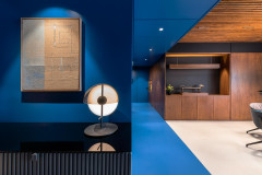
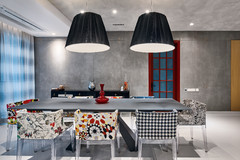
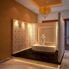
Browse through images of coral spaces
Browse through images of coral spaces
From sea to forest: Natural associations drive coral colour schemes
The starting point for using coral in an interior is, of course, finding good pairings. Here, natural associations step front and centre. Japanese colour specialist, Mayumi Amimura, says to learn from nature, “Coral would calm down and create a relaxing atmosphere when paired with colours and textures from nature, like green and wood.”
The starting point for using coral in an interior is, of course, finding good pairings. Here, natural associations step front and centre. Japanese colour specialist, Mayumi Amimura, says to learn from nature, “Coral would calm down and create a relaxing atmosphere when paired with colours and textures from nature, like green and wood.”
Coral and aquamarine: A contentious classic
Of course, one natural association that’s come up several times already is a classic: Coral and blue. As it turns out, the design community has a love/hate relationship with this ubiquitous duo.
Russian designer Irina Kovylina says, “indeed, coral can be combined perfectly with aquamarine. Both because of the associations with the ocean, and because they are complimentary colours.”
Anne Azoulay, on the other hand, recommends staying away from this assertive combo. “I think the coral-turquoise association should be avoided. Juxtaposing two strong colours results in an explosion of bad taste.”
Other combinations
One reason coral could be destined for greatness in 2019 is that it fits right in with some of the natural schemes we’ve been looking at this year, according to some of the designers we surveyed. Beyond this, it seems that pairing coral is a matter of taste.
“Coral is an easy, natural fit with fresh white, soft greys and a small amount of black, along with lighter [woods], but it is particularly interesting when paired with pale blues and dirty purples, too,” says Sonia Simpfendorfer.
Coral: Hero or highlight?
In the preceding photos, we’ve seen coral appearing on everything from small accents like pillows to full walls. What do our designers think? How much coral is just right?
Sonia Simpfendorfer says that using coral unapologetically will make it the hero. Think a pair of linen covered sofas, painted-timber chairs around a dining table, a long, low TV unit, a wall of custom joinery concealing a bar. “Don’t be shy! I’d paint a [wood] floor in coral too. It’s the kind of colour that could be fantastic as a front door – painted both sides of course.”
Other designers advocate focusing on accents first. “It can work well everywhere, it all depends on how much is used,” says Lia Lovisolo.
What kinds of accents are best?
There are lots of options for putting coral touches into a room. “An easy way to integrate and play with a bright colour in a room is to start small and simple, such as through accent pillows and throws,” says Jennifer Ott, architectural colour specialist and Houzz U.S. contributor. “These pieces offer a dash of colour that isn’t overwhelming, and they aren’t a big commitment since they are affordable enough to swap out down the road if you get tired of the colour.”
There are lots of options for putting coral touches into a room. “An easy way to integrate and play with a bright colour in a room is to start small and simple, such as through accent pillows and throws,” says Jennifer Ott, architectural colour specialist and Houzz U.S. contributor. “These pieces offer a dash of colour that isn’t overwhelming, and they aren’t a big commitment since they are affordable enough to swap out down the road if you get tired of the colour.”
“Textiles – carpets, cushions, armchairs, and so on – lend themselves well to this colour,” Alexandra Gorla says.
Learn how to show off your ceramics and tableware
Learn how to show off your ceramics and tableware
Alla Shumeiko has used this colour on striking curtains in an otherwise grey-toned room. “They were very thin linen curtains in coral. Sunlight passes through them and paints the grey wall in a cosy shade. The idea of using this as a secondary shade was based on the decor of the bedroom en suite – we have a coral ceiling there.”
Which rooms can benefit most from coral?
In advising where to use coral, many pros focus on its effect on our mood and well-being. Mayumi Amimura says coral can add a touch of happiness and warmth to the room. “Adding coral to a ‘colder’ part of the home, such as powder rooms and dressing rooms, would help add warmth. However, using coral all over the room might be too much. In those cases, placing green at eye-level would help bring out coral’s beneficial qualities”.
With that in mind, however, Houzz pros show how coral can shine in almost any room in the house.
1. Bedroom
Shumeiko is not the only one who sees coral as a great fit for a bedroom. “I can imagine coral on a bedroom wall, where the window frames and the base of the wall are underlined by an anthracite – almost black – and with a beautiful black-and-white photo in a frame,” Anne Azoulay says.
“Indeed, it shares with red the quality of making walls appear closer,” Alexandra Gorla says, “and it makes it possible to create a more intimate space in a long room, by visually resizing spaces.”
Anne Azoulay advises using coral “in a bedroom with light, warm colours (off-white, greige, taupe), on bed linen or curtains. Or in a living-room, with coral cushions or plaid on a dark sofa or a carpet that contains coral touches,” says.
Wondering what colour you should paint your bedroom walls?
2. Kitchen
When it comes to wall colour, Sonia Simpfendorfer says the kitchen area is a contender. “It’s warmth and golden undertone make it versatile, so it works well with food but it’s also a relaxing colour despite it’s strength.”
When it comes to wall colour, Sonia Simpfendorfer says the kitchen area is a contender. “It’s warmth and golden undertone make it versatile, so it works well with food but it’s also a relaxing colour despite it’s strength.”
3. Bathroom
Expert Ursula Kohlmann, painter and owner of Verwandlung Remmers Malerwerkstätten, says
“Coral is a great colour for a bathroom: It puts you in a good mood in the morning. In living rooms, it’s a good idea for the less brave to paint one or two accent walls in coral, for example the wall behind the couch or the dining table, and the rest of the room in a grey-beige colour. In dark rooms coral is perfect for creating a bright, warm and cozy overall effect.“
4. Living & dining rooms
Alexandra Gorla says, “[Coral] is best adapted to public areas: To highlight the dining area of a dining room; on the wall or sofa in a living room; and in children’s rooms.”
Alexandra Gorla says, “[Coral] is best adapted to public areas: To highlight the dining area of a dining room; on the wall or sofa in a living room; and in children’s rooms.”
5. Outdoors
“It can also be used profitably in outdoor spaces, on a balcony or poolside, like in Mediterranean countries.” says Anne Azoulay.
“I imagine it outside, on the walls of a terrace to evoke Spain and the warm countries,” Alexandra Gorla says.
“It can also be used profitably in outdoor spaces, on a balcony or poolside, like in Mediterranean countries.” says Anne Azoulay.
“I imagine it outside, on the walls of a terrace to evoke Spain and the warm countries,” Alexandra Gorla says.
6. Anywhere – as long as there’s a wow effect
“One of my favourite places to use a daring hue is on the front door,” Ott says. “To me, this is the best use of the lively hue, to welcome visitors to your home,” Jennifer Ott says.
Here’s how to choose an inviting front door colour
“One of my favourite places to use a daring hue is on the front door,” Ott says. “To me, this is the best use of the lively hue, to welcome visitors to your home,” Jennifer Ott says.
Here’s how to choose an inviting front door colour
Tips and tricks
As with most colours, a few tips and tricks can help coral put its best foot forward.
“The trick with using coral well is in the choice of gloss level,” Sonia Simpfendorfer says. “It is most desirable when kept in a matt or low gloss finish. When in high gloss it can take on a quite synthetic appearance – which could be fun, but it’s not as sophisticated.”
“By choosing a matte paint that reflects the light very softly, you can create a more gentle and calm space with a coral color,” says Akitsu Katsuura.
Read more:
Colour Me Bold: 11 Ways to Energise Your Home
Tell us:
What do you think of the Pantone Colour of the Year? How do you plan on using it in your home? Tell us in the Comments below.
Colour Me Bold: 11 Ways to Energise Your Home
Tell us:
What do you think of the Pantone Colour of the Year? How do you plan on using it in your home? Tell us in the Comments below.
Describing this shade as “vibrant yet mellow” in their press release, Pantone suggest that coral is a nurturing shade that bridges the natural and digital worlds and “symbolis[es] our innate need for optimism and joyful pursuits.”
But how do we use it in our decor? Houzz pros from around the world weigh in on how you can use living coral in your interior.
A colour for discerning tastes
Sonia Simpfendorfer, of Australian colour consultancy Nexus Designs, says coral has the potential to be very popular. “Pink has been a dominant colour recently – pastel pink, calamine pink, dirty pink – the whole spectrum of pinks, and it’s brought some loveliness and calmness to interiors. Coral is something quite different. Strong and welcoming, its energy is warmer, more playful and inclusive,” she says. “I see coral as being a related colour to emerge from the massive resurgence of interest in red bricks, which is something that we’ve been tracking. It’s like a washed, worn, classic brick colour. Really liveable and familiar.”