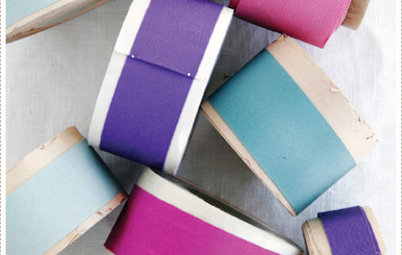
Opposites Attract: Orange and Blue
This No-Fail Color Combination Works With Every Design Style

I'm a sucker for blue and orange. The combination of the two emits a burst of energy. Until I started combing Houzz for examples, I did not realize how well this pairing works with every single design style. Depending on the particular hues and doses of oranges and blues, this is a very versatile pairing of opposite colors.
Groovy. An Artichoke Light, mid-century modern style furniture and a retro painting celebrate the combination.
Cozy country. A bright yet traditional style quilt and lovely porcelain lamp look great against a backdrop of very pale blue walls.
Hollywood Regency. Chinoiserie statuettes and reading lamp, a lacquered nightstand and a headboard with upholstery-nail detailing add to the exuberance of this color combination.
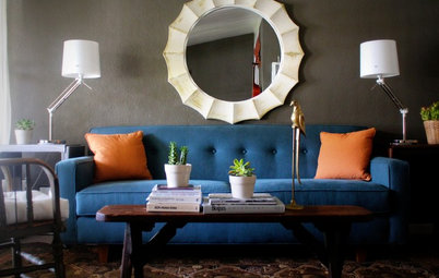
Meditative. Rich orange and blue even work in a soothing meditative space. Do you know where the wall hanging and other items are from? Let me know in the comments!
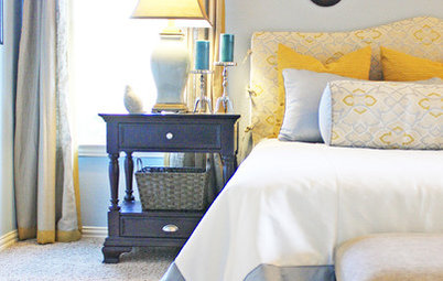
Boyish. These crisp stripes paired with navy curtains and neutral duvets make a happy space that fosters creativity.
Subdued nautical. This chair and curtains border on apricot/peach, and together with chocolate and light blue they provide an almost neopolitan alternative to navy and white nautical.
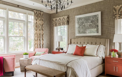
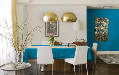
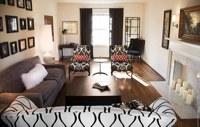
Transitional. The deeper hues used here (darker blue, pumpkin) paired with traditional furnishings and abstract art create a room that's somewhere between traditional and contemporary.
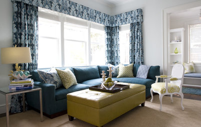
Modern. When a mostly-neutral palette needs just a little sumpthin-sumpthin, add a dash of orange and a calming blue.
Kitschy. The retro accent pieces here seem to take their cues from the Nelson Ball Clock, with bright turquoise and orange accents packing a punch.
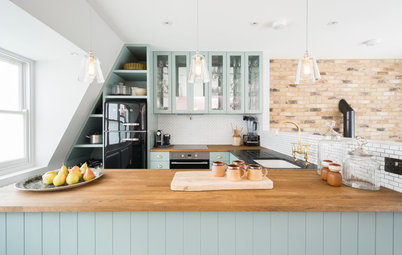
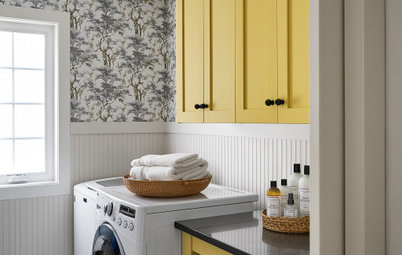
Modern farmhouse. This light and airy room utilizes a palette that skews more toward pastel hues.
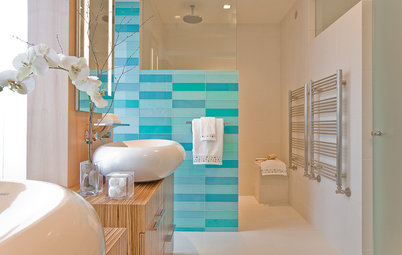
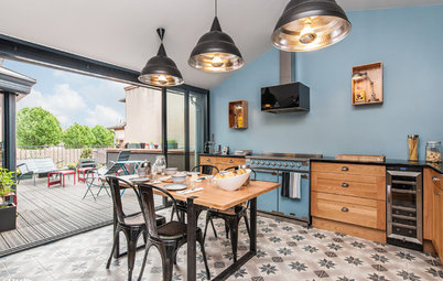
California cool. This kitchen reminds me of a Sea Ranch renovation, or the kind of place you would have found on an AIASF Marin County House Tour. The ocean-blue counters and tiles punctuated by the orange cookware add loads of color and personality to this contemporary kitchen.
Crisp gallery. Periwinkle and an orange I'll call "Gerber" add life to this long white space.
More:
How the Color Wheel Can Help You Choose Your Palette
Confident Color: When to Use Cool and Warm Hues
More:
How the Color Wheel Can Help You Choose Your Palette
Confident Color: When to Use Cool and Warm Hues