Obsessed With Gray in the Kitchen
See How to Use This Sexy Neutral to Heat Up Your Cookspace

Occasionally I get a little design bug in my bonnet (read "really cool hat") on a particular color or maybe an interesting tile texture or just whatever. Right now, my obsession is all about using gray in its many different forms. Most home owners are hesitant to use this particular color because of the common misconception that gray is a "cold" color. However, in my obsession I've been working diligently to find just the perfect shades of gray. The beauty of gray is that it looks great in both paint and so many other textures. Gray can be one of the best neutrals because it works with nearly every other color out there. It just depends on the particular shade, and warmth or coolness of the tone.
This ideabook is all about how to use gray in your kitchen without making the space cold or uninviting. You'll see both contemporary and traditional spaces, speaking to the sheer adaptability of this color.
This ideabook is all about how to use gray in your kitchen without making the space cold or uninviting. You'll see both contemporary and traditional spaces, speaking to the sheer adaptability of this color.
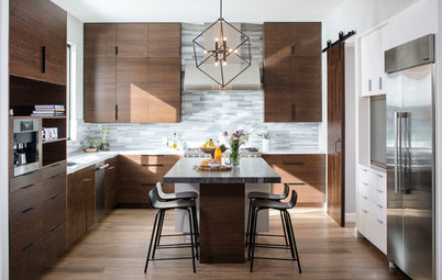
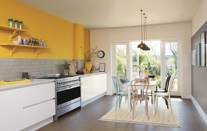
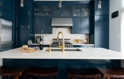
A great combination of colors makes this contemporary kitchen anything but cold. Cabinets painted in a gray with a touch of brown are paired with a dark wood tone and natural travertine. Splashes of color in the high display cabinets and bar chairs add a personal touch.
With a super industrial feel, the dark gray cabinetry and corrugated metal insets create such an interesting combination that one might not notice the funky fish hanging over the sink. Combining the lighter metal with the darker gray cabinetry keeps the kitchen from feeling too dark.
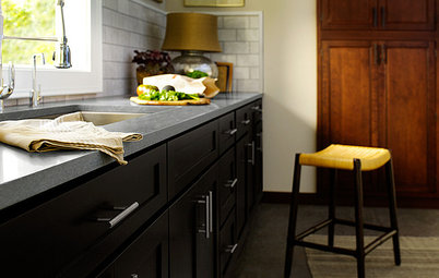
Amherst Gray by Benjamin Moore is a great dark gray for kitchen cabinetry.
Amherst Gray by Benjamin Moore is a great dark gray for kitchen cabinetry.
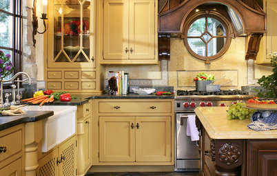
In this traditional kitchen, light gray walls, nearly black cabinetry and the gray rug in the foreground provide light, medium and dark tones of gray.
Look at Sherwin Williams Silverplate (SW7649)
Look at Sherwin Williams Silverplate (SW7649)
Nothing sexier than the gray of concrete — there's just something about this particular type of gray that gets my heart racing. Again, the warm wood tones are used in clever ways to counter the coolness of the gray and the glossy white cabinetry. Looking beyond the kitchen, we see the use of additional tonal variations of gray, adding to the overall effect.
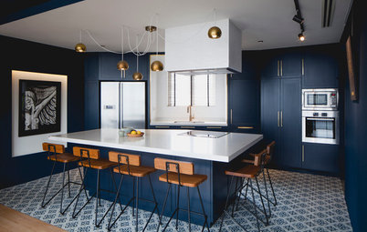
Maybe intentionally, maybe not, this white and soft-gray kitchen is so incredibly elegant and feminine. The basic palette provides a beautiful backdrop to the other splashes of colors in the accessories.
This contemporary kitchen is really about the beautiful wood cabinetry and the striking shape of the raised-bar countertop. Even with the cold grayness of the concrete, the counter stills feels like it belongs as a cohesive part of the overall aesthetic. It plays an important role in creating structure around the island, while tying the rest of the room to the kitchen by carrying the flooring materials (and color) through the space.
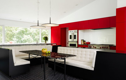
Here's another beautiful example of how a gray hard surface ties into an incredibly inviting and warm kitchen. The deep reddish brown cabinetry perfectly plays off the island counter to create an environment that speaks to hanging out and enjoying family and friends.
This fairly straightforward kitchen is all about color and texture. High-gloss white upper cabinets are paired with subtle gray-green lower cabinetry for a real treat. To bring it all together, a middle tone of stainless steel grating is used to wrap the sides of the island. Both functional and durable, the tonal quality mixed with the texture plays a good middleman to the rest of the colors and materials.
More:
How to Pick the Right Gray Paint
More:
How to Pick the Right Gray Paint