New This Week: 4 Not-White Kitchens With Character
See how cabinets in gray, pale green, light wood and inky blue bring character and dimension to their spaces

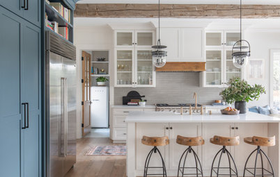
White is the top color choice for kitchen cabinets among people renovating a kitchen, according to the latest Houzz research. But anecdotally, and in new kitchen photos being uploaded to Houzz, that color choice appears to be shifting. “I see kitchens trending away from the white-on-white that we have seen for years,” designer Nate Fischer says. “White is, and will always be, timeless. However, using warmer and more natural-feeling materials in a kitchen is what people are gravitating toward.”
Fischer used bleached red oak cabinets in his own kitchen to introduce warmth to the design, which includes many white finishes. His kitchen is featured below, along with kitchens by three other designers who avoided white cabinets in recent kitchen projects.
Fischer used bleached red oak cabinets in his own kitchen to introduce warmth to the design, which includes many white finishes. His kitchen is featured below, along with kitchens by three other designers who avoided white cabinets in recent kitchen projects.
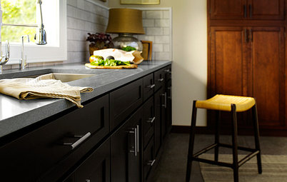
2. Pale Blue-Green
Designers: Cindy Aplanalp-Yates and Amber Reddoch of Chairma Design Group
Builder: Stone Acorn Builders
Location: Bellaire, Texas
Size: 301 square feet (28 square meters), including a large pantry
Homeowners’ request. For this new-construction house, the owners wanted a large kitchen with an open, welcoming and happy vibe.
Cabinets. Rookwood Blue Green by Sherwin-Williams. An antique piece in the “superpantry,” as designer Cindy Aplanalp-Yates refers to it, is painted Rookwood Sash Green by Sherwin-Williams. “The white ceiling millwork detail and shiplap throughout the home helped us land on [using] a color for the kitchen cabinetry,” Aplanalp-Yates says. “We selected the rugs and overarching color palette before choosing counter slabs and handmade backsplashes for both the kitchen and the superpantry. All of these choices helped us to narrow down the main cabinet colors.”
Other special features. Backsplash tile handmade in Mexico. Quartzite countertops in a leathered finish. Custom copper vent hood.
“Uh-oh” moment. “Blending two individuals’ ideas into a cohesive whole was a challenge,” Aplanalp-Yates says. “Both owners had very clear ideas of what they wanted and were not always on the same page. What made them really fun to work with was seeing how they compromised and respected each other’s opinions. Fortunately, they both really liked color, hence the brightness of this space.”
Shop for kitchen island seating
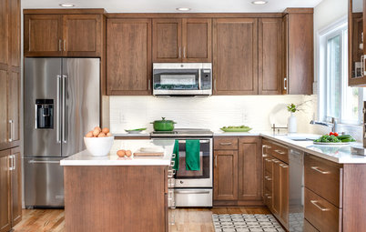
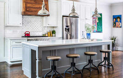
3. Bleached Red Oak
Designer: Nate Fischer
Location: Laguna Niguel, California
Size: 300 square feet (28 square meters)
Homeowners’ request. “I had a long list of must-haves for this space,” designer Nate Fischer says. This is his personal kitchen. “It is a small space, but an island was a must, as the original kitchen did not have one. Everything came down to the inch to make a narrow island and narrow walkways work, but it did. The space needed to be a perfect combination of modern and classic. Something bright and fresh, but also warm and cozy.”
Cabinets. Light gray-washed red oak. Fischer considered using white oak for the cabinets, but bleached red oak was less expensive. “I didn’t use a stain but a slight gray wash over the wood to keep it from reading too orange,” Fischer says. “Using wood instead of white on the cabinets let me bring in white tones with other materials in the room without it feeling too white. As much as I love white in a kitchen, to keep things more natural-looking I avoided true whites. I used a cream-colored sink, gray and warm tones in the backsplash tile, and a warmer white wall color.”
Other special features. Dark gray soapstone perimeter countertops with cut grooves that drain toward the sink. Marble island countertop with waterfall edge. Marble 6-by-6-inch backsplash tile. Millwork ceiling. “Anytime I am designing a completely new space, I love bringing in an older element,” Fischer says. “I tracked down the antique Russian pendant light in the perfect pastel mint color. And anything you can do to free up counter space is always welcome, so the cabinet-mounted fruit baskets really help give back some much-needed counter space.”
Designer tip. “Be sure to bring in some accents with contrast and style, but not too much,” Fischer says. “My light fixtures, countertops and windows were all the room needed for something with a contrasting or graphic element. I kept the cabinet pulls simple and very close in color to the cabinets, to keep visual distractions at a minimum.”
“Uh-oh” moment. “I got a great deal on a Shaws fireclay farm sink,” Fischer says. “It’s a big 36-inch sink, and the savings were too good to pass up. When I got the sink, I saw that it was a light beige color. At first I was heartbroken. I had envisioned a bright white sink. Now I love the softer natural feel that it brings into the space.”
Cabinet hardware: zinc Skylight pulls in Elusive Golden Nickel color, Hickory Hardware; faucet: Trinsic pull-down in matte black, Delta; chairs: Lowe midcentury in white, Btexpert
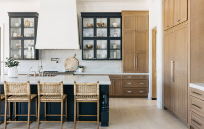
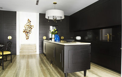
4. Custom Inky Blue
Designer: Lindsay Peters of Elle Peters Design
Location: Calgary, Alberta, Canada
Size: 252 square feet (23 square meters); 12½ by 20 feet
Homeowners’ request. “The homeowners had a clear vision for a moody, colorful kitchen that was both highly functional and beautiful,” designer Lindsay Peters says. “They weren’t afraid to be bold. We were inspired by the trendy and elegant streets of SoHo, New York.”
Cabinets. The inky blue cabinet color is a custom mix of 75 percent Railings and 25 percent Hague Blue, both by Farrow & Ball. “The clients had a white kitchen at their previous residence, and they were ready for a drastic change,” Peters says. “Avoiding upper cabinets and including a custom white range hood surround really helped us keep the space from feeling too dark and heavy. Brass accents also help to brighten the cabinets.”
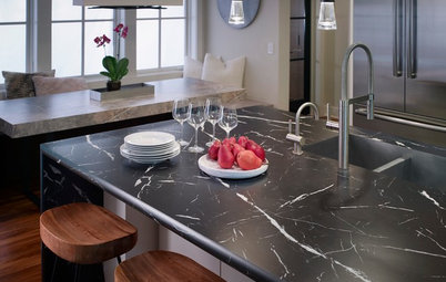
Other special features. Paonazzo marble countertops, slab backsplash and floating shelves. “There’s no question that the marble is a particularly striking feature of the space,” Peters says. “We looked at a lot of slabs before finally pulling the trigger on this Paonazzo beauty. I think the colorful veining provides just the right amount of drama we were going for.”
Designer tip. “I’m all about the symmetry, and I think it went a long way when designing the back wall,” Peters says. “We balanced the integrated fridge-freezer block with an identical-looking full-height pantry. The range is centered in between and flanked by mirrored floating shelves.”
“Uh-oh” moment. “The clients found the most beautiful bridge faucet for the project,” Peters says. “Unfortunately the countertop installer did not check the specifications prior to drilling the hole for the faucet and assumed it was a conventional model, leaving us with a hole in the precious marble in the middle of the bridge. Luckily we were able to install the [garbage disposal] button at this location.”
More on Houzz
The Latest Looks for Cabinets at IBS and KBIS 2020
The Most Popular Styles and Cabinet Choices in Kitchen Remodels
Find a pro to help with your kitchen remodel
Shop for products on Houzz
Designer: Lindsay Peters of Elle Peters Design
Location: Calgary, Alberta, Canada
Size: 252 square feet (23 square meters); 12½ by 20 feet
Homeowners’ request. “The homeowners had a clear vision for a moody, colorful kitchen that was both highly functional and beautiful,” designer Lindsay Peters says. “They weren’t afraid to be bold. We were inspired by the trendy and elegant streets of SoHo, New York.”
Cabinets. The inky blue cabinet color is a custom mix of 75 percent Railings and 25 percent Hague Blue, both by Farrow & Ball. “The clients had a white kitchen at their previous residence, and they were ready for a drastic change,” Peters says. “Avoiding upper cabinets and including a custom white range hood surround really helped us keep the space from feeling too dark and heavy. Brass accents also help to brighten the cabinets.”
Other special features. Paonazzo marble countertops, slab backsplash and floating shelves. “There’s no question that the marble is a particularly striking feature of the space,” Peters says. “We looked at a lot of slabs before finally pulling the trigger on this Paonazzo beauty. I think the colorful veining provides just the right amount of drama we were going for.”
Designer tip. “I’m all about the symmetry, and I think it went a long way when designing the back wall,” Peters says. “We balanced the integrated fridge-freezer block with an identical-looking full-height pantry. The range is centered in between and flanked by mirrored floating shelves.”
“Uh-oh” moment. “The clients found the most beautiful bridge faucet for the project,” Peters says. “Unfortunately the countertop installer did not check the specifications prior to drilling the hole for the faucet and assumed it was a conventional model, leaving us with a hole in the precious marble in the middle of the bridge. Luckily we were able to install the [garbage disposal] button at this location.”
More on Houzz
The Latest Looks for Cabinets at IBS and KBIS 2020
The Most Popular Styles and Cabinet Choices in Kitchen Remodels
Find a pro to help with your kitchen remodel
Shop for products on Houzz
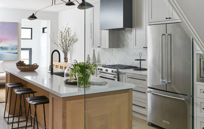
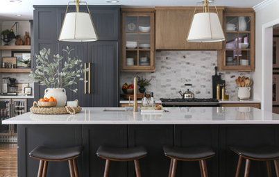
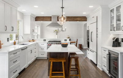
Designer: Stephanie Flemming of Flemming Interiors
Location: Chicago
Size: 300 square feet (28 square meters); 10 by 30 feet
Homeowners’ request. A warm and clean space with better storage solutions. Prior to the renovation, a peninsula perpendicular to the range wall divided the kitchen and eat-in area. Designer Stephanie Flemming removed the peninsula to create a more open plan, then added 30 continuous feet of cabinets on the back wall, drastically increasing storage.
Cabinets. The lower cabinets are custom-stained rift-cut oak. The upper cabinets are painted in Galveston Gray by Benjamin Moore. “Because there are 30 feet of cabinetry on one wall alone, we wanted cabinetry that was still light and bright but felt warm,” says Flemming, who used Houzz to gather inspiration photos for this project. “We achieved this by incorporating wood tones with the gray upper cabinets and using a light-colored countertop and backsplash.”
Other special features. Marble backsplash in herringbone pattern. Custom metal range hood. Custom glass-blown chandelier over eat-in table. Brushed-brass pendants.
Designer tip. “I like to mix up the hardware between the drawers and doors in a kitchen,” Flemming says. “It helps break up the space and makes it more interesting.”
Cabinets: Gravel Lane Design Studio
Find a kitchen designer in your area