Kitchen of the Week: Scandinavian Modern and Family-Friendly
A designer opens up a dated kitchen to other spaces and creates a palette of light wood, white and black

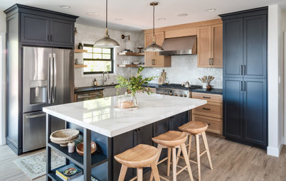
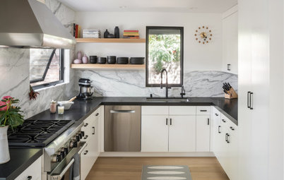
Interior designer Jessica Koltun partnered with a builder to make this dated ranch home in Dallas fresh and appealing to homebuyers. “This neighborhood is very family-oriented and lots of young kids live here,” the designer says. So she came up with a design with wide appeal, particularly to people looking for a nice place to raise a family. She chose a palette of white and wood with black accents, and she gleaned inspiration from Scandinavian modern and California coastal cool designs.
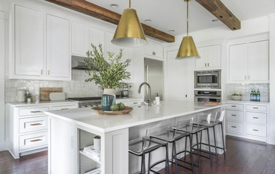
After: The kitchen’s approximately 20-by-10-foot footprint remained about the same. But Koltun replaced the range wall with a hardworking island to open up the plan, making the space feel much larger. She flipped the sink and range locations, placing the range along the exterior wall and the sink and dishwasher in the island. The island also contains trash and recycling pullouts as well as additional storage.
The eat-in area remained in the same spot in front of the picture window. Koltun replaced the existing window with an energy-efficient, double-paned window with low-E glass. “The kitchen gets lots of natural light and it looks out to a great backyard,” she says. Because she’d taken down the interior wall, the designer was able to lose a window on the left without sacrificing light.
Find a local interior designer on Houzz
Covering that existing window made space for a range with a vent hood trimmed with matching wood. “I used a 36-inch range. It doesn’t cost that much more but it looks so much more high-end,” Koltun says. They also brought in a gas line for the new stove.
She knew that calm Scandinavian modern simplicity would appeal to a wide range of buyers. The combination of warm wood, white and black lends a Scandinavian modern vibe. So do the simple lines of the wood-clad island. “And I took inspiration from that California coastal look but warmed it up for Texas,” she says.
Removing the window also left space for a stunning herringbone range backsplash. “I wanted to use a neutral color in here. This gray tile has a lot of variation in color and texture,” she says. “And using a double herringbone pattern gave it a custom look.” She located the outlets under the upper cabinets so as not to break up the backsplash.
Browse counter stools in the Houzz Shop
The layout is appealing, particularly for families with children. The kitchen island provides seating so kids can hang out with parents while staying out of the cooking zone. The eat-in breakfast nook is great for casual family meals. The kitchen is open to the family room, so parents can keep an eye on little ones while prepping meals. And the fridge is located at the edge of the kitchen (just out of view on the left), so it’s easy for kids to grab drinks while staying out of the cook’s way.
“I love to mix countertops,” Koltun says. The island features a quartz that looks like Calacatta marble. She chose solid gray for the perimeter countertops to add contrast.
Matte black finishes on the faucet, light fixtures and counter stool bases add contrast and play off the dark-colored cabinets on the right. Koltun chose brushed brass for the cabinet hardware. “I generally like to use two different metal finishes, three at the most,” she says. “The warm brass keeps the room from feeling too stark.”
Hire a kitchen remodeler
Koltun specified engineered white oak hardwood floors to be installed throughout the first floor. She stained the raw white oak island a shade darker than the floors to make it stand out.
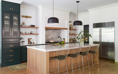
The dark-colored cabinet on the right serves as a good end point for the kitchen cabinet and backsplash runs. “I don’t like it when a backsplash just ends at some drywall,” she says. “And this piece has a freestanding furniture look.” The charcoal color provides strong contrast and plays off the other dark elements like the light fixtures, faucet and counter stool bases. This cabinet and the refrigerator bookend the L-shaped space.
Shop for matte black kitchen faucets
“The way the sun comes in makes this a great spot for breakfast,” Koltun says of the eat-in area. She chose an abstract landscape painting to bring in a light coastal feel. Using a lantern with clear glass kept the views of the painting and out the window relatively clear.
Even though it has dark metal on it, the lantern has a light feeling overall. Conversely, the dark solid wood base of the table anchors the space with something heavy. This combination makes the ceilings feel higher. Classic Danish modern chairs in a light wood enhance the Scandinavian vibe.
Even though it has dark metal on it, the lantern has a light feeling overall. Conversely, the dark solid wood base of the table anchors the space with something heavy. This combination makes the ceilings feel higher. Classic Danish modern chairs in a light wood enhance the Scandinavian vibe.
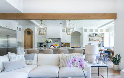
Here’s how the kitchen now relates to the dining room. The space located to the right, directly off the kitchen, is the family room. Koltun used a variety of light fixtures throughout the first floor, but choosing matte black finishes for all of them ties them together.
“While the dining room is visible from the kitchen, the casing and the wood header make it feel separate and not completely open,” she says. She placed the dining table and eat-in kitchen table far away from one another to maintain different atmospheres for each. And she strategically placed the kitchen island to block the view of one from the other.
The design was a success. A young couple bought the house soon after the remodel. It’s the first home they have bought together.
See more photos of this home
More on Houzz
Read more kitchen stories
Browse kitchen photos
Hire local design and remodeling pros
Shop for kitchen products
Kitchen at a Glance
Who uses it: A young couple
Location: Dallas
Size: 200 square feet (18.5 square meters)
Designer: Jessica Koltun
Before: The narrow and closed-in galley kitchen’s glory days had come and gone. Koltun had the wall on the right removed to open up the floor plan.