Kitchen of the Week: A Fresh Take on Midcentury Modern
Texture and pattern play a big part in giving definition to this neutral space

Before: One of the biggest concerns was the slim, U-shaped design, which left little room for the couple to cook together, something they love to do. The laminate counters and ho-hum cabinets and flooring were begging to be replaced.
The couple dreamed of having a more spacious layout with plenty of light and a clean color palette that would match their love of midcentury modern design, with sharp lines, minimalistic shades, functional layout, contrasting materials and touches of metal.
The couple dreamed of having a more spacious layout with plenty of light and a clean color palette that would match their love of midcentury modern design, with sharp lines, minimalistic shades, functional layout, contrasting materials and touches of metal.
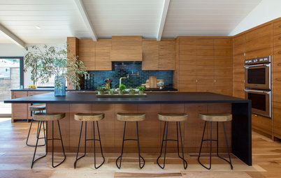
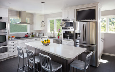
After: “Our main considerations were about materials,” Scheff says. “To me, midcentury translates to wood tones and angular sightlines, squared-off versus rounded edges, flat-front cabinetry and low-profile hardware.”
She encouraged the homeowners to blend creamy, glossy surfaces with matte, textured cabinets that resemble straight-grain wood. When choosing the backsplash, Scheff made sure to subtly incorporate all the colors in the space. The result is a sleek, neutral-toned kitchen with plenty of personality and movement.
Expansion: The extra square footage was gained by moving the peninsula a few feet into the dining room, allowing room for a bigger sink and a wider kitchen overall. Knocking down the overhead cabinets, which had obstructed the view to the dining room, made entertaining more convenient. To make the most of the available space, the team added a pantry with deep cabinets (visible to the right of the walkway in the following photo).
Floors: Scheff wanted the floors to give the room a lighter feel, so she went for ceramic tiles that look like linen. She had them cut to 12 by 24 inches to create the illusion of length. “Since the tiles are long, they also make the kitchen look longer,” she says.
Appliances: Beyond upgrading to stainless steel, the designer and homeowners were also thoughtful about the layout — especially for the refrigerator. “Fridges should be part of the design,” Scheff says. Here, they evenly encapsulated the appliance with cabinets to make it look integrated. The microwave was hidden away under the peninsula.
Appliances: Beyond upgrading to stainless steel, the designer and homeowners were also thoughtful about the layout — especially for the refrigerator. “Fridges should be part of the design,” Scheff says. Here, they evenly encapsulated the appliance with cabinets to make it look integrated. The microwave was hidden away under the peninsula.
Cabinets: Scheff and the homeowners chose flat-front cabinets because they are the most common choice in midcentury kitchens — though in many cases they tend to skew more retro.
Most of the cabinetry (from Martha Stewart’s collection) is made of a patterned wood-like laminate, but the designer chose to go solid and glossy for the upper cabinets to create contrast and a sense of lightness. “Having dark uppers can make the space feel heavy and imposing,” she says.
Most of the cabinetry (from Martha Stewart’s collection) is made of a patterned wood-like laminate, but the designer chose to go solid and glossy for the upper cabinets to create contrast and a sense of lightness. “Having dark uppers can make the space feel heavy and imposing,” she says.
Countertops: Quartz counters are an affordable, virtually indestructible investment. The speckled look of the quartz goes with the cabinets and reflects light upward to brighten the entire room.
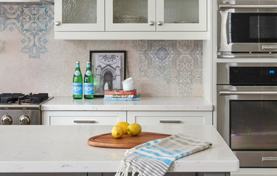
Backsplash: “My clients wanted some texture while keeping within the color palette,” Scheff says. They considered bolder options but ended up with this stone subway tile because it picks up shades from all the surfaces in the kitchen to tie everything together.
Backsplash: “My clients wanted some texture while keeping within the color palette,” Scheff says. They considered bolder options but ended up with this stone subway tile because it picks up shades from all the surfaces in the kitchen to tie everything together.
Smart storage: A drawer inside a drawer is a nifty way to save space and create a safe environment around children. “It’s a great way to keep sharp knives away from little hands,” Scheff says. “Plus, it’s a special and beautiful detail.”
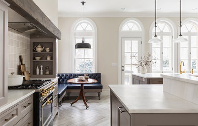
Flow: Opening the dining room and kitchen to each other meant the spaces needed to be designed together. “The rooms have such a strong relationship,” Scheff says. She made sure the furniture, lighting and color scheme in one room worked harmoniously with the other.
Lighting: Scheff knew a cluster of fixtures wouldn’t work. “Unless you have a large space, incorporating too many pendant lamps can become busy,” she says. “I prefer to have a clear featured lighting source for each space, where fixtures don’t match but are related.”
The dining room and kitchen function visually as one space, so Scheff and the homeowners chose to place a focal light above the dining table and balance it out with a flush-mount light over the sink. The latter is smaller but stylish, with black accents to match the faucet and dining room light. Four-inch recessed lights in the ceiling provide additional light while keeping the sightlines clean.
More
Your New Kitchen: 7 Tricky Questions You Didn’t Know You’d Ask
From the Pros: 8 Reasons Kitchen Renovations Go Over Budget
4 Kitchen Design Decisions to Spend a Little Extra Time On
Other Resources on Houzz
Search for kitchen products
Find a pro near you
Kitchen at a Glance
Who lives here: A couple and their two boys
Location: Seattle
Size: 125 square feet (11.6 square meters)
Designer: Allison Scheff of Distinctive Kitchens
The backstory: When two young parents bought this West Seattle home, they knew they had their work cut out for them. The house had been a rental, so it hadn’t received much love or updating.
The new owners didn’t want to spend a lot of money, and since they’re handy with tools they opted to do most of the construction themselves. They called in designer Allison Scheff to consult on the overall look and feel and to help with selecting materials and finishes. With a baby on the way, the couple — and Scheff — had to be scrappy with their time and budget.
Scope of work: Although the footprint of the kitchen didn’t change much — they only added about 25 square feet (2.3 square meters) — the project required a full gut to replace the dated materials, such as the laminate counters and 30-year-old fridge, as well as the cramped layout.
They ripped out the old cabinets and floors, replaced all the appliances, added more storage, redid the electrical and plumbing and widened the sink to give the entire space the width needed to comfortably accommodate the family’s cooking and entertaining needs.