Houzz Tour: A Smart Layout and Storage Transform a Victorian Home
A touch of lateral thinking in this terraced house helped to turn a privacy issue on its head – quite literally

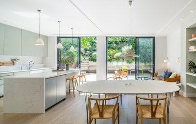
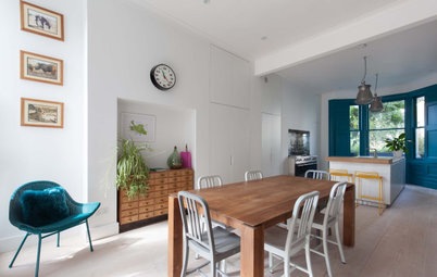
To gain light, flow and, most of all, privacy in this Victorian terraced house, architect Trevor Brown had a few tricks up his sleeve. A back-to-front ground-floor layout with a widened middle section has created a spacious yet intimate open-plan space, while clever storage around the property has added to the home’s brilliant functionality.
The solution? “We turned the house back to front, so the utilitarian kitchen space is at the front and the more private seating area is at the back and looking out to the garden,” Trevor says.
On the original floorplan (pictured) the living room was at the front and the kitchen and dining room were at the back, with a hallway leading from the front door to the back of the house.
On the original floorplan (pictured) the living room was at the front and the kitchen and dining room were at the back, with a hallway leading from the front door to the back of the house.
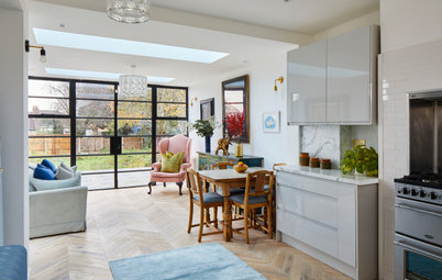
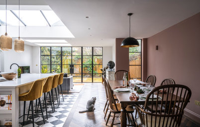
Trevor’s team added a full-width rear extension to the ground floor, and widened the central room by creating a niche right next to the staircase. This middle zone is the dining area and now forms the link between the front and rear of the house.
The owners had brought their large dining table with them from their previous home. Trevor needed to ensure there was enough room around it to move from one part of the open-plan space to the other – which is where the niche comes in.
Trevor designed a bench seat in the space with low-level storage drawers beneath it. Above this are high cupboards that can be accessed from the hallway.
Bench seating painted in Cromarty; walls painted in James White; both Farrow & Ball. Pewter wall lights, Industville. Pendant lights, Cox and Cox.
Bench seating painted in Cromarty; walls painted in James White; both Farrow & Ball. Pewter wall lights, Industville. Pendant lights, Cox and Cox.
The seating niche gives more space for people to move around the table, and also conceals the staircase behind.
Looking for an architect in your area? Read reviews of local companies in the Houzz Professionals Directory
Looking for an architect in your area? Read reviews of local companies in the Houzz Professionals Directory
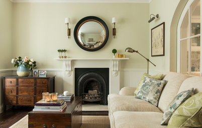
The chimney recess opposite was empty, so Trevor had a simple, white-painted pine fire surround made to provide a feature.
“It’s the first thing you see when you walk in from the hallway,” he says. “We decided not to put the stove here, though, as it would have been too warm near the dining table.”
Radiator, Cast Iron Radiator Centre.
“It’s the first thing you see when you walk in from the hallway,” he says. “We decided not to put the stove here, though, as it would have been too warm near the dining table.”
Radiator, Cast Iron Radiator Centre.
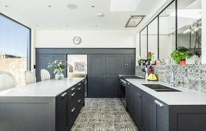
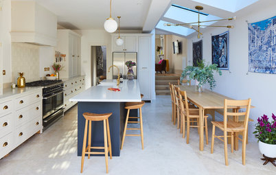
Rich parquet flooring was chosen by the firm’s interior designer, Odetta, to cover most of the ground floor. In the kitchen, however, they laid concrete-effect porcelain tiles as a more practical surface.
The clients worked with Odetta to choose lighting for the kitchen, and went for three different yet complementary pendants in bronze.
“The bronze helps to offset the rich dark blue,” Trevor says. “As the lights were located in different zones of the room, it felt OK to have slightly different designs.”
Double-brushed, herringbone parquet flooring, The Solid Wood Flooring Company. Mortar putty porcelain floor tiles, Mandarin Stone.
The kitchen units are from Ikea, while the fronts are from a company that makes made-to-measure doors and accessories. “If it’s fitted properly, Ikea stuff is really robust and great for modifying,” Trevor says. “You can make it work in any space.”
There wasn’t room for an island, but Trevor thought it was important the owners had a place to stand and face the rest of the space. “We built a peninsula at the end, which also works to clearly define the kitchen from the rest of the space, and provides an extra worksurface,” he says.
The curved design seemed more practical, particularly with small children running around. The zinc worktop contrasts with the simple white quartz worksurface elsewhere.
Kitchen units, Ikea. Doors, Homestyle. Zinc worktops, UKAA.
The bay window is the perfect spot for the sink, as the shape provides a really deep worksurface.
Trevor designed a wall of floor-to-ceiling cabinets to create plenty of storage in both the kitchen and the hallway. The area nearest to the window houses an oven, a fridge-freezer and cupboards for kitchen equipment.
The zone to the left of the oven might look like a kitchen cabinet, but in fact it’s accessed from the hallway – a sliding door opens up to reveal a space for pushchairs and other bulky outdoor paraphernalia.
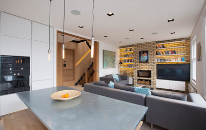
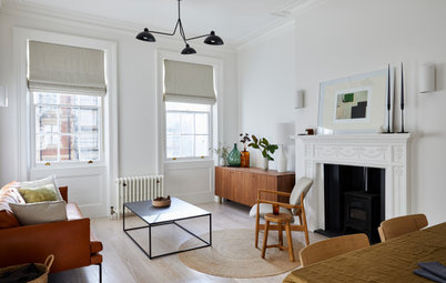
The living area is in the new extension and focuses on a central wood-burning stove.
“Rather than put glazing along the entire back wall, we gave the owners the option of creating a focus that feels cosy in the winter,” says Trevor. “A column sits between a fixed pane window and a patio door, and the furniture is arranged around the stove and the column.”
A huge skylight (2 x 2.5m) brings plenty of light into the centre of the space, which means the back wall doesn’t have to work so hard to illuminate the room.
Wood-burning stove, Jøtul.
The family’s TV has been tucked neatly into the huge shelving unit that Trevor’s team built into the wall, along with rows of books. “The owners have a great selection of books,” the architect says. “The shelves provide a place to display these and other belongings, while the bottom shelves are perfect for toy storage.
“There’s only a small lip around the sides, but the shelves are a foot and a half deep,” he adds. “The dark colour also helps to conceal the television, so it doesn’t dominate the space.”
“There’s only a small lip around the sides, but the shelves are a foot and a half deep,” he adds. “The dark colour also helps to conceal the television, so it doesn’t dominate the space.”
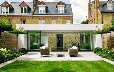
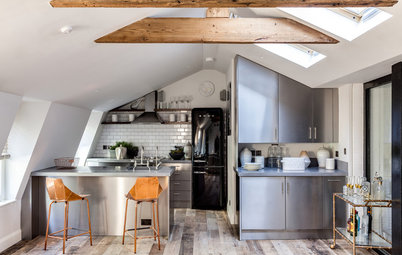
The team extended the house on the ground and first floor, and converted the loft.
“Planning required us to build the extension from brickwork,” says Trevor. “But rather than have standard brick, we worked out how we could lay it differently.”
They used standard English garden wall bond, but on the ground-floor extension they laid the cut bricks so they protrude slightly.
On the first-floor extension, the team reversed this and recessed the cut bricks. “The shadows fall completely differently on each one,” Trevor says.
“The garden was just too dark for a lawn, and the owners didn’t want artificial grass,” says Trevor. “So we designed a simple, practical layout with a clear surface for the kids to play on.
“We enclosed the space with cedar battens, and left them open at the top to make it feel less dense,” he adds. “The back wall reflects the brickwork on the extension.”
The team worked with gardener Theo, from Greenprint Landscapes, who took care of all the planting.
“We enclosed the space with cedar battens, and left them open at the top to make it feel less dense,” he adds. “The back wall reflects the brickwork on the extension.”
The team worked with gardener Theo, from Greenprint Landscapes, who took care of all the planting.
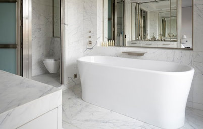
In the family bathroom, the architects removed all the partition walls and reconfigured the space. They chose simple sanitaryware and added quality fittings for a luxurious finish.
Sanitaryware, Bathstore. Fittings, Aston Matthews. Voronoi I lights, Tala. Xylem grey porcelain floor tiles; Mimica Carrara matt porcelain wall tiles, both Mandarin Stone.
Find a range of storage baskets, including belly baskets like this one, in the Houzz Shop
Sanitaryware, Bathstore. Fittings, Aston Matthews. Voronoi I lights, Tala. Xylem grey porcelain floor tiles; Mimica Carrara matt porcelain wall tiles, both Mandarin Stone.
Find a range of storage baskets, including belly baskets like this one, in the Houzz Shop
The bathroom is fairly large, which enabled the team to include a freestanding bath and separate shower enclosure.
The wood-effect porcelain tiles are a practical choice for the floor, and work well with the marble wall tiles.
The wood-effect porcelain tiles are a practical choice for the floor, and work well with the marble wall tiles.
The designers made even more use of this large space by fitting in a clever utility area behind a wall of sliding doors.
The doors open to reveal a washing machine and tumble dryer, and storage for all their utility items.
“We were a little restricted with space in the kitchen,” says Trevor. “So we made the most of the extra inches in the bathroom. The cupboard is well ventilated, the noise of the machines doesn’t disturb the living spaces, and it’s a lot easier to do the laundry upstairs where clothes are stored.”
Cabinets painted in Studio Green, Farrow & Ball.
On the other side of the cabinet there is even more storage for linen and bulky items.
The master bedroom is located in the converted loft, where Trevor suggested an alternative to a Juliet balcony. “We installed a large fixed window, with a ventilation shutter on the side,” he explains. “There are roof windows on the other side, which also provide ventilation.”
In front of the window, Trevor designed a bench seat with handy storage underneath.
Tell us…
What’s your favourite feature in this rejigged Victorian terrace? Have you designed your home with the kitchen at the front and living area at the rear? Share your thoughts in the Comments section.
In front of the window, Trevor designed a bench seat with handy storage underneath.
Tell us…
What’s your favourite feature in this rejigged Victorian terrace? Have you designed your home with the kitchen at the front and living area at the rear? Share your thoughts in the Comments section.


Sponsored
Who lives here? A professional couple and their two children
Location North London
Property A Victorian terraced house
Size Six bedrooms and two bathrooms
Architect Trevor Brown of Trevor Brown Architects
Photos by Adelina Iliev
There were two challenges the owners of this Victorian terrace were keen for the team at Trevor Brown Architects to address. The first was how to open up the narrow space and bring in plenty of light, despite its north-facing garden.
The other was to create privacy at the front of the house. The property is very close to a busy football ground, and can be overlooked by crowds of football fans.
“Usually, you’d want to have some kind of connection with the street,” Trevor says. “But when there’s a match on, people literally queue outside for the tube, so the owners needed a little more privacy for their living area.”
Walls painted in Ammonite; kitchen cabinets painted in Hague Blue, both Farrow & Ball.