Give Rooms Intrigue With a 'Clash Course'
Introducing the tension of opposites brings unparalleled spirit and energy to interior designs

Good design for me is ignited by the unexpected. When someone walks into a space, I want hearts to beat, eyes to roam and the mind to engage. The things we surround ourselves with should make us feel alive and inspired, and one of the best ways to inject this energy into your space is by introducing tension.
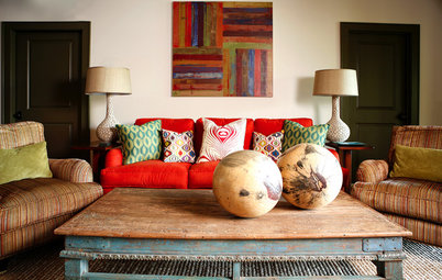
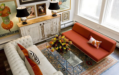
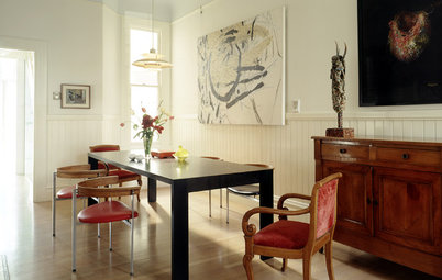
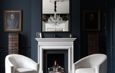
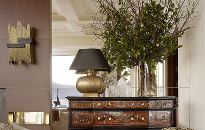
Creating tension is achieved by placing opposites in the same space, and it's integral to smart, interesting design. Light and dark, soft and hard — those are foundational elements, but it's the fantastic tongue-in-cheek tension between "ugly" and "beautiful" in interiors that is the epitome of unexpected. Of course, what "ugly" or "beautiful" entails is completely subjective.
It's about bringing in a "wart" to your space — something that shouldn't be there but ends up making the entire space work.
This kitchen is a perfect example of the kind of tension created when opposites attract to create genuinely eclectic spaces. Antique cupboards and functional stainless steel workspaces are united under the ornate chandelier.
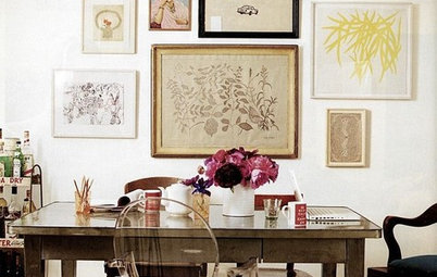
If committing to large pieces of furniture seems daunting, kitschy art — some with dark themes, such as this print of a skull (top right) — works to give a space a mysterious allure that would be lost if the art all fell within the same theme as the rest of the room.
Accessories are by far the best way to add some strangeness into a beautiful space. Creating tension doesn't mean introducing something unattractive — it means ensuring the design doesn't run in the same direction. This oversized and jagged piece keeps the mind active and engaged.
Imagine this kitchen without the framed art beside the window. With this odd piece, we get an idea about the people who live here. It's the mischievous sparkle in an otherwise well-mannered child's eyes.
The Lindsey Adelman chandelier itself is a work of tension. The smooth, round globes juxtaposed against the dark, rigid stems create a wonderful balance. Hung over an austere table and bench with graphic yet traditional wing chairs, this room whispers, screams, sleeps and dances all at once.
In my own kitchen I've hung a skull found on my parents' farm and placed a cheap religious print found in the basement on the shelf above. They're incongruous, but they make me smile every day.
Have you found a spot to include a "wart" in your own home? Tell us about it below!
Have you found a spot to include a "wart" in your own home? Tell us about it below!