Choosing Color: See 1 Cute Home in 3 Exterior Paint Palettes
Here’s proof that a little bit of fun color can add a whole lot of flair to your house

This article is from our Most Popular stories file.
I’ve done countless exterior color consultations in my professional career, and yet the dramatic change a new color scheme can bring to the outside of a home never ceases to amaze me. As part of a new series on exterior color palettes, we’re taking existing exteriors and, through the use of rendering software, trying out a few color options. Paint color palettes are included here in case you see something you like that you want to re-create on your own abode.
I’ve done countless exterior color consultations in my professional career, and yet the dramatic change a new color scheme can bring to the outside of a home never ceases to amaze me. As part of a new series on exterior color palettes, we’re taking existing exteriors and, through the use of rendering software, trying out a few color options. Paint color palettes are included here in case you see something you like that you want to re-create on your own abode.
Option 1: Elegant With Playful Purple
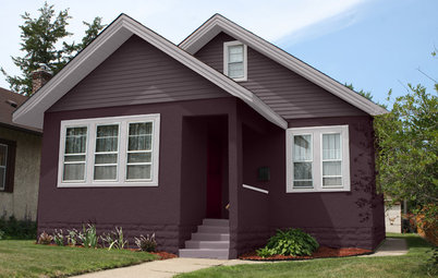
I haven’t had any takers on a purple exterior color scheme. Yet. But I personally think it could be a fantastic choice on the exterior of a home.
Typically you want to go for a toned-down color for the siding. That’s because large swaths of a loud shade can easily go garish. The trick when it comes to purple is to pick a hue that veers heavily toward gray, which keeps it closer to the neutral end of the spectrum.
You could select a lighter purple-gray than shown here, but I like the contrast between the darker siding and the bright white at the entry and bay window. A bit of dark gray at the roofline and the front door adds an elegant vibe.
Get the look: Siding and window sashes in Flannel Pajamas, entry and window accents in Delicate White, and door and roof eaves and fascia in Gray Flannel, all from PPG Pittsburgh Paints.
Find a painting professional near you
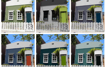
Option 2: Neutral With a Twist
If you favor an eye-catching vibrant door or trim color, then you definitely want to keep the body of the house super neutral.
Of course, neutral doesn’t have to be boring. Here we’re showing a perfectly practical medium gray siding color that then gets a lively boost of leafy green on the front door and window sashes. If green isn’t your favorite, you could easily swap it out for another bold hue since the gray and white play well with just about any color.
Get the look: Siding in Westchester Gray, accent and trim in Extra White, and door and window sashes in Overt Green, all from Sherwin-Williams.
Option 3: Fiery Front on a Cool Backdrop
I wanted to really stretch myself with this last option. The siding is a deep blue-green that gets nice contrast from the crisp white trim.
As much as I love the siding color here, too much of it could appear dreary and gloomy. The liberal dose of white keeps the look fairly light- and fresh-feeling. A feisty orange front door is super welcoming and adds the right amount of vibrancy to the palette.
Get the look: Siding in Newburg Green, accent and trim in Snowfall White, and door in Autumn Cover, all from Benjamin Moore.
Tell us: Which scheme is your favorite? And if you’ve recently repainted your house, please share your color palette!
More
Should My Window Trim Match — or Contrast With — the Sash?
Get more exterior paint palette ideas
Find a painting professional near you
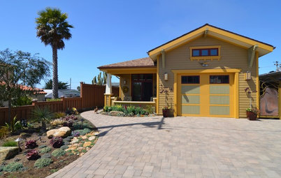
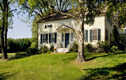
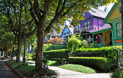
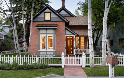
The existing color scheme on this cute little house is quite bold and unusual, but I wanted to see what other options the homeowners had that would still allow their residence to stand out from the pack on the block.