Before and After: 5 Kitchen Remodels Under 160 Square Feet
New layouts and lighter palettes help these smaller-than-average kitchens feel more open and bright

Each of these five remodeled kitchens is less than 160 square feet — just under the size of an average U.S. kitchen in a single-story home (161 square feet), according to the National Kitchen and Bath Association. (The average kitchen in a multistory home is 176 square feet.)
But as the before-and-after photos show, there’s nothing average about these kitchen makeovers. The designers knocked down walls, created new layouts and added features and materials that make these kitchens stand out from the pack. Let us know which one you think made the most of every square inch.
But as the before-and-after photos show, there’s nothing average about these kitchen makeovers. The designers knocked down walls, created new layouts and added features and materials that make these kitchens stand out from the pack. Let us know which one you think made the most of every square inch.
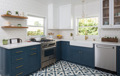
After: Designer Jaclyn Lankiewicz took the kitchen down to the studs. She relocated the fridge to the spot of a former pantry cabinet and stole space from a closet under a staircase to recess the appliance out of the traffic path. She removed the dining table and added an L-shaped run of lower cabinets and countertop, culminating in a new peninsula. She also added some upper cabinets along the same wall.
White Shaker-style cabinets and a marble tile backsplash give the kitchen a fresh look. “I wanted to do everything light and bright,” Lankiewicz says. “All of the kitchens she showed me had white cabinets, and it’s a classic look.”
Shop for counter stools
White Shaker-style cabinets and a marble tile backsplash give the kitchen a fresh look. “I wanted to do everything light and bright,” Lankiewicz says. “All of the kitchens she showed me had white cabinets, and it’s a classic look.”
Shop for counter stools
The sink is a white enameled cast-iron farmhouse-style model with a polished chrome faucet.
Lankiewicz integrated some glass-front upper cabinets to break up the cabinetry and allow the couple to display nice wine glasses and decorative plates. Each of the upper and lower corner cabinets has a lazy Susan inside.
Read more about this kitchen remodel
Lankiewicz integrated some glass-front upper cabinets to break up the cabinetry and allow the couple to display nice wine glasses and decorative plates. Each of the upper and lower corner cabinets has a lazy Susan inside.
Read more about this kitchen remodel
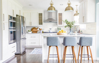
2. Big Move
Kitchen at a Glance
Who lives here: Korey Kulpins, a design assistant
Location: Scottsdale, Arizona
Size: 125 square feet (12 square meters)
Designer: Maegan Blau of Blue Copper Design
Before: This photo taken from the former dining area shows the previous galley kitchen in the background. The space was only 64 square feet, but it felt even smaller due to the dark wood cabinets, taupe walls and mottled granite countertops.
Designer Maegan Blau relocated the kitchen and created a new family hub with a more open and brighter feel.
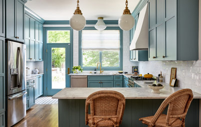
After: Blau moved the kitchen to the former dining area. The former galley space sits on the other side of the refrigerator wall at the right. This move created a 125-square foot G-shaped layout with a peninsula.
“I had to do some convincing when I proposed moving the kitchen,” Blau says. “But I knew by relocating the kitchen, it would allow more than one person to use the kitchen at the same time, and a good work triangle was possible.”
Soft two-tone Shaker-style cabinets significantly lighten the look. The uppers are painted a light greige (Warm Putty by Valspar). The lowers are a muted sage green with blue undertones (Hunters Point by Sherwin-Williams).
Wood-look luxury vinyl plank flooring complements the warm tones of the updated palette. Double doors on the left open to the condo’s main bedroom and bath.
Above the slide-in electric convection range is a stainless microwave with simple features. “I wanted to create symmetry in some way, so we placed the range on that wall so we could have symmetrical cabinets and drawers on each side,” Blau says.
The deep drawers on either side of the range store pots and pans, while the shallower ones on top include dividers for spices and cooking utensils. “I like putting pots and pans in drawers, because to me it’s the easiest way to do it,” Kulpins says.
A pull-down faucet in matte black coordinates with the cabinet hardware. The sink is a 28-inch undermount single basin in stainless steel.
Read more about this kitchen remodel
3. Taking It Higher
Kitchen at a Glance
Who lives here: Young newlyweds
Location: Boston
Size: 159 square feet (15 square meters); 9 feet, 10 inches by 16 feet, 2 inches
Designer: Jodi Swartz of KitchenVisions
Before: The existing kitchen was poorly and hastily constructed, unnecessarily divided the room and didn’t take advantage of the 11-foot ceilings. The appliances were crammed together on the shorter wall. “There was very little storage,” designer Jodi Swartz says.
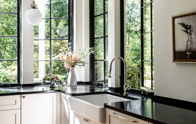
After: Swartz expanded the kitchen by extending it into the former dining area. This allowed her to create some breathing room between appliances. She moved the fridge to the far right and positioned the new induction range on the back wall. The space that contained the fridge became a closet that houses a stacked washer and dryer. A custom salvaged-wood table acts as both a dining spot and island prep space.
Swartz maximized storage and highlighted the height of the room by taking the cabinets almost to the ceiling and capping them with large cove molding. The homeowners use the top cabinets to store infrequently used items. A ladder stored in the laundry closet gives them access to the top cabinets.
Swartz maximized storage and highlighted the height of the room by taking the cabinets almost to the ceiling and capping them with large cove molding. The homeowners use the top cabinets to store infrequently used items. A ladder stored in the laundry closet gives them access to the top cabinets.
A trio of shelves made out of alder above the large farm-style sink adds some airiness to the kitchen. The dark blue lower cabinets ground the space and add a sophisticated touch.
Swartz decided to panel the dishwasher to the left of the sink so the stainless steel didn’t take away from the sink and shelves. “The fridge, induction oven and wine fridge were enough steel,” she says.
Read more about this kitchen remodel
Swartz decided to panel the dishwasher to the left of the sink so the stainless steel didn’t take away from the sink and shelves. “The fridge, induction oven and wine fridge were enough steel,” she says.
Read more about this kitchen remodel
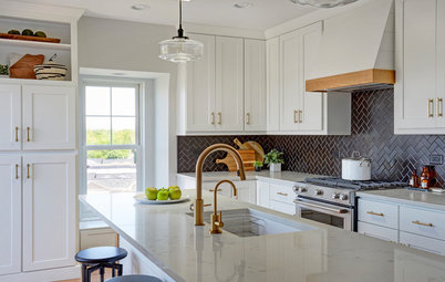
4. Bright White and Bronze
Kitchen at a Glance
Who lives here: A recent retiree and her boyfriend
Location: Plymouth, Minnesota
Size: 94 square feet (8.7 square meters)
Designer: Jolynn Johnson, owner of Crystal Kitchen + Bath
Before: A shell-like structure that didn’t extend to the ceiling surrounded the former kitchen, cutting it off from the dining room and living room. The homeowner disliked almost everything inside the kitchen as well — dark oak cabinets, laminate countertops, mirrored accent wall, worn-out vinyl tile floors.
After: Designer Jolynn Johnson removed the two walls around the kitchen and extended the peninsula to add more work surface, room for counter seating and a spot for a dishwasher.
She added white cabinets, countertops and appliances to give the compact space a light and airy feel. She extended the cabinetry a foot higher than before, to 8 feet, for more storage and a loftier look. The faucet and the hardware on the cabinets and appliances have a honey bronze finish that adds a warm shine.
Shop for a kitchen faucet
Johnson kept the range and microwave in the same location to keep costs down. White quartz countertops feature gray veining that coordinates with the warm greige wall color above the cabinets (Accessible Beige by Sherwin-Williams). The backsplash is a mosaic of white marble, glass and pearly shell tile. “It just ties everything together,” Johnson says. “It also brought in texture and pattern.”
The floors are 5-inch-wide planks of luxury vinyl tile that look like wood.
Read more about this kitchen remodel
The floors are 5-inch-wide planks of luxury vinyl tile that look like wood.
Read more about this kitchen remodel
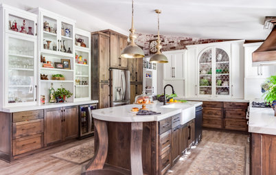
5. Lovely Mix of Materials
Kitchen at a Glance
Who uses it: A couple who are nearing retirement
Location: San Diego
Size: 140 square feet (13 square meters)
Designer: Melissa Prevost of M Prevost Design
Before: The couple’s former galley kitchen was closed off from the rest of the house. “They were struggling to envision how the kitchen would look if we took down the wall between it and the living room,” designer Melissa Prevost says. Once she showed them a 3D rendering of what the kitchen could be, her once trepidatious clients were fully on board.
The new, open kitchen features a lovely mix of materials and colors. Prevost added rift white oak cabinetry with a natural water-seal finish, mixed with blue-painted cabinets. The countertops are honed black granite.
The island is painted what Prevost describes as “a very, very moody blue” with a porcelain slab countertop that looks like marble. “She really liked the idea of marble, but knowing how hard she’d said she is on surfaces, the durability of porcelain was a much better choice for her.
The island is painted what Prevost describes as “a very, very moody blue” with a porcelain slab countertop that looks like marble. “She really liked the idea of marble, but knowing how hard she’d said she is on surfaces, the durability of porcelain was a much better choice for her.
One item that was an absolute must-have for the homeowner was a concrete sink. They specified one made by Native Trails that is well-sealed. “It really is the icing on the cake in this room,” Prevost says.
Once they took down the wall, they needed new floors. Prevost found them a budget-friendly luxury vinyl tile that looks like light wood. It is softer underfoot than hardwood and is waterproof.
Read more about this kitchen remodel
More on Houzz
Before and After: 4 Dreamy White-and-Wood Kitchens
Find a kitchen designer
Shop for kitchen appliances
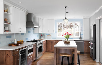
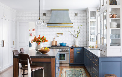

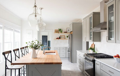
Kitchen at a Glance
Who lives here: Rob and Martha Carlin and an adult son
Location: West Islip, New York
Size: 120 square feet (11 square meters)
Designer: Jaclyn Lankiewicz of Jaclyn Marie Interiors
Before: The existing kitchen layout wasn’t working for these New York homeowners. The breakfast table was used more as extra counter space than as a place to eat, and the fridge in the back righthand corner gave the space a cramped, cluttered feel.
Fading white cabinets, dark blue laminate countertops, a beige tile backsplash and a wood floor with the stain coming off signaled that this was a kitchen in need of an update.
Find a kitchen designer