Before and After: 3 Bold Light-and-Dark Kitchen Makeovers
These remodels mix deep blacks and grays, white countertops and updated wood cabinets for better function and contrast

White combined with moody black and gray in a kitchen can create beautiful contrast that’s balanced and inviting. The white adds brightness while the black or gray adds depth and dimension. Take a look at these before-and-after photos to see how pros designed three bold kitchens with light and dark design elements and materials. Then let us know in the Comments which one you think underwent the biggest transformation.
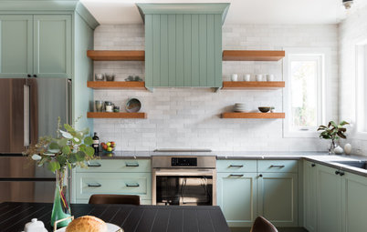
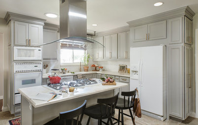
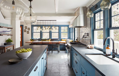
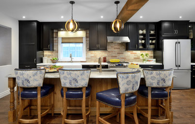
After: Smith eliminated the drop ceiling, making the kitchen feel more open. New cabinetry was added at the ceiling line for extra storage and visual interest. Moody black cabinets and a pantry wall add stunning contrast to the white walls, which brighten up the space. White marble-look quartz was chosen for the new counters, backsplash and the island’s waterfall countertop.
To break up the black and white, the designer added light wood elements throughout. Rift-cut oak paneling with a subtle whitewash conceals the range hood, and rift-cut oak floating shelves and white oak floors also help balance out the colors. A new stain on the existing beam that separates the kitchen area from the living and dining rooms blends well with the light wood additions.
The couple decided to get rid of their old gas cooktop and wall ovens and replace them with a new range, which helped free up space. They opted to keep their stainless steel fridge, which worked well with the new range and black-and-white aesthetics.
Janna’s decision to use satin brass cabinet pulls throughout the room was inspired by photos of kitchens she found online, including on Houzz. The gilded hardware shimmers beautifully against the sleek black cabinets.

Need a pro for your kitchen renovation & remodeling project?
Let Houzz find the best pros for you
Let Houzz find the best pros for you
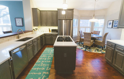
Before: The upper cabinets in the old design felt heavy, especially on the sink wall. And slate square tile flooring made the space feel dark.
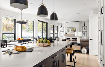
After: Smith knocked down the wall that separated the living and dining spaces. “When the wall came down, it opened up both the flow and light,” she says. “Instead of using walls to delineate the spaces, we used furniture.”
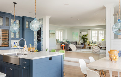
The new island, which features a white quartz waterfall countertop and a black base, is larger than the previous one and adds lots of work area and a place for socializing. For seating in the kitchen, the homeowners had inexpensive wood stools reupholstered in rich brown leather.
Pendant lights over the dark dining room table and white kitchen sink complement each another. The sink wall is bare, allowing light to fill the room.
Learn more about this kitchen remodel
2. Black-and-White Elegance
Kitchen at a Glance
Who lives here: Jesse and Alexa Tepperman and their 1-year-old son, Billy, and two dogs
Location: Toronto
Size: 225 square feet (21 square meters)
Designer: Arielle Mizrahi Design
Before: Soon after buying their 1950s bungalow in Toronto, Jesse and Alexa Tepperman sought to remodel the home’s choppy and dated kitchen. The alcove layout and faux butcher block countertops, aged black appliances and drab gray walls weren’t ideal.
A diner-style breakfast bar with seating that overlooked the living room and a wall with a doorway near the refrigerator that separated the kitchen from the dining room needed to be reworked. On the other side of the room was a second doorway into the kitchen near the range that created a potential hazard for their toddler and two dogs.
The couple hired interior designer Arielle Mizrahi to give them a kitchen with a more open and inviting layout. And with a small child, the homeowners needed a space that was safer and able to handle their busy lifestyle.
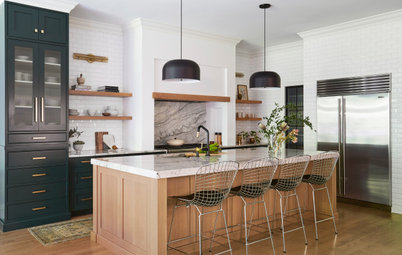
After: Mizrahi started by removing the walls that separated the kitchen from the living and dining rooms to create a new kitchen layout with an additional 95 square feet.
A 9-foot island with elegant creamy seating for six is topped with porcelain that mimics the look of white marble. The island contains a prep sink, slim dishwasher, wine storage and a microwave. “We love to entertain,” Alexa says. “But I also needed the island to be multifunctional so I could have a large workspace where I can pull out my laptop and get work done.”
Soft black upper and lower cabinets with blue undertones fill the back wall and the base of the large island. The dark cabinetry strikes a balance with the crisp white walls and engineered chestnut floors.
Black appliances were replaced with stainless steel pieces such as the double wall ovens, refrigerator and 24-inch dishwasher on the back wall. A new 36-inch cooktop and wall-mounted hood with a hint of white complement the black features in the kitchen.
Creamy zellige tiles in various glossy white tones create a handmade look for the backsplash. “The way the cabinetry is broken up helped conceal a 2-inch slope in the ceiling of this older home,” Mizrahi says. “By carrying the tile from counter to ceiling, it also helps obscure what would otherwise appear as a wedge-shaped spacer.”
Shop for pendant lights
Large black-framed windows on both sides of the kitchen let in tons of natural light that play with the dark hues of the cabinets. “This color adds a lot of dimension and is very compelling,” Mizrahi says. “It transforms as the light changes during the day.”
Brass details that add warmth include the swing-arm sconces above the main double-basin sink area and pendant lights over the island. Brass faucets, cabinet hardware and elegant legs on the seating also break up the light-and-dark motif of the space.
Learn more about this kitchen remodel
Brass details that add warmth include the swing-arm sconces above the main double-basin sink area and pendant lights over the island. Brass faucets, cabinet hardware and elegant legs on the seating also break up the light-and-dark motif of the space.
Learn more about this kitchen remodel
3. White, Wood and Gray
Kitchen at a Glance
Who lives here: A professional couple with three young daughters
Location: Cape Elizabeth, Maine
Size: 385 square feet (36 square meters)
Designer: Tina Rodda of Eyder Curated Kitchens
Before: A blended family of five just outside Portland, Maine, calls this Shingle-style abode on the edge of a wildlife preserve home. The kitchen, although in good working order when they purchased the home, needed some updating.
A tight layout with dated features such as black tile floors that transitioned into white-and-black checkered floors, a two-level peninsula that cut the kitchen off from the dining room and a wall that separated the kitchen from the family room needed to go.
Since the kitchen was built on a heated slab floor, moving the plumbing would have been costly. The challenge was figuring out a new layout with modern materials and finishes that could replace the yellows and blues in the existing kitchen.
The couple hired designer Tina Rodda to give them a bolder, brighter and more open kitchen where white, wood and gray lead the way.
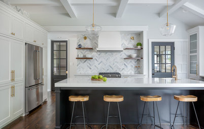
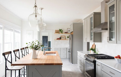
After: Rodda used a walk-in pantry to the left of the old refrigerator to expand the kitchen by about 30 square feet. The new hutch-style walnut-paneled fridge and pantry cabinet on the left stands in the same spot as the old design. This rearrangement gave the designer extra cabinet and counter space without excessive cost.
The refreshed design axed the peninsula and a wall that closed the kitchen off from the family room and dining room. This made way for the large island with white quartz top, deep gray base and leather stool seating for four.
Upper and lower maple cabinets painted a creamy white go well with the kitchen’s white quartz perimeter countertops, elongated white marble subway tiles and engineered European light oak floors with a matte whitewash finish. Brass cabinet hardware and dual faucets in a gold finish break up the light and dark colors.
One of the new kitchen’s standout features is the sliding gray-and-white marble slab backsplash that hides spices and cooking oils behind the range.
The backsplash features a fixed middle section with two sides that slide open for easy access to adjustable wooden shelves. “We used sliding hardware that is rated for the calculated weight of each stone door,” Rodda says. “We also upgraded the fasteners to ensure durability. The walnut has a finish that makes it feel lighter and less gold than natural walnut.”
Brass sconces on either side of the backsplash and white-and-bronze pendants over the island add soft glows throughout the kitchen.
Learn more about this kitchen remodel
More on Houzz
Read more kitchen stories
Find a kitchen designer near you
Shop for kitchen appliances
Brass sconces on either side of the backsplash and white-and-bronze pendants over the island add soft glows throughout the kitchen.
Learn more about this kitchen remodel
More on Houzz
Read more kitchen stories
Find a kitchen designer near you
Shop for kitchen appliances

Kitchen at a Glance
Who lives here: Andy and Janna Gilkison and their 10-year-old daughter, Lena
Location: Encinitas, California
Size: 252 square feet (23 square meters)
Designer: Julie Smith of Jula Cole Design
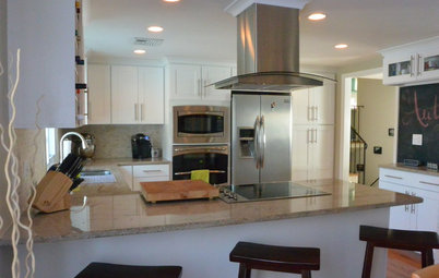
Before: These Southern California homeowners made the best of their existing kitchen, but after a while they wanted something new. The rounded maple cabinets, granite countertops and slate tile floor were among the elements that Andy and Janna Gilkison wanted to replace with new design features that felt more modern and open. They wanted a solution that would eliminate the drop ceiling, which took up valuable space for much-needed storage.
The old kitchen was closed off from the dining room and living room and just wasn’t working for the family. “The kitchen felt pushed back into a corner,” Janna says.
The family hired interior designer Julie Smith to give them a modern black, white and brass kitchen with a clean layout that better suited their needs.
Find a kitchen designer in your area