Bathroom of the Week: Streamlined Layout With a Soothing Spa Feel
A designer helps a Texas couple update their master bathroom with a large open shower and a fresh look

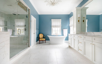
The master bathroom in Ken and Nikki Gill’s two-level suburban Dallas home was complicated. The dark and dated 240-square-foot space had a busy layout with two single-sink vanities on different walls, a jetted tub with jets that no longer worked, a separate shower, a badly positioned water closet and two large closets that took up valuable floor space. “We knew overall the footprint was a good size, but the layout was not the best use of space,” Nikki says.
The busy parents of school-age twins wanted better function with a brighter look and a soothing, spa-like feel. They looked at Houzz photos and other online sources for inspiration and hired designer Tara Lenney to help them create a layout that uses the space in a more efficient way. Lenney eliminated the tub, separate vanities and closets, then repositioned the water closet, created an open shower and added a custom double vanity with tons of storage. The result is a modern-day, easy-to-use retreat.
The busy parents of school-age twins wanted better function with a brighter look and a soothing, spa-like feel. They looked at Houzz photos and other online sources for inspiration and hired designer Tara Lenney to help them create a layout that uses the space in a more efficient way. Lenney eliminated the tub, separate vanities and closets, then repositioned the water closet, created an open shower and added a custom double vanity with tons of storage. The result is a modern-day, easy-to-use retreat.
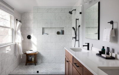
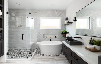
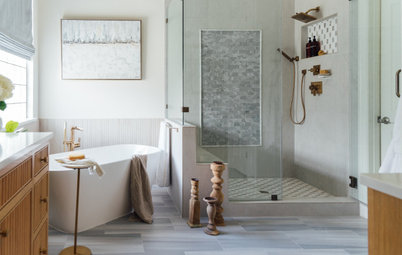
After: Lenney took the bathroom down to the studs and got rid of the vanities, closets, shower and jetted tub. She designed a spacious open shower in the former location of the tub. Glazed ceramic tiles in white and gray tones wrap the shower walls and bench. “We ran them vertically because we wanted something to lift the eye up,” Lenney says. “This space has a standard 8-foot ceiling that couldn’t be moved. We selected a busier floor, so we needed tiles on the shower walls that wouldn’t compete but would be visually interesting.”
The floor is white and putty-gray polished decorative marble tiles laser-cut into a diamond pattern. “This floor is a happy medium between modern and classic,” Lenney says.
A satin etched glass window replaced the glass blocks. “Having the [natural] light in there is really important,” Nikki says. “The old shower seemed very dark.”
Shower wall tiles: Cloe in white, 2½ by 8 inches, Bedrosians Tile & Stone
Find a bathroom remodeler near you
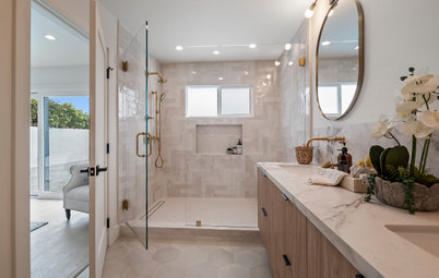
Lenney installed the matte black shower head higher than standard height to make it more user-friendly for Ken, who is tall. “We had Ken get in there and we measured everything to make sure it would work for him,” she says.
A large niche with four quartz shelves sits between the wall studs. Four-inch-square hand-glazed tiles in an aloe green color accent the back of the niche. “I’m a huge fan of a vertical shower niche,” Lenney says. “We used slightly more expensive tiles for this niche and wanted to keep the color palette really neutral. They wanted this space to be modern but fresh — and also serene.”
Shop for black shower heads and body sprays
Consolidating the two closets into one large closet allowed Lenney to create a 12½-foot-long custom rift-cut white oak vanity. “We wanted it to feel modern and spa-like,” she says. “I pushed for wood because I wanted the warmth. By making it appear that it’s floating and giving it some negative space, it’s not as oppressive and has room to breathe.”
Matte black pulls, faucets and mirror frames coordinate with the shower fixtures. The sconces feature black and brass finishes. “I love mixing metals so things feel layered,” Lenney says.
Vanity: Stauffer Custom Kitchens; wall paint: Snowbound in eggshell finish, Sherwin-Williams
Matte black pulls, faucets and mirror frames coordinate with the shower fixtures. The sconces feature black and brass finishes. “I love mixing metals so things feel layered,” Lenney says.
Vanity: Stauffer Custom Kitchens; wall paint: Snowbound in eggshell finish, Sherwin-Williams
Rectangular undermount sinks and wall-mounted faucets add a modern vibe. The same rift-cut white oak used for the vanity was used for a long shelf above it. “We wanted a way to terminate the backsplash, and it helps top off the vanity sink area,” Lenney says. “It’s a sweet spot for display storage, and they have another surface to spread things out and not have them on the countertop.”
The white quartz counter has a mitered edge for a thicker appearance. The same quartz forms the short backsplash. “It’s one of the elements that makes this bathroom feel modern and luxurious,” Lenney says.
Sinks: Verticyl, Kohler; faucets: Purist wall-mounted widespread in matte black, Kohler
The white quartz counter has a mitered edge for a thicker appearance. The same quartz forms the short backsplash. “It’s one of the elements that makes this bathroom feel modern and luxurious,” Lenney says.
Sinks: Verticyl, Kohler; faucets: Purist wall-mounted widespread in matte black, Kohler
An ivory hand-braided wool-and-cotton area rug with a nonporous mat underneath adds a touch of texture and softness to the bathroom floor, which is covered in the same marble tiles used for the shower floor.
This custom storage tower is an extension of the vanity, made from the same rift-cut white oak. Its bottom cabinet features two roll-out laundry hampers. “Previously we just had laundry baskets sitting out in our closets,” Nikki says.
The white paneled door connects to the master bedroom. Lenney widened the door to make it easier for Ken and Nikki to navigate between spaces. “If I was walking out of my closet with the laundry basket on my hip, I couldn’t get through that door easily,” Nikki says. “That’s why we asked them to widen it.”
Two matte black towel bars keep fresh towels close to the shower. This photo also highlights the well-placed LED ceiling lights added to improve overall lighting in the space. The location of the bathroom’s exhaust fan was also relocated, and a new fan was installed for proper ventilation.
Two matte black towel bars keep fresh towels close to the shower. This photo also highlights the well-placed LED ceiling lights added to improve overall lighting in the space. The location of the bathroom’s exhaust fan was also relocated, and a new fan was installed for proper ventilation.
Looking the other direction, this view shows the white paneled door on the left that leads to the new water closet and the opening at the far end to the expanded closet. “We sacrificed a window to get a more functional closet space,” Lenney says.
Lenney rotated the location of the water closet 90 degrees (see before-and-after floor plans below), so it now sits by the relocated shower. This design move also allowed her to create the spacious new closet. “The toilet almost stayed in the same location,” Lenney says. “If you’re mindful in keeping the plumbing in the same locations, you can save money. We didn’t try and move the shower to where the closets were, because that would have been expensive.”
The color of the storage cabinet added above the toilet coordinates with the tiles used for the large shower niche. “It also repeats in the artwork and greenery,” Lenney says.
The color of the storage cabinet added above the toilet coordinates with the tiles used for the large shower niche. “It also repeats in the artwork and greenery,” Lenney says.
The “before” floor plan on the left shows how the unused tub (bottom left) two sinks (middle bottom and bottom right corner) and two separate closets (top left and top right corners) created a disjointed layout. The small shower stood in the middle of the room.
The “after” floor plan illustrates the new, more open layout. The spacious new shower stands in place of the former tub (bottom left) and the long double vanity fills the far right side. Ditching a closet and the former shower and rotating the water closet allowed for a larger single closet (top left).
“The layout is so much more user-friendly for us, using every square inch of the bathroom we had,” Nikki says. “Now everything is cohesive.”
More on Houzz
Read more bathroom stories
Browse bathroom photos
Look for a bathroom designer near you
Shop for bathroom accessories
Bathroom at a Glance
Who lives here: Ken and Nikki Gill and their school-age twins
Location: Dallas
Size: 240 square feet (22 square meters)
Designer: Tara Lenney Design
Before: Prior to the remodel, the bathroom was heavy on tan walls and terra-cotta tile. A soffit brought the ceiling down, making the space feel tight. On the left is what was one of two basic vanities with cultured marble tops. The other sat against a different wall, awkwardly splitting up the layout. (See before-and-after floor plans below.)
The jetted tub was broken and rarely used by the couple anyway. The glass-block window dated the look. “The function and layout was driving them crazy,” Lenney says. “They had lots of space where they didn’t want it and not enough in other areas.”