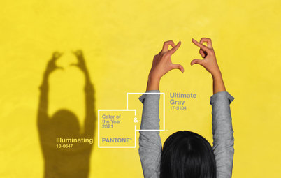
Are You a Fan of Pantone’s 2019 Color of the Year?
Living Coral is bold and bright. Here are places to consider using it indoors and out

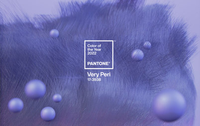
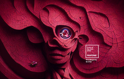
Color management company Pantone Color Institute announced its pick for Color of the Year for 2019, and it’s an eye-popping orange-pink hybrid called Living Coral. My initial reaction to Living Coral was that I prefer this color in the natural world and not in my home or wardrobe. But I do appreciate its boldness, so I set out to find successful uses of the new “it” color on Houzz.
Also: Read what designers around the world say about using Living Coral at home
Also: Read what designers around the world say about using Living Coral at home
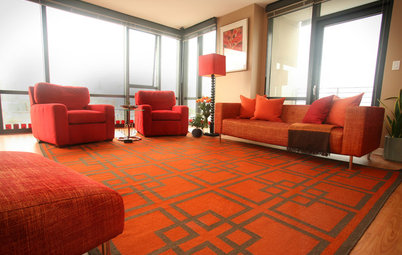
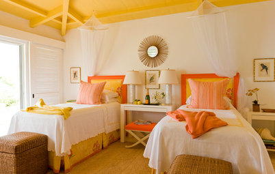
1. Textiles. An easy way to integrate and play with a bright color in a room is to start small and simple, such as with accent pillows and throws.
These pieces offer a dash of color that isn’t overwhelming, and they aren’t a big commitment since they are affordable enough to swap out down the road if you get tired of the color.
How to Decorate a Living Room: 11 Designer Tips
How to Decorate a Living Room: 11 Designer Tips
2. Decorative accents. If you want to take things a bit further with Living Coral, think about sprinkling it in a few small areas throughout a room via artwork, floor or window treatments, or side tables or other small pieces of furniture.
It’s a small amount of a big color, so this application doesn’t look too busy. By dispersing the color, you draw the eye all around the room.
Browse area rugs by color in the Houzz Shop
Browse area rugs by color in the Houzz Shop
3. Furniture. If you want to go bolder, consider larger, more statement-making coral-colored furniture. Now I would never advise someone to decorate with a color simply because it has been deemed fashionable, but having your favorite color become trendy means it will be easier to find all manner of items in that hue.
So if you are a big fan of bright coral and want to decorate with it, 2019 will be your year to stock up on home furnishings.
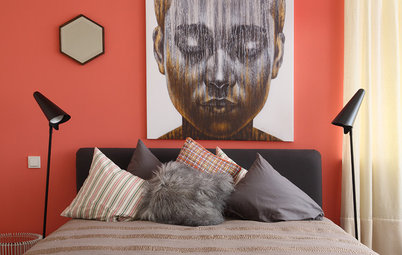
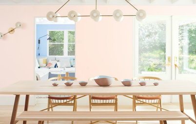
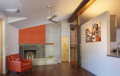
4. Accent wall. Ready to go really bold with Living Coral? Painting one or two walls in a saturated coral is a great way to pack a punch with this color.
Just think about keeping the other wall or walls light and neutral, especially if you are using this color as an accent in a bedroom. Too much of this hue could start to feel busy and anxiety-inducing, in my opinion.
Find a painter in the Houzz pro directory
Find a painter in the Houzz pro directory
5. Architectural accent. Because Living Coral is such a striking color, it can be called into service to bring attention to interesting architectural elements in your home.
Whether using it on a beautiful built-in desk and bookcase or in a cool and contemporary stairway, go bold to make it stand out. Keep in mind that if you attempt to make everything in a room stand out, then nothing does. So use the vivid hue thoughtfully on only those elements worth the attention.
6. Outside. A smart way to use a vibrant color that you love without knocking yourself or your guests over the head with it is to take it outside to furniture or accessories.
Because of the abundance of natural light during the day (or the forgiveness of darkness at night), outdoor areas can take vivid color more easily than indoor rooms, especially dark or cramped indoor spaces that can feel claustrophobic when decorated with intense colors.
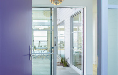
7. Front door. One of my favorite places to use a daring color is on the front door. The kinetic corals in this photo and the next one are energetic and inviting. To me, this is the best use of the lively hue — to welcome visitors to your home.
Houzz Quiz: What Color Should Your Front Door Be?
Houzz Quiz: What Color Should Your Front Door Be?
Tell us: What do you think of Pantone’s color choice? Have you used it in your home? Share your thoughts and pictures in the Comments.
More on Houzz
Designers Around the World React to Pantone’s 2019 Color Choice
Pantone Picks a Purple for Its 2018 Color of the Year
Meet Greenery, Pantone’s 2017 Color of the Year
Browse and save home design ideas
Shop for home furniture and decor
More on Houzz
Designers Around the World React to Pantone’s 2019 Color Choice
Pantone Picks a Purple for Its 2018 Color of the Year
Meet Greenery, Pantone’s 2017 Color of the Year
Browse and save home design ideas
Shop for home furniture and decor


Find an interior designer near you on Houzz