A Designer Opens Up the Living Area in a Compact English Home
Structural tweaks, clean-lined furniture and light colors result in a brighter, airier ground floor for 2 retirees

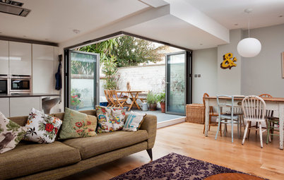
“The structural changes were quite small,” says interior designer Jessica Preston of the open-plan kitchen and living space she revamped for her clients. It’s when you see the “before” photos that you can grasp the difference those alterations and the rest of the redesign made to the ground floor of this eco-friendly home, which the owners built themselves.
Kitchen
Before: The original kitchen stopped where the hallway door was, and a breakfast bar separated it from the dining area. Preston decided to move the door slightly to allow for a longer run of base cabinets, and she took away the breakfast bar to open up the space.
She then positioned the dining area farther toward the living space, which is to the right in the L-shaped layout.
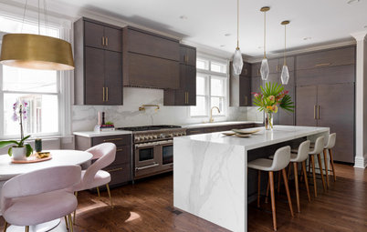
“The kitchen layout was kept much the same,” Preston says. “But as we were able to extend the units on the side, we could move the [cooktop] down, which made the work surfaces more spacious.
“We also totally cleared the end wall of units and shelving,” she adds. “As we had more space in the base units, we could keep the rest quite simple.”
Planning a new kitchen? Find a designer near you on Houzz
“We also totally cleared the end wall of units and shelving,” she adds. “As we had more space in the base units, we could keep the rest quite simple.”
Planning a new kitchen? Find a designer near you on Houzz
The floor plan illustrates how the door was moved to free up space for extra base cabinets. The new position also encourages people to enter directly into the dining-living area, rather than having them walk through the kitchen.
Two small walls that jutted out into the dining-living area also were removed. “It made a huge difference to how we could use the space,” Preston says.
Two small walls that jutted out into the dining-living area also were removed. “It made a huge difference to how we could use the space,” Preston says.
The couple chose flat-front kitchen cabinets with integrated handles. The counters are Corian in Whitecap. “It has a slight speckled pattern for some subtle interest,” Preston says.
The base cabinets house lots of drawer storage, including cutlery trays and custom herb racks. Opposite them are tall cabinets with an integrated fridge-freezer and pantry pullouts.
The original flooring was tile in the kitchen and dining room, and wood in the living room. Preston leveled the floor to lay wood-effect porcelain tiles throughout the area. “We set them in a diagonal pattern,” she says. “I think it works well to draw the eye across the L-shaped space.”
Roma kitchen cabinetry in sage green: Masterclass Kitchens
Find wood-effect floor tile in the Houzz Shop
“We replaced the ceiling downlights with flush fittings and a whiter finish, but the owners didn’t want the hassle of moving them,” Preston says. “Usually we would position them closer to the worktop, but in fact the undershelf LEDs make up for it and help to illuminate the worktop.”
“The owners were keen for a simple, uncluttered look,” Preston says, “so we tried to think of ways to introduce pattern in more subtle ways.” On the backsplash, for example, she chose plain white tiles but laid them in a basketweave pattern.
Love a White Backsplash but Not Subway Tile? Try One of These
Love a White Backsplash but Not Subway Tile? Try One of These
Dining Space
Although the couple had decided to remove the peninsula from the kitchen, Preston wanted to give them a breakfast bar. She used the space next to the back door to fit in a seating zone and storage unit, with a window above.
“I also wanted to introduce as many gloss and glass surfaces as possible to reflect the light,” she says. The glass tiles behind the stools give a shimmery effect; she also used them behind the wood-burning stove in the living room.
Find glass tile in the Houzz Shop
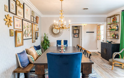
Preston moved the dining area toward the living room, which freed up space around it. Light wood chairs and leafy houseplants complement the couple’s oak dining table.
“They were uncertain about having wallpaper behind, but I thought the wall needed something, rather than a piece of artwork floating in the middle,” Preston says. “This dappled watercolor is subtle enough not to overpower the space and almost ties in with the glass tiles under the breakfast bar and in the fireplace.”
The couple were also reluctant to have pendant lights over the dining table, as they used to bang their heads on the old ones. “So I tucked these out of the way in the corner,” Preston says. “They’re replicated in the opposite corner of the living area.”
Brush Large wallpaper: Engblad & Co.
Find pendant lights with smoked-glass shades in the Houzz Shop
Living Area
Before: A wall jutting into the living room complicated the furniture arrangement. To accommodate their seating, the owners turned the two chairs to face the dining area.
Before: A wall jutting into the living room complicated the furniture arrangement. To accommodate their seating, the owners turned the two chairs to face the dining area.
Preston swapped the original seating for a sofa and a chaise. “The owners sit in here in the evening to watch TV and knit,” she says. “The chaise longue allows the person sitting in that space to turn and face the television comfortably.”
The wood-burning stove was already in place, but the top of the opening was very high up the wall. “It made the ceiling look quite low,” Preston says. “We built a studwork frame to bring the line down and balance the space.”
The wood-burning stove was already in place, but the top of the opening was very high up the wall. “It made the ceiling look quite low,” Preston says. “We built a studwork frame to bring the line down and balance the space.”
Preston also replaced the dark wood shelving units in the alcoves with simple floating shelves in pale oak.
“They didn’t have a central coffee table, and it wasn’t something they felt they needed,” the designer says. “We chose some small side tables, which add to the fresh, uncluttered feel.”
More
Read other stories about living spaces
Browse living room products in the Houzz Shop
“They didn’t have a central coffee table, and it wasn’t something they felt they needed,” the designer says. “We chose some small side tables, which add to the fresh, uncluttered feel.”
More
Read other stories about living spaces
Browse living room products in the Houzz Shop
Kitchen-Dining-Living Area at a Glance
Who lives here: A retired couple
Location: Cambridge, England
Size: 484 to 538 square feet (45 to 50 square meters)
Designer: Jessica Preston of Colour + Shape
Preston’s clients had built their house about 10 years before, but they didn’t feel as if the ground floor’s layout was really working. “It’s an eco house, and there was a lot of timber,” she says. “However, it looked quite dark and heavy, as many of the surfaces were dark wood or granite.”
Pearl Colour Pale wall paint and Pearl Colour Mid baseboard and architrave paint: The Little Greene Paint Co.; Gin & Tonic window frame paint: Fired Earth