5 Bright Palettes for Front Doors
Splash bold green, blue, orange or red on your front door, then balance it with a more restrained hue on the rest of the house

Nothing welcomes guests to your home better than a bold, beautiful color on the front door. Many people have no trouble picking out a fun color to paint the door, but don't know what to do with the rest of the exterior. And what about the trim?
The key to working with bold colors is to limit them to elements you really want to stand out, which makes the front door the ideal place to feature a vibrant color. Then select supporting hues for the rest of the house that don't try to compete for attention.
Check out these Houzz homes with delightfully colorful front doors, along with potential palettes that incorporate a bold front door hue with other exterior hues.
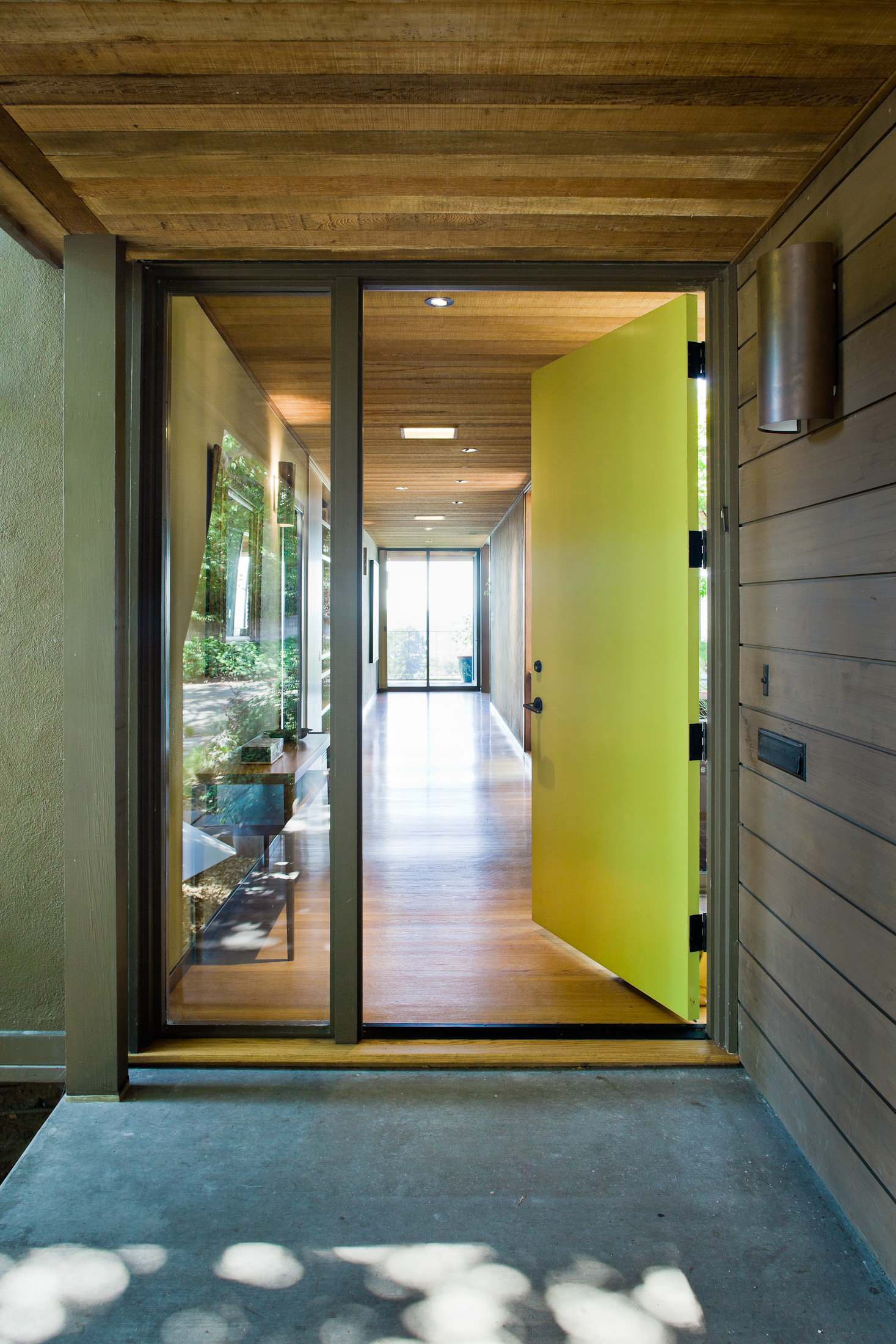
This acid yellow-green front door shouts "Come on in!" and works nicely with the natural wood siding. If you have no choice but to paint your siding, you could go with a cooler brown/taupe shade to set off the brighter hue of the door.

Example palette. Get a similar look with these colors (clockwise from top left, all from Glidden): Lime Sorbet GLG12 for the front door, Bronzed Ivy GLN23 for trim and Khaki Green ICI830 for the main house color.
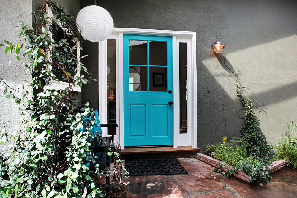
I love this vibrant turquoise door against the dark sage-green house color. The white door trim makes it all look crisp.

Example palette. Get the same effect with (clockwise from top left, all from Martha Stewart Living): Lagoon MSL125, Lamb MSL225 and Bayou MSL237.

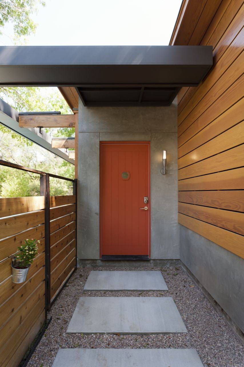
Orange doors are hot right now. Cool them down by pairing them with gray hues that have a bit of green in them.

Example palette: Try (clockwise from top left, all from Benjamin Moore): Tangy Orange 2014-30, Narragansett Green HC-157 and Templeton Gray HC-161.

One of my favorite colors, a bright leafy green, works well with steely gray neutrals.

Example palette: For a similar effect, use (clockwise from top left, all from Mythic Paint): Sweet Summer 069-5, Grecian Grey 132-5 and Court Magician 133-1.
Red doors look fantastic on just about every house style, from traditional to contemporary. Let the door remain the star by keeping the main house color neutral, ranging from white to cooler taupes or to gray. The cooler neutrals won't compete with the red, but instead will offer a nice, contrasting background.

Example palette: Clockwise from top left (all from Sherwin-Williams): Red Tomato SW6607, Iron Ore SW7069 and Cityscape SW7067.
Tell us: What color is your front door? What color would you like it to be?
More: Should you paint your door black?
Explore more color palettes for inside and out
Tell us: What color is your front door? What color would you like it to be?
More: Should you paint your door black?
Explore more color palettes for inside and out