cniosi73

Backsplash help

8 years ago
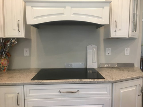
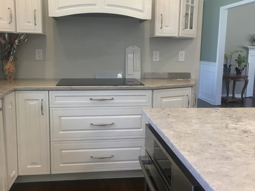
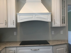
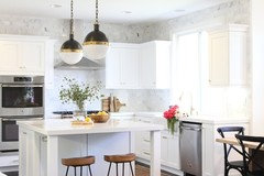
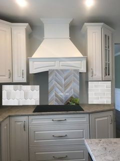
I'm stuck on a color for back splash. My cabinets are white, countertop is quartz with movement and veins, beige, gray and white. It's called moorland fog. Both my island and floor are dark. I wanted a light grey tile but not sure if I should just do white. I wanted some contrast. Should I do a design over the cooktop? Any help and advice is appreciated.


Comments (53)

  • 8 years ago
    last modified: 8 years ago

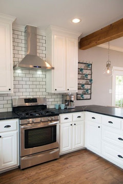
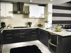
    I think pulling the gray veining into a solid gray backsplash will make the backsplash look dull in comparison whereas pulling the beige veining into a solid beige backsplash will make the counter look dull in comparison. I would therefore go with a white backsplash and have the uniqueness be in the tile material, shape, or layout. You could also consider a unique design incorporating some beige and gray tiles beneath the vent hood to create some interest.

  • 8 years ago

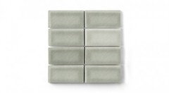
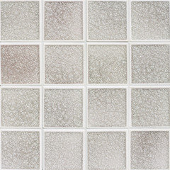
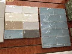
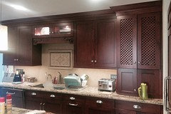
    The 1st tile bliss element Skylight

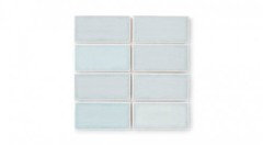
    The 3rd tile quintessenza Grigio 2

  • 8 years ago

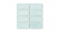
    I would chose a tile that had some very slight color variation - a fireclay or a crackle as shown above. It will help to blend the colors of the kitchen together without adding too much pattern.

  • 8 years ago

    Thank you! You would tile above the range hood? How far up? The trim on the cabinets don't go to the ceiling.

  • 8 years ago

    I love Encore tiles & Fireclay. I can't get enough of them & your space is perfect for them. Would you be open to a little color?


  • 8 years ago

    Yes, a little color but not dark.

  • 8 years ago

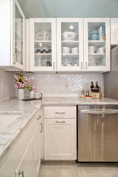
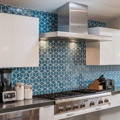
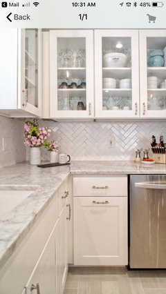
    Or go with a shape or pattern in white. A glossy herringbone would look nice. It would add texture without adding another color or distraction from your stone.


    Cynthia thanked mark_rachel
  • 8 years ago

    take the tiles up to be even w/the top of the cabinets. how far from the ceiling are they? post a pic of that entire wall

  • 8 years ago

    Big vote for the herringbone. The texture is really nice. You could do as shown in rachel mark's pic above or use a 3x6. I did it and it looks fantastic. I only took it as high as the hood edge though and I'm very happy with it.

  • 8 years ago

  • 8 years ago
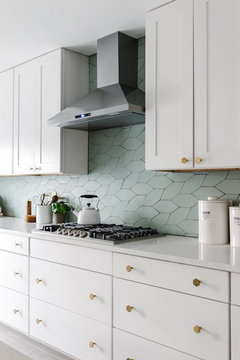
    I love the glass ‘shaped’ up and down tiles Beth suggested in that grayish almost light blueish tint - I think that would look so pretty.
  • 8 years ago
    last modified: 8 years ago

    cynthia,,this is a beautiful kitchen. use a beautiful tile to compliment it. using a plain old everyday white or gray subway will just make it look like all the others out there. do something diff.

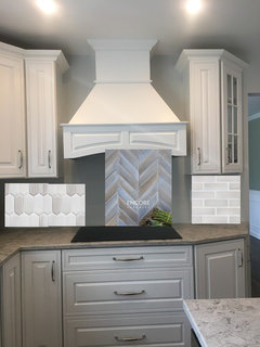
    Encore Ceramics has the most beautiful glazes. you can mix and match or do diff sizes

    shadow quartz glaze, (this one actually picks up the red/brown tone in your stone)

    from left,,earl gray picket (again, any shape you want), the matte metallic blend, and the 2x6 silver crackle.

    or, go basic

    Walker Zanger Cafe

  • 8 years ago

    Thank you I will look for these. Do most tile stores carry encore? Also, how far up with tiles should I go? See picture I posted later.

  • 8 years ago

    cynthia,,no, they don't. go to the site and look for distributers in your area.

    http://encoreceramics.com/find-a-showroom/

    I had another poster on here just go see them in Charolette. they had some nice sample boards. there was another poster last year who went with them after I showed her some pics. she ordered them online and installed. she loves them! they aren't cheap, so if budget is a huge issue,,,,,,they're in the 30-40 range a sq ft. Encore has some that are already in stock, otherwise it's a custom order.

    http://encoreceramics.com/quick-ship/


    as far as how high, I'd go all the way up. to the ceiling. you can stop even w/the cabinet crown, but that only leaves another inch or so to the ceiling. If it was 6", then I'd say stop,,,but because it's so small,,take them all the way. you can even fan out and do the small portion above the cabs,,,up to you.


    I would have insisted on a larger crown molding to close that gap you have. you could have easily have gone w/something larger.


    a lot of people will tell you stop the tile at the hood level. I think it looks like one ran of tile, but that's my opinion.

  • 8 years ago
    Our sink is against a wall like your cooktop is. We used Sonoma Tilemakers’ products on our backsplash w/ a medallion over the sink & their gorgeous crackle tile for trim & accents. It has great luster that looks super when undercounter lights are on.
  • 8 years ago
    This is not a great pic to show backsplash, but if you’re interested I have others on my desktop.
  • 8 years ago
    Too fast!
  • 8 years ago

  • 8 years ago

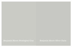
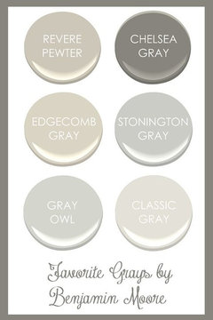
    I am doing the same project right now with white cabinets and Moorland Fog counters....All of the comments are so helpful I wonder if you anyone would also recommend a paint color. I tried BM Revere Pewter, but it is pulling too much blue for my liking. Any suggestions for paint is appreciated. Also, Cynthia...if you finished your backsplash, I would love to see the pics. TIA

  • 8 years ago

    Hi Desiree, would you believe I have no backsplash yet! I actually am going to a tile shop next week to check on the encore ceramics which are very expensive but so pretty. I got side tracked with other things. In the kitchen, I ended up using BM Grey Owl. It looks pretty.

  • 8 years ago

    Cynthia, I am considering Moorland Fog also. We'll have white cabinets and dark floors (perhaps a little lighter than yours). I'm concerned that Moorland Fog will be too pink/cream for other parts of the house. In your first photo, it looks pink/cream, in the second I LOVE the look of your island counter. I'm wondering, in real life, does it look more like the first photo or the island in the second? Thanks!

  • 8 years ago

    Hi,

    It really depends on the lighting. I think my pendant lights were on and the stone didn’t show that cream color. However, there is a beige/cream (not pink) tone to the counter.

  • 8 years ago

    Cynthia thanks so much! Are your cabinets white white, or a slight off-white? I'm trying to decide between two whites, and white the off-white seems to be a better blend for the cream, I don't want my cabinets to look cream...I want them to look white.

  • 8 years ago

    They are white NOT off white. I didn’t want a cream cabinet either.

  • 8 years ago

    thank you!!

  • 7 years ago

    Beth H, I love the backsplash in the middle that you recommended, but when I go to Encore Ceramics and search for matte metallic blend, I can't find it. Where did you find that awesome backspash you put in the middle? Many thanks.


  • 7 years ago
    last modified: 7 years ago

    Katie,,,this is the name of that design

    Chevron-2×6 staggered mosaic shown in Heron matte.

    http://encoreceramics.com/product/chevron-2x6-staggered-mosaic/


    http://encoreceramics.com/product/chevron-dimensional-mosaic/


    if you want the metallic, go to Alloy,, you can choose any of the alloy to go on the chevron design

    http://encoreceramics.com/alloy-glazes/

  • 7 years ago

    Beth H, thanks so much. These are so incredibly beautiful. . . and a bit bluer and darker than I originally expected. I'll have to think about whether I am bold enough to add that much color to my kitchen!

  • 7 years ago
    Mark H
    Mark, what size are these tiles? Are the just glossy white? What is the brand? Thanks
  • 7 years ago

    Can anyone tell me what the name of the counter is in the above pic? Mark_Rachel offered it up above as an example of using a backsplash that accented shape/texture as a nice complement to the counter. Great example--it's perfect!. It lets the counter be the star while still having a life of its own in its shape and shine. While I know the posters were discussing Moorland Fog, I don't know if Mark offered that as a pic of M. Fog. Whatever the counter is, I love it? Anyone know if it is indeed MF?

  • 7 years ago

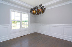
    Beth. in your first response on this you included pictures of an install. One of them shows a small area of wall with a medium grey paint. Do you know the name of it and the brand? That is my kitchen exactly and I'm trying to find the right wall color. Thanks

  • 7 years ago

    Beth what is the brand and color of the gray paint in the first set of pics you sent on this?

  • 7 years ago

    Teresa, have no idea. Gray paint can change on your wall depending on your lighting. best thing to do is get a few samples and try them

    this one is SW Crushed Ice. It's a nice light gray, without looking blue or green.

  • 7 years ago

    Hi Cynthia,

    Is your Moorland Fog gray? The store sample was gray, but online it looks a little beige/pink/maroon. Is it just my computer, or does it have those hues as well.

    Did you go for the Encore backsplash?

    Thanks,


  • 7 years ago

    Your counter is more beige than anything else. I think a gray backsplash would conflict badly. White to match the white in the counter would be better if it is the same white as the cabinets.

  • 7 years ago

    H

  • 7 years ago

    Hi! The Mooreland Fog does have a beige tone but it really depends on the lighting in your kitchen. If you have a lot of lighting you see gray. I found that in the tile shops it was more grey. It is a beautiful stone. I didn’t buy tiles yet. I’m getting back to looking again.

  • 7 years ago

    Oh wow! Looks beautiful. Nice contrast. I guess I can’t be afraid of color.

  • 6 years ago
    last modified: 6 years ago

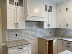
    We just used the same countertop, but went with 2x10 white tile with a dove gray grout.


  • 6 years ago

    Greg: Can you post a picture of it?

  • 6 years ago


  • 6 years ago

    @Greg F. is that ungrouted? @Cynthia You have to be careful going with white. You don't want it to clash with your cabinets, but its a great choice if you can find the right color.

  • 6 years ago

    No, it is grouted with a dove gray (charcoal) color. The tile also has dimension to it which gives more character than a standard flat subway tile.

  • 6 years ago

    I like a backsplash that matches a color in the counter.

  • 6 years ago

    @Greg F. Your cabinets & countertop read warm, but the backsplash is reading cool. Maybe it looks different in person.

  • 6 years ago

    Hi Cynthia, just wondering if you have chosen you backsplash tiles yet? I’m in the middle of renovating my kitchen and will be using Moorland Fog as my countertop. Thanks

  • 6 years ago

    Ann2017: No, I haven’t. I never did, I was so undecided and then time and life just took over. I’m beginning to look again and would like to have this project done this year. I’m leaning toward white or light grey like my wall color. If you look at the stone, it has light grey. Also, it can look taupe or beige if you don’t have a lot of sunlight in your kitchen. Let me know what you find 🙂

  • 5 years ago
    last modified: 5 years ago
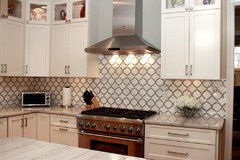
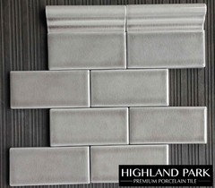
    @Greg F. I love the tiles you chose with the counter (we have the same counter and more of a cabinet color similar to simply White cabinet color-(white but not the brightest white ) --are you cabinets bright white? What is the name of the back splash tile and can you share the manufacturer or where you purchased it? We are trying to decide between white subway with same grout color or the highland park 3x6 subway in Dove Grey