Azalea
Within an otherwise seemingly conventional and somber canvas of grey walls and white floor, an unusual hue of crimson erupts intermittently into the space almost like a hypnotic lava flow against an otherwise dull grey landscape; and stands out as one of the main highlights of the Azalea home.
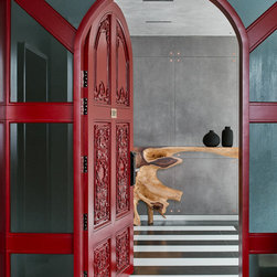
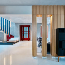
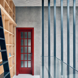
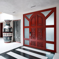
Interestingly enough, the concept of this home began in two areas. The first was an aesthetic one in which the inspiration for the doors arose in the deep red English phone booth design. Because the clients were keen on a very unusual (bordering even avant-garde) home, we were thrilled to discover that the crimson doors we recommended excited the clients as much as they excited us. This naturally set a bold and challenging palette for us to work with.
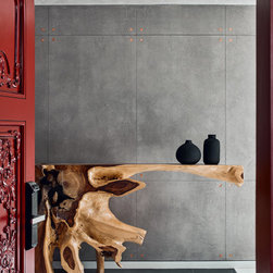
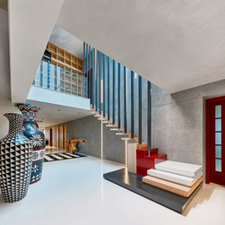
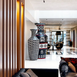
The second area is one where some amount of camouflage was required. At the right of the entrance was a massive column that needed to be hidden. Building closets around it or even painting it would just not cut it. So instead we made it into a sculpture. Make that two! This life size tribal pottery seen is that concoction.
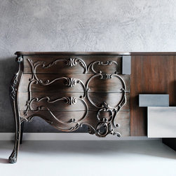
Given that above two concepts were crystal clear in our minds, the rest was easy, we thought. How difficult could it be to design around giant hand-painted tribal pots and red doors? Very! So after trying several colour combinations, we decided on a set of colours that would deliver a stark yet seamless experience throughout the house. Black, white, grey and red would be the colours and oak would be the choice of wood.
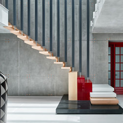
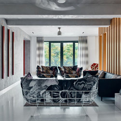
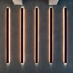
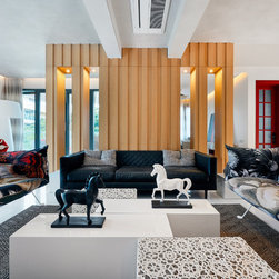
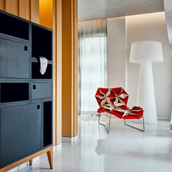
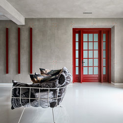
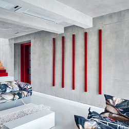
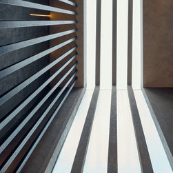
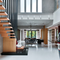
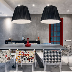
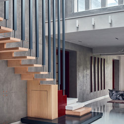
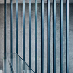
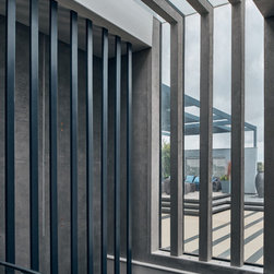
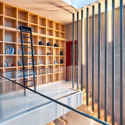
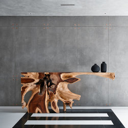
The main door is arched and baroque, setting the stage for a dramatic entry with black and white stripes leading to a drift wood sculpture console. In the main areas (living and dining), the floor and walls are white; the main long wall is cement finished emulating an RCC wall with copper studs; ceiling is also cement finished; the staircase, also a feature, sits on a stepped platform of the above colours and the railing is a multiplicity of black members, not only giving he space texture, but also mirroring the architectural slits of skylight and cutout of the adjacent wall as well as the custom made vertical red lights opposite the living cluster. The furniture in the living and dining is carefully chosen to stand out and blend in – depends on how you see it.
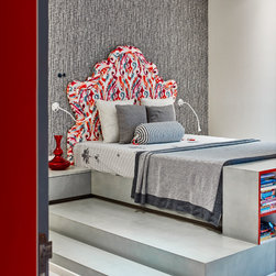
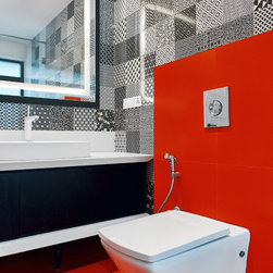
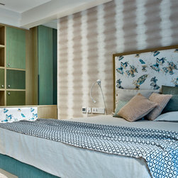
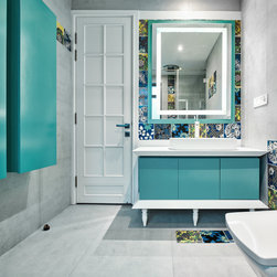
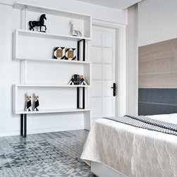
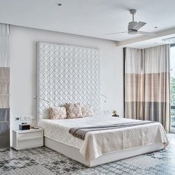
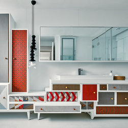
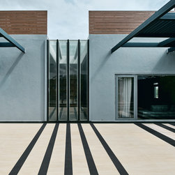
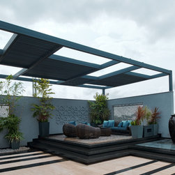
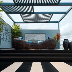
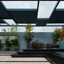
Within the rooms, we tried to maintain the concept and also meet the individual and teenage needs of the two young daughters of the couple. Neutral wallpapers lie behind upholstered beds. Bathrooms reflect the room colours and are eclectic in their own way. In the master, the floor is a beautifully printed motley tile in neutral colours. The bed is white and the bathroom has a hand painted vanity. The terrace is more monochromatic with black white and navy. The straight lines on the floor create a shadow-like effect for the vertical skylight slits.
This wonderfully stimulating experiment in design has resulted in a space that is contemporary, dramatic, explosive, eclectic, energetic and electrifying.
Interestingly enough, the concept of this home began in two areas. The first was an aesthetic one in which the inspiration for the doors arose in the deep red English phone booth design. Because the clients were keen on a very unusual (bordering even avant-garde) home, we were thrilled to discover that the crimson doors we recommended excited the clients as much as they excited us. This naturally set a bold and challenging palette for us to work with.
The second area is one where some amount of camouflage was required. At the right of the entrance was a massive column that needed to be hidden. Building closets around it or even painting it would just not cut it. So instead we made it into a sculpture. Make that two! This life size tribal pottery seen is that concoction.
Given that above two concepts were crystal clear in our minds, the rest was easy, we thought. How difficult could it be to design around giant hand-painted tribal pots and red doors? Very! So after trying several colour combinations, we decided on a set of colours that would deliver a stark yet seamless experience throughout the house. Black, white, grey and red would be the colours and oak would be the choice of wood.
The main door is arched and baroque, setting the stage for a dramatic entry with black and white stripes leading to a drift wood sculpture console. In the main areas (living and dining), the floor and walls are white; the main long wall is cement finished emulating an RCC wall with copper studs; ceiling is also cement finished; the staircase, also a feature, sits on a stepped platform of the above colours and the railing is a multiplicity of black members, not only giving he space texture, but also mirroring the architectural slits of skylight and cutout of the adjacent wall as well as the custom made vertical red lights opposite the living cluster. The furniture in the living and dining is carefully chosen to stand out and blend in – depends on how you see it.
Within the rooms, we tried to maintain the concept and also meet the individual and teenage needs of the two young daughters of the couple. Neutral wallpapers lie behind upholstered beds. Bathrooms reflect the room colours and are eclectic in their own way. In the master, the floor is a beautifully printed motley tile in neutral colours. The bed is white and the bathroom has a hand painted vanity. The terrace is more monochromatic with black white and navy. The straight lines on the floor create a shadow-like effect for the vertical skylight slits.
This wonderfully stimulating experiment in design has resulted in a space that is contemporary, dramatic, explosive, eclectic, energetic and electrifying.
Country: India